
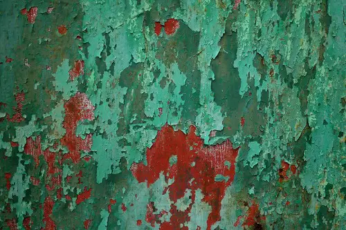
1. Black and Red
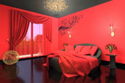
Black and red is one of those color schemes that feels instantly intense—and unfortunately, instantly outdated. It was big in early 2000s bachelor pads and edgy teen bedrooms, often with vinyl furniture or flame decals (yikes). The high contrast is hard to work with and rarely feels inviting. More often, it comes across as aggressive or overly dramatic.
Red also tends to dominate, making it hard to balance in real life spaces. Black, while chic on its own, just adds more weight here. Unless you’re designing a themed restaurant, this palette can quickly feel like a relic. For drama without the cringe, try black with deep green or plum instead.
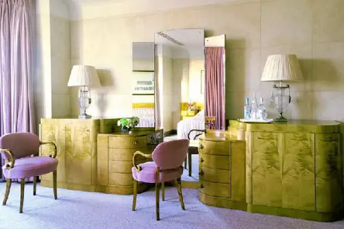
2. Tuscan Red and Mustard Gold
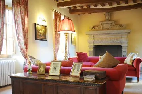
Once the darlings of early 2000s suburban kitchens, this palette now feels like it belongs in an Olive Garden ad from 2003. Tuscan-inspired interiors were all the rage thanks to faux finishes and wrought iron everything. But in today’s cleaner, more minimalist era, this heavy color combo can feel stuffy and overly ornate. It’s not cozy—it’s more like a visual hangover from too much sponge painting.
The richness of these tones can overwhelm smaller spaces and clash with more modern furniture. Instead of feeling warm and inviting, the reds and golds can feel dark and dated. Even when used sparingly, they tend to drag a room back in time. If you’re aiming for timeless, skip this palette.
3. Brown and Beige Everything
Earth tones can be beautiful—but when it’s just brown and beige wall to wall, you’ve got a time machine to 1997. This palette was once considered “safe” and neutral, but now it often reads as lifeless and drab. Think brown microfiber sofas, beige carpets, and taupe walls all blending into one forgettable blur. It’s more waiting room than warm retreat.
The real issue is the lack of contrast or energy. Without pops of color or texture, everything starts to look the same. These shades can also make natural light feel muddy instead of bright. To avoid a dated look, mix in cooler neutrals or crisp whites instead.
4. Navy and Coral
This pairing had a big moment in coastal-inspired design around 2010, especially in bedrooms and nurseries. At the time, it was a breezy alternative to red, white, and blue—still patriotic-adjacent, but softer. Today, the combo feels overly branded, like a throw pillow set you’d see in a clearance bin at a beachy chain store. It’s too theme-y and not flexible enough.
Coral in particular hasn’t aged well; it feels stuck between trendy and uncertain. Paired with navy, it can become visually jarring instead of balanced. The once-bold contrast now feels more harsh than chic. There are more sophisticated ways to do coastal today—this isn’t it.
5. Olive Green and Burgundy
This color combo screams “grandma’s dining room”—and not in the cool, retro way. Olive and burgundy were popular in the ’80s and ’90s for their richness and sense of formality. But together, they can suck the air out of a room, especially when paired with heavy wood furniture. It’s more Thanksgiving dinner than year-round style.
Both colors are intense and earthy, which can quickly overwhelm smaller or less naturally lit rooms. They also lean heavily toward traditional, which makes updating furniture or accessories tricky. Unless you’re intentionally going for a vintage vibe, it’s hard to make this look modern. Try incorporating just one of the two and balancing it with fresher tones.
6. Teal and Chocolate Brown
This duo had a chokehold on 2000s dorm rooms and first apartments, and it hasn’t quite recovered. It was the go-to “cool girl” color combo for a minute—teal was trendy, and brown made it feel grounded. But in retrospect, it just doesn’t hold up, especially when both shades are dark. It can make a room feel oddly cold and heavy at the same time.
The contrast isn’t sophisticated enough to feel timeless. Teal can veer too bright or too muddy, while chocolate brown often lacks depth. Together, they flatten a space instead of enriching it. If you’re after bold, try teal with crisp white or warm metallics instead.
7. Millennial Pink and Rose Gold
Ah yes, the color combo that launched a thousand influencer bathroom selfies. Millennial pink had its heyday around 2016, and when paired with rose gold, it felt fresh and flirty—for about a year. Now, the combination is so overused it can make a room feel like a Pinterest board from a bygone era. It’s hard to take seriously in adult spaces like kitchens or offices.
The problem isn’t the colors themselves—it’s how often they were used together in overly styled, cliché ways. They tend to flatten a space, making it feel more like a showroom than a home. The soft pink can quickly veer into saccharine territory, and rose gold accents have a tendency to chip or tarnish. If you’re chasing modern elegance, this duo is no longer it.
8. Mauve and Dusty Blue
There was a moment in the late ’80s and early ’90s when every wedding, bathroom, and living room had these two colors front and center. At the time, they felt soft, romantic, and sophisticated. Today, they mostly feel like a faded snapshot from a department store catalog. The pastel-meets-powdery vibe hasn’t transitioned well into modern tastes.
Both colors can look washed out, especially under artificial lighting. Mauve in particular can make a room feel like it’s permanently stuck in twilight. Dusty blue often lacks the energy of newer blues like slate or steel. Try updating with richer tones if you love a muted palette.
9. Forest Green and Rust
While each of these colors has made comebacks in isolation, pairing them can feel very “1970s rec room.” Think avocado appliances and shag carpet—it’s hard not to go straight to vintage overload. The combo can feel heavy and nostalgic in a way that’s tough to modernize. Without careful styling, it tips from retro-cool to just plain dated.
The warm and cool tones don’t always play nice, especially in low light. It’s a palette that needs a lot of white space to breathe, or else it starts to feel claustrophobic. Rust especially can be tricky—it can skew orange or brown too easily. If you love these tones, try using one as an accent rather than a base.
10. Lilac and Mint Green
This sugary-sweet combo had its time in the spotlight during the early 2010s thanks to pastel trends in fashion and decor. It was cute, quirky, and very “ice cream parlor meets baby shower.” But it’s extremely hard to make these two look grown-up, especially when used together in large doses. The result is often more juvenile than joyful.
Both shades can clash with more sophisticated furniture or architectural features. They also tend to fade quickly in natural light, leading to a tired, washed-out look. The overall effect can feel more disposable than designed. If you want pastels, aim for slightly dustier or moodier versions.
11. Bright Yellow and Gray
This pairing got a huge boost when Pantone named them co-Colors of the Year in 2021, but it already feels like it’s losing steam. Yellow is tricky—it can either energize or overwhelm—and when paired with cool gray, it often feels like it’s trying too hard to be modern. Instead of being cheerful, it can come off as clinical. It’s a tough palette to cozy up to.
Gray, especially in its cooler tones, has fallen out of favor in general. Combine that with a bold yellow and you’ve got a look that feels more like a warning sign than a welcoming home. The contrast lacks subtlety and doesn’t age gracefully. For a longer-lasting look, consider warming up the gray or muting the yellow.
This post 11 Color Palettes That Feel Dated Before the Paint Even Dries was first published on Greenhouse Black.