
Trends may come and go, but some colors never truly disappear—they just wait for the right moment to shine again. In 2025, a wave of nostalgic hues is sweeping through interiors, proving that classic doesn’t mean outdated. From warm neutrals to bold blues and rich jewel tones, these familiar shades are being reimagined in modern ways, bringing both comfort and sophistication back into the home. Here are 12 classic home colors making a bold comeback right now.
1. Hunter Green
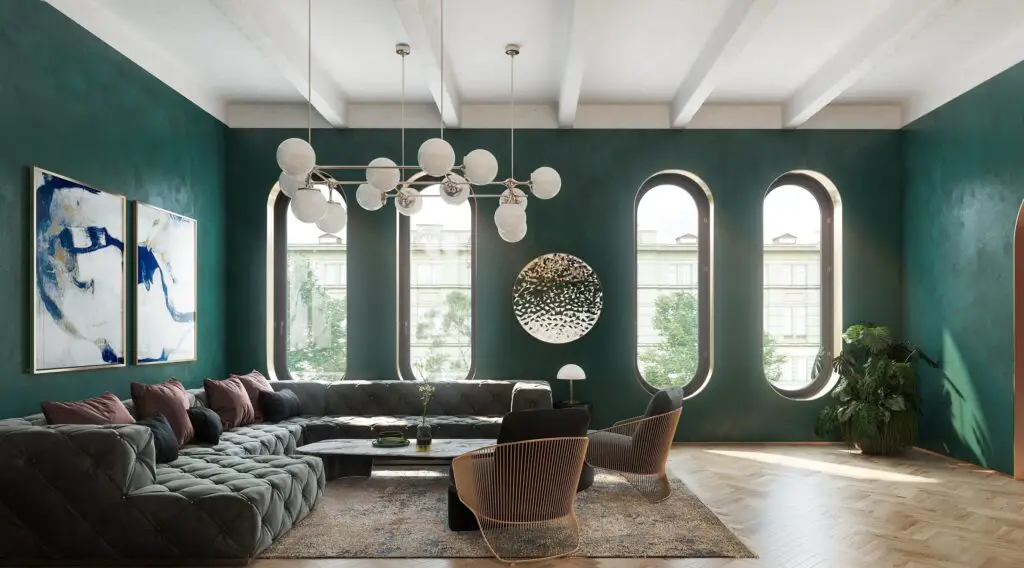
Hunter green is making a strong return in 2025 as a rich, nature-inspired color that exudes sophistication, says House Beautiful. This deep shade of green works beautifully on kitchen cabinetry, accent walls, and velvet upholstery. When paired with brass fixtures or warm wood tones, it creates an upscale yet grounded aesthetic. It’s a favorite among designers looking to blend traditional charm with modern boldness.
The earthy quality of hunter green adds depth and a cozy, cocooning feel to any space. It complements a wide range of materials, including stone, leather, and rattan, making it highly versatile. For those wary of bold colors, it can be introduced through smaller pieces like artwork or side tables. Whether rustic or refined, hunter green is proving it has staying power in today’s homes.
2. Mustard Yellow
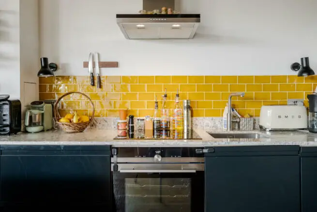
According to The Spruce, mustard yellow, once a vintage staple, is enjoying a fresh revival in today’s interiors. This golden-hued color brings vibrancy and cheerfulness to a space without overwhelming it. It pairs especially well with mid-century modern furnishings and bohemian elements like macramé and patterned textiles. Whether featured in accent chairs or wall art, mustard yellow brings a dose of personality.
Modern designers are using mustard yellow to add warmth to otherwise cool palettes. It plays beautifully with wood tones, navy, and deep greens, making it easier to layer into a space. You’ll often find it in curated gallery walls or patterned throw pillows as a subtle nod to its retro roots. In 2025, it’s less about nostalgia and more about bold, joyful expression.
3. Terracotta
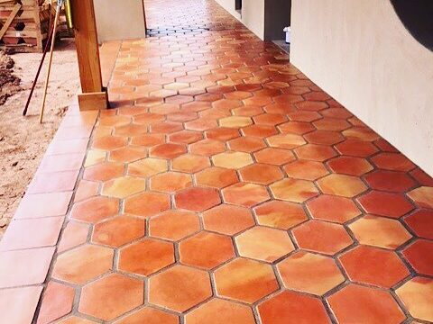
House Digest notes that terracotta is trending again thanks to its rich, earthy warmth and connection to natural materials. Inspired by clay and sunbaked landscapes, it brings Mediterranean charm into homes around the world. You’ll see it used in tiles, paint, pottery, and even upholstered pieces. It radiates comfort while maintaining a grounded, organic vibe.
Terracotta pairs beautifully with neutrals, muted blues, and soft greens, allowing for a wide range of styling options. It works equally well in rustic farmhouses and modern minimal spaces, depending on how it’s applied. Layered with textured textiles and natural fibers, it creates an effortlessly cozy environment. Its timeless warmth ensures it won’t be going out of style any time soon.
4. Powder Blue
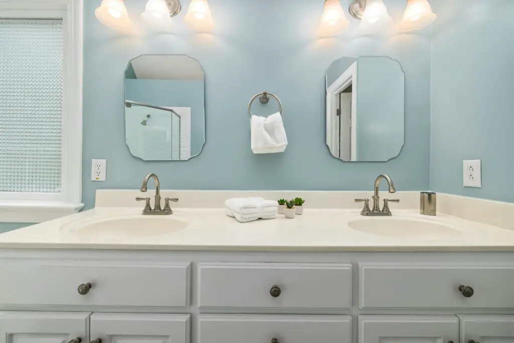
Powder blue has long been a staple in traditional interiors, and it’s gaining renewed attention in 2025 for its soothing qualities, says Good Housekeeping. The soft, airy hue brings a sense of tranquility to bedrooms, bathrooms, and even kitchens. It evokes a coastal or vintage charm, depending on how it’s paired. White trim and brass hardware can elevate its elegance for a clean, classic finish.
Designers are also experimenting with powder blue in modern settings, using it to soften strong architectural lines. It can be paired with deeper blues or warm creams to create subtle contrast and visual depth. Even used in small doses—like in ceramics or light fixtures—powder blue adds freshness and lightness. Its timeless charm continues to appeal across design styles.
5. Blush Pink
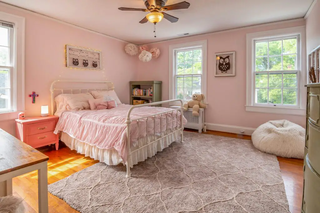
Blush pink has moved beyond its “millennial pink” origins to become a new classic in interior design. Soft, subtle, and warm, it offers a refined alternative to beiges and grays. Blush works beautifully with neutrals, darker hues like navy or charcoal, and metallic accents for a more elevated look. Its gentle tone adds femininity without being overly sweet.
In 2025, designers are embracing blush as a foundational color rather than just an accent. It’s being used in wall paint, upholstery, and bedding to create serene, welcoming spaces. Blush also balances out industrial or minimalist designs, adding softness and warmth. Its versatility makes it an enduring favorite for both modern and vintage-inspired interiors.
6. Burnt Orange
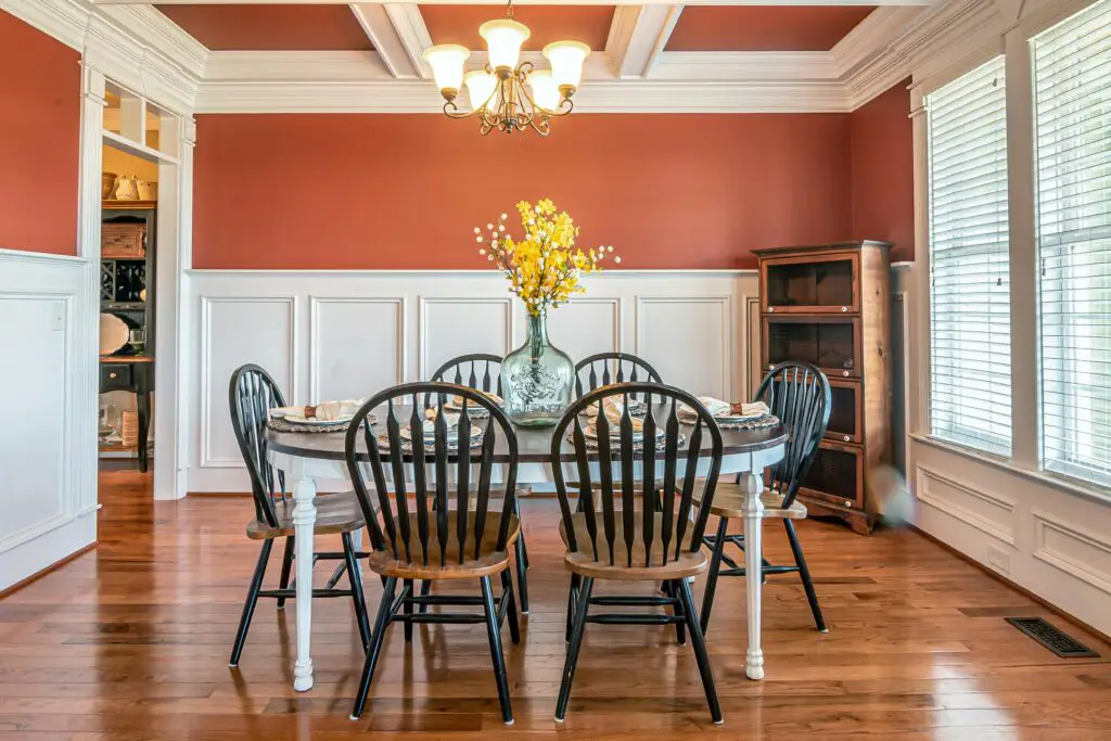
Burnt orange is gaining traction as a rich, spicy color that adds warmth and character to any space. Unlike brighter tangerines or corals, this deeper tone has a grounded, autumnal quality that feels inviting year-round. It’s particularly striking in velvet fabrics, wall paint, or statement decor pieces. Burnt orange can instantly make a room feel cozy and well-lived-in.
This hue pairs beautifully with olive green, navy blue, and cream tones, creating a bold yet balanced palette. It brings an earthy sophistication that’s ideal for both boho and eclectic interiors. When used in moderation, it acts as a strong accent without overpowering the space. Whether on a front door or a throw pillow, burnt orange makes a bold, confident statement.
7. Navy Blue
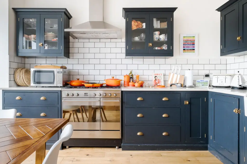
Navy blue remains a go-to color for those seeking depth and elegance in their interiors. It’s bold but neutral, allowing it to anchor a room without clashing with other colors. In kitchens and bathrooms, navy cabinetry or tilework adds drama and sophistication. It also provides a striking contrast against lighter elements like white countertops or brass fixtures.
Beyond high-contrast applications, navy blue works beautifully in more subdued palettes. Paired with warm wood, soft gray, or blush accents, it creates a cozy, balanced look. It’s also a favorite for moody, monochromatic rooms that exude calm and confidence. Whether classic or contemporary, navy continues to prove its versatility.
8. Sage Green
Sage green has reemerged as one of the most calming and popular hues for modern interiors. Its muted tone brings a sense of serenity and connection to nature, making it perfect for restful spaces. You’ll see sage in kitchens, bedrooms, and living rooms, often alongside light woods and matte finishes. It provides subtle color without overpowering the decor.
Sage green pairs beautifully with other nature-inspired tones like beige, terracotta, and pale pink. It offers a softer alternative to bolder greens like emerald or forest hues. Its understated elegance makes it ideal for minimalist and Scandinavian styles. Sage green is a grounding, adaptable shade that invites calm into every corner of the home.
9. Warm White
Warm white is taking the spotlight from cooler, bluish whites as homeowners seek softer, more inviting interiors. Creamy tones like ivory, linen, and antique white add a subtle glow to walls and trim. These hues are perfect for creating a cozy atmosphere without veering into full beige territory. Warm whites serve as a neutral backdrop that flatters wood, brass, and organic textures.
Designers are using warm whites to craft layered, tonal interiors with depth and character. These shades are especially popular in open-plan homes where continuity is key. They reflect light beautifully while avoiding the stark, sterile feel of cooler whites. The shift toward warm white signals a broader movement toward comfort and lived-in elegance.
10. Maroon
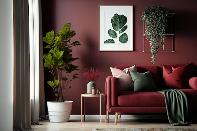
Maroon is making a refined comeback as a deep, luxurious color choice for bold interiors. This moody red hue adds instant drama and richness, whether used in velvet upholstery, painted walls, or heavy drapery. It evokes a sense of old-world glamour while remaining modern when paired with sleek lines and minimalist decor. Maroon is perfect for those looking to make a statement.
This shade pairs well with neutrals like beige and charcoal, or with metallic accents like gold and bronze for added opulence. It’s often used in formal dining rooms or cozy libraries to create a dramatic atmosphere. When balanced with lighter elements, it can bring depth without feeling too heavy. Maroon is ideal for interiors that prioritize bold, elegant storytelling.
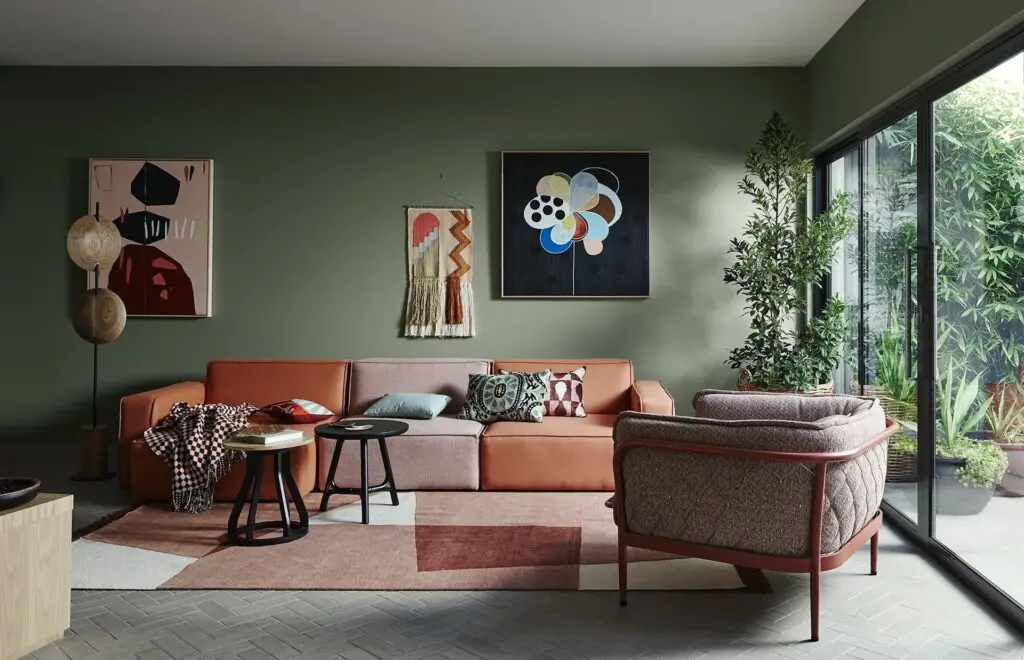
11. Olive Green
Olive green is being embraced as a versatile, vintage-leaning color that adds warmth and depth. Its earthy undertones make it feel grounded and organic, ideal for cozy, lived-in interiors. Olive works especially well in kitchens, where it complements butcher block counters and aged brass fixtures. It’s also a favorite for painted cabinetry, vintage textiles, and moody wall paint.
This color is often paired with rich wood tones, terra cotta, and muted gold for a retro-modern blend. Olive green balances boldness with subtlety, making it suitable for both accents and main color schemes. It can be styled to feel rustic, industrial, or mid-century depending on the decor. As a timeless natural hue, olive green remains both trendy and classic.
12. Charcoal Gray
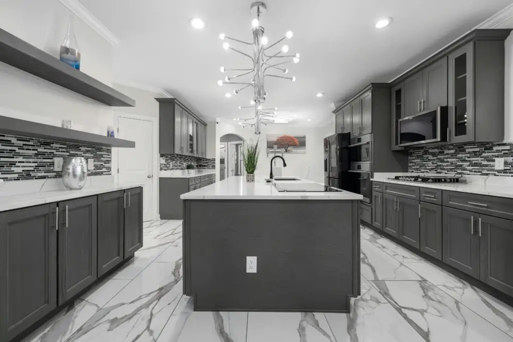
Charcoal gray remains a popular neutral for those who want depth without turning to black. This dark, cool shade provides a strong foundation for modern, industrial, and minimalist styles. It creates visual contrast and sophistication when paired with brighter colors or natural materials. Charcoal gray is often seen on feature walls, cabinetry, or large furniture pieces.
Despite its depth, charcoal can also feel surprisingly cozy when layered with warm textures like wool, linen, or wood. It’s incredibly versatile, working with a wide range of accent colors from mustard yellow to dusty rose. In open-plan spaces, it helps anchor specific zones without making the space feel closed in. Charcoal gray continues to evolve as a staple for bold, grounded design.