
Paint trends are as fickle as fashion. One year a color is everywhere—on walls, in magazines, flooding your Pinterest feed—and the next, it feels tired and overdone. Some shades burn bright for a season but don’t have the staying power to become true classics. As design preferences evolve toward more organic, timeless palettes, these once-popular hues are starting to fade into the background. If you’re considering a refresh, these are the colors designers are moving away from in 2025. Whether they’re too bold, too brash, or simply past their prime, these shades are already starting to feel like yesterday’s news.
1. Mint Green
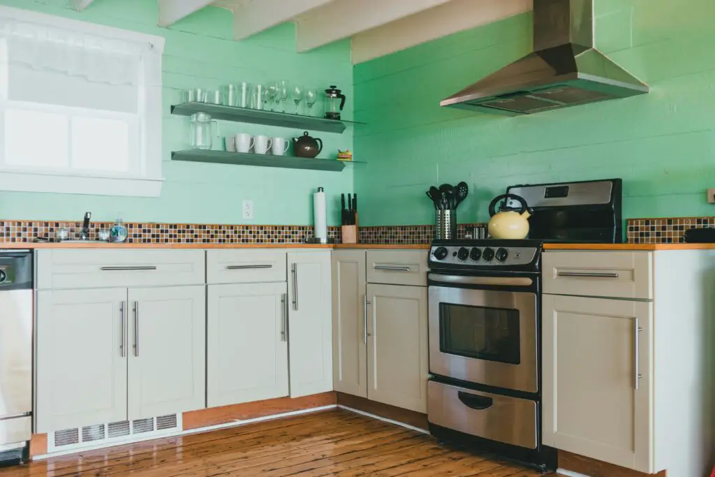
Mint green once symbolized retro charm and soft freshness, but it’s now losing ground in modern interior palettes. Its pastel tone can feel overly sweet or juvenile when applied to large surfaces, especially when paired with more mature furniture or decor. In many cases, it ends up giving a room an overly stylized or vintage feel that clashes with today’s clean-lined, organic aesthetic. While it still has appeal in niche spaces like bathrooms or playrooms, it no longer leads the trend cycle, says Real Simple.
Designers are opting for more grounded greens like sage, olive, and eucalyptus, which feel calmer and more sophisticated. These tones bring in the same sense of tranquility but with a richer, earthier base that pairs beautifully with trending textures like linen, rattan, and warm wood. Mint green, by contrast, now feels like a throwback rather than a forward-thinking design choice. Its delicate brightness can make it difficult to style in a cohesive, contemporary way.
2. Eggplant Purple

Eggplant purple once brought drama and elegance to interiors, but it’s become a color that’s more difficult to work with in today’s design landscape. Elle Decor notes that its rich, jewel-toned nature can overpower a room and limit styling options due to its intensity. While it can feel luxurious in small doses, using it on walls tends to weigh down the space. The shade is starting to feel overly theatrical rather than stylishly moody.
In place of eggplant, softer purples like lilac, mauve, or lavender are gaining ground for their versatility and fresh aesthetic. These hues still introduce a touch of whimsy and color without overwhelming the space. They work well in both traditional and contemporary settings, adding visual interest without stealing the spotlight. Eggplant, while once bold and fashionable, now feels out of sync with today’s softer, earthier palettes.
3. Peach

Peach has long had a place in interior design, but its sugary undertone is now falling out of step with contemporary preferences, according to Domino. It’s associated with older decor trends and often feels too sentimental or outdated in modern spaces. When used on walls, it can cast an odd, almost artificial glow in a room. As softer, neutral palettes dominate, peach stands out for the wrong reasons.
In its place, designers are leaning into clay, apricot, and terracotta—tones that offer warmth with a bit more depth and maturity. These alternatives still provide that hint of color while blending better with natural textures and minimalist decor. They evoke a desert-inspired warmth rather than a retro kitsch. Peach, while charming in small accessories, is no longer a color that holds weight in current paint trends.
4. Fire-Engine Red
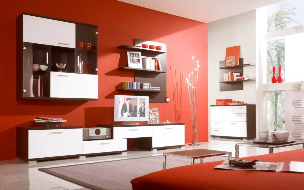
Fire-engine red made a bold impression during its trend peak, but its energy can be more unsettling than inspiring, says Homes & Gardens. It commands attention in a way that can become tiresome quickly, especially in everyday living areas. In enclosed spaces, it often feels aggressive and cramped rather than cozy or inviting. What once felt daring now feels disruptive to the eye.
The shift in decor trends leans toward muted, earthy reds that evoke warmth without intensity. Rust, terracotta, and brick red bring in that same vibrant energy but in a more grounded, refined way. These shades are easier to pair with other elements in the room and don’t fatigue the senses over time. Fire-engine red, by contrast, feels like a design decision that demands constant justification.
5. Neon Green

Neon green might have once represented bold creativity and playfulness, but it now reads as harsh and overstimulating in most interiors. Its high-voltage intensity can dominate a room in a way that feels more chaotic than creative. In natural light, it reflects sharply and often competes with even neutral furnishings. The result is a space that feels more like a funhouse than a functional home.
In today’s interiors, the focus is shifting toward natural greens that soothe rather than shout. Sage, eucalyptus, and olive offer a more relaxed and sophisticated vibe while still connecting to the vibrancy of the outdoors. These tones are easier to live with and work well in a range of design styles, from modern to farmhouse. Compared to these understated greens, neon looks more like a passing fad than a timeless choice.
6. Black

Black interiors once carried an air of sophistication and edge, but when overused, they can make rooms feel heavy and claustrophobic. While black still has its place in accents and contrast detailing, entire walls painted black now feel too severe for many people. In rooms lacking ample natural light, the effect can be especially bleak and unwelcoming. As the design world moves toward wellness and calm, black can feel emotionally draining.
Warmer, softer darks like charcoal, graphite, or navy are stepping in to replace true black in many modern palettes. These tones offer a similar sense of drama without shutting down the room’s energy. They also pair more harmoniously with the natural materials and organic finishes that are currently trending. While black is timeless in small doses, as a dominant wall color, it’s slipping off trend lists in 2025.
7. Orange

Bright orange had its moment as a lively, retro-inspired accent color, but it’s now seen as too loud and overstimulating for most interiors. Especially in its pumpkin or traffic-cone forms, orange tends to make rooms feel restless and difficult to relax in. It’s also tricky to coordinate with other colors, leading to a chaotic rather than cohesive look. What was once fun and bold now comes off as visually abrasive.
Designers are pivoting toward more grounded versions of orange that still bring warmth without the jolt. Terracotta, burnt sienna, and copper shades are becoming the new go-to for adding energy in a more curated, mature way. These hues blend beautifully with natural wood, woven textures, and earthy neutrals. Compared to the new wave of warm tones, bright orange feels unsubtle and outdated.
8. Turquoise

Turquoise was once synonymous with boho and coastal aesthetics, but it’s started to feel overly specific and dated. Its bright, saturated hue is hard to tone down and can dominate a space in an unbalanced way. When overused, turquoise creates an overly stylized look that lacks the versatility modern spaces demand. As design tastes evolve, its novelty appeal is wearing thin.
Softer, dustier versions of blue-green are taking its place—tones like duck egg, muted teal, or misty aqua. These colors maintain the cool, calming effect of turquoise but with a more subdued presence. They’re easier to layer with modern textures like stone, linen, and warm woods. Turquoise, by comparison, feels locked in a past trend cycle that’s quickly losing momentum.
9. Bubblegum Pink
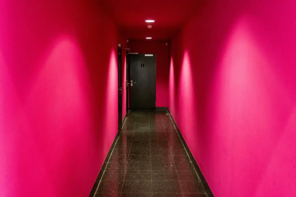
Bubblegum pink enjoyed a burst of popularity for its fun, playful vibe, but it’s no longer resonating with contemporary design trends. The high-saturation sweetness feels overly youthful and tends to clash with more refined furnishings. In larger spaces, the color can feel overpowering and one-dimensional. It lacks the maturity that many people now seek in their interiors.
In its place, blush and rose tones with neutral undertones are rising in favor. These shades feel more grown-up while still offering a sense of warmth and charm. They pair effortlessly with metallics, natural materials, and earthy palettes, making them more adaptable. Compared to bubblegum’s pop-art vibe, these newer shades bring elegance and subtlety.
10. Lime Green

Lime green has become one of the more polarizing colors in decor, mainly because of its acidic brightness. It can easily clash with other colors and often feels more like a theme park than a home design choice. Even in small doses, lime green tends to dominate the palette and can be exhausting to look at day after day. Its artificial intensity doesn’t blend well with today’s love for organic, nature-inspired elements.
The green family isn’t out entirely—just evolving. Moss, laurel, and muted jade are gaining popularity for their earthiness and compatibility with a wide range of design styles. These tones reflect a return to the natural world, offering tranquility rather than tension. Lime green, in contrast, feels like a color from an earlier, louder era of design.
11. Maroon

Maroon once brought a sense of tradition and richness, but its heavy tone now feels overbearing and dated. Used on walls, it can make a space feel dark, formal, and almost oppressive. It’s also difficult to match with modern finishes, especially the lighter woods and metallics that are popular today. The color feels too rooted in the past to carry the ease and freshness that current trends demand.
Burgundy, wine, and deep cranberry are evolving as fresher takes on maroon’s deep aesthetic. These hues offer the same sense of depth and luxury but with a touch more vibrancy and versatility. They look rich without dragging the room down, pairing well with contemporary palettes. As maroon fades, these newer shades offer a more elegant and adaptable alternative.
12. Dark Brown

Dark brown walls once brought a sense of richness and coziness, but they’re quickly becoming a thing of the past. The shade tends to close in a room, absorbing light and making spaces feel more confined than comforting. In today’s trend cycle, light and openness are prioritized, and dark brown often stands in stark contrast to that aesthetic. As a result, it’s no longer a favorite for contemporary interiors.
Designers are now embracing lighter, earth-toned neutrals that still offer depth without the heaviness. Mushroom, taupe, and warm greige tones provide a similar sense of grounding with a more refreshing, updated look. These alternatives complement a broader range of decor styles, from minimalist to rustic, offering more flexibility. Dark brown, in comparison, now feels heavy-handed and outdated in many modern settings.