
Your pantry might look the same, but what’s inside those familiar packages is changing—and not always for the better. Brands are quietly shrinking sizes, tweaking ingredients, and using vague labels to make products seem healthier or more generous than they are. These tactics, often called shrinkflation or skimpflation, are designed to cut costs without alerting consumers. Here are 13 everyday pantry items being repackaged in ways that may mislead you.
1. Baby Food Pouches
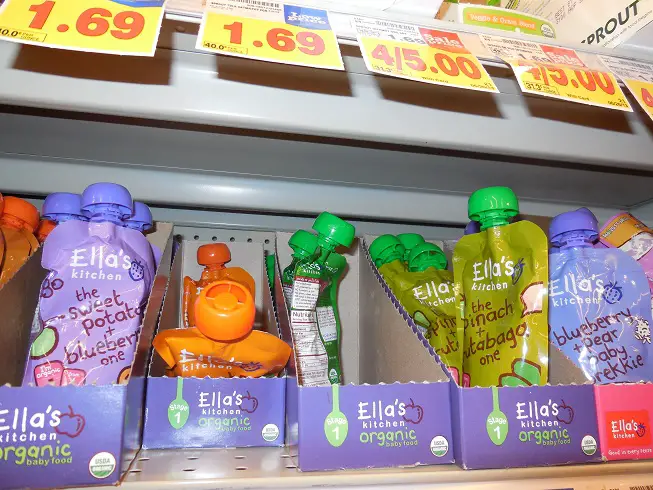
Baby food pouches are designed to be convenient and wholesome, but not all are as healthy as they seem. A study published in Parents in 2024 showed that many pouches labeled as “no sugar added” still contain high levels of natural sugars. These sugars often come from juice concentrates, which are far less nutritious than whole fruits and vegetables. Parents may feel confident in their choices based on misleading labels.
The packaging often features organic badges and nature-themed colors. This reinforces the perception of health even when the nutritional value is lacking. Since babies can’t read ingredients, it’s up to caregivers to be cautious. These tactics rely on trust and convenience to move product quickly.
2. Cereal Boxes
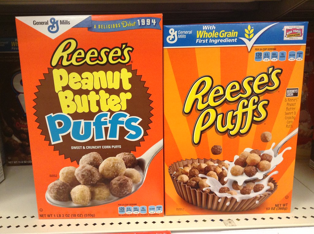
Cereal boxes are being designed to maintain their shelf presence even as the contents shrink. According to NPR, General Mills reduced its family-size cereals from 19.3 ounces to 18.1 ounces without significantly changing the box size. This makes the difference hard to spot unless you inspect the fine print. Brands rely on visual familiarity to keep you from noticing you’re paying the same for less.
Even the placement of the net weight can be adjusted to draw less attention. The box may feel just as full because of interior shaping or fluffier cereal. These tactics are part of a broader trend known as shrinkflation. Shoppers often miss the change unless comparing side-by-side with older packages.
3. Peanut Butter Jars

Your peanut butter jar may look unchanged, but chances are it’s holding less. Skippy’s jars were reduced from 18 ounces to 16.3 ounces, says USA Today, all while retaining the same shape and label design. The subtle change ensures customer loyalty while quietly reducing manufacturing costs. Many buyers do not realize they’re getting fewer servings per container.
This tactic is especially effective because pantry staples like peanut butter are repeat purchases. If the price hasn’t changed dramatically, most consumers won’t think to check the weight. The familiar branding masks what’s essentially a price increase. As a result, families may run out of product sooner and buy more frequently.
4. Fruit Snacks
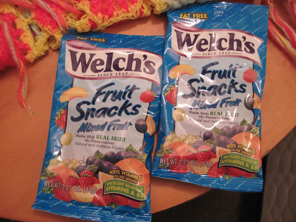
Fruit snacks often use phrases like “made with real fruit” to project a healthy image. However, as Consumer Reports notes, the ingredients typically include fruit concentrates or juices with added sugars—not whole fruit. This gives the impression of nutritional value that isn’t actually there. Parents looking for healthy snacks may be misled into thinking these are better than they are.
These snacks are typically aimed at children, making their marketing especially powerful. Bright packaging and fruit imagery reinforce the message of health. In reality, many fruit snacks are closer to candy than produce. Without careful label reading, shoppers are easily duped.
5. Maple Syrup Bottles

What looks like a bottle of maple syrup may actually be flavored corn syrup with artificial coloring. Many “pancake syrup” products are packaged to resemble real maple syrup with golden tones and rustic fonts. However, a close inspection of the label reveals ingredients like high fructose corn syrup, caramel coloring, and natural flavors. These imitation products are often sold right next to the real thing to confuse buyers.
Because the bottles are shaped similarly and often priced lower, shoppers grab them assuming they’re the same. Real maple syrup typically costs more and is labeled by grade. Without prior knowledge, the average consumer may never know the difference. This repackaging undermines transparency in food labeling.
6. Canned Soups
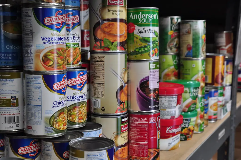
Canned soups have long used wording like “homestyle” or “hearty” to evoke a sense of tradition and substance. Recently, many brands have slimmed down their cans or reduced the amount of solid ingredients. Instead of chunks of vegetables and meat, you may be getting more broth and fewer nutrients. Labeling tricks like “now with more flavor” disguise these changes.
Some cans are also narrower while maintaining the same height. This makes them appear the same size from a distance. These changes often occur without formal announcements. Consumers are left to notice only when they feel less full after a serving.
7. Pasta Boxes
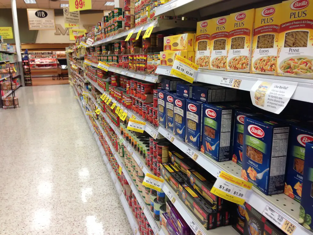
Pasta boxes are increasingly being sold with less product, though the packaging hasn’t changed much. Cardboard inserts or angled window cutouts create the illusion of fullness. What used to be a full pound of pasta might now be 14 or 12 ounces. These tweaks reduce costs without alerting most customers.
Because pasta is sold in bulk or as part of multi-buy deals, it’s harder to spot the changes. Shoppers assume they’re getting the same amount unless they check the label. Over time, this change adds up at the household level. Brands rely on familiarity to keep sales steady.
8. Bottled Salad Dressings

Many salad dressings are now thinner in consistency, despite the bottles appearing the same. Manufacturers use added water and thickeners to stretch ingredients. This creates a product that pours the same but has less flavor and richness. The packaging is also often reshaped to look taller while containing less volume.
These tricks make it seem like you’re getting a full bottle, but you’re not. The labels still boast the same calorie count per serving. However, you’re often using more to get the same taste. This leads to quicker use and repeat purchases.
9. Instant Coffee Containers
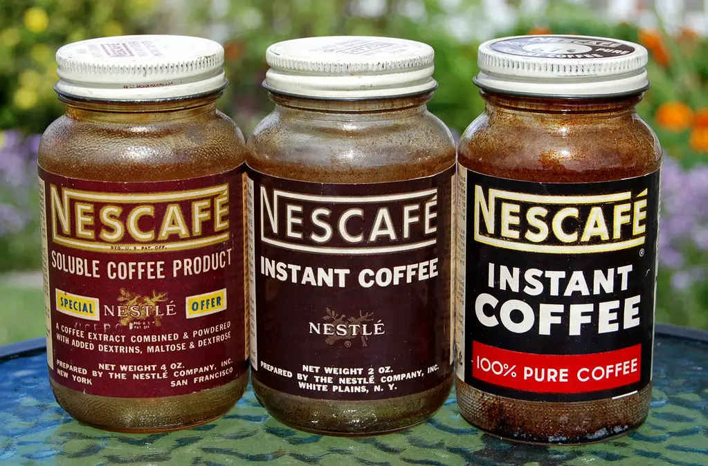
Instant coffee containers are shrinking while prices either stay the same or increase. Some brands have even redesigned lids and jars to create a perception of bulkiness. These updated packages may feature bold colors or “new look, same great taste” slogans to distract from smaller contents. This tactic works especially well with products not typically weighed at home.
Most buyers notice the taste, not the size. The change usually becomes clear only after refilling less often. Brands hope that convenience will outweigh consumer scrutiny. It’s a quiet shift in a daily routine.
10. Baking Mixes
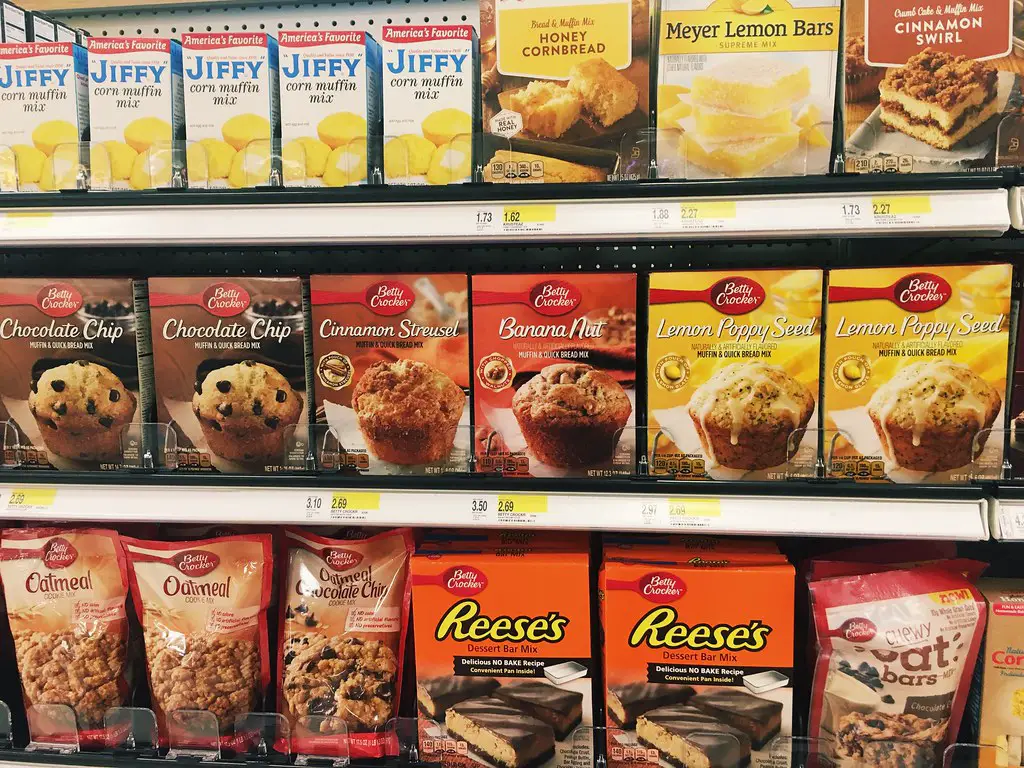
Baking mixes are another category seeing subtle size reductions. What used to make a full tray of brownies now may yield smaller portions. The box might highlight “improved recipe” or “more fudge flavor” instead of calling attention to the decrease. Many companies count on the fact that consumers don’t measure serving sizes before baking.
Visual cues like large fonts and colorful images guide attention away from the fine print. Boxes may also now include fewer mix-ins like chocolate chips or nuts. As a result, your final product might seem less rich or indulgent. This change impacts perceived quality even if customers don’t notice the weight reduction.
11. Crackers and Snack Packs
Cracker boxes and multi-pack snacks are being repackaged with fewer individual servings. While the exterior packaging remains cheerful and familiar, interior contents may have shrunk. Brands often use phrases like “on-the-go” or “snack-size” to justify the smaller portions. These repackaged products may cost more per ounce than their original versions.
Most shoppers buy based on habit and convenience. They’re unlikely to count out crackers or read the fine print on multi-packs. These small tweaks go largely unnoticed. The long-term cost adds up across repeat purchases.
12. Bottled Spices
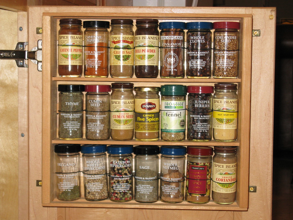
Spices are essential kitchen staples, but even they’ve fallen victim to repackaging tactics. Many brands now use smaller jars with larger caps to make them appear unchanged. The fill level is often reduced, with more air than product inside. Labels may also emphasize premium wording to distract from size differences.
Because spices are used sparingly, most consumers don’t notice right away. The gradual emptying of jars feels normal. However, you may find yourself replacing staples more frequently. The new packaging is designed to stretch margins without alerting you.
13. Canned Vegetables
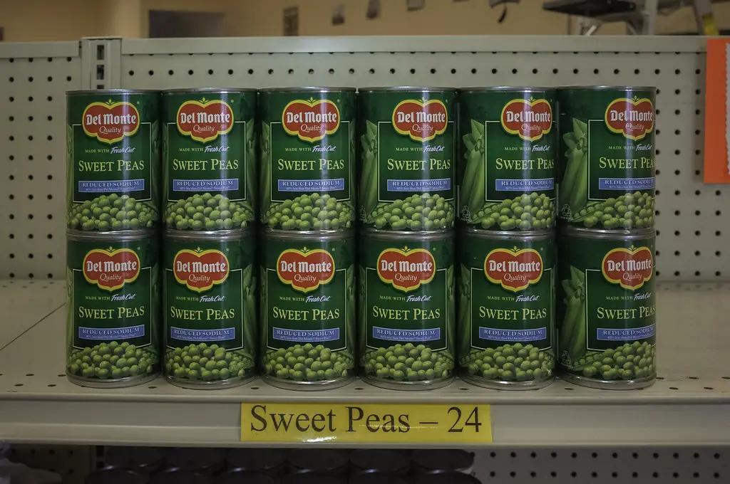
Canned vegetables are being sold with more liquid and fewer solids. Labels still list the same net weight, but drained weight has decreased. Companies may shift to “fresh pack” or “farm fresh” wording to create a sense of abundance. The cans themselves often look identical to previous versions.
This makes it difficult to detect any changes without close inspection. Many buyers assume the volume is consistent with past purchases. In reality, they may be getting 10–20% less vegetable content. Over time, this reduction can affect meal planning and grocery budgets.