
1. Bright Red
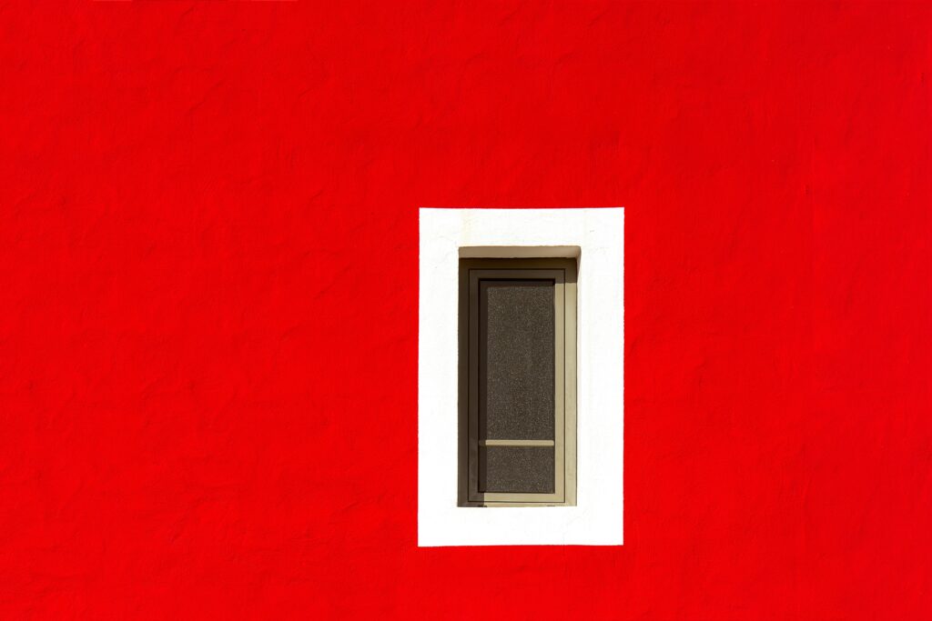
While it’s bold and eye-catching, bright red can overwhelm potential buyers. This intense color is often associated with energy and passion, which can be off-putting in spaces like bedrooms or kitchens where calm is preferred. For a higher resale value, consider softer tones like warm neutrals or muted reds instead.
2. Neon Green
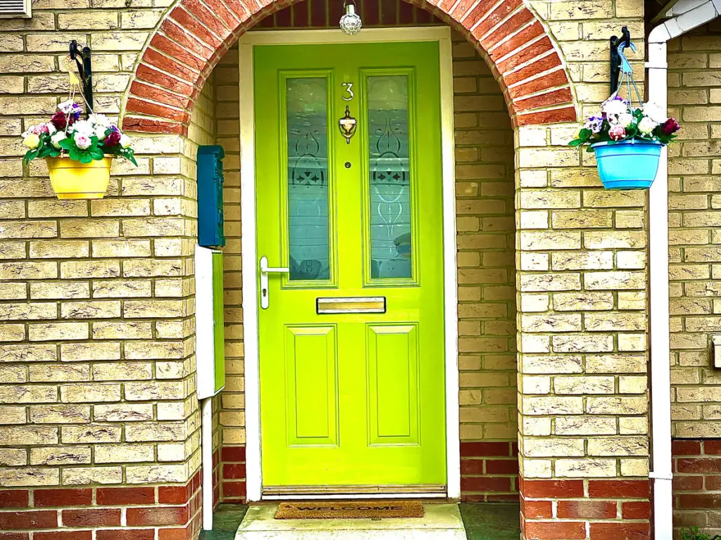
Neon green might be trendy in some circles, but it’s generally too harsh for most buyers. This color can feel jarring in bedrooms, living rooms, or even bathrooms, where people usually want a more relaxing atmosphere. To create a calm, inviting vibe, opt for subdued greens like sage or olive instead.
3. Eggplant

Eggplant walls can make a strong statement, but they often feel too dark and niche for broad appeal. This color doesn’t blend easily with other tones, which can limit a buyer’s decor options. Lighter, earth-toned purples bring similar richness without the commitment to such a deep hue.
4. Hot Pink
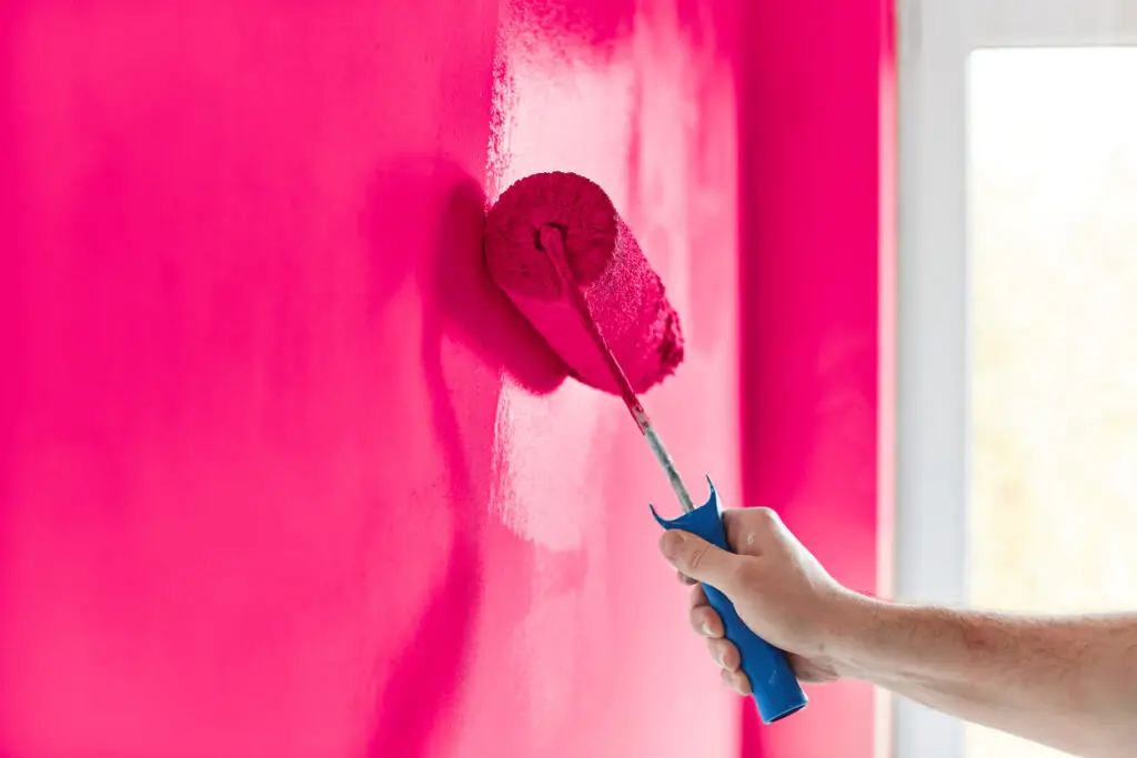
Hot pink is fun but generally too intense for most homes, especially in common areas or bedrooms. It can make a space feel juvenile, which isn’t ideal for buyers seeking a more timeless look. Softer pinks, like blush or dusty rose, offer a much more universally appealing alternative.
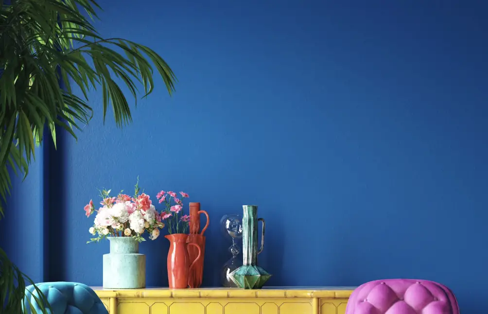
5. Navy Blue
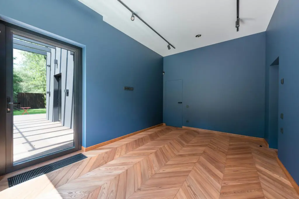
Navy blue can be striking in the right room but can make small spaces feel cramped and dim. While it can add drama to a large, well-lit area, using it in smaller rooms may be a mistake when trying to appeal to a broad audience. Light blues or greys give rooms a similar sense of coolness without closing in the space.
6. Deep Black
Black can add drama, but it’s tricky to pull off without making the room feel heavy or unwelcoming. Buyers may see it as a costly repaint job, especially if it’s used on entire walls. A softer charcoal or dark gray can provide the same sleek appeal without overpowering the room.
7. Orange
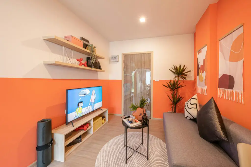
Orange walls can feel overwhelming and dated, as this color was popular in past decades but hasn’t aged well. It can be energizing but tends to limit design possibilities for new buyers. Earthier tones like burnt orange or terracotta offer a similar warmth in a more modern, subtle way.
8. Bright Yellow
Bright yellow can be cheerful, but too much of it can create a high-energy environment that’s not always desirable. Kitchens or bathrooms in particular might look garish with this color. Muted shades of yellow, like buttercream, deliver a sunny feel without overwhelming the space.
9. Dark Brown

Dark brown may feel cozy to some, but it’s often seen as outdated and overly dark, particularly in smaller spaces. It can make a room feel cramped, making it harder for buyers to picture a fresh start. Lighter taupes or beige tones provide warmth without the heaviness.
10. Pastel Peach
While it might seem sweet, pastel peach can come across as too specific and dated. This color may limit decor options, as it pairs awkwardly with many modern color schemes. To keep things neutral but warm, consider shades like sand or light taupe that appeal to a wider range of tastes.
11. Electric Blue
Electric blue is vibrant but can be overpowering and difficult to match with furnishings or other decor. Its intensity can make a space feel less adaptable, deterring potential buyers. Choosing a cool, calming blue like sky or slate can achieve a similar effect in a subtler way.
12. Mint Green
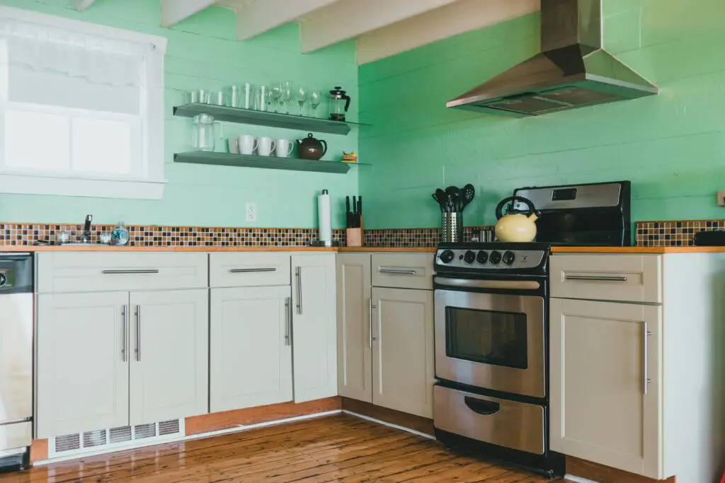
Mint green has a vintage charm, but it doesn’t always align with modern design preferences. It can appear outdated, especially in kitchens and bathrooms. Substituting it with more muted shades, like sage or soft olive, brings a sense of calm and sophistication.
13. Burgundy
While burgundy was once a popular choice, it now feels heavy and dated in modern homes. It can shrink the perceived space and create a dark atmosphere that’s hard to brighten with decor. For a refined look that still has depth, consider a warm terracotta or clay tone.
Sticking to more neutral, versatile paint colors can make a big difference in your home’s appeal to potential buyers, helping them envision themselves in the space and making it easier for you to maximize value.