
1. Clunky Coffee Tables
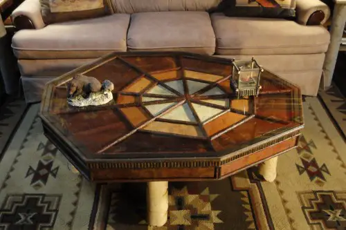
That giant, rustic coffee table you saw on Pinterest? Probably not meant for your 400-square-foot apartment. Bulky coffee tables take up serious floor space and restrict movement, especially in tight seating arrangements. They’re often too wide, too tall, or just too square for smaller layouts.
The room ends up feeling like it’s built around the table rather than the people in it. Go for something leggy, glass-topped, or multi-functional instead. Nesting tables or ottomans can work double duty and reduce crowding. When furniture blocks easy walking paths, it’s not helping your flow.
2. Tall Bookcases in Low-Ceiling Rooms
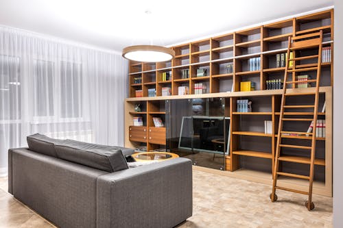
Tall bookcases can be elegant, but if your ceilings are under 8 feet, they’ll dwarf the entire space. That vertical push draws the eye up, but not in a flattering way—it emphasizes the low ceiling rather than making the room feel taller. The contrast between the height of the furniture and the wall height creates visual tension. It can almost feel like the room is being squashed from above.
Even worse, these bookcases often create a sense of visual clutter, especially when filled with mismatched books and objects. All those shelves pull focus away from the rest of the room. Floating shelves or a low credenza can give the same function with a more breathable aesthetic. Remember, in tight spaces, horizontal lines often feel more open than vertical ones.
3. Dramatic Light Fixtures
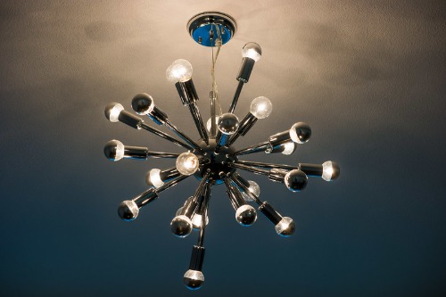
An oversized chandelier or a sprawling Sputnik fixture might feel luxurious, but it can be a style killer in a small room. Big lighting makes a ceiling feel lower and a room feel tighter, especially if it hangs below eye level. Instead of elevating the room, it can feel like it’s closing in on you. You want light to lift the space, not crush it.
When the fixture’s diameter is wider than your dining table or its drop invades your headspace, it becomes a liability. In compact areas, scale matters more than ever. Flush mounts or slim pendants offer just as much personality without the crowding effect. Think of lighting as atmosphere, not architecture.
4. Bulky Armoires
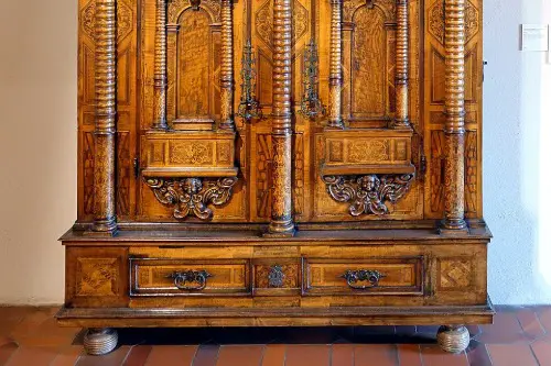
A big, antique armoire can look stunning in a showroom, but in a small bedroom or hallway, it’s like adding a closet-sized obstacle course. They’re often deep, tall, and commanding—which might sound good, until they block natural light or throw off balance in your layout. These pieces visually weigh down the space and reduce flow. What started as extra storage becomes a giant wall of wood.
They often prevent you from using the rest of the space efficiently, like placing a chair, bench, or mirror nearby. Sliding doors or built-ins offer the same utility without the visual bulk. Also, modern storage solutions are often more adaptable to small-space living. So unless you live in a Parisian apartment with 12-foot ceilings, maybe skip it.
5. Dark-Colored Accent Walls
A deep navy or charcoal wall can look moody and sophisticated, but in a small room, it often sucks up the light and closes in the space. It makes the walls feel like they’re pressing inward. This kind of color saturation may seem dramatic, but it easily tips into overwhelming when there’s not enough space to balance it. Even with bright furnishings, that darkness clings.
Accent walls work best when they contrast with open sightlines or generous lighting. Without that, they just make your room feel boxed in. Lighter tones can still feel stylish without cramping your vibe. If you really want a dark color, consider using it in textiles or art instead.
6. Heavy Drapery
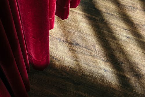
Thick velvet curtains or layered drapes look luxe—but they also close off a room, both literally and visually. They absorb light and hang heavily, especially if they’re dark or extend well beyond the window frame. In a small space, that weight can make the windows—and therefore the room—feel smaller. The drama they add comes at a steep cost.
Opting for sheer or linen curtains keeps things feeling airy. Or better yet, go for shades or blinds that stay tight to the window frame. Every inch counts when you’re trying to create the illusion of more space. When your curtains feel like stage props, it’s time to reconsider.
7. Overly Patterned Rugs
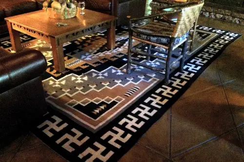
A loud, busy rug might catch your eye, but it can also make a small space feel chaotic and cluttered. Large-scale patterns or dark colors dominate the floor, which already takes up a lot of visual real estate. If the rug has contrasting borders or too many elements, it draws attention downward and narrows the room. Instead of grounding the space, it becomes a distraction.
This effect is especially strong if your furniture is also patterned or colorful. It turns the whole room into a competition for attention. A neutral or solid rug helps expand the room visually and lets other elements shine. Subtle textures go further than dizzying designs when space is limited.
8. Oversized Sectionals
Sure, they’re cozy, but those giant L-shaped or U-shaped sectionals can absolutely swallow a room whole. Even in open layouts, a chunky couch with massive arms and deep cushions eats up square footage fast. They often leave little room for side tables or walking space, making everything feel cramped. If your living room isn’t palatial, a more modest sofa will usually make the space breathe easier.
What’s worse, their visual weight can dominate a room and throw off the proportions. Instead of adding comfort, they become clutter. You might find yourself constantly adjusting the layout to make it work—and it still won’t. Sometimes, a simple loveseat and a pair of sleek chairs are a smarter style play.
9. Large Wall Art Without Breathing Room
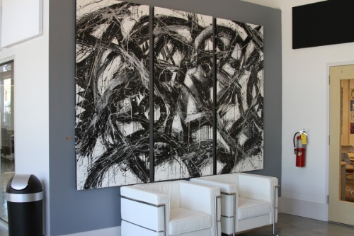
One giant piece of art can be a bold move, but in a small space, it often overwhelms the wall it’s on. Especially if it nearly touches the ceiling or edges of adjacent furniture, it can feel like it’s looming rather than enhancing. The room starts to feel like a gallery gone wrong. That scale mismatch is distracting, not impactful.
Smaller pieces grouped intentionally usually work better—they give your eyes a path to follow. You also get more flexibility in arranging your furniture without having to anchor everything to one massive focal point. Art should complement a space, not compete with it. Negative space on walls is just as important as what’s on them.
10. Mirrored Furniture
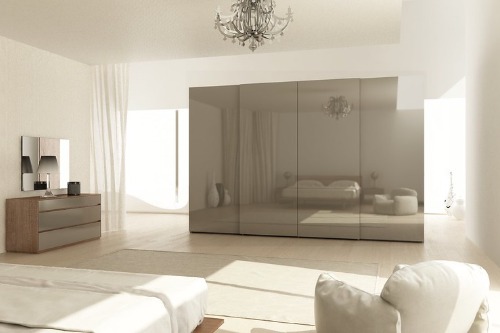
This might sound counterintuitive—aren’t mirrors supposed to make a room look bigger? Yes, when they’re on the wall. But mirrored dressers, nightstands, and consoles can actually add more visual clutter than clarity. Their reflective surfaces bounce around everything, multiplying the mess.
In bright or colorful rooms, mirrored furniture turns into a visual echo chamber. Instead of softening the space, it highlights every object in sight. You end up with more visual noise, not more room. Clear acrylic or glass furniture is usually better for lightening the look without the chaotic reflection.
11. Statement Dining Chairs
Those sculptural chairs with arms, angles, or bulky cushions may be stunning, but they’re often too large for small dining areas. Their unusual shapes take up more space than standard chairs, especially when multiplied around a table. Instead of a sleek dining zone, you end up with a jumbled mess of legs and upholstery. Your knees (and your guests’) will not thank you.
In smaller rooms, it’s smarter to choose dining chairs with slim profiles and open backs. They allow light and sightlines to move freely, which helps the room feel larger. That airy feel is lost when every seat looks like a throne. Style can come in smaller doses—and usually looks better that way.
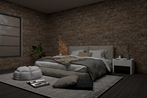
12. Platform Beds with Thick Frames
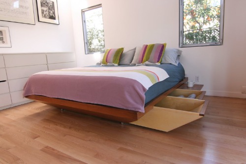
Low-profile beds seem minimal, but if they have thick sideboards or solid bases, they often take up more floor space than you think. Their frame extends beyond the mattress, eating up square footage without adding function. That visual bulk makes small bedrooms feel like there’s no room to breathe. Plus, they can throw off balance in rooms where wall space is already tight.
Look for beds with storage underneath or sleek, raised legs to help keep things open. Letting the floor peek through under the bed tricks the eye into seeing more space. You’ll get the same clean vibe without the cramped feeling. Don’t let your bed be the elephant in the room.
13. Room Dividers
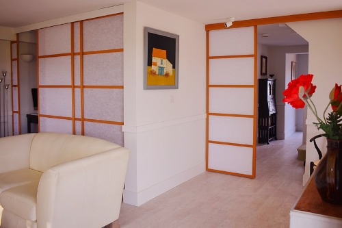
While they seem like a clever way to define space, most physical room dividers just make things feel smaller. Folding screens, shelving units, or curtains placed between zones break the flow and reduce open sightlines. What you’re gaining in separation, you’re losing in spaciousness. It’s like cutting your apartment in half for no real reason.
Instead, use rugs, lighting, or furniture placement to create subtle divisions. Visual boundaries are more forgiving than physical ones in tight spaces. Unless privacy is essential, dividers tend to do more harm than good. Think openness first, function second.
14. Over-the-Top Headboards
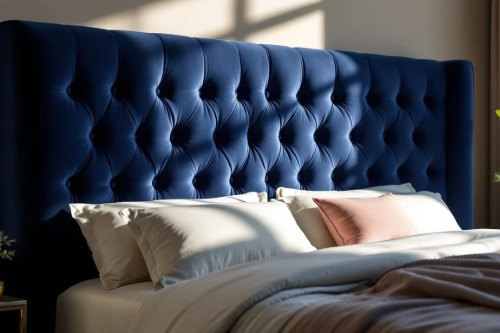
A tall tufted headboard or one with wings and elaborate detail might seem luxurious, but it can dominate a small bedroom. It pushes the bed visually forward and limits what you can do with the rest of the wall. Art, lighting, or even a small shelf all become harder to place. The room ends up feeling like it revolves around that one piece.
A simple upholstered or wooden headboard gives you more flexibility and openness. If you want drama, try it with pillows or bedding instead. You’ll get a similar effect without boxing in your sleep space. Big headboards belong in big rooms—no shame in scaling down.
This post 14 Statement Pieces That Make Your Space Feel Smaller (Not Stylish) was first published on Greenhouse Black.