
1. Bright Neon Colors
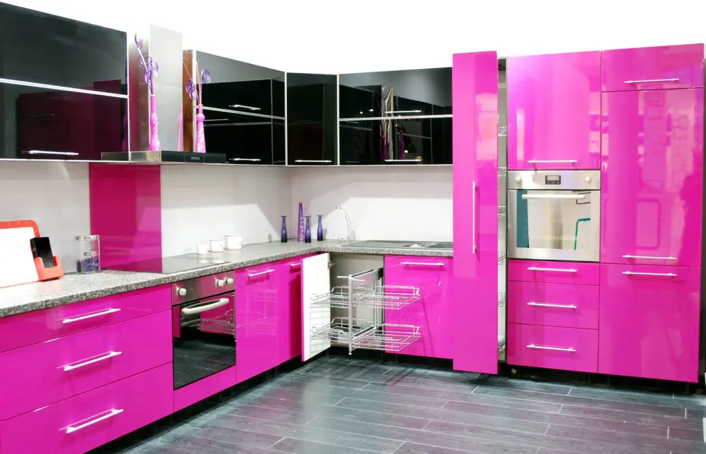
While bold colors can be fun, neon shades like electric blue or fluorescent green are overwhelming in a kitchen. These hues can quickly become an eyesore and make your space feel chaotic. Instead, opt for calming tones like sage green or navy for a more timeless look.
2. Jet Black
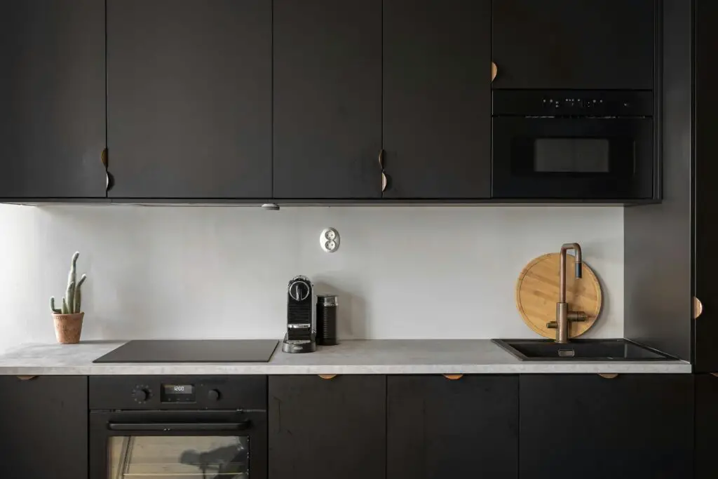
Black cabinets might seem sleek, but they can make a kitchen feel dark and cramped, especially in smaller spaces. They also show smudges and fingerprints more easily than other finishes. Consider a deep charcoal or rich navy as a softer, more elegant alternative.
3. Lemon Yellow
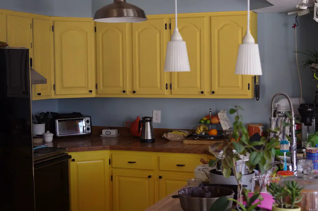
Yellow can bring cheer to a room, but a bright, lemony shade on cabinets can feel too intense. This color often clashes with other elements in the kitchen and quickly becomes dated. For a softer touch, try a warm buttery yellow or creamy beige instead.
4. Fire Engine Red
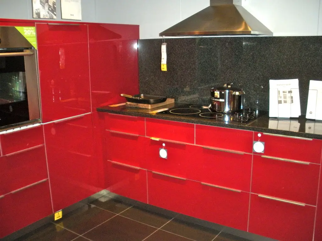
Bold reds can dominate a space, making it feel aggressive and overly stimulating. Kitchens should feel inviting, and this color often does the opposite. Opt for a subdued terracotta or muted coral for a warmer, more modern vibe.
5. Pure White
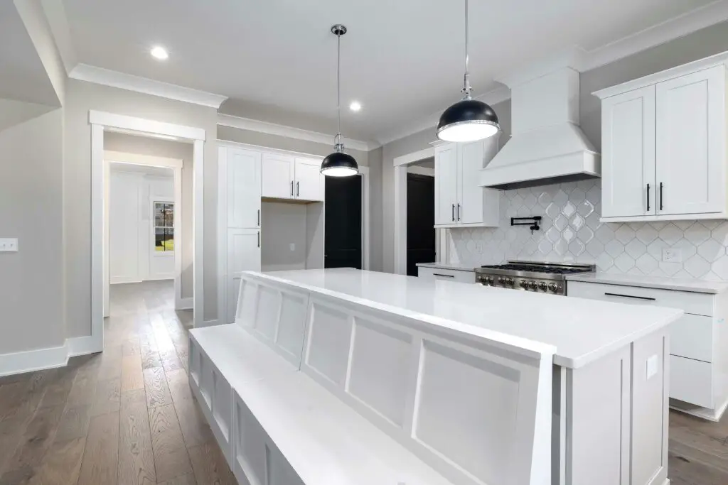
While white cabinets are classic, a pure, stark white can feel sterile and unwelcoming. They also show dirt and wear much faster than softer hues. Consider a creamy off-white or light gray to keep the space bright without feeling clinical.
6. Purple Shades
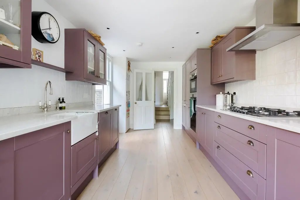
Purples, especially bright or royal tones, rarely work in kitchens and often feel mismatched with other design elements. This color can make cabinets look dated and overly trendy. Swap purple for a muted lavender or warm taupe for a more harmonious look.
7. High-Gloss Metallics
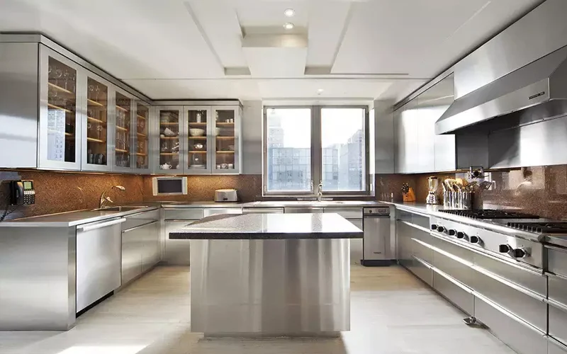
Metallic finishes like silver or gold might seem futuristic, but they can look tacky and cheap in a kitchen setting. They also tend to clash with appliances and other finishes. Opt for matte finishes in complementary tones like greige or navy for understated elegance.
1. Soft Sage Green
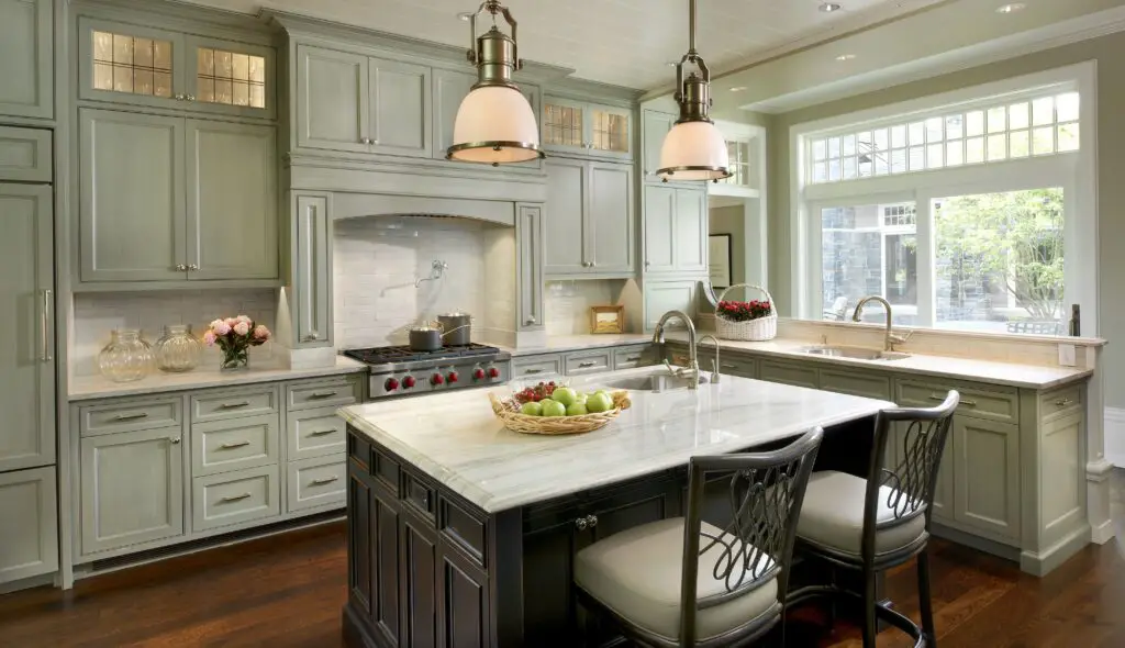
Sage green is a calming and versatile choice that pairs beautifully with natural wood and white countertops. It adds a touch of color while remaining timeless and sophisticated. Perfect for creating a fresh, earthy vibe in your kitchen.
2. Rich Navy Blue
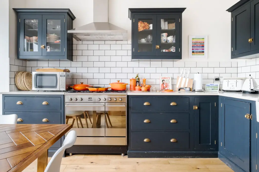
Navy is a bold yet classic option that works well in both traditional and modern kitchens. It pairs beautifully with brass or gold hardware for a high-end look. Use it for lower cabinets to ground the space while keeping upper cabinets lighter.
3. Warm Taupe
Taupe is a neutral shade with just enough warmth to feel cozy and inviting. It complements a variety of materials, including marble and wood. Ideal for kitchens aiming for a transitional or farmhouse aesthetic.
4. Buttery Cream
A soft cream tone creates a welcoming and bright atmosphere without feeling stark. It’s perfect for kitchens that want a cozy, classic look with a touch of elegance. Pair it with natural wood accents for a timeless appeal.
5. Matte Charcoal Gray
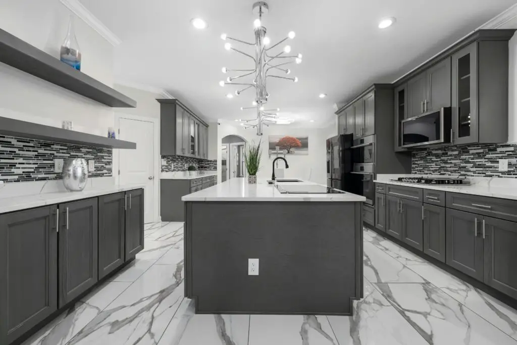
Charcoal gray is a sophisticated alternative to black, offering depth without overwhelming the space. It works particularly well in modern kitchens and pairs beautifully with lighter countertops and bold hardware.