
1. Overcrowded Multi-Function Rooms
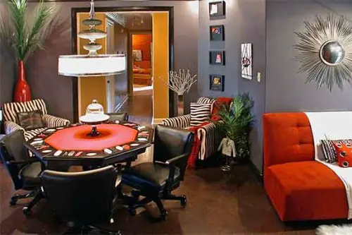
With the rise of open-concept living, clients often want one room to do it all: living, dining, working, and playing. But stuffing every function into a single space usually leads to chaos. Designers hate when there’s no clear zoning or hierarchy, and everything competes for attention. Instead of feeling multifunctional, the room just feels cluttered and unfocused.
Designers prefer to define “zones” using rugs, furniture groupings, and lighting to make each area feel intentional. Even in a small space, you can carve out mini-environments that support different uses without overwhelming the eye. When function trumps form, and there’s no flow, the room loses its soul. But clients often prioritize utility over cohesion, leaving designers to clean up the mess—literally and visually.
2. TVs Above the Fireplace
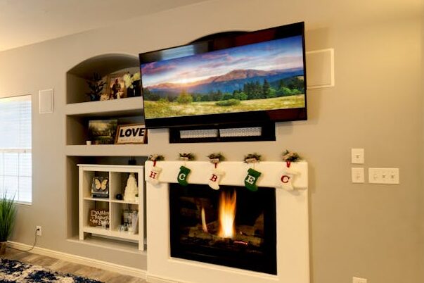
This one makes designers cringe, even if it’s one of the most common client requests. Mounting a television above a fireplace forces viewers to crane their necks upward, which is ergonomically uncomfortable over time. Plus, it compromises both the function of the fireplace and the viewing quality of the TV. And don’t forget the heat—prolonged exposure can actually damage electronics.
From a visual standpoint, this layout often results in poor proportions, especially when the mantle is high. It also creates a design dilemma: do you make the fireplace or the TV the focal point? Most designers would rather see the TV off to the side or integrated into built-ins. But since it “saves space,” clients often push for it anyway.
3. Centering Everything Around the TV
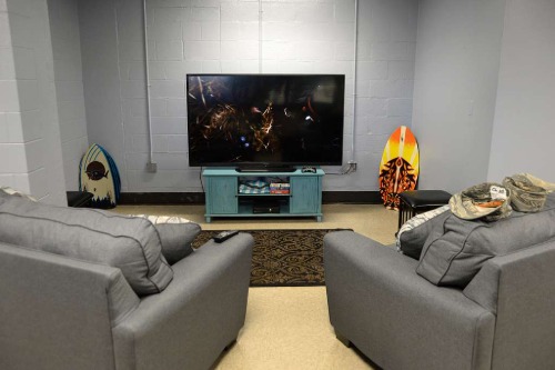
While it’s understandable that the TV gets a lot of attention, designing a room solely around it can make the space feel one-dimensional. Designers sigh when a client insists that every chair and sofa face the screen, creating what feels like a home theater rather than a living room. This layout often leaves no room for intimate conversation, reading, or other activities. The energy of the room becomes passive, not dynamic.
Designers often suggest multiple focal points or dual-purpose arrangements to make a room more livable. That might mean orienting seating toward both a fireplace and a TV, or creating a reading nook that doesn’t compete with screen time. By thinking beyond entertainment, a room becomes more versatile and inviting. But convincing clients to break up the shrine-to-Netflix setup isn’t always easy.
4. Giant Sectionals That Dominate the Room
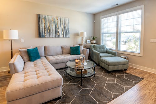
Clients love the idea of a cozy sectional where the whole family can pile on. But designers often dread working with those sprawling, L- or U-shaped behemoths that swallow up every square foot. These oversized pieces frequently limit flexibility and can make a room feel cramped, especially in smaller or oddly shaped spaces. They’re a commitment—both spatially and stylistically—that often outlasts their welcome.
Instead, designers typically recommend a more balanced setup with a sofa, chairs, and perhaps an ottoman. This allows for better flow, traffic patterns, and conversation. Sectionals can work beautifully, but only when they’re scaled properly to the room and layout. When they’re too large, they become a barricade rather than a gathering space.
5. Dining Tables That Are Way Too Big
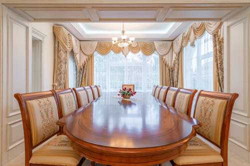
Big dining tables may feel like a luxury, especially for people who love to host, but they can be a real headache for designers. Oversized tables often overwhelm the room, leaving little space for chairs to be pulled out comfortably or for guests to circulate. Worse, they can throw off the visual balance if the lighting or rug isn’t scaled appropriately. Functionally, they’re often underused—most families don’t need seating for twelve every night.
Designers prefer tables that allow for flexible seating and movement, leaving enough breathing room for sideboards or other furnishings. An expandable table is usually a smarter option, offering the ability to scale up when needed. When a table dominates the room 24/7, it sacrifices style and practicality for a “just in case” scenario. That trade-off usually isn’t worth it.
6. Beds on Walls Without Windows
Clients sometimes request placing the bed on a wall without windows, assuming it will give a “clean” backdrop. But designers know that this often creates a lopsided room, especially if windows are only on one side. It disrupts symmetry, natural light flow, and sometimes even circulation patterns. Rooms can feel visually unbalanced and claustrophobic.
Ideally, a bed is centered between windows or has enough wall space on both sides for nightstands and lighting. If the bed must go on a blank wall, designers often add mirrors or faux windows to create balance. But when natural light is ignored for the sake of layout, the room usually pays the price in comfort and style. It’s one of those decisions that sounds logical until you actually live in the space.
7. Matching Furniture Sets
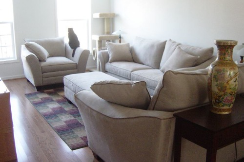
Many clients think buying a matching furniture set—say, a sofa, loveseat, and chair in the exact same fabric—is a shortcut to a “put-together” look. Designers, however, see it as the fastest way to make a room feel flat and uninspired. These sets lack contrast, personality, and often scale poorly in a real-world setting. Instead of feeling layered and thoughtful, everything just blends together.
Designers prefer to mix different silhouettes, fabrics, and textures to create visual interest. You can still achieve harmony by tying pieces together with color or style, without everything looking identical. A coordinated look doesn’t mean a copy-paste job from a catalog. But many clients still find comfort in that matchy-matchy vibe, much to their designer’s dismay.
8. Floating Furniture in Huge Open Spaces (With No Purpose)
Designers understand the appeal of floating a sofa or sectional away from the wall—it’s a great look when done right. But what they quietly groan about is when clients insist on pushing furniture into the middle of a cavernous room with no anchoring rug, no focal point, and no cohesive conversation zone. Instead of looking curated, the result often feels like an awkward showroom or lobby. The space lacks visual weight and can leave people unsure of where to sit or look.
The problem is that furniture without purpose or structure can make even a beautiful room feel cold and unfinished. Designers prefer to define areas with rugs, lighting, or architectural elements like built-ins. A floating layout can work in moderation, but only when there’s a clear sense of flow. Without these guidelines, the room just floats into chaos.
This post 8 Room Layout Choices Designers Secretly Hate (But Clients Keep Demanding) was first published on Greenhouse Black.