
1. Acrylic Coffee Tables
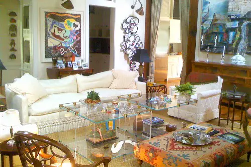
Acrylic coffee tables look stunning in editorial spreads—clean, sleek, and somehow invisible while still making a statement. But in real life, they’re fingerprint magnets and scuff up faster than a toddler on a sugar high. They also offer little visual weight, which can make a room feel oddly ungrounded, especially if your space already lacks strong architectural features. Plus, they often lack storage, which isn’t ideal unless you’re living in a minimalist fantasy.
Despite these flaws, we keep buying them because they photograph like a dream. They don’t visually clutter a room, which makes small spaces look bigger (even if they don’t function that way). And there’s no denying they add a modern, high-design touch—until your cat uses one as a runway. We convince ourselves it’s worth the upkeep because it’s all over Pinterest and still trending.
2. Open Kitchen Shelving
In magazines, open shelving makes a kitchen look airy, organized, and full of rustic charm. What you don’t see are the layers of grease, dust, and the daily struggle of keeping matching dinnerware perfectly aligned. Unless your kitchen is styled weekly and you don’t actually cook, open shelving is a maintenance nightmare. Plus, it often leads to wasted space since it holds less than closed cabinets.
Still, we keep installing it because it feels like a shortcut to a Pinterest-worthy kitchen. It gives the illusion of space and personality, showcasing pretty plates, cookbooks, and your one ceramic pitcher. But let’s be real—behind the camera, half those shelves would be stuffed with mismatched mugs and a bag of half-eaten chips. We just want our kitchen to feel curated, even if it’s chaos 90% of the time.
3. Giant Floor Mirrors
A giant leaning mirror looks dramatic and luxe, often propped against a wall with effortless elegance in design mags. But they’re heavy, often unsafe around pets or kids, and can warp your reflection if they’re not perfectly flat against the wall. They also take up a ton of floor space, which most of us can’t really spare. And let’s not forget: the angle often shows parts of the room we don’t necessarily want to spotlight.
That said, we keep buying them because they feel like an instant room upgrade. They bounce light, make a space feel larger, and let’s be honest—they’re great for outfit selfies. Brands like Anthropologie and Arhaus have made them aspirational with their signature gold frames. We want the vibe, even if we’re constantly tiptoeing around them with mild anxiety.
4. Ladder Shelves
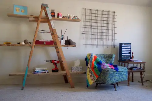
Ladder shelves are the ultimate “I’m a grown-up now” purchase—sleek, vertical, and just artsy enough to suggest taste. But they’re notoriously wobbly and usually can’t hold much weight, especially on the upper rungs. The spacing is awkward for most practical storage, and they collect dust faster than you’d think. They also look sparse unless styled obsessively, which is… not how real life works.
We still fall for them because they’re affordable, compact, and super photogenic. They look great with three books, a candle, and a plant—just don’t ask them to hold a printer or a basket of blankets. And because they’re often featured in small space design articles, we assume they’re functional. The reality? They’re decorative props we keep pretending are furniture.
5. Overly Abstract Wall Art

A massive canvas with chaotic brushstrokes or one lone squiggle? It’s everywhere in design mags and modern Airbnbs. But unless your space is perfectly curated or minimal, it often looks out of place—or worse, like you accidentally bought stock art. Abstract art can be beautiful, but it’s easy to get it wrong when there’s no context or balance in the rest of the room.
We still buy it because it feels “grown up” and artsy without being controversial. You don’t need to explain it like you would a Renaissance print, and it matches a lot of neutral decor. It fills wall space quickly, especially when you don’t know what else to hang. But without thoughtful design around it, it ends up feeling like decor filler instead of a statement.
6. Decorative Beads or Chains in Bowls
You know the look—a shallow ceramic bowl with a string of wooden or marble beads draped just-so. These are visual catnip for stylists but completely impractical for everyday homes. They don’t do anything, they gather dust, and they’re the first thing your pet will try to eat or swat off the table. They’re often meant to signal “boho-chic” or “elevated minimalism,” but read as clutter to most guests.
Still, we keep buying them because they’re an easy way to add texture and dimension without commitment. They’re cheap, photogenic, and seem like something a professional decorator would use. When styled with a candle and a book stack, it feels like a shortcut to sophistication. But let’s be honest: no one knows what they are, and we’re all too embarrassed to admit that.
7. Sculptural Chairs No One Sits In
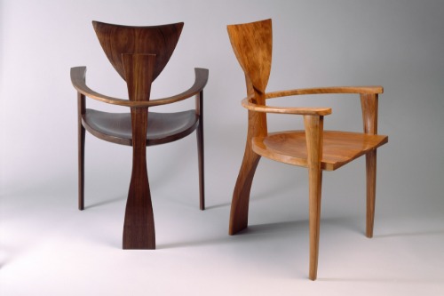
Think boucle chairs with no back support or chairs shaped like hands, lips, or clouds. They look like museum pieces and immediately elevate a corner in any photo shoot. But they’re uncomfortable, hard to clean, and usually cost a small fortune for something no one actually uses. Worse, they can dominate a room with their quirkiness, making everything else feel mismatched.
Yet we keep adding them to our carts because they scream “I have taste and disposable income.” They look amazing on Instagram, especially next to a funky mirror or an artful lamp. We think of them as “accent chairs” but rarely consider what they’re accenting—or who’s going to sit in them. Truth is, they’re conversation pieces that never really lead to comfort.
8. Tiny Rugs in Large Rooms

Small rugs under giant couches or dining tables look tidy in styled spreads—probably because the rest of the room has no real-life furniture. But they often make a room feel disconnected and disjointed, like furniture is floating on a too-small island. Designers agree rugs should be big enough that at least the front legs of furniture rest on them. Tiny rugs break that rule constantly, and it shows.
Still, we buy them because they’re cheaper and easier to clean, and they look “just fine” at first glance. You spot one at HomeGoods, it matches your curtains, and boom—decision made. It’s only later that the scale feels off, but by then the receipt’s long gone. The magazines make it look effortless, but in real homes, sizing matters more than style.
9. Indoor Trees in Comically Small Planters
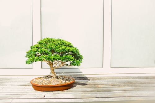
Fiddle leaf figs, olive trees, and rubber plants all get the spotlight in interior shoots, usually standing tall and proud in tiny, trendy baskets. But in reality, those plants need massive root systems and grow fast, outpacing their containers within months. Small planters restrict growth and can actually harm the plant, leading to root rot or stunted development. And if they’re fake? The illusion often shatters up close.
Despite all this, we keep buying them because they look perfect—just the right height and shape to fill an awkward corner. We forget that plants are living things, not styling props, and assume our real-life greenery will behave like the ones in catalogs. Plus, the tiny basket planters are easier to move and style for photos. It’s a case of aesthetics over biology, and we’re all guilty.
This post 9 Decor Pieces That Only Work in Magazines (But We All Keep Buying Anyway) was first published on Greenhouse Black.