
1. Dark Brown
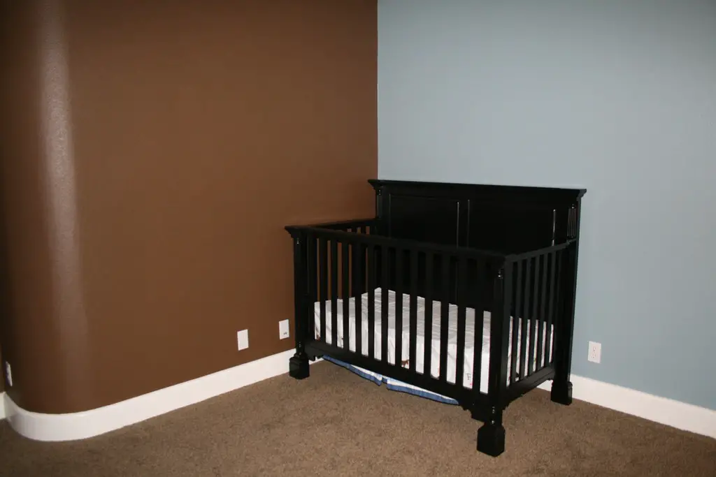
Dark brown walls were once popular for creating a warm, cozy aesthetic, but they’ve fallen out of favor with today’s buyers. These deep, earthy tones can make rooms feel smaller and darker, especially in spaces without ample natural light. While brown can work as an accent color, using it as the primary shade can make a home feel outdated and closed off.
According to Better Homes & Gardens, lighter, neutral tones like beige or taupe are much more appealing to modern buyers. These shades provide the same warmth as brown but create a more open and airy feel. If your home features dark brown walls, consider repainting with a lighter, more versatile color to brighten up the space and attract more potential buyers.
2. Bright Red
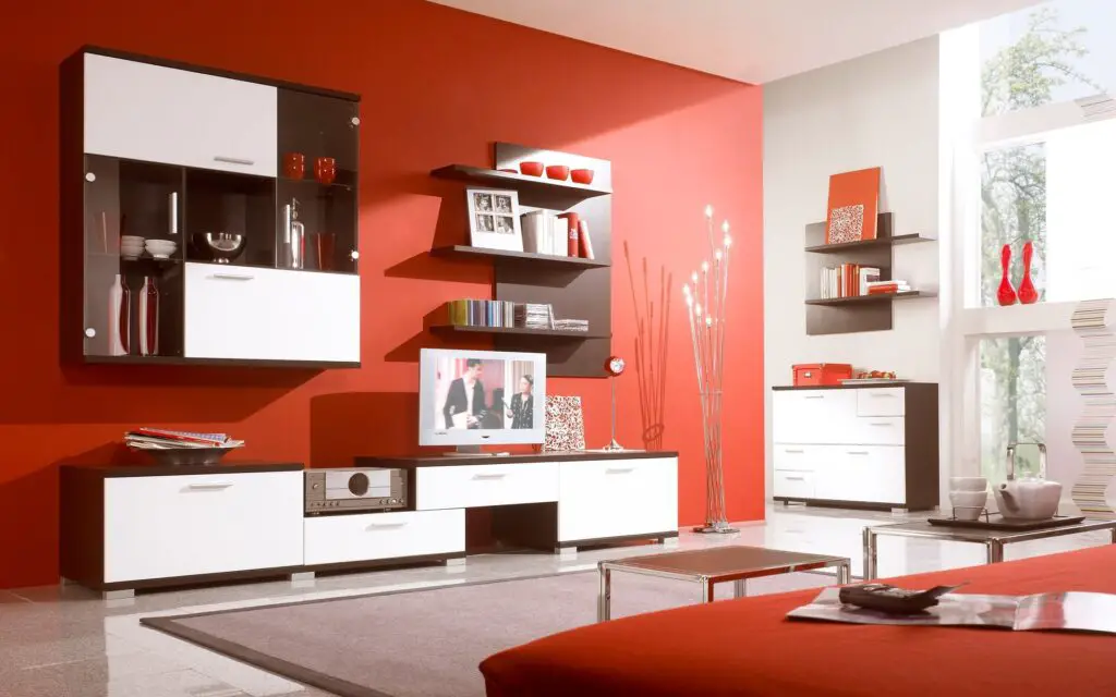
Bright red walls were once a popular choice for dining rooms and accent spaces, but they’ve become a major turnoff for buyers. While red is associated with energy and passion, it can also feel overwhelming and aggressive in large doses. In small spaces, red can make a room feel cramped and overstimulating, creating an uninviting atmosphere.
As noted by Realtor.com, modern buyers prefer soft, muted tones that evoke calm and relaxation. Neutral shades like warm whites, soft grays, or pale greens are better suited for creating a universally appealing space. If your home features bold red walls, repainting with a neutral color can help create a more welcoming environment and improve its marketability.
3. Peach or Apricot
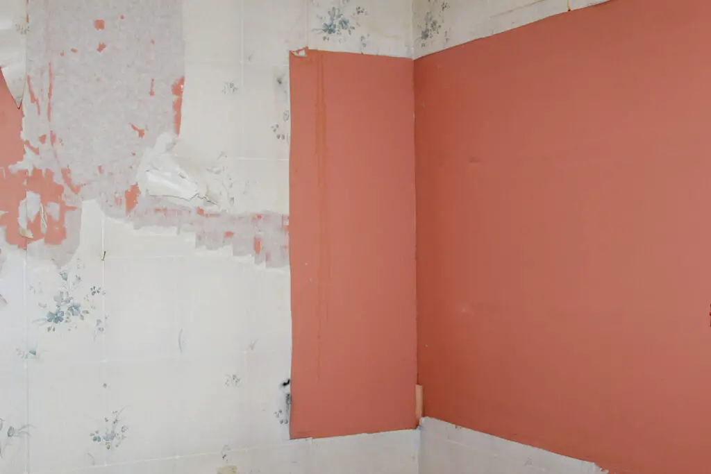
Peach and apricot shades were once trendy in bedrooms and bathrooms, but they’ve become outdated in recent years. These warm, orangey hues can make spaces feel overly dated, as they were widely used in the 1980s and 1990s. They can also clash with modern furniture and décor, making it harder for buyers to envision themselves in the space.
According to The Spruce, neutral tones like pale beige or blush pink are better alternatives for creating a fresh, contemporary look. These shades complement a wider range of styles and give rooms a timeless feel. If your walls are painted in peach or apricot, consider updating them with softer, more versatile colors to appeal to today’s buyers.
4. Eggplant Purple
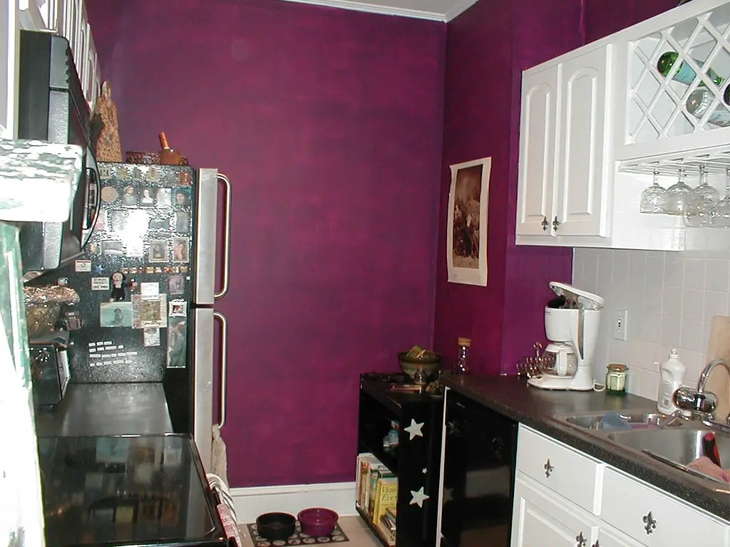
Eggplant purple gained popularity as a bold, dramatic choice for bedrooms and living rooms, but it’s now considered a risky color for resale. While it can create a sense of luxury and sophistication, it often feels too dark and polarizing for most buyers. Purple is also a divisive color, with strong opinions that can work against you in the selling process.
According to HGTV, lighter purple tones like lavender or lilac are more appealing for creating a subtle, serene atmosphere. Alternatively, opting for neutral shades like gray or greige can provide a more versatile backdrop that suits a variety of styles. If your home features eggplant walls, repainting with softer or more neutral tones can help widen its appeal.
5. Neon Yellow
Neon yellow may bring energy and brightness to a room, but it can also feel jarring and harsh to potential buyers. This high-intensity shade often overwhelms a space, making it difficult for buyers to imagine their furniture and décor fitting in. In addition, neon yellow can make a room feel overly informal, which may not align with the aesthetic preferences of most buyers.
As reported by House Beautiful, softer yellows or creamy off-whites are better alternatives for creating a warm, inviting space. These hues maintain a cheerful vibe without overpowering the room. If your home features neon yellow walls, repainting with more subdued tones can instantly make the space feel more sophisticated and buyer-friendly.
6. Olive Green
Olive green, once a trendy choice for kitchens and living rooms, has lost its appeal and is now seen as outdated by many buyers. This muted, earthy color can give rooms a heavy and dull feeling, particularly in spaces with limited natural light. Olive green also tends to clash with modern design trends, making it harder for buyers to envision the space in their own style.
As suggested by Apartment Therapy, soft greens or sage tones are more popular and modern alternatives. These shades bring a fresh, calming atmosphere to any room and pair well with both warm and cool décor. Repainting with a lighter, more neutral green can instantly transform the space into something more appealing to today’s buyers.
7. Black
While black can create a dramatic and chic look in certain contexts, using it excessively on walls or ceilings can make a space feel oppressive and unwelcoming. Rooms with black walls may appear smaller and darker, which can be off-putting to potential buyers. Overuse of black can also make it difficult for buyers to imagine their own furniture and personal style fitting into the space.
According to Elle Decor, instead of using black as the dominant wall color, consider incorporating it as an accent color through accessories like throw pillows, rugs, or artwork. Lighter shades like charcoal gray or deep navy provide the same sense of sophistication but feel more balanced and inviting. If your home features black walls, repainting with a lighter, more neutral color can open up the space and appeal to a broader audience.
8. Shocking Pink

Shocking pink may have been a popular choice for bedrooms and bathrooms in the past, but it’s now considered too bold and intense for most buyers. This vibrant, neon-inspired shade can make rooms feel overly playful or juvenile, which may not resonate with buyers seeking a more mature or neutral aesthetic. Pink is also a color that doesn’t appeal to everyone, limiting its potential for broad buyer interest.
As recommended by Houzz, opting for softer, muted pink tones like dusty rose or blush can offer a more sophisticated and universally appealing look. These colors still evoke warmth and comfort but with a more subtle, calming effect. If your walls are painted in shocking pink, consider repainting with one of these softer alternatives to create a more welcoming environment.
9. Turquoise or Teal
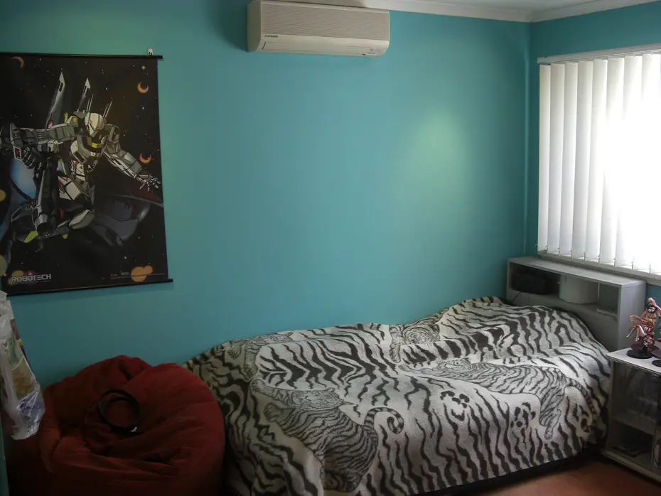
Turquoise and teal were once popular in coastal-themed homes, but their vibrant and bold hues have become less desirable in recent years. While these colors can evoke feelings of the beach and the ocean, they can also feel out of place in more traditional or contemporary settings. Turquoise and teal can clash with certain types of furniture and décor, making it harder for potential buyers to see how the space would work for their own needs.
According to Real Simple, light, neutral blues like soft sky blue or pale seafoam are more universally appealing alternatives that still evoke a sense of calm and serenity. These shades pair well with almost any style and make spaces feel airy and fresh. If your home features turquoise or teal walls, repainting with a gentler shade of blue can make the space more attractive to a wider audience.
10. High Gloss Finishes
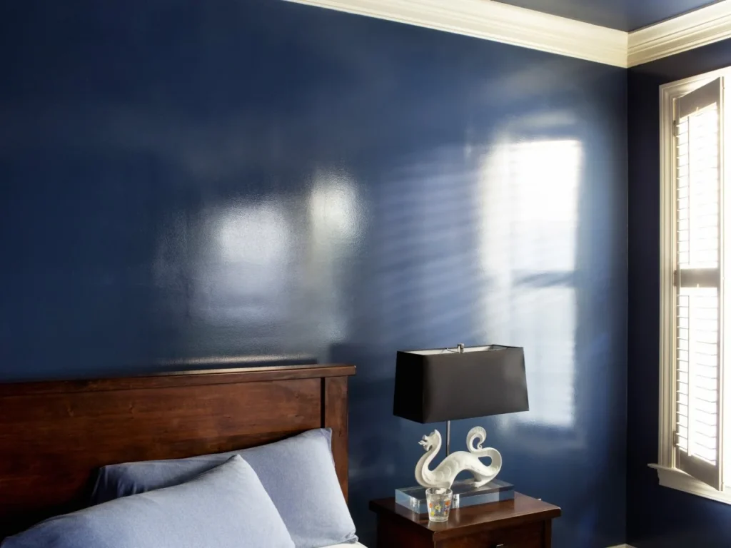
High gloss finishes on walls, especially in living areas or kitchens, can create an overly shiny, reflective surface that detracts from the warmth of a room. While high gloss paint may look polished in certain design settings, it often highlights imperfections in the wall surface, making a space look less refined. The reflective nature of high gloss also makes the room feel less intimate and more sterile, which isn’t ideal for spaces like living rooms or bedrooms.
As pointed out by Dwell, matte or eggshell finishes are more desirable for creating a soft, inviting atmosphere. These finishes help hide wall imperfections and offer a more subdued, elegant aesthetic. If your walls are painted in high gloss finishes, switching to a matte or satin finish can instantly improve the overall feel of the space and make it more appealing to potential buyers.
11. Lime Green

Lime green may have once been a popular choice for accent walls or children’s rooms, but its bright, intense hue now tends to feel overwhelming and unappealing to most buyers. While the color may appeal to some for its vibrancy and energy, it can make a room feel small and chaotic, which is not ideal when trying to sell a home. Lime green is also associated with a more niche style, making it harder for potential buyers to envision the space as their own.
According to BHG, opting for more neutral or pastel greens can create a similar fresh vibe without being overpowering. Lighter shades of green, such as mint or sage, are better suited for creating a soothing and welcoming environment. If your home features lime green walls, painting over them with a more neutral green can make the space feel much more universally appealing and market-ready.
12. Royal Blue
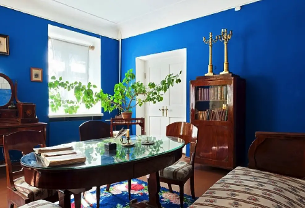
Royal blue was a favorite for creating a regal or dramatic effect in certain rooms, but it’s fallen out of favor in recent years due to its bold, overpowering nature. While the color can make a statement, it tends to dominate a room, making it feel unbalanced or too intense. Royal blue also doesn’t always work well with all types of furniture or décor, limiting its ability to appeal to a wide range of potential buyers.
As advised by Architectural Digest, a more subdued shade of blue, like navy or slate, can offer the same depth and elegance without overwhelming the space. These colors work well in various design settings and are much more versatile. If your walls are painted royal blue, switching to a darker, more neutral blue can help make the space feel more sophisticated and easier to sell.