
The color of your front door can significantly affect the overall appeal and value of your home. Some shades, while trendy or eye-catching, may not have the broad appeal needed to attract potential buyers, especially if they clash with the home’s architecture or neighborhood aesthetic. Here’s a guide to front door colors that could inadvertently detract from your home’s value and curb appeal.
1. Bright Pink
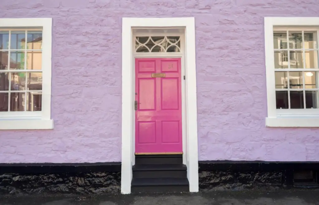
While bright pink can feel fun and bold, it’s often too unconventional for many buyers. This color can clash with various architectural styles, and its highly personalized nature makes it challenging for others to picture as part of their future home. Opting for a more neutral or subtle color can ensure broader appeal.
2. Neon Green
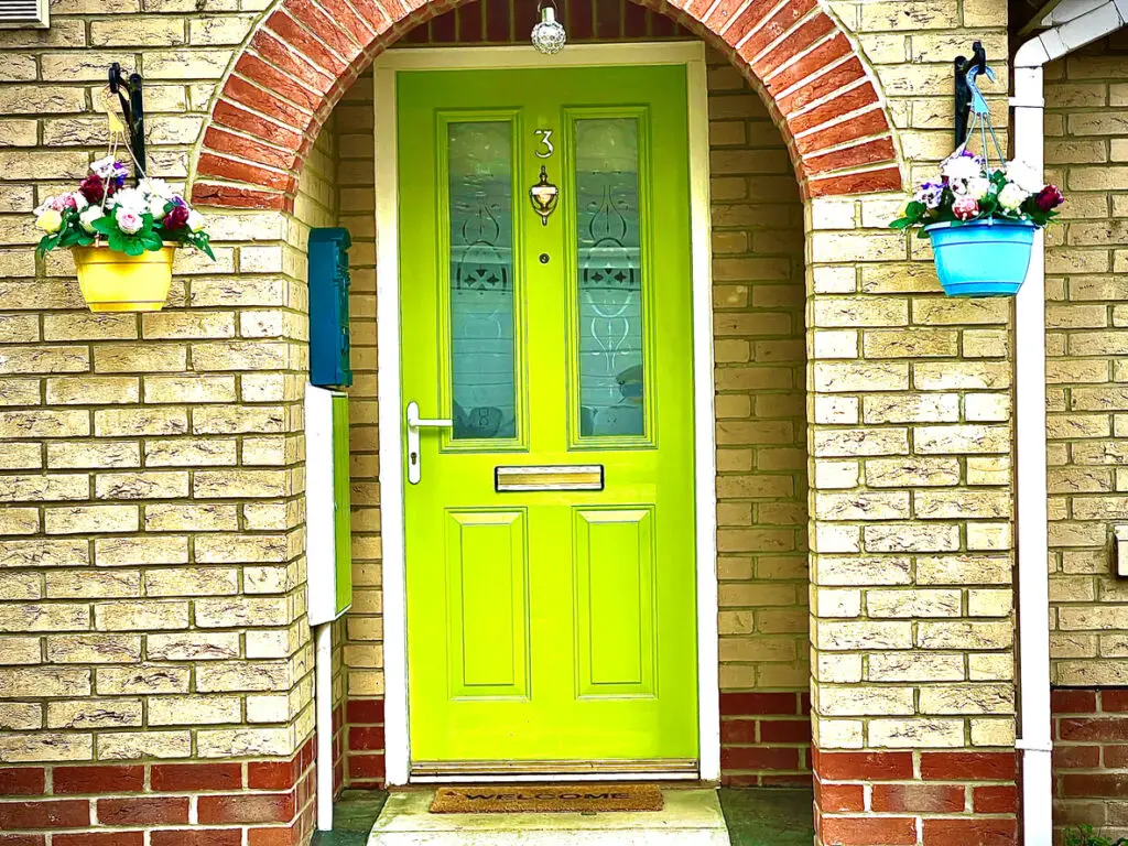
Neon green is energetic but can be jarring in a residential setting. It doesn’t naturally blend into most home exteriors and can detract from the architectural elements or landscaping. Instead, consider a more understated green shade like sage or forest green, which feels fresh but more harmonious with nature.
3. Deep Purple
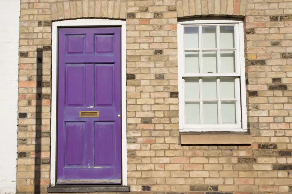
Dark purple is dramatic but can look out of place on many homes. While it might suit a historic or Victorian-style house, on other properties, it may feel too moody or eccentric. If you’re after a unique hue, consider softer shades of lavender or a deep navy blue for a similar impact without the risk.
4. High-Gloss Black
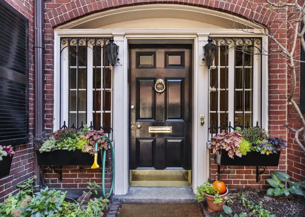
Black is a popular, sophisticated choice for front doors, but high-gloss black can appear too intense, reflecting too much light and drawing attention away from other features. Matte or satin black provides a more refined look that retains elegance without overpowering the façade.
5. Fire Engine Red
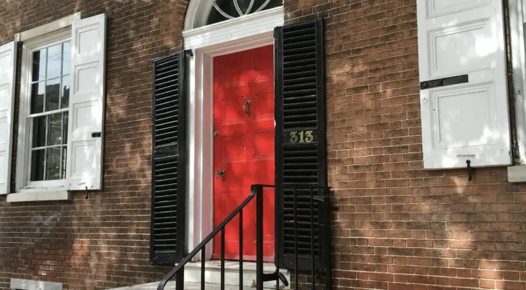
While red doors are classic, a bright, fire engine red can look harsh against certain exteriors. It may also fade faster under sun exposure, leading to frequent touch-ups. Choosing a softer shade of red, such as a muted brick or terracotta, can achieve a similar effect without overwhelming the space.
6. Bright Yellow

Yellow can add a cheerful touch, but when it’s too bright, it risks looking out of place, especially if it’s in a neighborhood where neutral tones prevail. A soft, buttery yellow might work better, balancing warmth and subtlety, particularly with traditional or cottage-style homes.
7. Orange
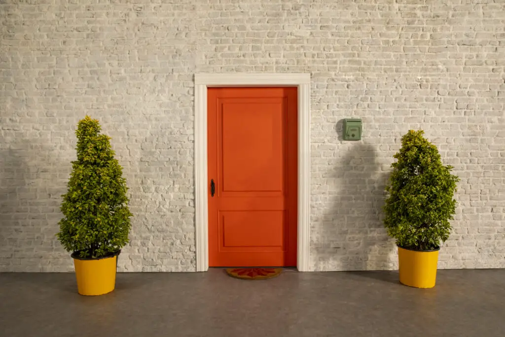
Orange is energetic, but it’s not a color associated with broad appeal in real estate. In many cases, it’s simply too unusual and doesn’t complement common home exterior colors. If you’re inclined toward an earthy palette, consider a rich rust color or a muted coral instead.
8. Aqua or Turquoise

Though aqua and turquoise can feel tropical and inviting, they may not suit many home styles or locations, particularly in regions without a coastal influence. These colors can feel too niche and may not resonate with potential buyers looking for a more classic or timeless look.
9. Peach
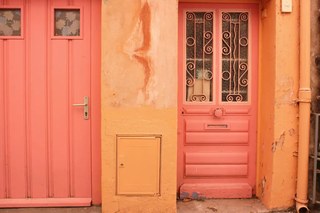
Peach can feel dated and doesn’t often complement the natural surroundings or exterior materials. Its softness lacks the contrast needed to make the front door pop without clashing. For a warmer tone, try a deep, earthy taupe or sandy beige that feels both subtle and sophisticated.
10. Metallic Silver
A metallic silver door can look overly industrial and may conflict with the home’s style or the surrounding area. It can also show fingerprints and smudges easily. If you want a contemporary look, consider charcoal gray or a rich, dark slate for a subtler modern feel.
11. Mint Green
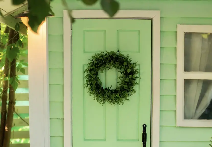
Mint green can be charming on a vintage or cottage-style home but can feel too pastel or kitschy for many potential buyers. This color doesn’t blend easily with most exterior styles, so if you’re looking for a green that’s soft yet classic, try a muted olive or sage.
12. Pastel Pink
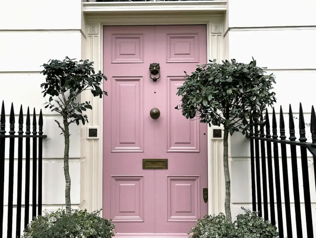
Pastel pink might seem whimsical, but it’s a divisive choice that can deter buyers who see it as too feminine or out of sync with the home’s character. A dusty rose or subtle blush can create a similar soft effect without overwhelming the exterior.
13. Lavender
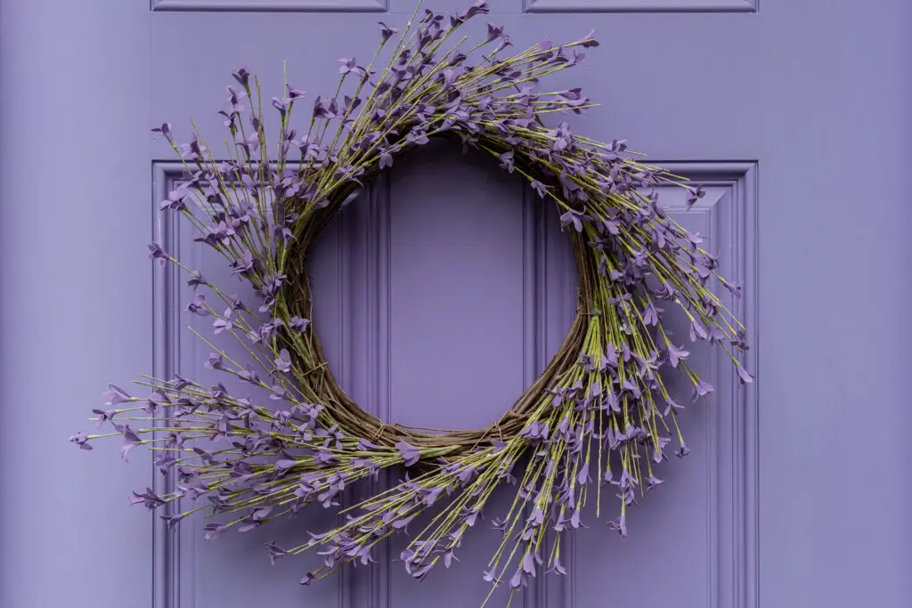
Lavender can come across as overly feminine or even out of place in many neighborhoods. It’s a delicate color that’s better suited to gardens than front doors, where it can appear washed out or mismatched. If you’re interested in a similar hue, a deep plum or soft gray with purple undertones offers a unique look with broader appeal.
Selecting the right front door color can be a subtle but powerful way to enhance your home’s exterior. Sticking with classic or neutral shades can make your home more attractive to a wide audience, preserving its value and curb appeal.