A home’s layout should support daily activities, but some designs look better on paper than they do in real life. Poorly planned spaces can create frustration, inefficiency, and even discomfort, forcing homeowners to adapt rather than enjoy their living areas. Whether it’s an awkward furniture arrangement, misplaced doorways, or impractical kitchen islands, these layouts don’t always match how people truly live. If you find yourself constantly maneuvering around obstacles or struggling to make a space functional, your home’s design may be working against you.
1. Open-Concept Living That Lacks Privacy
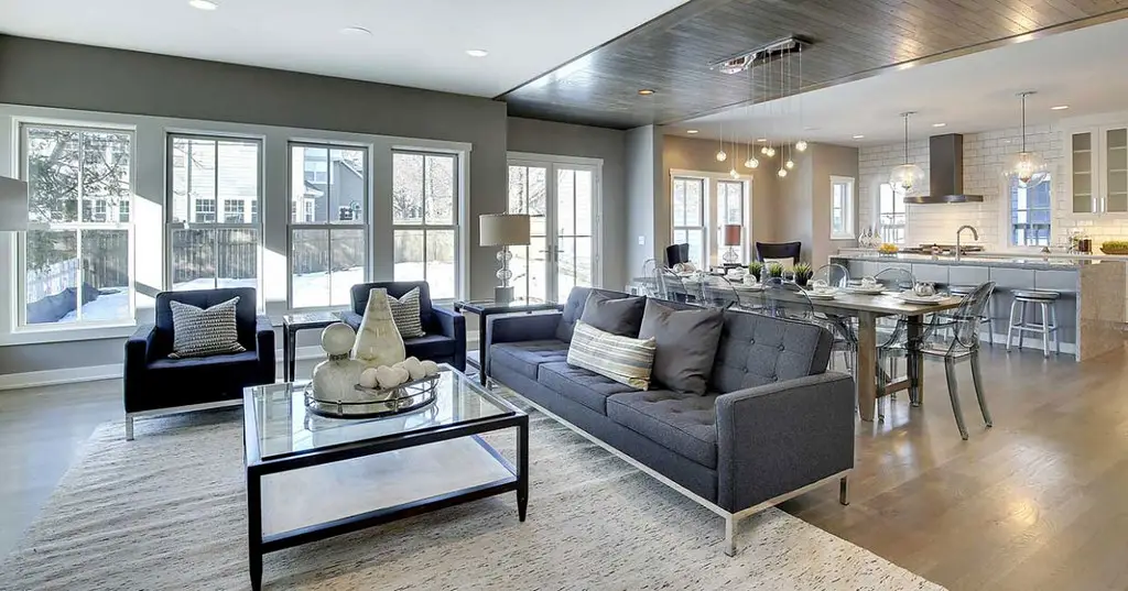
Open-concept living was once the gold standard for modern home design, but it’s losing favor due to its lack of privacy. More homeowners are now opting for defined spaces that allow for better noise control and separation of activities. While an open floor plan can make a home feel spacious, it often leads to sound traveling too easily, making it difficult to focus, work, or even have a private conversation. As families spend more time at home, the demand for distinct rooms has grown.
Additionally, open-concept layouts can be challenging to heat and cool efficiently. Without walls to contain temperature-controlled air, energy costs can skyrocket, making the home less sustainable. As Architectural Digest points out, designers are now integrating “broken-plan” layouts that maintain some openness while still providing designated areas for different functions. This shift reflects a growing preference for homes that balance connection and separation.
2. Oversized Kitchen Islands That Dominate the Space
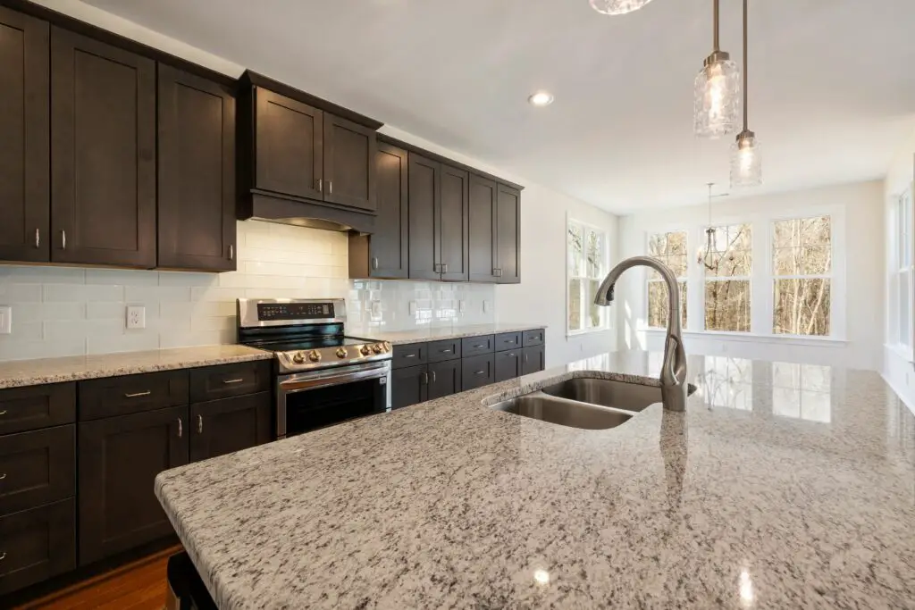
Kitchen islands are a popular feature, but oversized versions can become more of a hindrance than a help. Homeowners are realizing that massive islands can disrupt workflow, making it harder to move efficiently between cooking, prepping, and cleaning areas. A too-large island can also eat up valuable space, making a kitchen feel cramped rather than open and inviting. While islands offer extra seating and storage, their size should be proportional to the kitchen’s overall layout.
Another issue with oversized islands is that they can become clutter magnets. Instead of maintaining a sleek, stylish look, they often accumulate mail, appliances, and miscellaneous items. House Beautiful highlights that designers are now favoring more streamlined islands or even breaking them into two smaller stations for better functionality. The key is ensuring the island enhances the kitchen’s workflow rather than overwhelming it.
3. Sunken Living Rooms That Create a Tripping Hazard
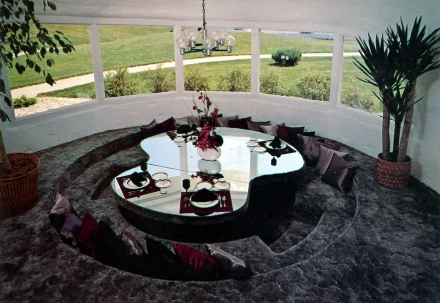
Sunken living rooms were a staple of mid-century design, but they come with practical downsides. These design elements are increasingly seen as safety risks, especially in homes with children, elderly residents, or guests unfamiliar with the layout. The step-down design can easily cause trips and falls, making the space less functional for everyday use. While they add architectural interest, their potential hazards outweigh the aesthetic appeal for many buyers.
Another drawback of sunken living rooms is their effect on furniture placement and overall flow. Traditional layouts work best when floors remain level, allowing for seamless transitions between spaces. As Living Bright Interiors notes, many homeowners are choosing to raise sunken floors to create a more modern and practical living area. This not only improves safety but also increases the home’s resale value by making it more accessible.
4. All-White Interiors That Are High-Maintenance
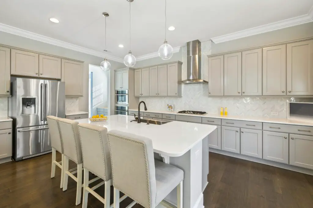
Crisp, white interiors have long been associated with luxury and minimalism, but they are notoriously difficult to maintain. All-white surfaces show dirt, scuffs, and stains far more easily than darker or patterned materials. This means homeowners must constantly clean walls, furniture, and floors to keep the space looking pristine. While white interiors can make a room feel bright and airy, the upkeep often isn’t worth the hassle.
Beyond maintenance, all-white designs can sometimes feel sterile rather than inviting. Real Simple notes that designers are now incorporating warmer tones and textured materials to create a more comfortable atmosphere. Soft neutrals, natural wood, and earth-toned accents provide the same airy effect while making a home feel more livable. As trends shift toward practicality, all-white interiors are becoming less desirable for everyday living.
5. Tiny Dining Areas in Open Floor Plans
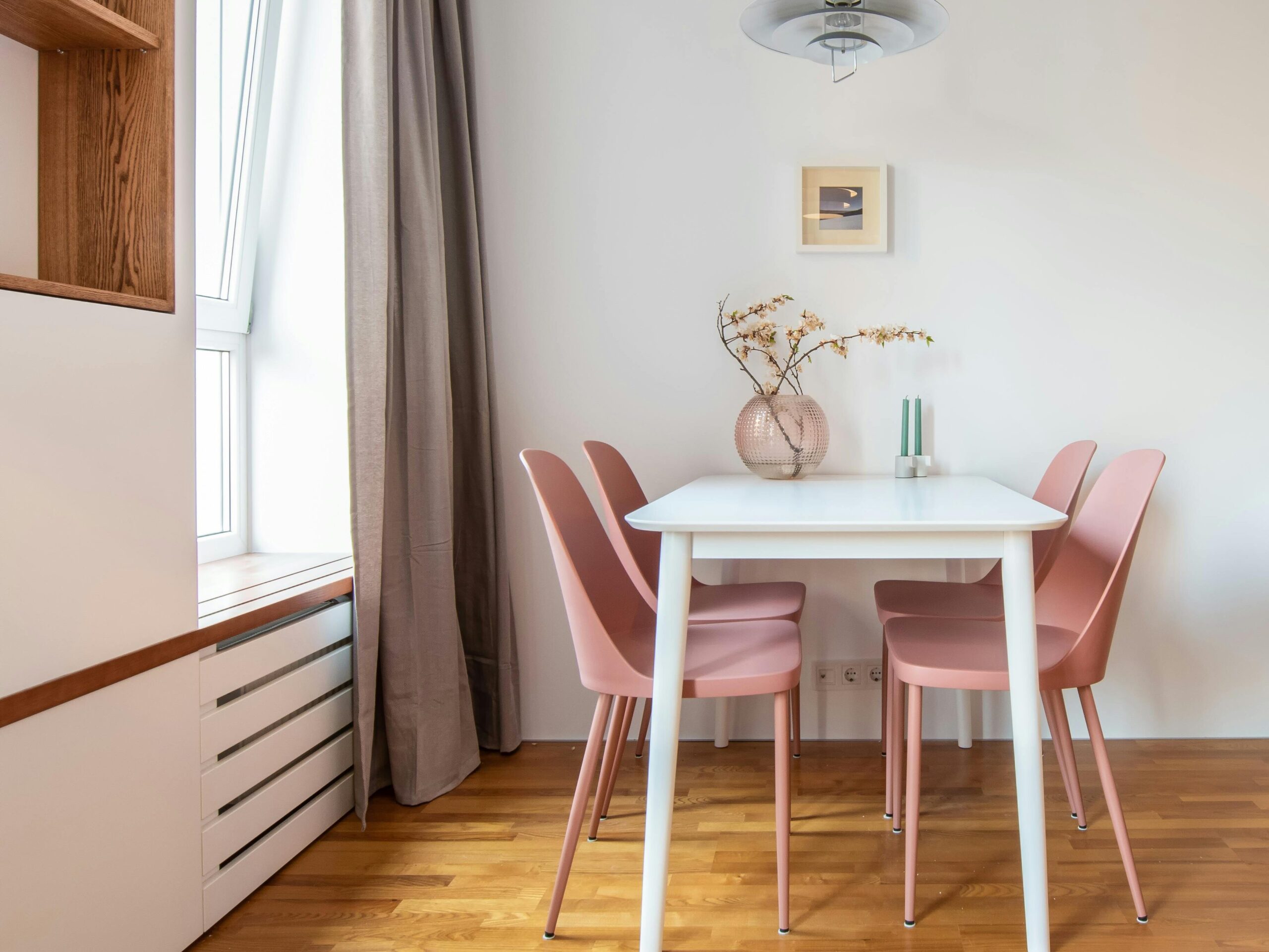
Open floor plans often squeeze dining areas into awkward spaces, making mealtimes less enjoyable. In many modern layouts, the dining area is little more than a narrow space between the kitchen and living room, leaving barely enough room for a table and chairs. This setup forces people to navigate tight walkways, making family dinners feel cramped rather than comfortable.
Additionally, these dining areas often lack definition, causing them to blend into surrounding spaces. Without proper lighting or visual separation, they can feel like an afterthought rather than a cozy gathering place. A well-designed dining area should provide both functionality and ambiance, rather than feeling like a leftover sliver of space.
6. The Bathroom Door That Opens Into the Kitchen
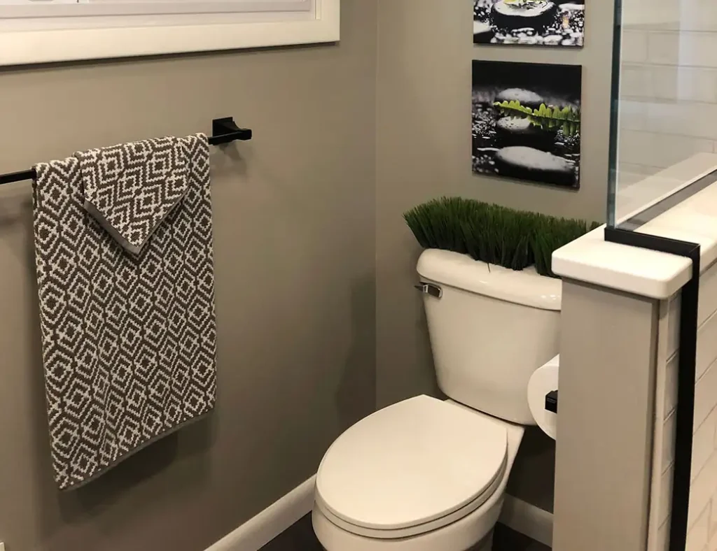
Few things are more awkward than a bathroom door that leads directly into the kitchen. This layout creates an uncomfortable lack of privacy, making mealtime conversations more awkward than they need to be. Whether it’s the sound, smell, or just the idea of a bathroom right next to where food is prepared, it’s a design flaw that most homeowners dislike.
This layout also disrupts the natural flow of both spaces. Kitchens are high-traffic areas, and having a bathroom in the middle of the action can create congestion. Ideally, bathrooms should be positioned near bedrooms or hallways, away from spaces where people gather to eat and socialize.
7. Awkwardly Placed Fireplaces

Fireplaces can be a beautiful focal point, but when placed incorrectly, they can throw off an entire room’s design. A fireplace that isn’t centered or is placed at an odd angle makes furniture placement difficult. Homeowners often struggle to arrange seating in a way that balances both function and aesthetics.
Another issue arises when fireplaces compete with TVs for attention. In many homes, the fireplace and TV are placed on separate walls, forcing an uncomfortable choice between focal points. When people have to crane their necks to watch TV or ignore the fireplace entirely, the layout isn’t working in their favor.
8. Long, Narrow Hallways That Waste Space
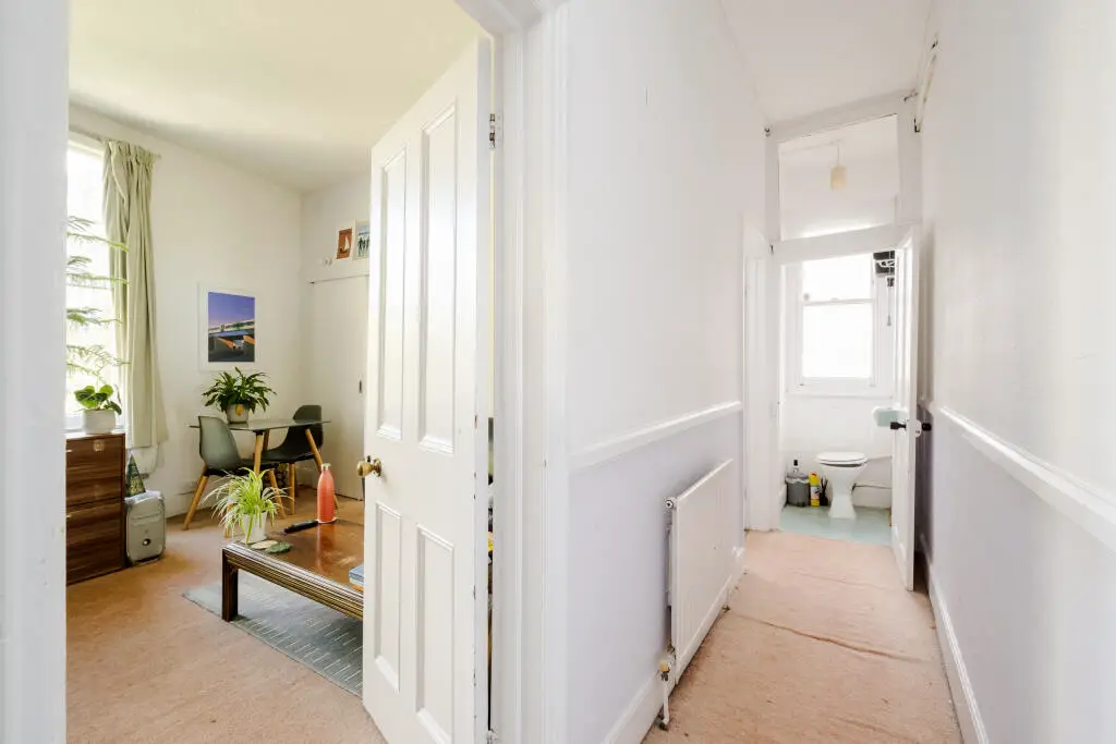
Long hallways may be a necessity in some homes, but they often waste valuable square footage. These spaces typically serve no real function beyond connecting rooms, leaving them feeling empty and underutilized. Instead of contributing to a home’s livability, they create a sense of disconnection between spaces.
Additionally, narrow hallways can feel claustrophobic, especially in smaller homes. Poor lighting and lack of windows only make the problem worse. A well-designed home should minimize wasted space and prioritize areas where people actually spend time.
9. A Laundry Room in the Basement
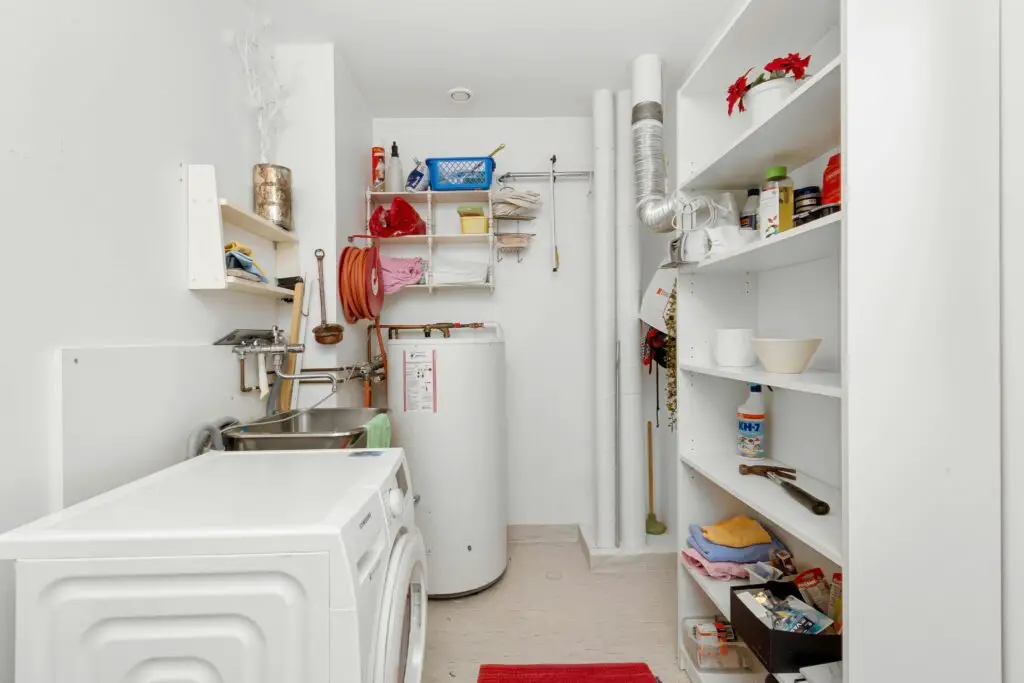
While a basement laundry room may have been standard in older homes, it’s far from convenient. Having to carry heavy laundry baskets up and down stairs can be exhausting, especially for those with mobility issues. In homes where laundry is a frequent chore, this layout adds unnecessary hassle.
Additionally, basement laundry rooms tend to be poorly lit and disconnected from the main living areas. A more functional layout places the washer and dryer near bedrooms or the kitchen, where laundry can be done with minimal effort. Modern homes prioritize convenience over tradition, making upstairs laundry rooms the preferred choice.
10. Kitchen Work Triangle Mistakes
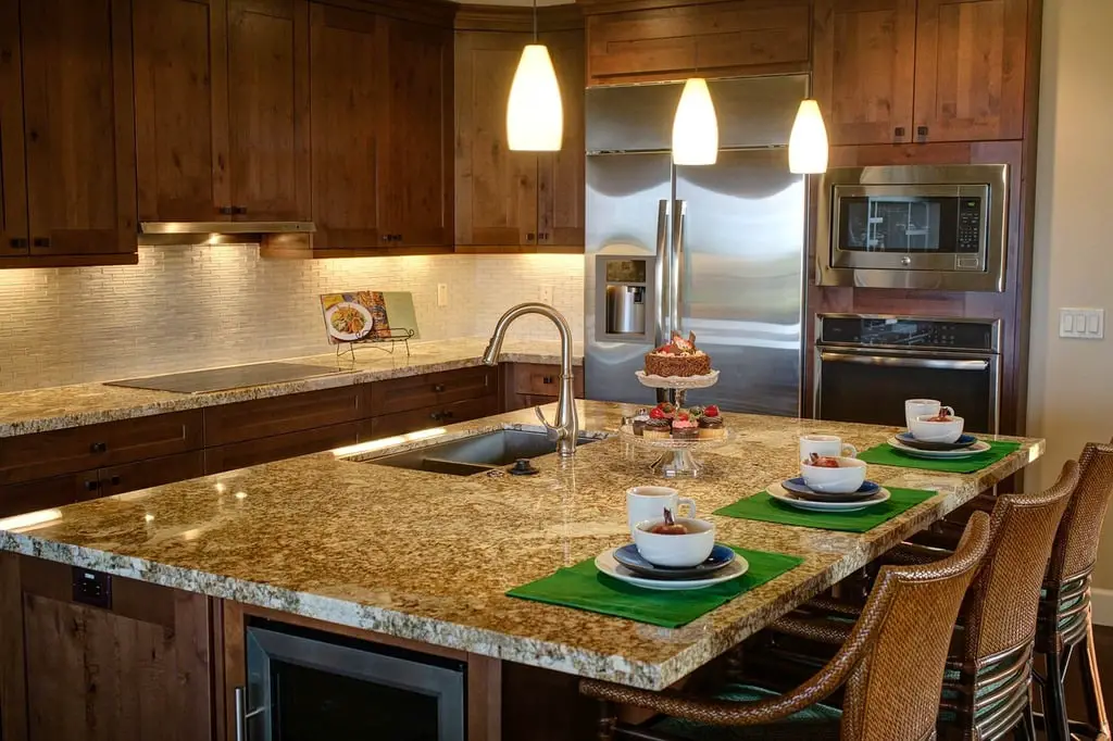
The kitchen work triangle—made up of the sink, stove, and refrigerator—is essential for efficiency. However, some layouts ignore this principle, placing these key elements too far apart or too close together. When the triangle is disrupted, meal prep becomes more difficult, forcing extra steps between tasks.
Additionally, poor kitchen layouts often result in bottlenecks, especially when multiple people are cooking at once. If the refrigerator is positioned in a high-traffic area, for example, it can create constant interruptions. A well-designed kitchen should allow for smooth, natural movement without obstacles.
11. Oversized Master Suites That Waste Space
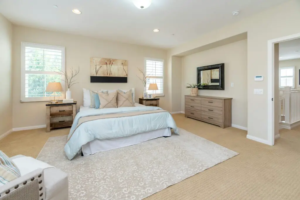
A spacious master suite may seem like a luxury, but when oversized, it can feel empty and underutilized. Some designs prioritize massive bedrooms over practical living spaces, leading to an imbalance in a home’s layout. If extra square footage isn’t being used efficiently, it becomes wasted space.
Large bedrooms also require more furniture to feel complete, which can drive up decorating costs. Instead of an oversized suite, many homeowners prefer to allocate space to functional areas like a home office, walk-in closet, or additional storage. A well-balanced home prioritizes both comfort and practicality.
12. Cramped Entryways That Feel Unwelcoming
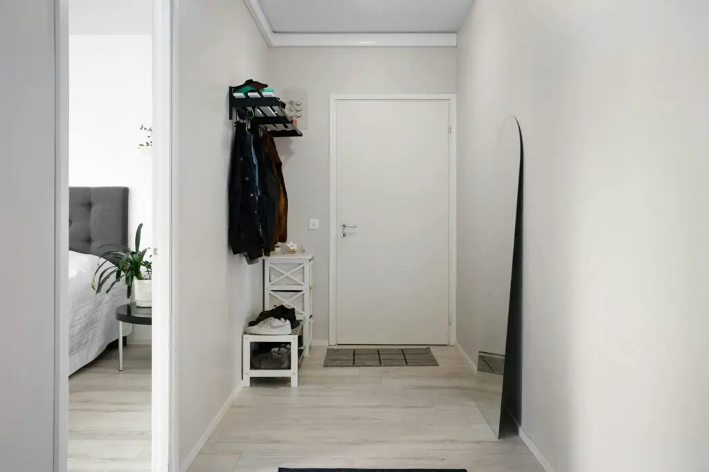
A home’s entryway sets the tone for the entire space, but many layouts fail to make a good first impression. Narrow, cluttered, or poorly designed entryways can feel cramped, making it difficult for guests to remove shoes, hang coats, or transition smoothly into the home. If the front door opens directly into a living area without any separation, it can create an awkward flow and lack of organization. An entryway should provide a welcoming and functional space rather than a bottleneck.
Additionally, cramped entryways often lack proper storage, leading to piles of shoes, bags, and jackets accumulating near the door. Without a designated place for everyday essentials, the space can quickly become cluttered. A well-designed entryway includes built-in storage, benches, or hooks to keep things organized. By prioritizing both aesthetics and functionality, homeowners can create a space that makes coming and going more seamless.
13. Homes Without a Dedicated Office or Flex Space
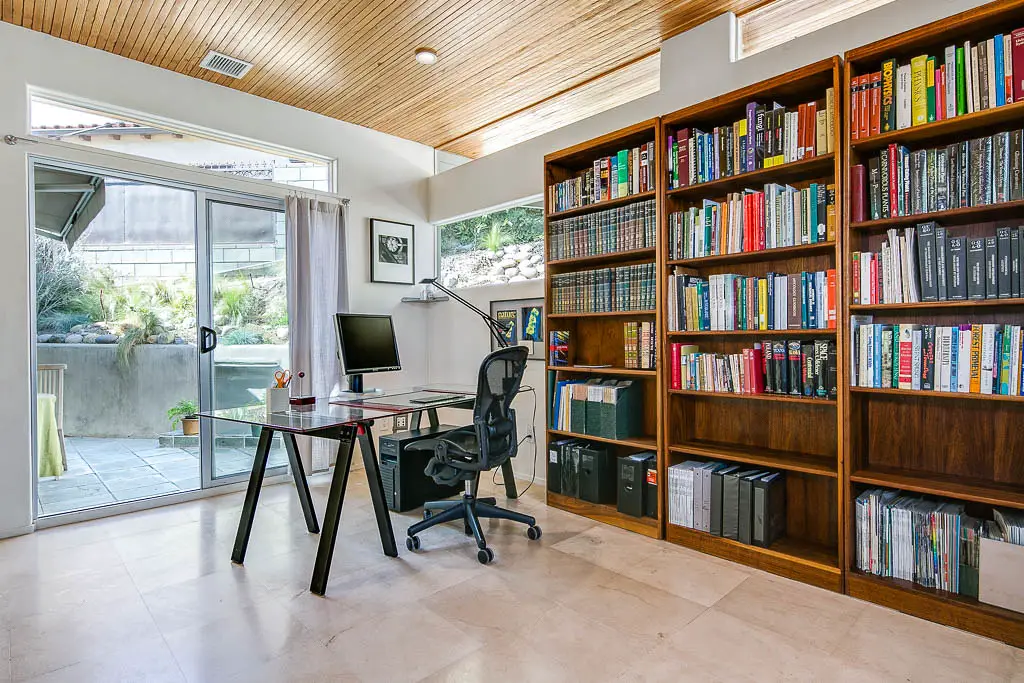
In an era where remote work is more common than ever, homes without a dedicated office or flex space feel outdated. Many layouts still prioritize formal dining rooms or oversized living areas instead of carving out space for a quiet, productive workspace. Without a designated office, remote workers are forced to use kitchen tables, couches, or bedrooms, which can blur the boundaries between work and home life. A lack of privacy and proper ergonomics makes working from home far less efficient.
Beyond remote work, flex spaces add much-needed versatility to a home. They can serve as a home gym, hobby room, or study area for kids, adapting to different needs over time. A rigid floor plan that lacks flexible spaces may struggle to meet the evolving demands of modern homeowners. As more people seek adaptable living environments, a home without a multifunctional space may feel limiting.
