
Supermarkets are expertly designed to guide your path, influence your senses, and convince you to spend more than you planned. The layout isn’t random—it’s the result of behavioral science, marketing strategies, and years of research into consumer habits. From the entrance to the checkout, every aisle and display is curated to increase your total bill. Understanding these layout tricks can help you shop smarter and stick to your budget.
1. Putting Produce at the Front
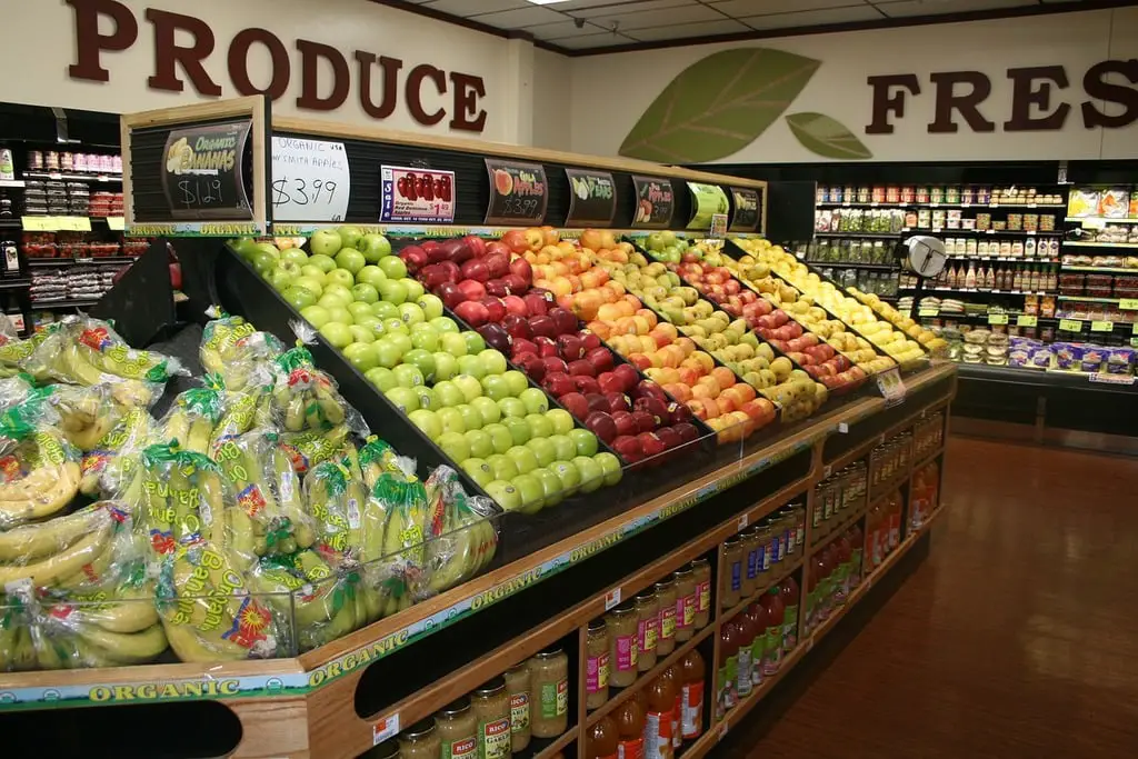
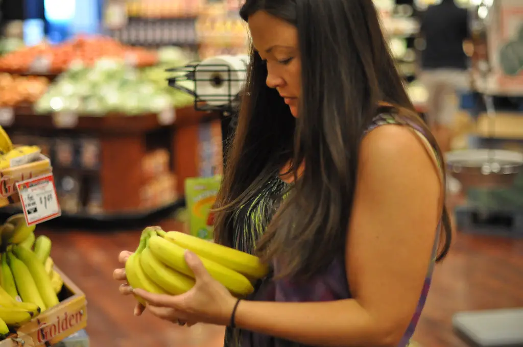
Fresh produce is often the first thing you see when entering a supermarket. This placement creates a positive impression, making shoppers feel they’re making healthy choices right away. According to The Daily Meal, this tactic is designed to put customers in a good mood, which increases the likelihood of them making impulse purchases later. The bright colors and freshness create a sense of abundance that sets the tone for the entire shopping trip.
Because produce is colorful and appealing, it draws the eye and helps set the emotional stage. This strategic mood-boosting can make shoppers more receptive to splurging on less healthy or pricier items later. Supermarkets bank on the idea that if you start by feeling virtuous, you’ll feel justified in indulging. The goal is to balance your cart between perceived “needs” and guilty pleasures.
2. Essential Items at the Back
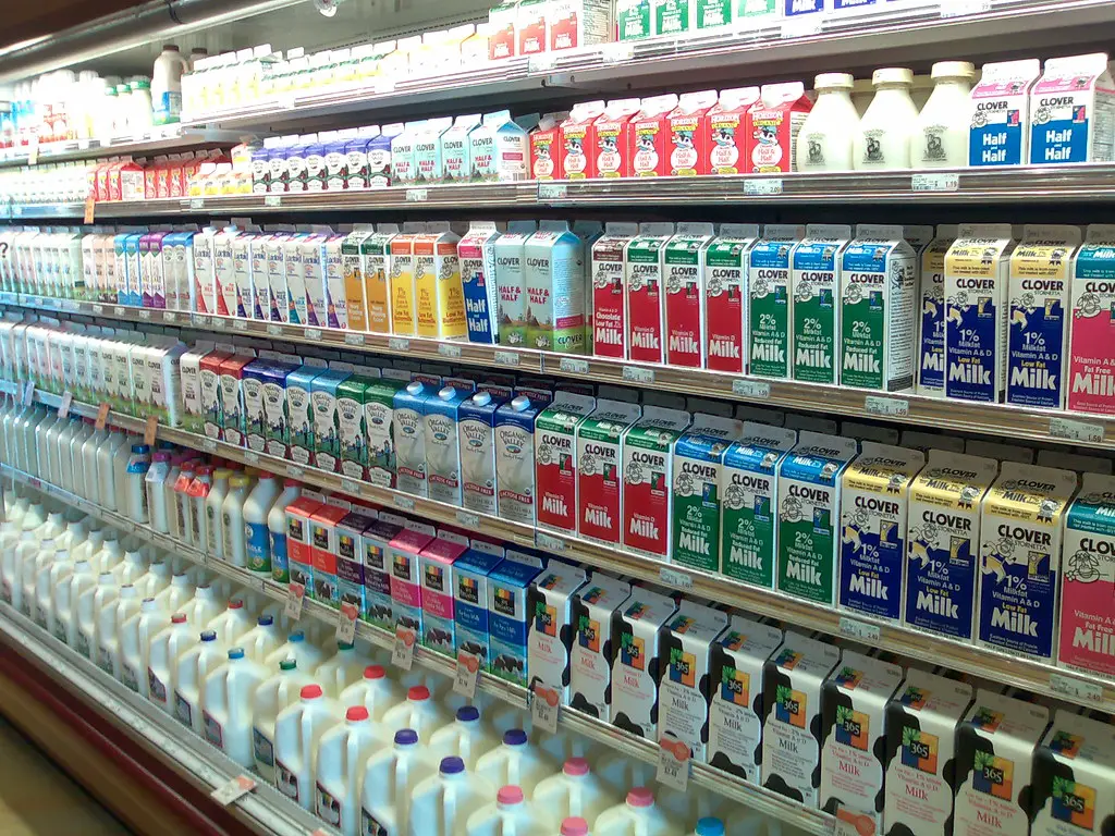
Milk, eggs, and bread are always in the farthest corner of the store. This placement forces shoppers to walk through multiple aisles to grab the basics, increasing the chances of adding more items along the way. As noted by Forbes, this long journey exposes customers to countless tempting products, strategically placed to maximize impulse purchases. It’s not about convenience—it’s about maximizing revenue.
Supermarkets know that foot traffic drives sales, so making shoppers cover more ground is part of the plan. This layout increases dwell time, which has been proven to correlate with higher spending. Even if you’re in for just a gallon of milk, you’re likely to pick up a snack or a sale item on your way. It’s a deliberate and effective detour.
3. Expensive Items at Eye Level
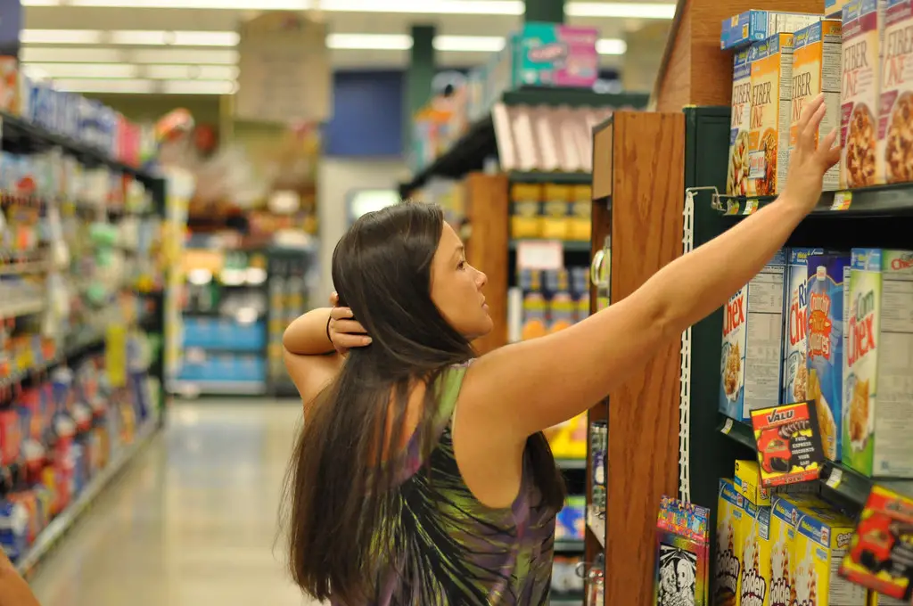
The most expensive or highest-margin products are almost always placed at eye level. Supermarkets know that this is where shoppers are most likely to look, and that most people rarely scan the top or bottom shelves. According to Chowhound, this tactic is known as “eye-level marketing” and is used to boost sales of targeted products. Lower-cost or generic options are often harder to spot, tucked away on less visible shelves.
This trick takes advantage of the average shopper’s limited attention span. Convenience often wins out over cost-saving, especially in a rush. By putting pricey items front and center, supermarkets can subtly increase your total bill. Next time, try glancing up or down before grabbing your usual brand.
4. Endcap Displays Suggest Urgency
Endcap displays—those product setups at the ends of aisles—are prime real estate in any grocery store. According to The Atlantic, brands often pay a premium to get their products on endcaps because shoppers see them as special deals or new items. But not every endcap item is actually on sale—many are just strategically placed to drive attention. This illusion of urgency leads shoppers to add them to their carts without much thought.
These displays are highly visible and designed to disrupt your usual route through the store. They often feature items you didn’t come in for but suddenly seem necessary. The convenience and perceived novelty make them hard to resist. Always double-check whether the price is actually a deal before you grab it.
5. Huge Carts Make Your Haul Look Small
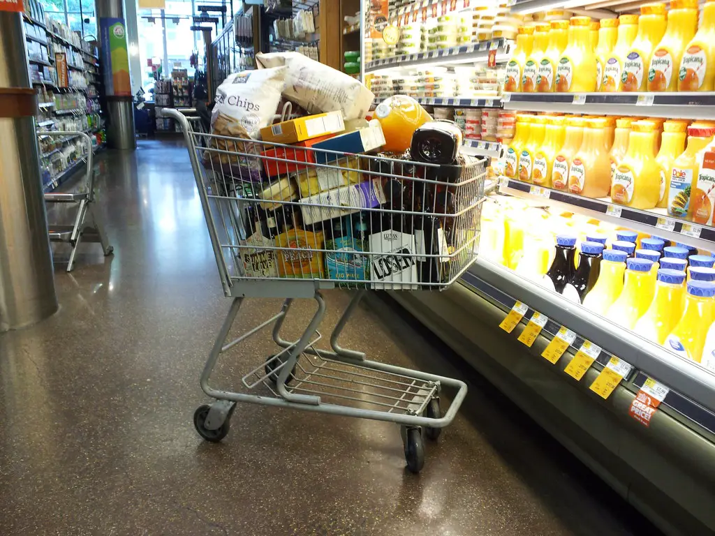
The bigger the cart, the more you’re likely to put in it. Supermarkets increased cart size over time because studies show shoppers spend more when they feel they haven’t filled their cart yet. A cart that’s only half full looks like you’re barely buying anything, even if you’re overspending. This creates a subtle pressure to keep adding more items.
Shopping baskets can have the opposite effect. They limit how much you carry and make you more selective. But with a cart, especially a deep or double-decker one, you’re more likely to add “just one more thing.” Over time, this small psychological trick has a big financial impact.
6. Confusing Aisle Layouts Slow You Down
Stores are often designed with twists, turns, and split sections that make navigating feel like a maze. This isn’t accidental—it forces you to spend more time in-store. The more time you spend browsing, the more you’re exposed to promotions, signage, and tempting items. It also breaks your focus from your shopping list.
Even frequent shoppers can be tripped up by a store layout that’s been slightly rearranged. Moving items around regularly ensures you don’t fall into a habitual route that bypasses profitable zones. This confusion leads you to see products you weren’t looking for. And those unexpected finds often end up in your cart.
7. Music and Scent Influence Your Mood
Many stores play slow, relaxing music to encourage you to linger. A calm atmosphere makes it easier to lose track of time and feel more comfortable browsing. At the same time, the bakery section might pump out the smell of fresh bread to make you hungry. Your senses are being played like an instrument—and it works.
These sensory tactics increase emotional engagement and lower your defenses. If you’re hungry, you’re more likely to grab snacks or pre-cooked meals. If you’re relaxed, you’re more likely to browse. It’s all engineered to get you to open your wallet.
8. Impulse Items at the Register
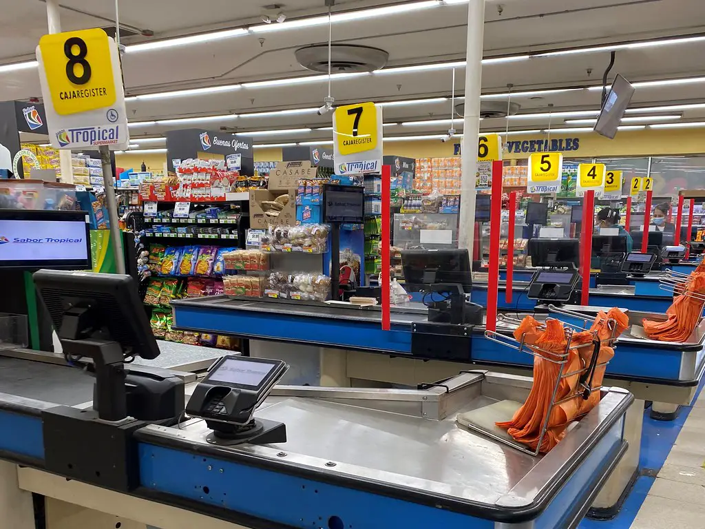
The checkout line is a danger zone for your wallet. While you’re waiting, you’re surrounded by snacks, gum, cheap gadgets, and magazines. These are classic impulse items—low-cost, high-margin, and strategically placed at the exact moment your willpower is lowest. You’re tired, possibly hungry, and just want to be done.
Even kids are targeted, with candies placed at a child’s eye level. It’s a last-chance cash grab for the store. Shoppers often justify these purchases by thinking, “It’s just a dollar or two.” But those dollars add up fast over time.
9. In-Store Samples Drive Purchases
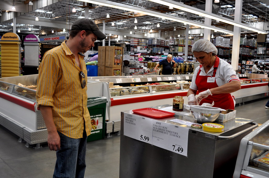
Free samples might seem like a nice treat, but they serve a deeper purpose. Once you taste something, you’re more likely to buy it—even if you didn’t plan to. This tactic plays on the principle of reciprocity: when someone gives you something, you feel compelled to return the favor. In this case, that favor is buying the product.
Samples also lower your resistance to unfamiliar items. Trying before you buy removes uncertainty and speeds up decision-making. Plus, if you’re already eating, you might get hungrier and grab even more. That tiny bite can lead to big spending.
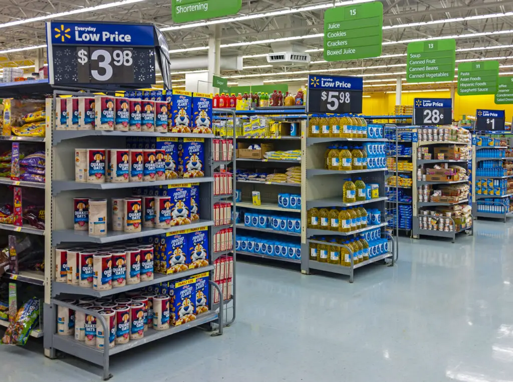
10. Cross-Merchandising Sells More
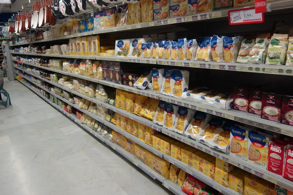
Ever see peanut butter next to jelly or spaghetti sauce near the noodles? That’s cross-merchandising, and it’s meant to nudge you into buying related items together. By putting complementary products side by side, stores trigger suggestions in your mind. “If I’m getting this, I might as well get that.”
This technique works especially well on busy shoppers who don’t want to make another trip. It saves time, but it also increases your total spend. You may have come in for one item, but now you’re leaving with three. It’s subtle, but incredibly effective.
11. Eye-Catching Signage Distracts You

Bold signs that say “Deal!” or “Special Offer” are designed to grab attention, even if the savings are minimal. These signs create a sense of urgency and value, even when the price hasn’t changed. They break your focus and get you to consider products you hadn’t planned to buy. The power of signage lies in the split-second reaction it provokes.
A sign doesn’t even have to say “sale” to work—it just needs to stand out. Bright colors, large fonts, and placement at key eye-level areas do the trick. These visual cues override logic and encourage emotional purchases. The more signs you see, the more likely you are to spend.
12. Loyalty Discounts Add Pressure
Loyalty programs are pitched as money-saving tools, but they also track your behavior. These programs create psychological incentives to shop more often and “unlock” better deals. You may find yourself spending extra just to qualify for points or discounts. And once you’re invested in the system, it’s harder to walk away.
While loyalty cards do offer savings, they also build brand commitment. You’re more likely to return to the same store to maximize benefits. This means you’re spending in one place more frequently, even when better deals might be found elsewhere. It’s less about loyalty and more about controlled habits.
13. Seasonal Zones Tap Into Emotion
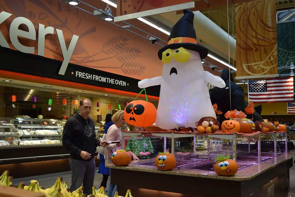
Stores often create themed sections around holidays, back-to-school, or barbecue season. These areas are heavily curated and meant to make you feel like you “need” items to participate in a cultural moment. The emotional pull can override logic, prompting unnecessary purchases. You might not need that novelty dish towel, but it feels festive.
These displays change often, keeping the shopping experience fresh. They rely on a fear of missing out (FOMO) and the appeal of fitting in. With the right lighting and decor, a seasonal aisle can feel irresistible. It’s another way to boost spending without you noticing.
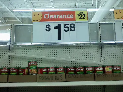
14. Limited-Time Offers Play on Scarcity
Shoppers are more likely to buy when they think a product might disappear soon. “Today only” or “while supplies last” signs trigger a sense of urgency. Scarcity makes a product feel more valuable, even if you didn’t originally want it. This tactic plays on fear and emotional decision-making.
Even if you weren’t planning to buy, the limited-time label creates pressure to act. These psychological tricks are designed to rush you into a decision. And the faster you decide, the less likely you are to evaluate the purchase logically. It’s a time-tested sales tactic used in every aisle.