
Choosing the wrong paint color can completely change the feel of a room—and not always for the better. Some shades have the power to visually shrink a space, making it feel darker, more cramped, and less inviting. Interior designers often warn homeowners to be cautious when selecting hues for small spaces, since color plays a major role in perception. From moody tones to outdated finishes, these interior colors are best used sparingly if you’re hoping to keep your rooms feeling light and airy.
1. Deep Charcoal Gray
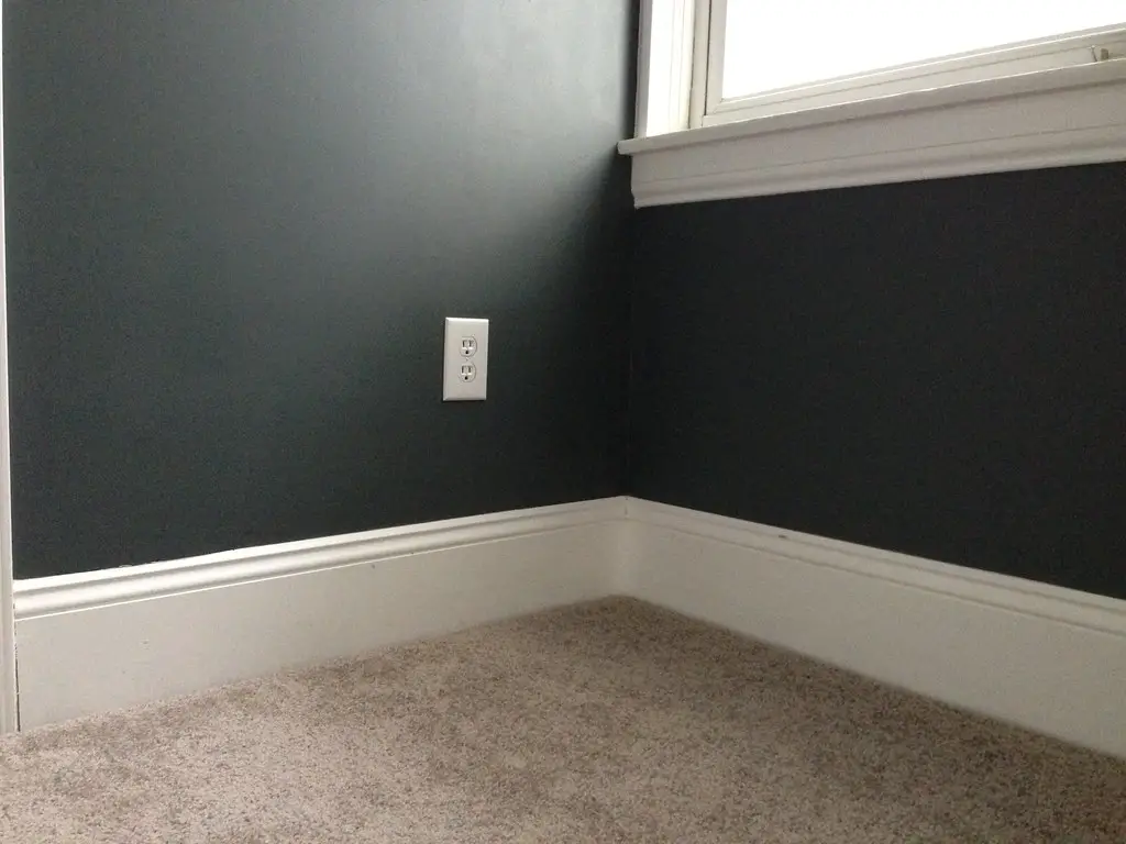
Charcoal gray might seem modern and chic, but it often absorbs light and makes a space feel more confined. This is especially true in rooms with limited natural light, where the color can become oppressive instead of cozy. According to Better Homes & Gardens, dark grays tend to close in walls, ceilings, and corners, creating a cave-like atmosphere. If you’re committed to using this hue, it’s best saved for accents or a single focal wall.
Charcoal gray can also clash with warmer furnishings and wood tones, which may enhance the feeling of imbalance. When applied in large areas like a living room or bedroom, the color can mute textures and details that otherwise add visual interest. Pairing this shade with matte finishes can make it even heavier on the eyes. For an airier feel, consider medium grays or softer taupes that reflect more light.
2. Forest Green
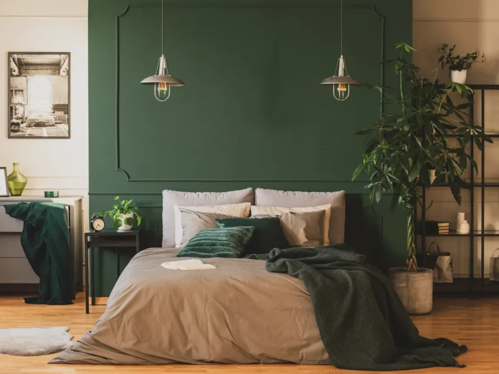
Forest green has a rich, earthy appeal, but it can quickly overpower a space if overused. Its dense saturation can cause walls to recede visually, making rooms feel tighter and more enclosed. Elle Decor notes that darker greens, while elegant in some settings, can create a heavy atmosphere in smaller homes or apartments. Without ample lighting and contrast, forest green easily dominates rather than complements.
This shade can also be challenging to pair with décor, especially in contemporary or minimalist spaces. Its deep tone tends to pull focus from other elements in the room, including furniture, rugs, and artwork. Forest green often performs better in larger rooms or those with high ceilings. In smaller settings, it may feel more suffocating than stylish.
3. Eggplant Purple
While luxurious and bold, eggplant purple is notorious for making rooms feel tighter. Its dark, bluish undertones absorb light and can cause ceilings to seem lower and corners to close in. According to HGTV, this color is best used in moderation, ideally in accessories or accent pieces. Covering all four walls in eggplant can dramatically reduce the perceived size of a room.
It’s also a difficult shade to coordinate with other common interior palettes, such as whites, beiges, or soft pastels. Too much contrast can make the room feel visually jarring and further reduce its openness. Using lighter purples or muted lavenders is often a better compromise. When applied thoughtfully, eggplant can add depth without overwhelming a space.
4. Chocolate Brown
Chocolate brown can add warmth, but it often backfires when used excessively in smaller interiors. The shade is heavy and tends to dull natural light, particularly in rooms with small windows. According to Real Simple, brown walls absorb more light than they reflect, leading to an enclosed and dim appearance. Even glossy finishes struggle to counteract this effect in tight spaces.
This rich hue can also date a room, especially when paired with similarly dark wood furniture. In compact living areas or bedrooms, brown may feel somber and lack the vibrancy needed for comfort. A softer tan or sandy beige can give a similar warmth without the visual weight. As a result, brown is best reserved for accents like cabinetry or trim work.
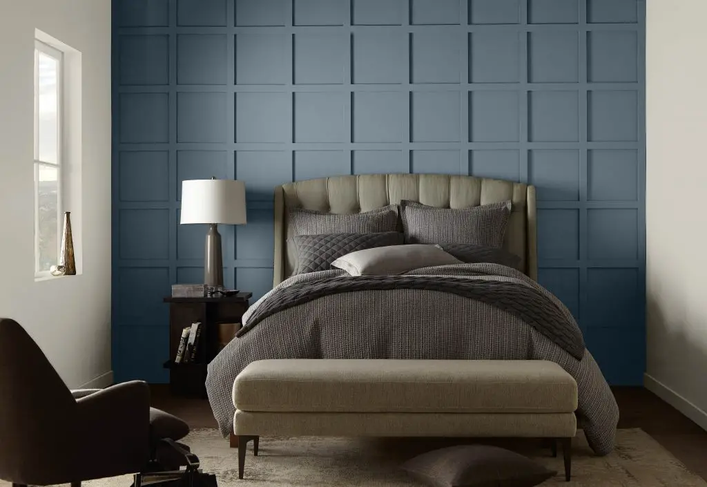
5. Navy Blue
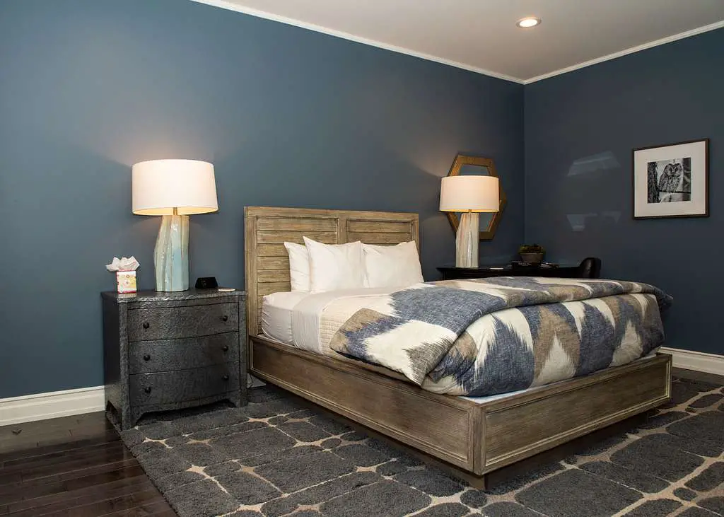
Navy blue is a striking color, but it can overwhelm small rooms when applied too generously. Its deep tone absorbs both natural and artificial light, causing walls to close in visually. Many homeowners choose navy for its classic appeal, yet they underestimate its impact on spatial perception. Without proper lighting and contrast, the shade can feel heavy and enclosing.
Pairing navy with dark furniture or flooring compounds the issue, eliminating the visual breaks that create openness. In compact areas like bathrooms or entryways, the color can lead to a boxed-in feeling. Lighter alternatives such as powder blue or sky blue can maintain a calming aesthetic without shrinking the room. If navy is a must-have, it’s best used as an accent rather than a primary wall color.
6. Black
Black is one of the most visually aggressive colors in interior design. It absorbs nearly all light, making spaces feel confined and less breathable. When applied to multiple walls or ceilings, it can create a sense of compression that’s especially noticeable in already small rooms. While black can feel sophisticated in certain contexts, it rarely enhances spatial perception.
This color also highlights dust and imperfections more easily, requiring high maintenance to look polished. Unless paired with abundant light sources and contrasting furnishings, black can weigh down a room. Even glossy finishes do little to reduce its visual heaviness. For a more flexible dramatic look, charcoal or graphite might be safer choices.
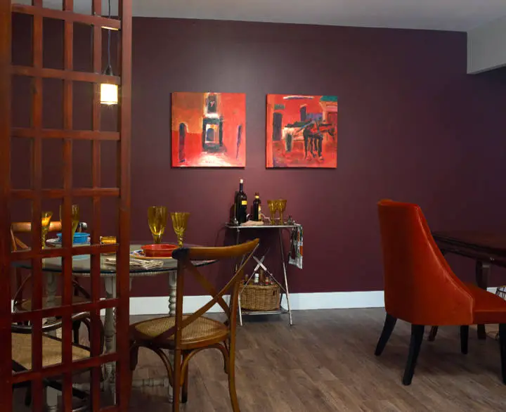
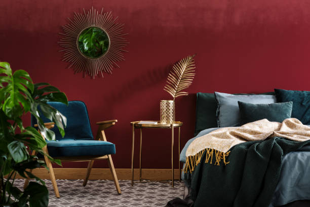
7. Burgundy
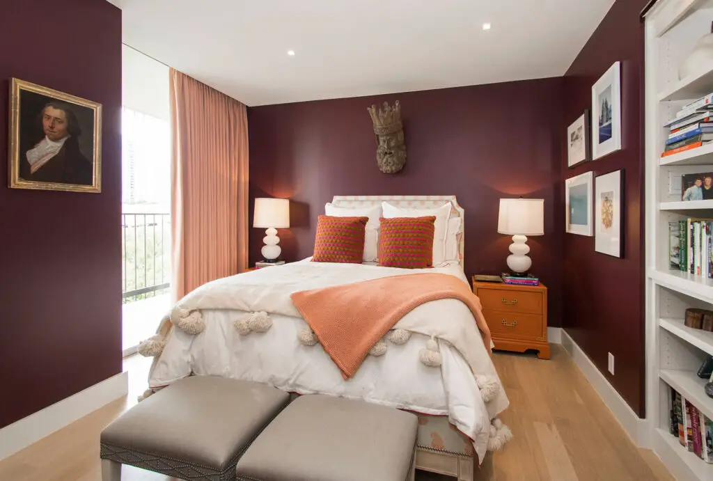
Burgundy has long been associated with richness and luxury, but its dark, wine-colored base can shrink a room. Like other deep shades, it reflects little light and contributes to a closed-in feeling. It also tends to dominate the color palette, making coordination with other design elements more difficult. This can lead to visual clutter and reduced spaciousness.
In dining rooms or home offices, burgundy may feel traditional or formal, but in smaller bedrooms or hallways, it becomes overwhelming. Unless carefully balanced with white trim or light furniture, the room may feel both dated and cramped. Substituting with lighter reds or dusty rose tones can provide similar warmth with less visual weight. Burgundy is best used in moderation or layered as fabric rather than paint.
8. Olive Green
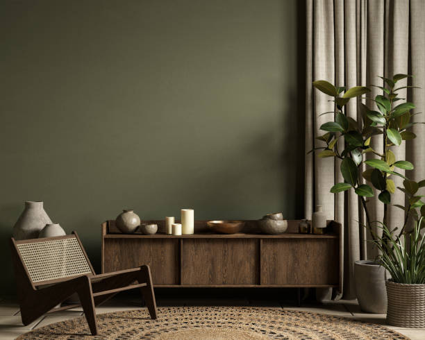
Though trendy in recent years, olive green can easily make a room feel stale and confined. It has a muted, almost muddy appearance that doesn’t reflect much light, especially in dim spaces. When used on walls, olive tends to visually flatten the area, removing dimension and depth. This creates a boxy, uninspiring effect that’s hard to counterbalance.
The color also leans earthy in tone, which may clash with cooler or more modern design styles. In narrow hallways or small guest rooms, olive can feel more like camouflage than comfort. Light sage or pistachio green offers a similar natural feel without the heaviness. For those drawn to green interiors, sticking with brighter or more pastel variants is key.
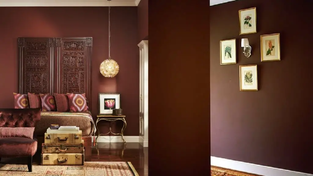
9. Maroon
Maroon is deep and dramatic, but in small rooms it can feel almost suffocating. Its red-purple undertones absorb light while adding visual heat, both of which reduce the sense of openness. When paired with similarly rich textiles or woods, maroon creates an old-fashioned, cramped atmosphere. Even when styled well, it rarely contributes to a feeling of spaciousness.
Many designers recommend using maroon only in large or open-concept areas. Smaller rooms simply don’t benefit from its visual intensity. Substituting maroon with cranberry or muted raspberry can maintain a bold palette without overwhelming the space. Strategic use is crucial to prevent maroon from taking over the room entirely.
10. Slate Blue
Slate blue sits in a gray-blue territory that may seem soft but often ends up feeling cold and dense. It lacks the brightness of true blues and tends to flatten spaces rather than energize them. In small rooms, slate blue can make corners and ceilings feel closer than they are. The result is a dull, muted atmosphere that lacks dimension.
Its subtlety can be a double-edged sword—it doesn’t create contrast, nor does it reflect light effectively. Paired with dark floors or furniture, the room may feel overly somber. Lighter blues or dusty periwinkle shades work better to open up space. Slate is better used in accessories or rugs than across all four walls.
11. Rust Orange
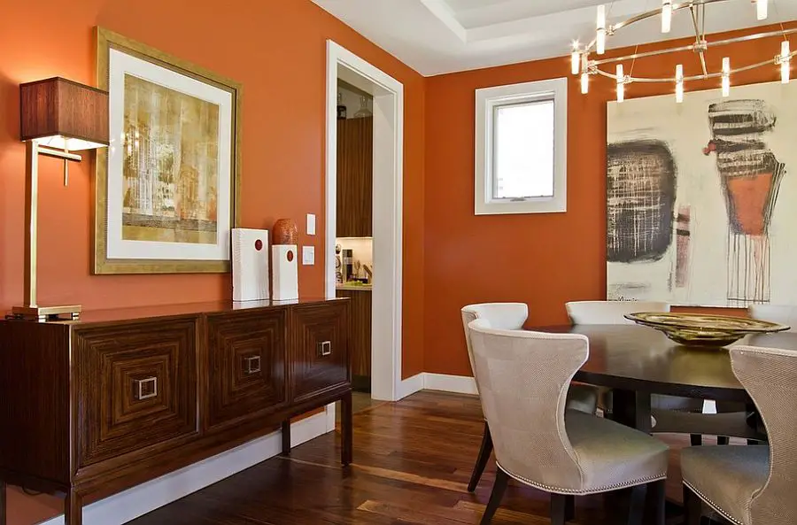
Rust orange has an earthy vibrancy, but it can visually crowd a room when used in large doses. The color’s strong saturation can cause walls to feel closer together, especially in rooms with low ceilings. It also reflects warm light in a way that emphasizes shadows and dark corners. The result is a space that feels smaller and more cluttered than it is.
While rust works well in autumnal or vintage aesthetics, it’s challenging in compact spaces. Mixing it with too many patterns or textures enhances the feeling of confinement. Burnt sienna or terracotta offer similar tones in a lighter, less intense form. In most cases, it’s better as an accent wall or in decorative pieces.
12. Plum
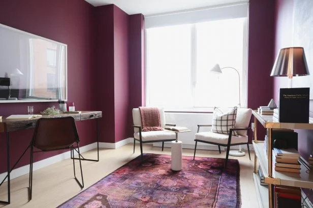
Plum is a luxurious purple with brownish undertones, but it often closes off a space more than it enhances it. Its darkness makes walls feel like they’re closing in, especially in areas without abundant natural light. The color can also evoke a moody, formal vibe that might not suit relaxed, lived-in rooms. This limits its flexibility across various design styles.
In bedrooms, plum may feel too heavy for comfort and too dark for productivity in home offices. When combined with heavy drapery or thick furniture, the overall space can become visually dense. Mauve or lilac are safer alternatives that provide elegance without the weight. If you do use plum, limit it to accents like throw pillows or artwork.