
In the age of social media, our homes have increasingly become stages for curated perfection, with platforms like Instagram transforming interior design into a public performance. While seeking inspiration online can be fantastic, a peculiar phenomenon has emerged: homes decorated primarily for photographic appeal rather than practical, comfortable habitation. These spaces often prioritize aesthetics over functionality, leading to beautiful but ultimately unlivable environments. Recognizing these telltale signs can help us discern between genuine design and mere digital showmanship.
1. Impractically Placed, Perfect Decor Objects
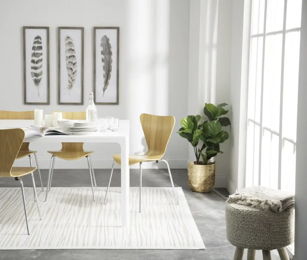
Have you ever seen a perfectly styled bookshelf with books artfully arranged by color, or a pristine, untouched coffee table with a single, sculptural object that seems to defy gravity? These arrangements, while visually appealing in a photograph, often feature decor objects placed in highly impractical or easily dislodged locations. According to Architectural Digest, such precise, static arrangements are designed to look perfect from a specific camera angle rather than to be interacted with daily.
In a real, lived-in home, coffee tables host remotes and drinks, and bookshelves hold a mix of beloved reads and personal mementos, not just color-coordinated spines. The sheer effort to maintain such untouched perfection signals a space prioritized for viewing, not active use. These meticulous placements suggest a constant vigilance against disorder, which isn’t conducive to relaxed living, as noted by lifestyle bloggers on Apartment Therapy who discuss the reality of everyday clutter.
2. Excessive Use of White or Light-Colored Furnishings in High-Traffic Areas
A sea of pristine white or very light-colored sofas, rugs, and upholstery can certainly create a bright, airy, and expansive look that photographs beautifully. This aesthetic is often championed by minimalist and Scandinavian-inspired design trends, which translate well to a clean Instagram feed. As discussed by designers in Elle Decor, light colors can visually enlarge a space and serve as a neutral backdrop for other decor elements.
However, in a home where actual living occurs, particularly one with children, pets, or frequent guests, maintaining such an immaculate palette in high-traffic areas is an extraordinary, often impossible, feat. Spills, dirt, and wear become instantly noticeable, turning daily life into a constant battle against stains and imperfections. The impracticality of this choice in a busy household suggests that the pristine look for the camera was prioritized over durable, forgiving materials, a point frequently made by interior design experts on House Beautiful.
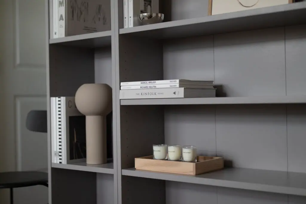
3. All Surfaces Are Clutter-Free (Too Much So)
An Instagram-ready home often boasts surfaces that are completely devoid of everyday clutter – no stray papers, no charging cables, no remotes, no mail, and nary a dust bunny in sight. Every countertop, table, and shelf appears meticulously staged with only a few curated objects. This level of tidiness creates a serene visual that looks effortlessly chic online, says Forbes.
In reality, even the most organized homes accumulate a certain amount of “living clutter” throughout the day – keys, wallets, phones, glasses, and documents all find temporary resting spots. When a home appears completely sterile of such items, it suggests that these everyday necessities are constantly being hidden away just for the shot, rather than having a natural place within the functional flow of the home. This level of staged perfection indicates a home that is always ready for a photoshoot, not for spontaneous human activity.
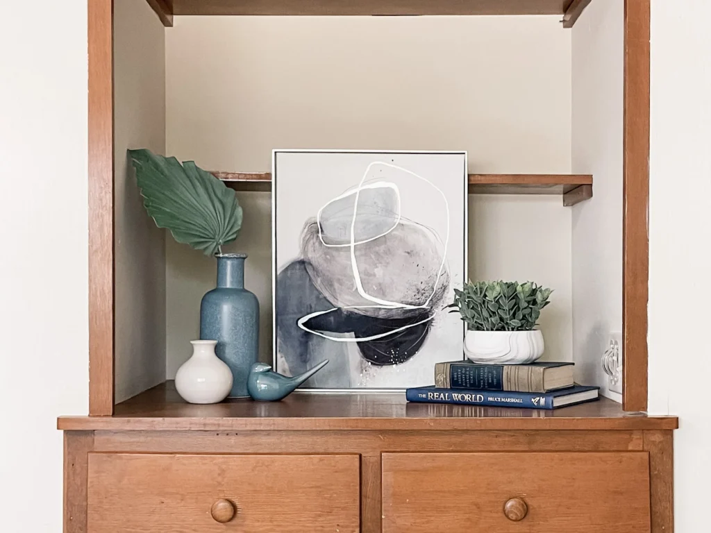
4. Overly Styled “Shelfies” with Unreadable Books
The “shelfie” – a perfectly arranged bookshelf or open shelving unit – is an Instagram staple, often featuring books arranged by color, spines facing inward, or mixed with a few chosen decor objects. While visually striking, these arrangements frequently prioritize aesthetic uniformity over actual readability. As critiqued by librarians and book enthusiasts on Lit Hub, arranging books by color or hiding their spines makes them difficult to locate and enjoy.
In a genuine home, books are typically organized for easy access and enjoyment, with spines facing outward and often grouped by genre or author. When books appear to be mere props for a specific color scheme or texture, it indicates that the display is more about photographic composition than practical use. This highly curated, almost decorative use of books suggests a space designed to be admired from afar, rather than one that invites a deep dive into its literary treasures.
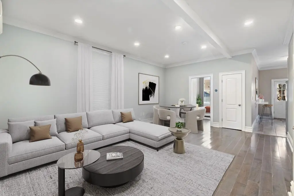
5. Pristine White Rugs in High-Traffic Zones
A fluffy, pristine white rug can undeniably create a sense of luxurious softness and brightness in a photograph, instantly elevating the perceived elegance of a room. It adds a touch of aspirational cleanliness and a feeling of expansive, untouched beauty, perfectly complementing minimalist or airy design aesthetics.
However, placing such a delicate and stain-prone item in a high-traffic area like a living room or entryway is a nightmare for actual living. Every spilled drink, muddy footprint, or pet-related mishap becomes an immediate source of stress. The constant vigilance required to maintain a white rug’s pristine condition suggests its primary purpose is visual appeal for curated images, rather than providing practical comfort in a bustling household.
6. Art Hung Impractically Low or High
In Instagram-worthy rooms, artwork is sometimes hung at unconventional heights – either dramatically low, almost grazing the furniture, or surprisingly high, leaving significant empty space below. These placements can create a unique visual line or emphasize a particular furniture piece for the camera.
In a home designed for comfortable living, artwork is typically hung at eye level (around 57-60 inches from the center of the piece to the floor) to be easily viewed and appreciated while standing or sitting. Deviating significantly from this standard suggests a placement chosen for a specific photographic composition rather than optimal viewing in real life. It might look good in a square frame, but it’s awkward in person.
7. Everything is Brand New and Matches Perfectly
An Instagram-perfect home often features furniture and decor that looks like it just came off the showroom floor, with every piece matching flawlessly in style, color, and finish. There’s an absence of wear, tear, or the charming imperfections that come with a lived-in space.
A home that is actually lived in accumulates layers of history, personal touches, and pieces acquired over time, creating a more eclectic and authentic feel. When everything appears uniformly new and perfectly coordinated, it can feel impersonal and sterile, hinting that the primary goal was a pristine visual for a social media feed rather than a comfortable, evolving sanctuary.
8. Bouquets of Fresh Flowers in Every Room, All the Time
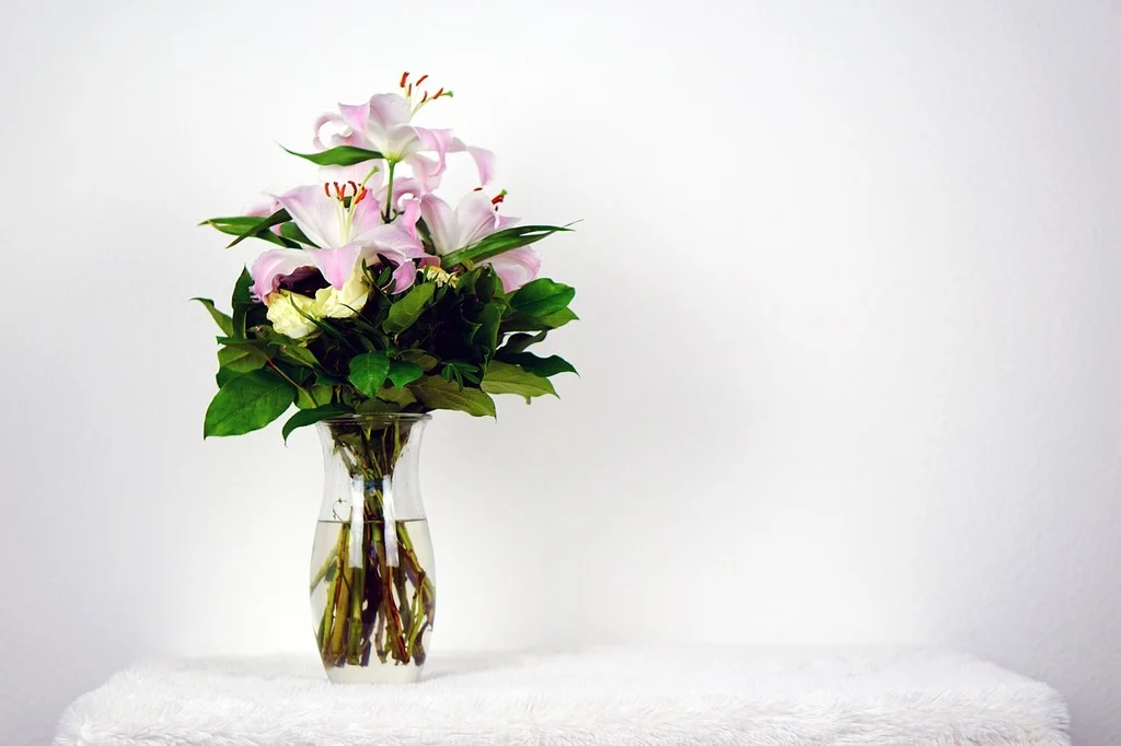
While fresh flowers undeniably add beauty and life to a home, an Instagram-perfect feed often features elaborate, often expensive, fresh bouquets in every single room, meticulously arranged and always vibrant. This creates an immediate impression of luxury and constant renewal.
In reality, maintaining fresh flowers in every room constantly is both time-consuming and costly for most homeowners. Real-life homes might have one or two bouquets for special occasions, or perhaps some low-maintenance houseplants. The perpetual presence of perfect fresh blooms suggests a dedication to photographic staging over sustainable everyday aesthetics.
9. Too Many Throw Pillows on Sofas and Beds
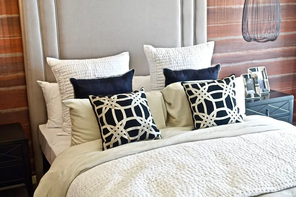
Instagram-perfect sofas and beds are often laden with an excessive number of throw pillows, arranged in a precise, almost sculptural way. While visually appealing in a photograph, these arrangements prioritize aesthetics over comfort and practicality.
In a lived-in home, throw pillows are meant to add comfort and a touch of style, but not so many that one has to remove a pile of them just to sit down or lie on the bed. An overwhelming number of pillows suggests a space designed for visual impact rather than actual lounging or sleeping, making the act of relaxing more of a chore.
10. Blankets Artfully Draped (Never Actually Used)
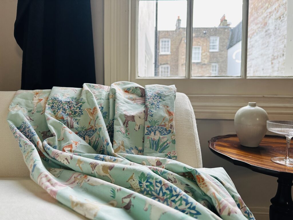
You’ll often spot a throw blanket draped just so, casually yet perfectly arranged over a sofa or armchair, creating an inviting texture and adding to the room’s cozy aesthetic in photos. The folds are always just right, never a wrinkle out of place.
In a real home, blankets are meant to be used for warmth and comfort, which means they get rumpled, unfolded, and might not always be perfectly draped. When a blanket consistently looks untouched and perfectly staged, it suggests it’s more of a prop for the camera than a functional item intended for snuggling.
11. Overly Simplistic or Non-Functional Lighting
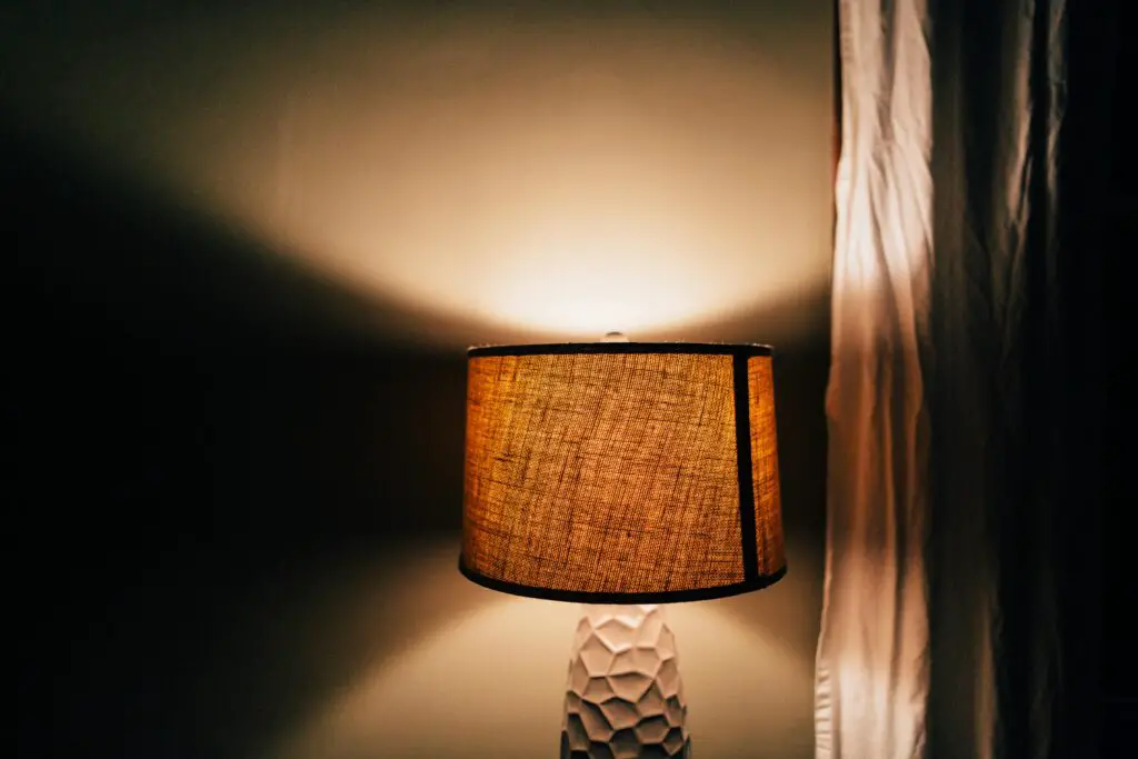
Some Instagram-focused interiors feature lighting primarily for aesthetic effect, such as decorative lamps with minimal light output or strategically placed accent lighting that creates shadows rather than illumination. The emphasis is on the fixture’s appearance or the mood it creates for a photo.
In a functional home, lighting is crucial for daily tasks, ambience, and safety. There’s a balance of ambient, task, and accent lighting to ensure rooms are well-lit for various activities. When lighting appears more sculptural than practical, it suggests the room is meant to be seen, not necessarily used effectively after dark.
12. Furniture Arranged for “Vignettes,” Not Conversation
Instagram often showcases small, perfectly styled “vignettes” within a room – a chair, a side table, a lamp, and a few decor items arranged beautifully for a close-up shot. While these are visually pleasing compositions, they may not contribute to the overall conversational flow of a living space.
In a home designed for living, furniture arrangements prioritize comfortable conversation and easy movement between seating areas. When chairs face away from each other or are clustered in ways that make conversation awkward, it suggests the arrangement was dictated by a specific visual composition for a camera rather than practical interaction.
13. Kitchens with Pristine, Unused Countertops
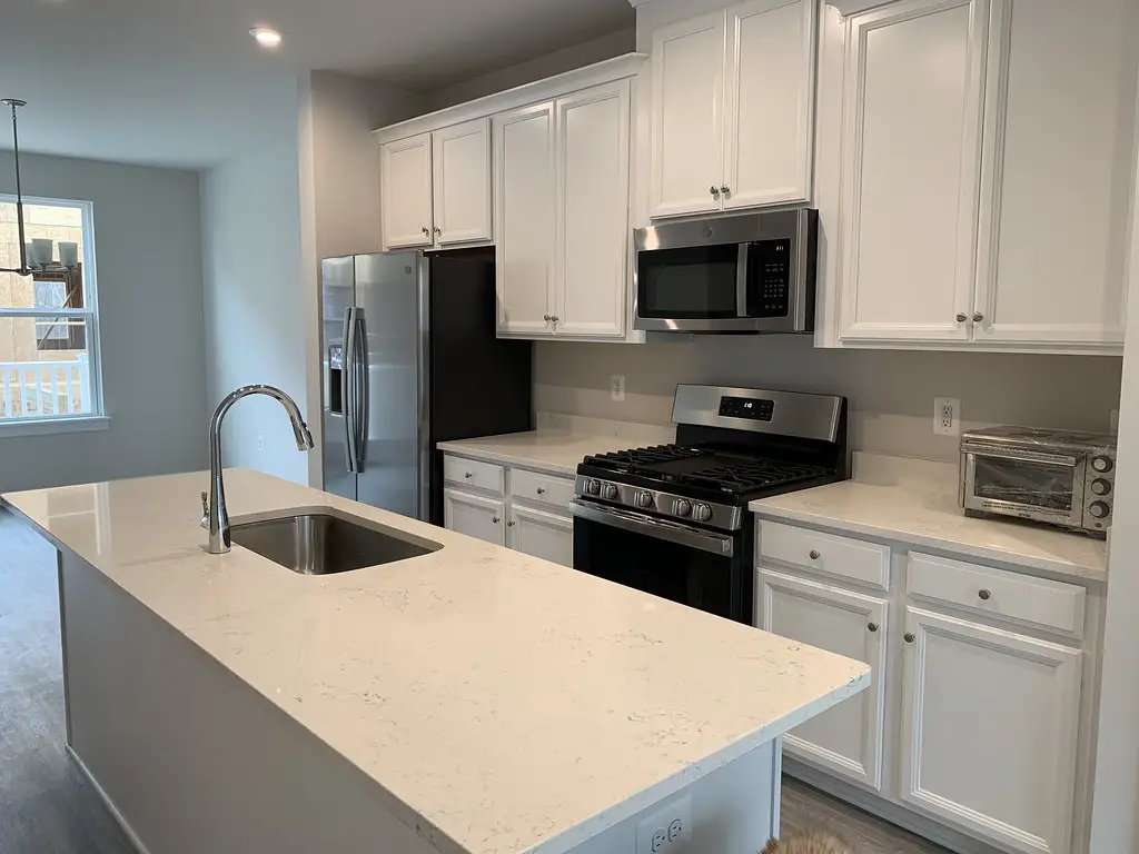
An Instagram-perfect kitchen typically features sparkling, uncluttered countertops, with perhaps a single, aesthetically pleasing appliance or a bowl of perfect fruit. There are no signs of daily cooking prep, crumbs, or stray utensils.
In a kitchen that is actually used for cooking and daily life, countertops inevitably accumulate appliances, prep items, and the general residue of meal preparation. A perpetually pristine countertop suggests a kitchen that is rarely, if ever, used for its primary function, indicating its role is more about visual display than culinary activity.