
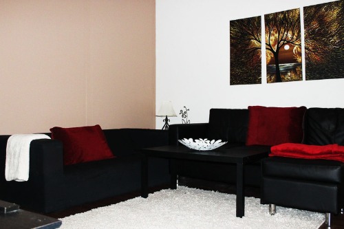
1. Matching Furniture Sets Are a Must
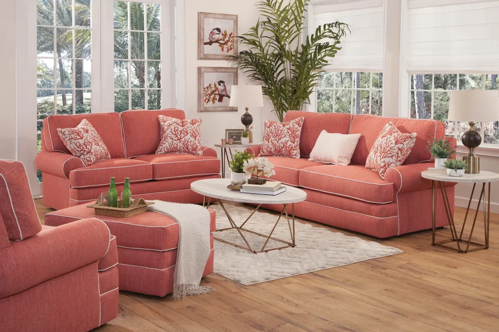
Remember the days when buying a living room set – sofa, loveseat, armchairs, all in the exact same fabric and style – was the epitome of good taste? According to a trend report by Houzz, homeowners are increasingly opting for an eclectic look, mixing and matching different styles, textures, and even periods of furniture. This move away from uniformity allows for more personality and a collected-over-time feel, rather than a showroom aesthetic.
Sticking to a matching set can actually make a room feel a bit flat and lacking in character. By intentionally choosing pieces that complement each other but aren’t identical, you can create visual interest and a space that truly reflects your individual style. Think of it like curating a wardrobe – you wouldn’t wear the exact same outfit every day, so why should your living room look like it came straight out of a catalog?
2. All Wood Tones in a Room Should Match
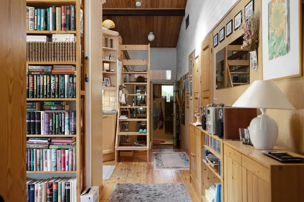
For a long time, the prevailing wisdom was that all the wood finishes in a room – from flooring to furniture to picture frames – needed to be in the same color family. As noted by interior design experts at Apartment Therapy, this rule has been widely debunked. Mixing wood tones can actually add warmth, depth, and a more natural, organic feel to a space.
The key is to vary the tones and ensure there’s enough contrast between them. For example, pairing light maple with dark walnut can be striking, while layering several medium-toned woods might feel a bit muddy. Consider the undertones of the wood (warm, cool, or neutral) to create a cohesive yet interesting look. Don’t be afraid to experiment and trust your eye!
3. Small Rooms Should Only Use Light Colors
The idea that dark colors will make a small room feel even smaller has been a long-standing belief. However, as design professionals often point out in publications like Architectural Digest, this isn’t always the case. In fact, a carefully chosen dark color can add drama, intimacy, and a sense of cozy enclosure to a small space.
Instead of making the room feel smaller, a deep, rich hue can blur the boundaries of the walls, making the space feel infinite. The trick is to balance the dark walls with lighter accents, such as furniture, rugs, and artwork, to prevent the room from feeling like a cave. Don’t underestimate the power of a bold color choice, regardless of square footage.
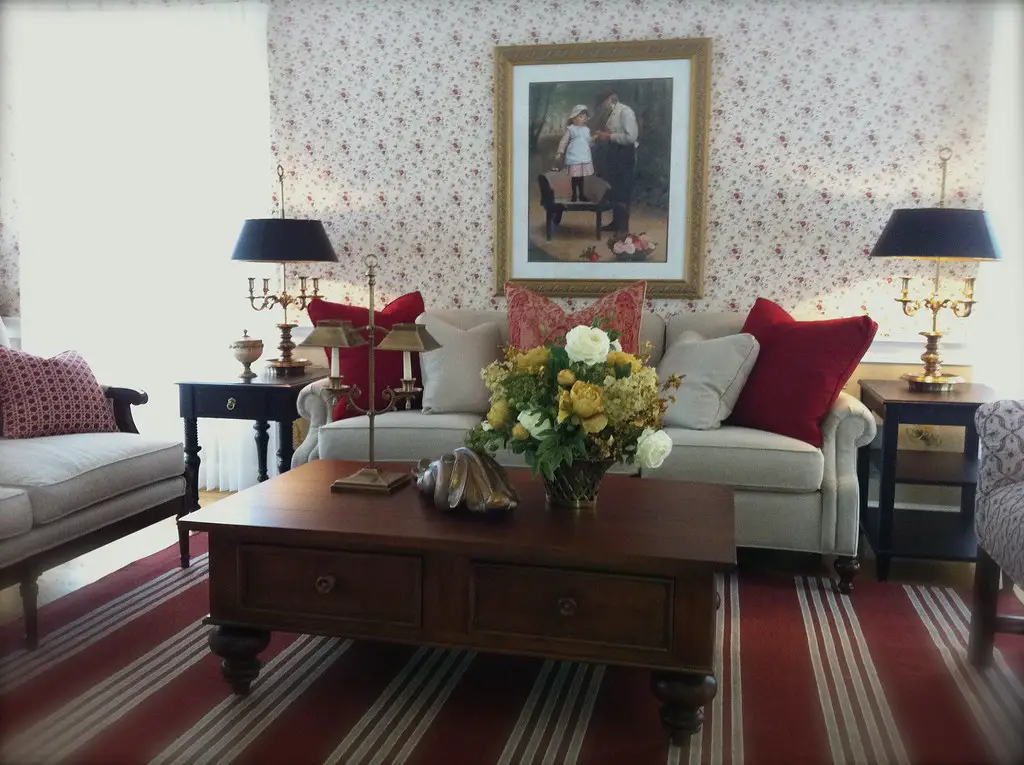
4. Rugs Should Only Be Placed Under the Front Legs of Furniture
There was a time when the “proper” way to place a rug in a living room was to have just the front legs of the sofa and chairs resting on it. According to The Spruce, this was thought to anchor the furniture without overwhelming the space. However, this rule often resulted in rugs that looked too small and disconnected from the seating arrangement.
Modern design embraces the idea of a rug that is large enough for all the main pieces of furniture in a seating area to sit entirely on it. This creates a more cohesive and grounded feel, visually pulling the furniture together and defining the space. If your budget doesn’t allow for a rug that large, aim for one that extends at least six inches beyond the sides of your sofa.
5. Avoid Mixing Patterns
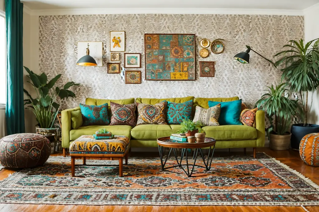
For years, the advice was to choose one main pattern and stick to solid colors for everything else to avoid a chaotic look. However, contemporary design celebrates the art of mixing patterns. The key is to do it thoughtfully, creating a harmonious yet visually interesting space.
To successfully mix patterns, vary the scale of the patterns (large, medium, and small) and choose patterns that share a common color palette. Stripes, florals, geometrics, and animal prints can all play nicely together if you find the right balance. Don’t be afraid to experiment and layer different patterns to add depth and personality to your decor.
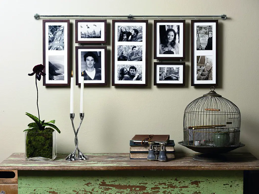
6. Everything Should Be Symmetrical
While symmetry can create a sense of balance and formality, an overly symmetrical room can sometimes feel stiff and uninviting. Modern design embraces asymmetry to create a more relaxed and dynamic feel.
Instead of perfectly matching lamps on either side of a sofa, try varying the height or style. Arrange artwork in a gallery wall instead of a perfectly aligned row. Introduce unexpected elements to create visual interest and a more organic flow within the space.
7. Artwork Must Be Hung at Eye Level
While hanging artwork at eye level is a good general guideline, it’s not a rigid rule that must be followed in every situation. Consider the size of the artwork, the height of your ceilings, and the furniture below it.
A large piece of art above a sofa might need to be hung a bit higher to relate to the scale of the furniture. A gallery wall can have varying heights to create visual interest. The goal is for the artwork to feel connected to the space and the other elements in the room, not just rigidly placed at a predetermined height.
8. Don’t Mix High-End and Low-End Pieces
There used to be a notion that everything in a well-designed home should be expensive and of high quality. However, a truly stylish and personal space often incorporates a mix of investment pieces and more affordable finds.
The beauty of mixing high and low is that it allows you to splurge on items that really matter to you (like a comfortable sofa or a piece of art you love) while saving money on less impactful pieces. This approach also prevents your home from looking like it was entirely purchased at one expensive store.
9. Metal Finishes Should Match Throughout the House
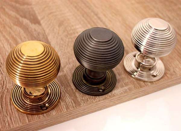
Similar to wood tones, the idea that all metal finishes (like brass, silver, and bronze) in a home should be consistent is an outdated notion. Mixing metals can add visual interest and a sense of depth to your decor.
The key is to choose one dominant metal finish and then incorporate one or two accent metals. Ensure there’s a common thread, such as similar undertones (warm or cool), to create a cohesive look. Don’t be afraid to mix that brushed nickel faucet with brass light fixtures.
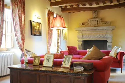
10. Window Treatments Should Always Be Formal
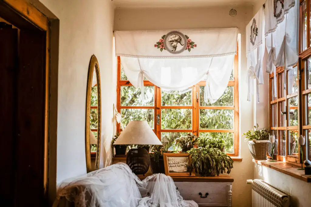
For a long time, elaborate and formal window treatments were seen as a sign of sophistication. However, modern design often favors simpler, more functional, and less fussy options.
Consider the purpose of your window treatments – privacy, light control, or purely decorative. Choose styles and fabrics that suit your needs and the overall aesthetic of your room. Simple roller shades, relaxed linen curtains, or even no window treatments at all can be perfectly stylish choices.
11. Throw Pillows Should Be Chopped
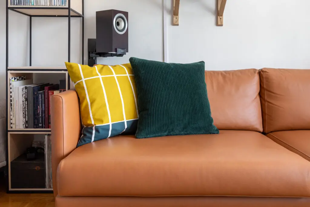
The “karate chop” to the center of a throw pillow was once considered the height of stylish sofa styling. However, this overly perfect look can now feel a bit dated and unnatural.
Instead of rigidly chopping your pillows, opt for a more relaxed and inviting look. Simply fluff them and arrange them casually for a comfortable and lived-in feel. The goal is to create a welcoming space, not a perfectly staged photograph.
12. Never Paint Ceilings a Different Color
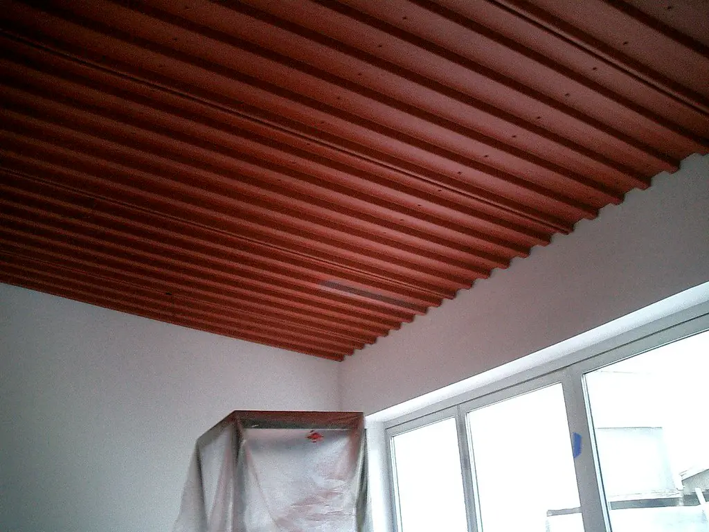
The traditional approach was to always paint ceilings white, believing it would make the room feel taller and brighter. While white ceilings are a safe and versatile choice, painting the ceiling a different color can add drama, warmth, or a sense of intimacy to a space.
Consider painting a bedroom ceiling a soft, calming color to create a cozy atmosphere. A bold color on a powder room ceiling can add unexpected personality. Don’t be afraid to look up and see the potential for adding another layer of design to your room.
13. Every Wall Needs Something On It
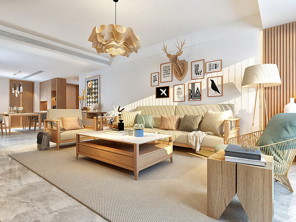
The idea of “filling every blank space” with artwork or decor can lead to a cluttered and overwhelming room. Sometimes, the most impactful design choice is to embrace negative space and allow walls to breathe.
A well-placed piece of art or a striking architectural detail can have more impact when surrounded by open space. Don’t feel pressured to fill every wall just for the sake of it. Embrace the beauty of simplicity and intentional emptiness.
14. Minimalism Is the Only Path to Good Design
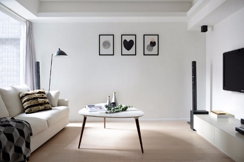
For years, minimalism was considered the gold standard of sophistication—clean lines, neutral palettes, and “less is more.” But in 2025, design is shifting toward warmth, comfort, and personal expression. People are realizing that empty spaces can sometimes feel sterile or impersonal. A home that feels lived-in, layered, and reflective of its owner’s story is now the true mark of good design.
This new approach doesn’t mean abandoning simplicity altogether; it’s about finding balance. Incorporating meaningful objects, vintage pieces, and rich textures can make a minimalist space feel more human and inviting. Designers are now embracing the term “edited maximalism,” where each piece has a purpose and a story. It’s less about austerity and more about authenticity.
15. Every Room Needs a Focal Point
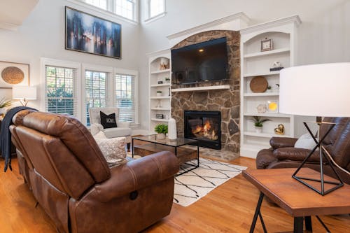
The once-popular design advice to create a single focal point—like a fireplace, chandelier, or statement wall—has become less relevant. In 2025, homes are designed for flow, not hierarchy. Instead of one element demanding attention, designers are distributing interest throughout the space. This creates rooms that feel more dynamic and balanced, rather than centered around one “star” feature.
Modern living spaces often serve multiple purposes—think hybrid office-lounges or open-plan kitchens—so having a single focal point can actually limit flexibility. Designers now play with layered focal moments, using texture, color, and light to guide the eye naturally. The result is a more fluid and immersive experience. Today’s interiors invite exploration, not just admiration from one angle.
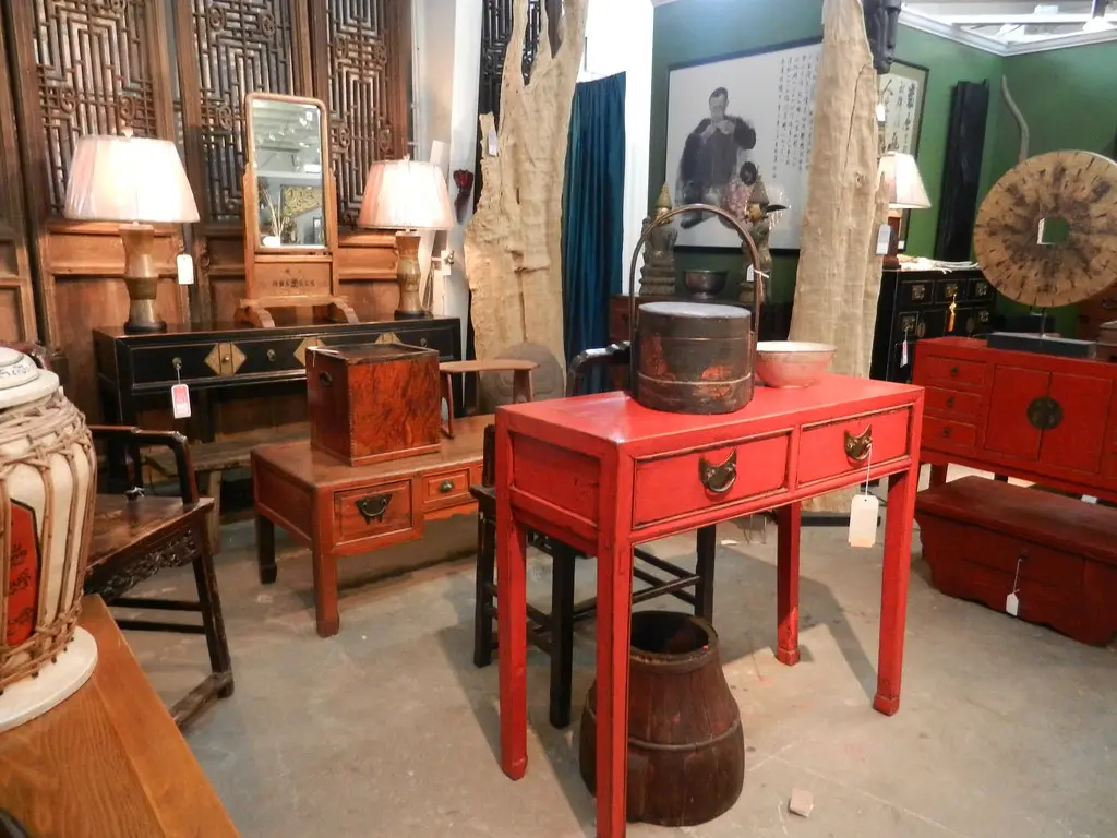
16. You Should Never Mix Design Eras
It used to be considered poor taste to pair mid-century furniture with Victorian decor or to combine contemporary art with rustic finishes. But the charm of 2025 interiors lies precisely in those unexpected juxtapositions. Blending design eras adds depth, personality, and a sense of evolution to a home. It’s about creating visual stories that feel collected, not coordinated.
When done thoughtfully, mixing eras showcases your individuality and defies the constraints of any one “trend.” A sleek 1970s chair can look stunning beside an antique cabinet if they share a common tone or material. The goal is to achieve harmony through contrast. By ignoring the rulebook, you create a home that feels timeless rather than time-stamped.
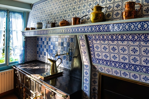
17. Kitchens Must Be All White to Feel Clean

The all-white kitchen once symbolized freshness and modernity, but by 2025 it’s begun to feel cold and predictable. Designers and homeowners are embracing moodier tones, natural woods, and colorful cabinetry. These elements make kitchens feel warmer, more personal, and easier to maintain. White surfaces, while beautiful, can often highlight every smudge and imperfection.
Rich hues like forest green, deep navy, or even muted terracotta now dominate kitchen design. They create a cozy, grounded atmosphere that feels welcoming rather than clinical. Mixing materials like stone, metal, and wood also adds visual richness. Clean doesn’t have to mean colorless anymore.
18. Bathrooms Should Always Be Bright and Glossy

For years, bathrooms were treated as purely utilitarian spaces meant to be bright, reflective, and spotless. But design trends in 2025 favor a softer, spa-like approach that prioritizes relaxation over sterility. Matte finishes, warm lighting, and natural textures are replacing the cold, glossy look of the past. The goal is to create a retreat, not a laboratory.
Dark tiles, moody lighting, and tactile materials like plaster or wood now have a place in modern bathrooms. These elements add depth and make the space feel more luxurious and cocooning. Designers are also incorporating ambient lighting instead of harsh overhead fixtures. The result is a more serene and emotionally comforting environment.
19. Accent Walls Are a Must for Adding Interest
The accent wall—once the go-to way to introduce color or texture—has largely fallen out of favor. In 2025, designers are opting for more immersive approaches, wrapping entire rooms in color or texture instead of isolating a single wall. This shift creates continuity and sophistication rather than a sense of abrupt contrast. Accent walls can sometimes make a space feel incomplete or disconnected.
Today’s color trends emphasize commitment and confidence. Painting all four walls, or even the ceiling, can transform a space far more effectively than one bold stripe. Wallpaper, plaster finishes, or tone-on-tone schemes also help achieve depth and cohesion. The modern approach favors harmony over highlight.
20. Every Home Needs a Defined Style Label
In the past, homeowners felt pressured to define their aesthetic—modern farmhouse, boho chic, Scandinavian minimalism, and so on. But in 2025, rigid style labels are being replaced by more fluid, personal design philosophies. People are realizing that a home doesn’t need to fit into a specific category to feel cohesive. What matters most is that it feels authentic to the people who live there.
Designers now encourage clients to mix influences and trust their instincts rather than adhere to a defined trend. This freedom allows homes to evolve naturally over time. Your space might blend modern lines with vintage accents or industrial finishes with soft textiles—and that’s the beauty of it. In 2025, personality is the new perfection.
This post 20 Design Rules That No Longer Make Sense in 2025 was first published on Greenhouse Black.