
1. Bright Red
While bold and daring, bright red cabinets often feel overwhelming in a kitchen or bathroom. This intense color reflects too much light and can make your space feel chaotic instead of cozy. It’s also tricky to pair with other design elements, like countertops and backsplashes, without creating a clash. Plus, trends in red tend to change, making it a dated choice quickly. Save red for accents rather than splashing it across your cabinetry.
2. Black
Though sleek and modern in theory, black cabinets can make your space feel small and uninviting if not executed carefully. They absorb light, which can darken even a well-lit room, especially if your space doesn’t have much natural light. Maintaining them is also a nightmare, as fingerprints, dust, and smudges are glaringly obvious. Unless balanced with light walls and counters, black can be more trouble than it’s worth. It’s better as a statement island or small feature piece.
3. Lime Green
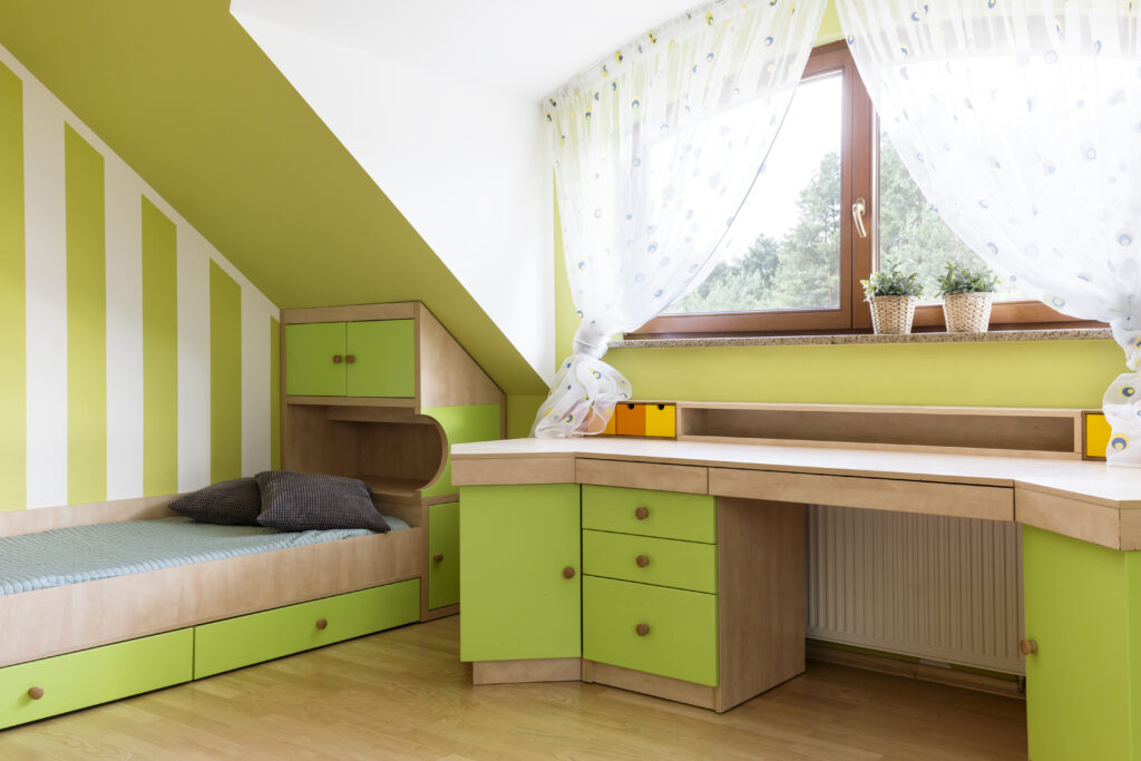
Lime green cabinets scream 1970s retro, and not in a charming way. This color can quickly veer into tacky territory, making your kitchen feel more like a time capsule than a contemporary home. It’s also very polarizing, which could hurt resale value if you plan to sell your house. Lime green is too loud for most palettes, often clashing with neutral tones. If you love green, stick to softer, earthier shades for a more elegant look.
4. Bright Yellow
Sunny yellow may sound cheerful, but on cabinets, it often feels overpowering and juvenile. This color reflects so much light that it can become visually fatiguing over time. Bright yellow also limits your ability to incorporate other colors into your decor, as it competes for attention. It’s better suited for accents, like dishware or small decorative pieces, than a full set of cabinets. A muted mustard yellow is a safer, trendier option if you insist on yellow.
5. Pastel Pink
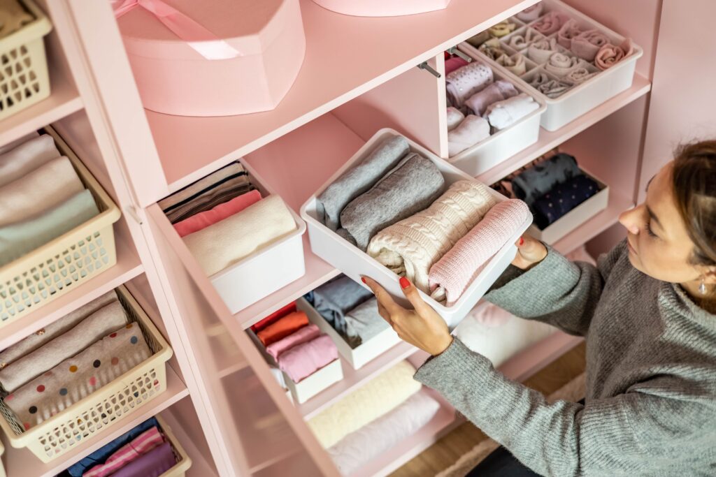
While pastel pink can feel charming in a child’s room, it rarely works well for cabinetry in a kitchen or bathroom. The color tends to make the space look more like a dollhouse than a functional home. It’s also highly divisive and can feel outdated quickly. Pink cabinetry struggles to pair with natural wood tones or metallic fixtures, often creating a design mismatch. If you’re drawn to softer shades, consider a muted blush or beige-rose instead.
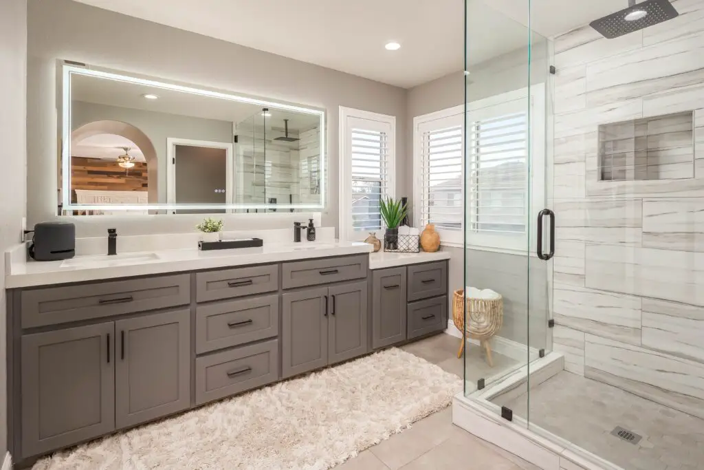
6. Glossy White
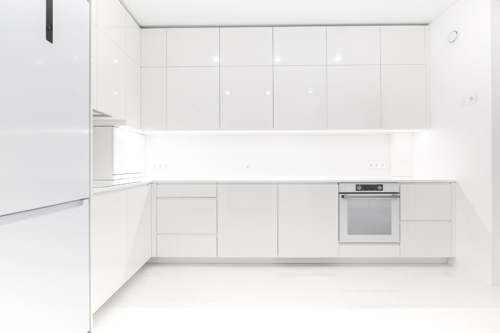
White is a classic choice, but glossy finishes can push cabinets into sterile, clinical territory. The high shine reflects light unevenly, making smudges, streaks, and fingerprints stand out. Over time, glossy white cabinets may yellow or discolor, particularly in kitchens where grease and heat are common. If you’re after a timeless look, opt for a matte or semi-gloss white, which feels more sophisticated and durable.
7. Purple
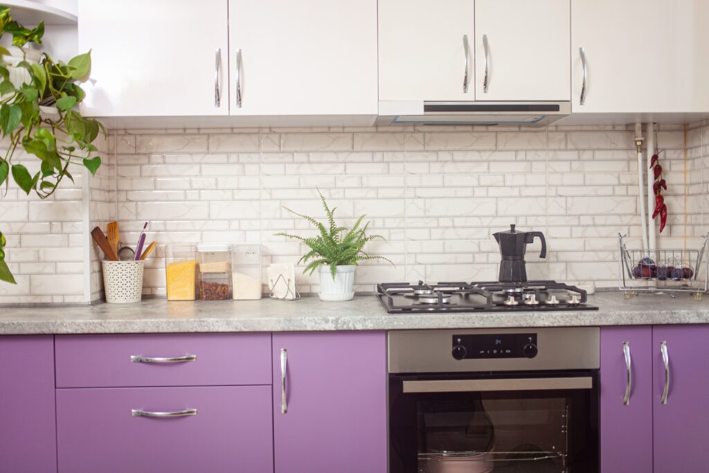
Purple cabinets can be bold and unique but often feel garish in most home designs. The color is challenging to style with other elements, often clashing with common materials like stone and wood. While dark purples might seem rich and royal, they can quickly make your space feel oppressive. On the flip side, lighter purples risk feeling juvenile or overly feminine. Save purple for accent decor rather than full cabinetry.
Instead, you should try:
1. Soft Sage Green
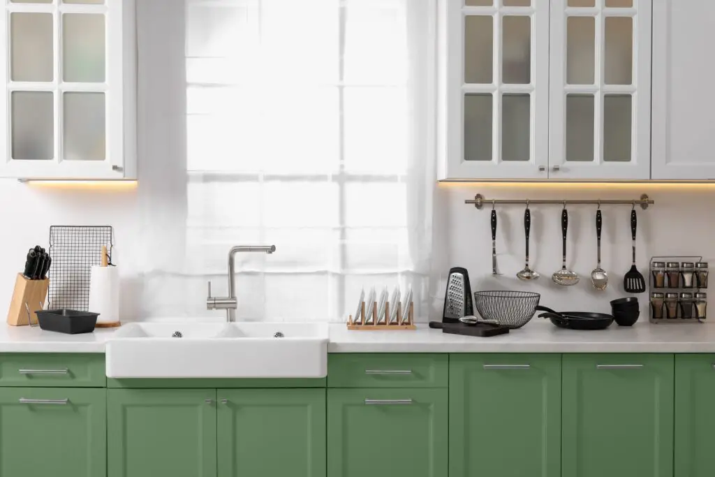
Sage green is a versatile, earthy tone that exudes calm and sophistication. This muted green pairs beautifully with natural wood, marble, and brass fixtures, creating a timeless and modern look. It’s subtle enough to work in both traditional and contemporary spaces, adding a touch of nature indoors. Sage green also hides dirt and smudges better than lighter shades, making it practical for busy homes. Whether your style leans farmhouse or minimalist, sage green is a winner.
2. Warm Greige
A blend of gray and beige, greige is a neutral tone that feels warm and inviting. It complements almost any decor style, from modern to rustic, and works well with a variety of countertops and backsplashes. Greige adds depth without being too bold, giving your cabinets a clean yet cozy feel. This color is timeless, so it won’t look outdated as trends evolve. It’s also an excellent choice if you’re considering resale value.
3. Classic Navy Blue
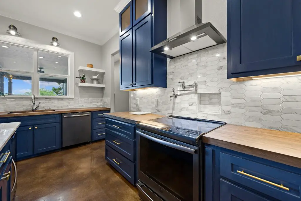
Navy blue cabinets are the perfect mix of bold and timeless. This deep, rich hue pairs wonderfully with gold or brass hardware, creating an elegant and upscale vibe. Navy is dark enough to add drama without feeling as heavy as black, and it complements light countertops beautifully. It works particularly well in open kitchens with plenty of natural light. Navy blue adds a sense of depth and luxury to any room while staying versatile.
4. Matte Charcoal Gray
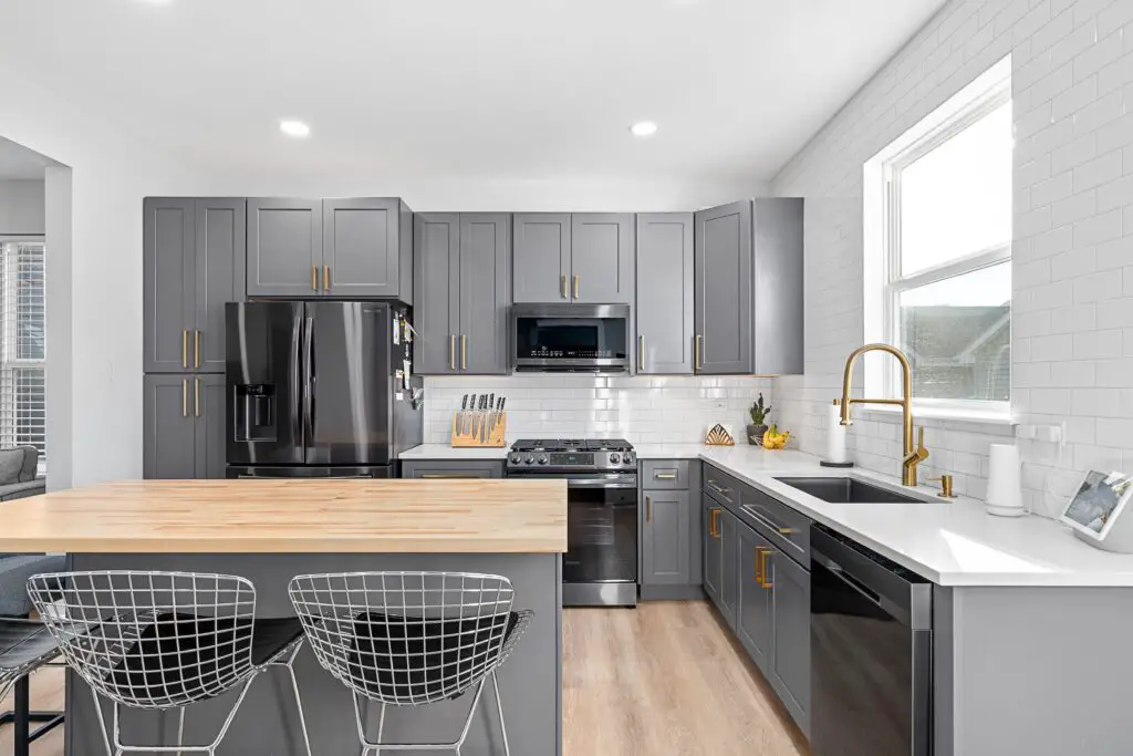
Charcoal gray strikes a balance between dark and neutral, making it a sleek choice for cabinets. Unlike black, it doesn’t absorb too much light, allowing your space to feel modern without being overly stark. This versatile color pairs effortlessly with both cool and warm tones, offering flexibility in your overall design. Matte finishes on charcoal gray hide fingerprints and smudges better than gloss, making it both stylish and practical. It’s an excellent option for a contemporary home.
5. Rich Espresso Brown
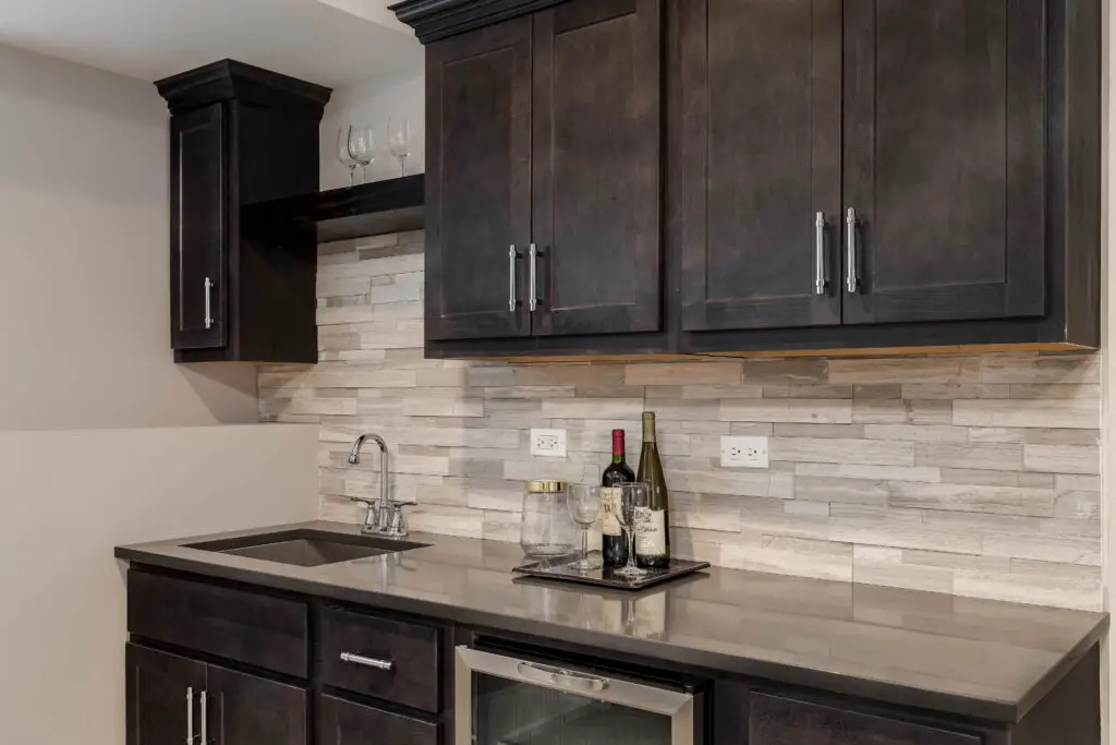
Espresso brown offers a classic, timeless look that feels both cozy and elegant. This deep brown works particularly well in kitchens with natural light, where it adds warmth and character. It pairs beautifully with neutral walls, white countertops, and metallic accents like stainless steel or brass. Espresso brown is a more modern take on traditional wood cabinetry, giving a sleek and polished appearance. If you love natural tones but want something darker, espresso is an excellent choice.