
Selecting the perfect neutral paint color can feel overwhelming, but choosing the right shade can make all the difference in your home’s overall aesthetic. The best neutrals serve as a timeless backdrop, enhancing your space without overpowering it. While some neutral shades can feel too stark or dull, others create a warm, inviting atmosphere that makes any room feel effortlessly stylish. If you’re looking for the most versatile, high-impact options, these 12 shades are the only ones worth your money.
1. Chantilly Lace by Benjamin Moore
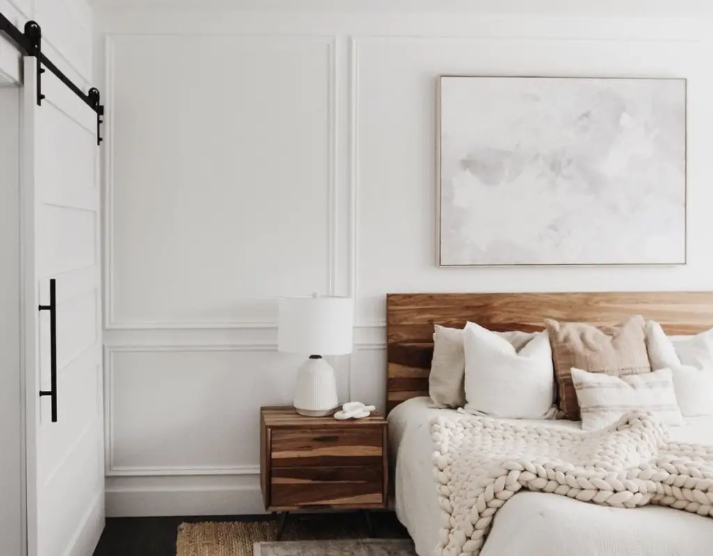
A crisp and clean white, Chantilly Lace is a designer favorite for its ability to brighten any space without feeling too harsh. According to Architectural Digest, this shade is widely regarded as one of the purest whites, making it an excellent choice for walls, trim, or ceilings. Unlike other whites that have yellow or gray undertones, Chantilly Lace offers a true neutral backdrop that complements a variety of interior styles. Whether you’re going for a modern, minimalist look or a more traditional aesthetic, this shade delivers a fresh and timeless appeal.
One of the reasons Chantilly Lace stands out is its adaptability in different lighting conditions. It maintains its bright, crisp look in natural daylight while still feeling warm and inviting under artificial lighting. Because of its lack of strong undertones, it pairs beautifully with both cool and warm accent colors, allowing for endless design possibilities. If you want a white that feels classic without looking sterile, Chantilly Lace is a foolproof choice.
2. Swiss Coffee by Benjamin Moore
Swiss Coffee is a warm off-white with just enough depth to make a room feel cozy without appearing yellow or dingy. As reported by House Beautiful, this shade has been a long-time favorite among interior designers for its ability to create a welcoming atmosphere. It has subtle beige and gray undertones that keep it from feeling too stark, making it ideal for spaces where you want a softer, more lived-in feel. Many homeowners choose Swiss Coffee for open-concept homes because it seamlessly connects different rooms with a consistent, harmonious look.
This shade works especially well in spaces that receive a mix of natural and artificial light. In bright rooms, Swiss Coffee appears creamy and luminous, while in dimmer spaces, it takes on a richer, more enveloping tone. It’s an excellent option for walls, cabinetry, and even ceilings, as it adds warmth without clashing with other colors. If you’re looking for a sophisticated neutral that isn’t too cold or too warm, Swiss Coffee is a standout choice.
3. Repose Gray by Sherwin-Williams
A perfect blend of gray and beige, Repose Gray is a go-to shade for those who want a neutral with subtle complexity. According to The Spruce, this shade has become increasingly popular in recent years due to its versatility and ability to adapt to various decor styles. It has a slight warmth to it, preventing it from feeling too industrial or cold, yet it still provides the clean and modern look that many homeowners desire. Whether used in living rooms, bedrooms, or even kitchens, Repose Gray maintains a balanced and elegant feel.
One of the biggest advantages of Repose Gray is how well it complements both cool and warm tones. It pairs beautifully with crisp white trim for a fresh and contemporary look, while also working well alongside wood finishes and metallic accents. Its ability to shift subtly depending on the lighting makes it a dynamic choice for homes with varying exposures. If you want a gray that feels welcoming rather than stark, Repose Gray is a reliable and stylish option.
4. Edgecomb Gray by Benjamin Moore
Edgecomb Gray is a soft, warm greige that offers the best of both worlds—light enough to keep a room airy but rich enough to add depth. As noted by Better Homes & Gardens, this shade has been a top pick for designers because of its ability to work with a variety of materials and furnishings. It leans slightly toward beige in warm lighting and takes on a cooler gray tone in shaded areas, making it an ideal neutral for homes with varying natural light. This subtle shift in undertones makes Edgecomb Gray an elegant and flexible option for any space.
The versatility of Edgecomb Gray makes it a favorite for whole-house color schemes. It works well in traditional, farmhouse, and even modern interiors, providing a warm yet sophisticated foundation. It pairs beautifully with white trim, natural wood tones, and even bold accent colors like navy or deep green. If you’re searching for a greige that never looks dull or flat, Edgecomb Gray is one of the best investments you can make.
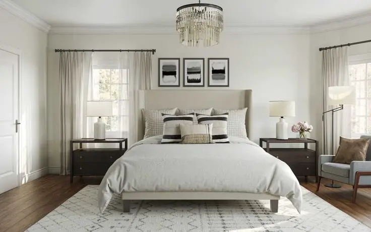
5. Balboa Mist by Benjamin Moore
Balboa Mist is a light, airy greige that leans slightly cooler than some of its warmer-toned counterparts. Its subtle gray undertones prevent it from feeling overly beige, making it a sophisticated and modern choice for contemporary interiors. This shade works particularly well in spaces with plenty of natural light, where it appears soft and elegant rather than overly warm. It’s a favorite for bedrooms and living rooms because it provides a neutral backdrop without feeling cold or sterile.
One of Balboa Mist’s standout qualities is how well it works with other colors. It pairs effortlessly with crisp whites for a clean, fresh look or can be combined with darker, moody hues for a striking contrast. It’s a particularly strong choice for open-concept spaces, as it maintains a consistent feel while allowing for subtle variation depending on the time of day. If you’re looking for a greige that feels light and refined, Balboa Mist is a smart and stylish pick.
6. Classic Gray by Benjamin Moore

Classic Gray is a soft, understated neutral that provides a hint of warmth without veering too far into beige territory. Its subtle undertones give it a chameleon-like quality, allowing it to shift slightly depending on the lighting in a room. In spaces with ample natural light, Classic Gray appears crisp and airy, while in darker areas, it takes on a more intimate and cozy feel. This balance makes it an excellent choice for those who want a neutral that is both sophisticated and easy to work with.
One of the key benefits of Classic Gray is its versatility across different styles and spaces. It pairs seamlessly with both cool and warm tones, making it a reliable choice for homeowners who want a neutral that complements a wide range of décor. Whether used in a minimalist, modern setting or a more traditional space with rich wood accents, this shade adapts beautifully. If you’re looking for a neutral that won’t overpower a room but still adds subtle character, Classic Gray is a fantastic option.
7. Shoji White by Sherwin-Williams
Shoji White is a warm, creamy off-white that bridges the gap between beige and white, making it an excellent alternative to stark, pure whites. This shade has just the right amount of warmth to feel inviting, yet it maintains a fresh and clean look that works well in contemporary and classic interiors alike. It’s a particularly great choice for homeowners who want a neutral that doesn’t feel too cool or sterile but still offers a light and airy feel. Shoji White works exceptionally well in spaces with wood finishes, as it enhances natural tones rather than competing with them.
Another reason Shoji White is a standout shade is its ability to provide a soft contrast when paired with bright whites. When used on walls alongside crisp white trim, it creates a sophisticated and layered look that adds depth to a room. It also works well in homes with mixed lighting conditions, as it maintains a balanced appearance throughout the day. If you’re seeking a warm yet refined neutral, Shoji White is a dependable and elegant choice.
8. Agreeable Gray by Sherwin-Williams
Agreeable Gray is one of the most popular greige shades because of its perfect blend of gray and beige tones. This color has a slightly warm undertone, preventing it from feeling too cold, while still maintaining enough gray to look modern and fresh. It’s often used in open-concept spaces because it seamlessly connects different rooms, creating a cohesive and inviting environment. Homeowners love this shade because it adapts beautifully to various décor styles, from farmhouse to contemporary chic.
The appeal of Agreeable Gray lies in its ability to complement a wide range of accent colors. Whether paired with crisp white trim, deep navy cabinets, or warm wood furnishings, this shade provides the perfect neutral backdrop. It’s also a great option for resale value, as it’s a crowd-pleasing color that appeals to many different tastes. If you want a timeless and universally flattering neutral, Agreeable Gray is a tried-and-true option that never goes out of style.
9. Alabaster by Sherwin-Williams
Alabaster is a soft, warm white that creates a cozy and welcoming atmosphere without looking too yellow. This shade is perfect for homeowners who want a white that feels gentle and inviting rather than stark and clinical. It has subtle beige undertones that give it a natural warmth, making it an excellent choice for living spaces, bedrooms, and kitchens alike. If you want a white that adds a sense of softness to a room while still looking fresh, Alabaster is an excellent selection.
Another reason Alabaster is so popular is its ability to pair beautifully with a wide range of design elements. It works well with both light and dark accent colors, creating a timeless and versatile look that never feels outdated. Whether you’re painting walls, trim, or cabinetry, this shade provides an effortlessly elegant foundation. If you’re searching for a white that feels classic and inviting, Alabaster should be at the top of your list.
10. Pale Oak by Benjamin Moore
Pale Oak is a subtle, warm greige that offers a sophisticated and refined look without feeling too dark. This shade has a delicate balance of beige and gray undertones, allowing it to complement a variety of design styles. It’s an especially good choice for those who want a neutral with depth but don’t want to commit to a darker hue. In well-lit spaces, Pale Oak appears soft and luminous, while in dimmer rooms, it takes on a richer, cozier feel.
One of the biggest advantages of Pale Oak is its ability to create a soothing and harmonious atmosphere. It pairs beautifully with natural materials like stone and wood, making it a great option for homes with rustic or organic-inspired elements. It also works well with both warm and cool accent colors, allowing for flexibility in decorating choices. If you want a neutral that is subtle yet sophisticated, Pale Oak is a fantastic investment.
11. White Dove by Benjamin Moore
White Dove is a warm, creamy white that has been a favorite among designers for years due to its timeless and versatile appeal. Unlike stark, bright whites, White Dove has a soft, muted quality that makes it feel more inviting. It’s an ideal choice for trim, cabinetry, and walls, as it provides a gentle contrast without feeling too sharp. This shade is perfect for those who want a white that feels warm and classic while still maintaining a fresh and clean aesthetic.
Another reason White Dove is a designer favorite is its ability to adapt to different lighting conditions. In natural daylight, it appears bright and airy, while in artificial lighting, it takes on a slightly richer warmth. It pairs beautifully with both bold and neutral color palettes, allowing for endless styling possibilities. If you’re looking for a white that exudes understated elegance, White Dove is an unbeatable option.
12. Mindful Gray by Sherwin-Williams

Mindful Gray is a sophisticated mid-tone gray that offers a perfect balance between warmth and coolness. Unlike some grays that can feel too cold or too beige, Mindful Gray sits comfortably in the middle, making it a fantastic all-purpose neutral. It has enough depth to add character to a room while remaining versatile enough to work with a wide range of accent colors. Whether used in a bedroom, living room, or kitchen, this shade provides a polished and refined look.
One of the reasons homeowners love Mindful Gray is its ability to pair well with both modern and traditional elements. It works beautifully with white trim for a crisp contrast, as well as with wood finishes for a more natural, organic feel. Because it adapts well to different lighting conditions, it’s a great choice for rooms with mixed sources of light. If you’re looking for a gray that feels stylish and enduring, Mindful Gray is an excellent investment.