
1. Oak Cabinets
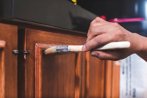
Honey-toned oak cabinets were everywhere in 1990s kitchens, so it’s no surprise many people see them as dated. The wood’s pronounced grain and warm finish became strongly associated with that era. However, oak is a durable hardwood that has been used in cabinetry for generations. It’s the finish and surrounding elements that often date it, not the material itself.
Updating hardware, adding modern lighting, or painting walls in cooler or deeper tones can shift the overall look. White countertops and simple backsplashes help balance the warmth of the wood. Even lightly sanding and refinishing oak in a more neutral stain can make a big difference. Treated thoughtfully, oak cabinets can feel grounded and timeless rather than stuck in the past.
2. Brass Fixtures
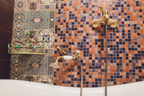
If you hear “brass fixtures” and immediately picture the shiny, orange-toned hardware from the late 1980s, you’re not alone. After years of brushed nickel and matte black dominating kitchens and bathrooms, polished brass can feel like a throwback. But brass has been used in interiors for centuries because of its durability and warm undertones. The key difference is finish and context, not the material itself.
Today’s revival leans into unlacquered or satin brass, which develops a natural patina over time. Pair it with deep paint colors, natural stone, or even modern cabinetry to keep it from skewing dated. Mixing brass with other metals, like black iron or chrome, also makes it feel layered instead of matchy-matchy. Styled thoughtfully, brass reads classic and collected rather than stuck in 1987.
3. Floral Wallpaper
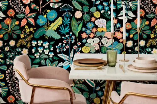
Floral wallpaper can instantly conjure images of busy 1990s dining rooms or overly sweet cottage bedrooms. It’s easy to associate it with small-scale prints and heavy borders that once framed every ceiling. But florals have been part of interior design since at least the 18th century, when printed wallpapers became more widely available in Europe. The pattern itself isn’t dated; the way it’s used often is.
Oversized, painterly florals in bold or moody color palettes feel dramatically different from tiny repetitive prints. Limiting floral wallpaper to a powder room, a ceiling, or a single accent wall keeps it intentional. Pairing it with modern lighting and streamlined furniture creates contrast that feels fresh. Suddenly, what seemed old-fashioned becomes expressive and design-forward.
4. Heavy Drapes
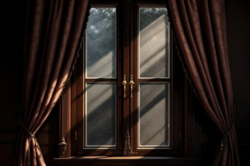
Thick, floor-to-ceiling drapes can feel like a relic from formal living rooms that no one was allowed to sit in. Swags, jabots, and ornate valances were once status symbols, especially in the 1980s and 1990s. Yet substantial curtains have always served practical purposes, from insulation to light control. The fabric isn’t the problem; the fussy styling is.
When you choose solid fabrics like linen blends, velvet, or textured cotton in modern colors, heavy drapes look elevated. Hanging them high and wide makes ceilings appear taller and windows larger. Skipping excessive trim and ornate hardware keeps the look streamlined. Styled simply, they add softness and acoustical warmth instead of visual clutter.
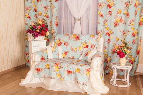
5. Ruffled Bedding
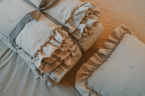
Ruffles tend to get labeled as fussy or overly romantic, especially when layered excessively. Many people remember 1990s bed-in-a-bag sets with matching shams and dust ruffles. But textured bedding has long been used to add dimension and softness to a room. The trick is restraint and contrast.
Opt for a duvet with subtle ruffle detailing instead of full-on cascading layers. Pair it with crisp sheets and modern nightstands to balance the softness. Sticking to a monochromatic color scheme keeps it from feeling overly sweet. When styled with intention, ruffles read cozy and inviting instead of outdated.
6. Glass Block
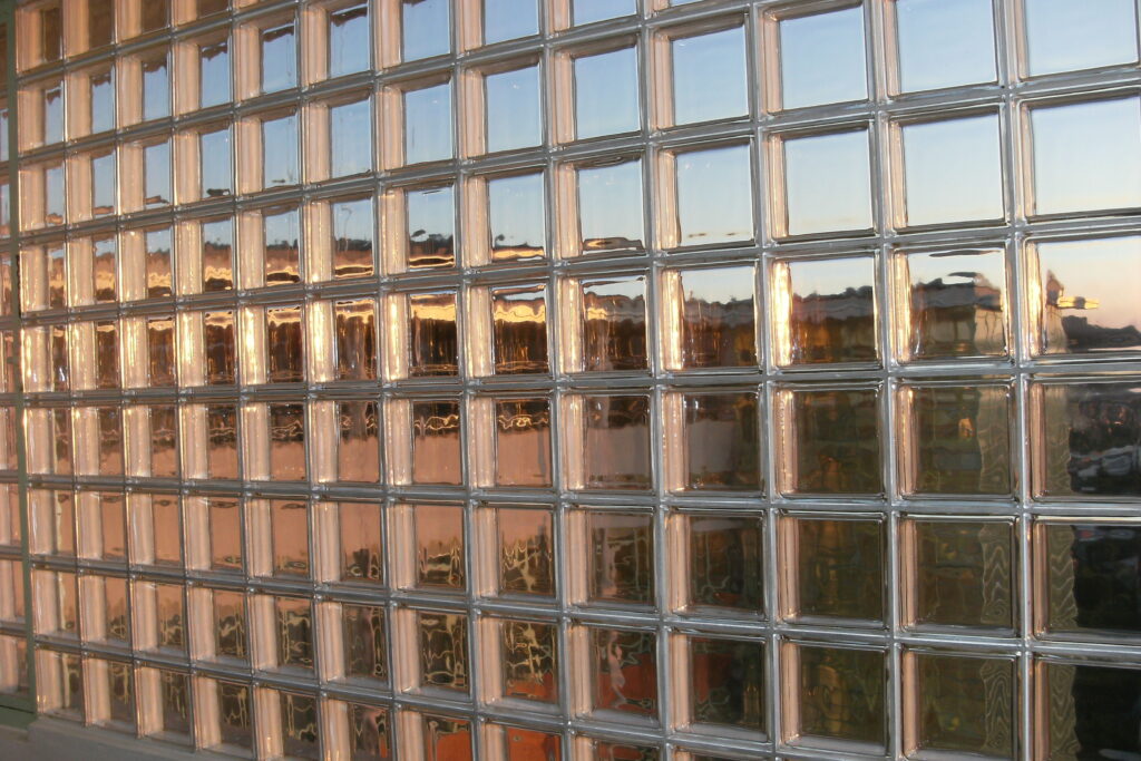
Glass block walls were especially popular in the 1980s and 1990s, often used in bathrooms and entryways. Because of that strong association, they can feel immediately dated. Yet glass blocks were originally embraced for their ability to transmit light while preserving privacy. They are still used in contemporary architecture for exactly that reason.
In smaller applications, like a shower partition or a transom window, glass block can look sleek and functional. Pairing it with minimalist tile and matte finishes keeps the focus on texture and light. Avoiding curved walls and overly ornate shapes helps modernize the look. Used strategically, glass block feels architectural rather than nostalgic.
7. Tiled Countertops
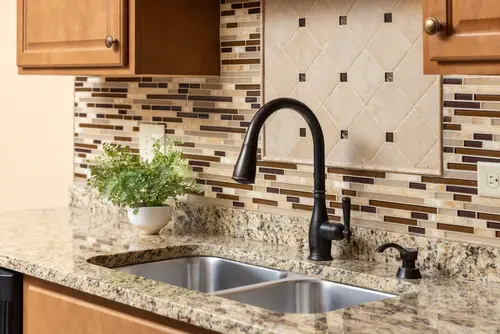
Tiled kitchen countertops were once common, particularly in the 1970s through 1990s. Grout lines and small square tiles can make people think of older, heavily patterned kitchens. However, tile has always been valued for its heat resistance and customization options. The dated feeling often comes from busy patterns and contrasting grout.
Large-format tiles with minimal grout lines instantly look more current. Choosing a grout color that closely matches the tile creates a seamless effect. Pairing tiled counters with simple cabinetry and open shelving helps them feel intentional. Done right, they can look artisanal and charming instead of purely retro.
8. Wicker Furniture
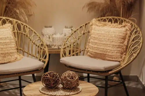
Wicker furniture often brings to mind sunrooms from decades past or overly themed coastal spaces. Its lightweight, woven texture can feel casual to the point of being kitschy. But wicker and rattan have been used for centuries in furniture design because they are durable and flexible materials. Designers frequently reintroduce them in updated silhouettes.
Mixing wicker chairs with contemporary upholstery or metal tables adds contrast. Painting wicker in black or keeping it in a natural tone can shift its vibe dramatically. Using it indoors alongside modern art and clean-lined pieces makes it feel curated. In the right setting, wicker reads relaxed and organic rather than outdated.
9. Terrazzo
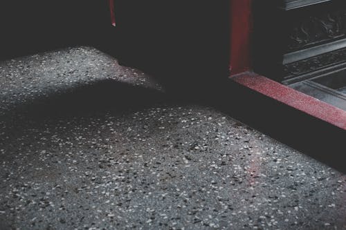
Terrazzo flooring peaked in popularity in mid-20th-century commercial buildings and homes. For a while, its speckled look was considered too busy or institutional. In reality, terrazzo dates back to 15th-century Italy, where it was developed as a way to reuse marble scraps. Its durability and unique patterns have kept it in use for centuries.
Modern terrazzo often features larger chips and unexpected color combinations. Using it sparingly, like on a backsplash or coffee table, keeps it from overwhelming a space. Pairing it with minimalist cabinetry and neutral walls highlights its artistry. Instead of dated, it can feel playful and distinctly contemporary.
10. Wood Paneling
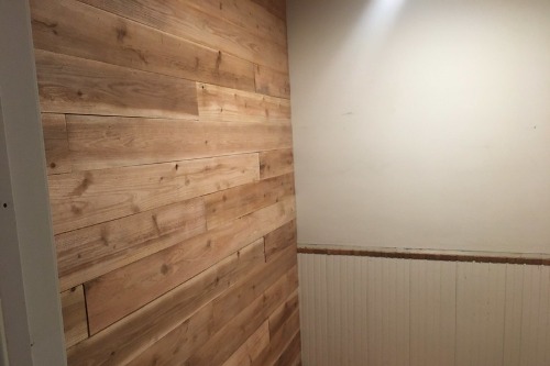
Wood paneling, especially the thin, dark varieties common in the 1960s and 1970s, can instantly feel heavy. Many people associate it with dim basements or retro dens. However, wood-clad walls have long been used to add insulation and visual warmth. The issue is often the color and lighting, not the concept itself.
Painting paneling in a light neutral shade can transform the entire room. Alternatively, embracing rich wood tones and balancing them with modern furniture creates a moody, sophisticated effect. Adding layered lighting keeps the space from feeling cave-like. With the right styling, paneling feels cozy and intentional rather than stuck in another decade.
11. Pastel Bathrooms
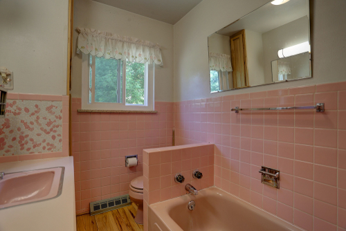
Pastel fixtures in pink, mint, or baby blue were common in mid-20th-century homes. Many of these bathrooms, installed in the 1940s and 1950s, are still intact today. Because they are so distinctive, they can feel frozen in time. Yet their color and craftsmanship are part of a specific design era, not inherently bad taste.
Leaning into the palette with complementary wallpaper or modern lighting can make the space feel curated. Swapping dated accessories for sleek mirrors and updated hardware creates balance. Keeping the tile and tub while simplifying everything else honors the original design. Styled thoughtfully, pastel bathrooms feel vintage and charming instead of outdated.
12. Slipcovered Sofas
Slipcovered sofas are often linked to casual 1990s living rooms or beach houses. Wrinkled fabric and oversized silhouettes can make them seem sloppy. But slipcovers have practical roots, originally used to protect upholstered furniture and make cleaning easier. They’re still valued for their versatility and washability.
Choosing tailored slipcovers in structured fabrics instantly elevates the look. Neutral colors paired with modern coffee tables or sculptural lighting add sophistication. Keeping the fit snug prevents that overly relaxed vibe. Done well, a slipcovered sofa feels comfortable and intentional rather than dated.
13. Patterned Tile Floors

Small, highly patterned tile floors were popular in various decades, from Victorian encaustic tiles to bold 1990s motifs. Over time, some patterns became closely tied to specific eras. That strong association can make them feel outdated at first glance. Still, patterned tile has deep historical roots in many cultures.
Using black-and-white geometric designs or simplified motifs makes the look feel current. Letting the floor be the focal point and keeping walls and cabinetry understated prevents visual overload. Updating grout and maintaining clean lines goes a long way. When balanced properly, patterned tile floors look expressive and timeless rather than dated.
This post Decor Pieces That Only Look Dated Until Styled Correctly was first published on Greenhouse Black.