
1. Coordinating Every Single Throw Pillow Like It’s a Puzzle
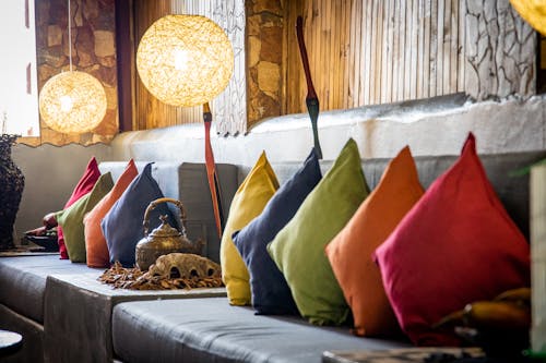
If you grew up flipping through Pottery Barn or Crate & Barrel catalogs, chances are you treat your sofa like a sacred canvas. The pillows must match—but not too much. There needs to be one with texture, one with a subtle pattern, one in a complementary color, and one “pop.” You probably also know that odd numbers look best, thanks to years of seeing professionally styled rooms that followed that exact rule.
This isn’t just about comfort—it’s about visual balance. Catalog homes are curated for the eye, not just for lounging. That habit sticks, and suddenly you’re adjusting pillows before guests arrive like you’re prepping for a photoshoot. People who didn’t grow up in that culture might just see “pillows,” but to you, it’s art.
2. Needing Matching Lamps on Both Nightstands (Even if One Side’s Bare)

Symmetry is a core principle in catalog aesthetics, especially in bedroom layouts. If you were raised around pages filled with serene master suites, you probably internalized the idea that matching lamps equal peace and order. Even if you live alone or have one nightstand, that second lamp will find a way into the picture. It’s not about utility—it’s about visual harmony.
This habit also taps into how catalogs sell the idea of a “complete” life. A set means stability, and that’s something you carry into your own space subconsciously. People without that catalog influence might not even notice or care. But to you, an unmatched side looks like something’s missing.
3. Hanging Art That’s the “Right Size” for the Wall (Not Just What You Like)
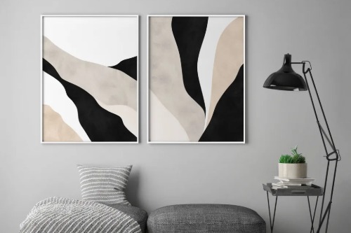
Catalogs never hang an 8×10 on a 12-foot wall. They scale everything meticulously, which means you’ve been trained to see small art on a big wall as… awkward. You might find yourself passing on a beloved piece just because it’s not the “right dimensions” for the space. Or you’ll frame it with a huge mat just to make it look more substantial.
This obsession with proportion comes straight from those styled spreads that drill in the importance of balance and scale. Even if your taste evolves, your brain still runs it through the “would this look right in a West Elm spread?” filter. It’s not that you don’t appreciate quirky or personal art—it just feels wrong when it isn’t the size catalogs have taught you to expect. That’s a habit, not a personal failing.
4. Styling Bookshelves Like They’re on Camera
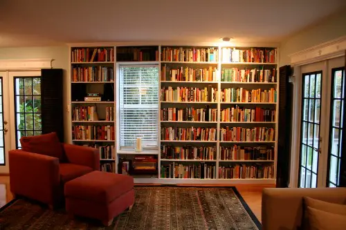
Most people see a bookshelf and think: “Time to store books.” But if you were raised flipping through glossy catalog pages, bookshelves are for “styling”—a delicate mix of books, vases, framed photos, and decorative spheres. You know not to overfill them, and you’ve probably done the whole “stacked-books-horizontal-with-object-on-top” move at least once. This isn’t instinctual—it’s learned behavior from years of exposure to staged perfection.
That doesn’t mean you don’t love books—it just means they can’t mess with the vibe. Even your most treasured hardbacks might get relegated to the bottom shelf if they clash with the color scheme. Catalogs taught you that aesthetics sometimes trump content. If someone rearranges your shelves without your permission, it feels like vandalism.
5. Using Neutrals as a Personality Trait
Taupe, greige, sand, ivory—if those words were spoken often in your childhood home, you probably believe that loud colors belong in small doses. Catalogs push neutral palettes because they photograph well and appeal to a wide range of buyers. If your early design exposure came from those pages, your brain equates calm and clean with cream and beige. Bold choices feel risky, even when you like them.
This habit is about control as much as style. Neutral tones make it easy to swap out seasonal decor and keep things feeling cohesive. You might find color overwhelming, not because you dislike it, but because it wasn’t part of your “normal.” People raised outside the catalog bubble might see your living room as bland—when to you, it’s perfectly curated.
6. Always Including a Tray on a Coffee Table
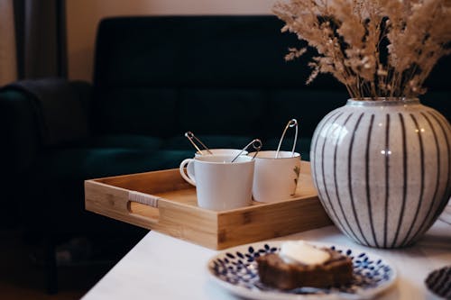
It doesn’t matter what’s on the table—candles, remotes, a tiny succulent—as long as it’s corralled on a tray. This one’s straight out of the catalog playbook, where trays are used to create tidy, contained groupings that make a space feel organized. It’s a visual anchor, and once you start doing it, a bare table looks “off.” Even if the tray isn’t functional, it gives the illusion of intentional design.
It’s not that you’re inherently more organized—it’s that you’ve absorbed visual cues about what “styled” looks like. Trays are the coffee table equivalent of underlining a sentence for emphasis. People without that catalog background might see clutter where you see composition. But for you, the tray is non-negotiable.
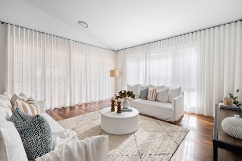
7. Obsessing Over Rugs That “Define the Space”
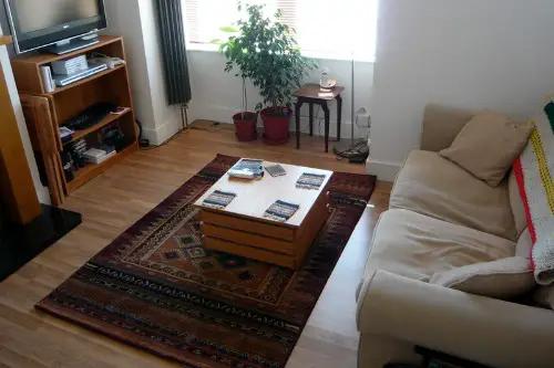
Catalogs love open-concept rooms, and they use rugs to give them structure. So if you were raised on those visuals, you’ve probably internalized that every furniture group needs its own rug—even if it’s tiny. It’s not just about comfort underfoot—it’s about drawing invisible lines between areas. That’s why you can’t stand a living room without a rug, or a dining area with chairs that fall off the edge.
This rule comes from those aspirational photos where the rug always fits just right and anchors everything around it. You’ve learned to measure for rugs with the precision of an architect. People who didn’t grow up with that influence might not even notice when the rug is wrong. But you’ll feel it like an itch in your brain.
8. Leaving Blank Space on the Walls—Intentionally
The idea that “every wall needs art” is foreign if you were raised in a catalog home. Catalog spreads often leave walls open to emphasize airiness and light, especially in minimal or Scandinavian-inspired looks. If you absorbed that aesthetic young, you probably feel okay—even proud—when there’s empty space. It creates a sense of calm and lets furniture or lighting do the talking.
This habit often gets misread as “unfinished” by people who equate bare walls with neglect. But for you, it’s a design choice, not a lapse. Blank space is visual breathing room, and you’ve seen it modeled so consistently in catalogs that it feels more intentional than cluttered walls. You may not realize it, but that quiet minimalism is something you were trained to appreciate early on.
This post 8 Decorating Habits That Only Make Sense If You Were Raised in a Catalog was first published on Greenhouse Black.