
1. The Weight of Your Curtains
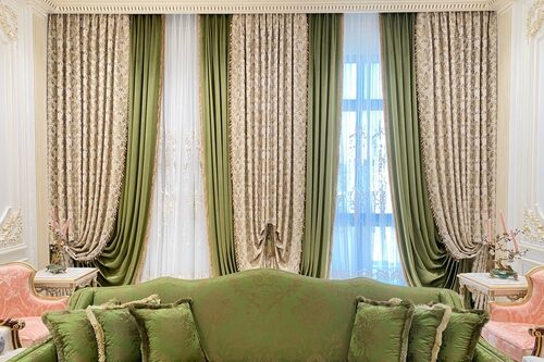
Heavy, lined curtains instantly read as “expensive” because they require more fabric, craftsmanship, and custom fitting. Lightweight polyester or unlined curtains, on the other hand, tend to hang awkwardly and let light through in a way that looks unintentional. Designers often use thick velvet, linen, or silk blends to give a room that quietly luxurious feel. Even if your curtains are neutral, it’s the texture and drape that tell the story.
Beyond aesthetics, well-made curtains serve a functional purpose — they insulate better and reduce noise. That level of practicality usually comes with a higher price tag and indicates thoughtful design. If you’ve ever noticed how hotel rooms feel “finished,” it’s often because of their window treatments. Skimping here can make an otherwise elegant space feel unfinished.
2. Matching Hardware Finishes
Mixing metals can work in a carefully curated design, but mismatched finishes often signal a lack of planning or budget. Wealthier homes tend to have cohesive hardware — think matching door handles, cabinet pulls, and faucets. This kind of consistency suggests that someone invested time and money into the details. Brass, matte black, and brushed nickel are all fine — as long as they agree with each other.
The reason this matters is psychological: consistency creates harmony, which our brains interpret as quality. It shows that choices weren’t random but deliberate. Cheap rentals or rushed renovations often skip this step because replacing hardware adds up quickly. That’s why aligned finishes whisper “intentional luxury.”
3. Real Artwork vs. Generic Prints
Original art doesn’t have to cost thousands, but it always carries more depth and individuality than mass-produced prints. Homes that feel elevated often include pieces by local artists, limited editions, or family heirlooms. These suggest personal taste and cultural awareness rather than trend-chasing. Generic art from big-box stores, while convenient, tends to flatten a room’s personality.
Art also subtly indicates leisure — the ability to collect, travel, or engage in aesthetic pursuits. Wealthier homeowners often curate over time, creating a layered look that feels lived-in but refined. Even a single striking piece can change how people perceive your entire space. When art feels meaningful, the home feels more expensive.
4. The Presence of Empty Space
Ironically, one of the clearest signs of wealth is restraint. Cluttered rooms can feel cramped and anxious, while sparse, curated spaces project confidence and calm. It takes both discipline and resources to buy fewer, better pieces. Every empty surface tells visitors, “Nothing here is accidental.”
This concept aligns with minimalist and high-end design philosophies: quality over quantity. The affluent can afford not to fill every wall or corner. It suggests that the homeowner values breathing room — a true luxury in most households. Empty space, when intentional, is a form of quiet power.
5. The Quality of Lighting Fixtures
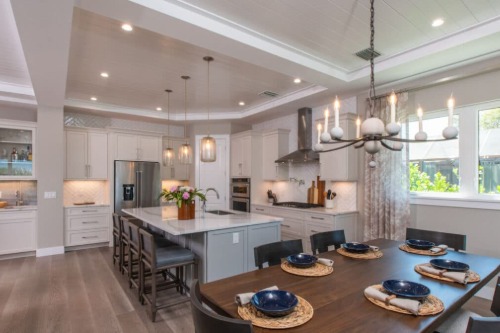
Lighting is often overlooked, but it makes or breaks how everything else looks. High-end homes tend to layer lighting — combining ambient, task, and accent sources. A sculptural chandelier or designer pendant can transform even a modest room into something striking. Cheap, flush-mount lights (the dreaded “boob light”) instantly flatten the mood.
Quality fixtures signal attention to proportion, materials, and tone. Even switching to warm, dimmable bulbs changes how your space feels — and how expensive it reads. Designers know lighting temperature affects how color and texture appear. In short, bad lighting cheapens everything beneath it.
6. Fresh Flowers or Greenery
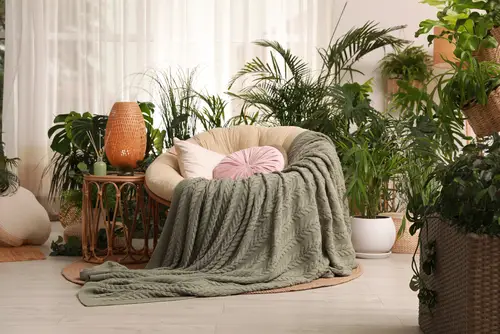
There’s a reason luxury hotels and show homes always have real plants or flowers. They add life, scent, and a touch of impermanence that feels indulgent. Real blooms suggest care and maintenance — things that cost both time and money. Faux arrangements, though improving, still rarely capture the same effect.
Freshness signals abundance, while neglect reads as scarcity. Even a single vase of seasonal stems can lift an entire room. Those who keep plants thriving tend to project an image of stability and mindfulness. It’s not about the bouquet’s price — it’s the ongoing upkeep that impresses.
7. The Smell of the Space
Scent is one of the most powerful subconscious cues of luxury. Wealthier homes often smell subtly curated — like sandalwood, linen, or a faint floral blend. Synthetic air fresheners, especially plug-ins, can come off as artificial or overpowering. A quiet, layered scent feels more natural and expensive.
High-end candles or diffusers are crafted with better-quality oils that linger softly rather than shouting. A pleasant aroma also suggests cleanliness and care. Even guests who can’t pinpoint the fragrance will sense the difference. It’s the kind of detail that whispers refinement rather than shouting for attention.
8. Rugs That Fit the Room
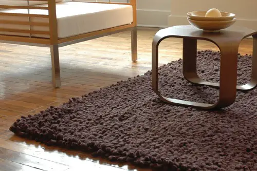
A too-small rug is one of the fastest ways to make a space look cheap. In luxury interiors, rugs are large enough that at least the front legs of major furniture pieces rest on them. This proportional choice makes a room feel anchored and intentional. Small “floating” rugs make furniture look disconnected.
The reason comes down to scale and investment. Larger rugs cost more, both in materials and cleaning, but they unify the design. Designers often custom-fit rugs for irregular spaces, which adds another layer of perceived expense. Simply sizing up can make a massive visual difference.
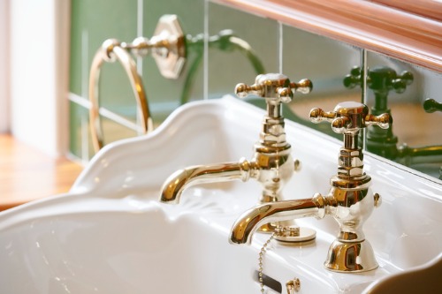
9. Framed Mirrors Instead of Builder-Grade Glass
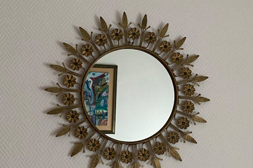
That frameless sheet mirror over the bathroom vanity? It’s a dead giveaway of budget construction. Framed or beveled mirrors, on the other hand, instantly elevate a space. They add depth, craftsmanship, and a sense of permanence. It’s a small change with a big psychological payoff.
Framed mirrors also reflect better lighting and hide aging edges that plain glass can’t. They suggest customization — a sign of taste and care. Even an inexpensive frame can make a basic mirror look tailored. In design, “finished” always reads as “luxurious.”
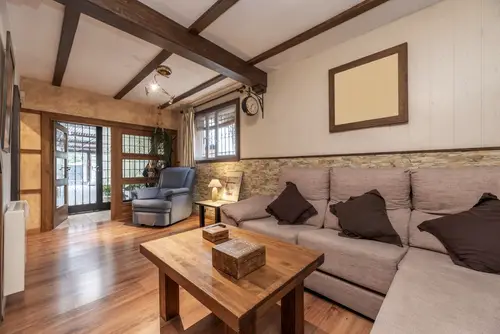
10. Consistent Flooring
Transitions between flooring types are another subconscious wealth signal. When every room flows seamlessly — say, continuous hardwood or stone — it feels expansive and intentional. Budget homes often switch materials abruptly, like carpet to laminate to tile. Each transition interrupts visual flow and hints at staged upgrades.
Continuous flooring isn’t just aesthetic; it requires larger material orders and professional installation. That cost signals permanence and quality. It also increases the sense of spatial harmony, which our brains read as luxurious. Inconsistent flooring, by contrast, feels patchwork and provisional.
11. Upholstery That Fits Properly
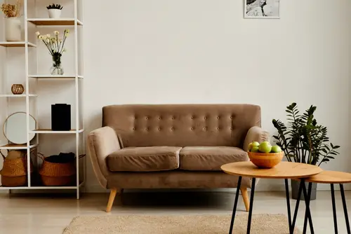
Slipcovers that sag or cushions that look deflated instantly cheapen a space. Well-upholstered furniture — with taut seams and high-quality fabric — always looks richer. This is because proper upholstery involves skilled labor and precise tailoring. The result is structure, which we associate with durability and care.
Even if your furniture isn’t designer, reupholstering in a natural fabric like linen or velvet can completely change the perception. Loose-fitting covers suggest improvisation, while crisp lines imply planning. The tactile quality of upholstery affects how guests perceive the entire room. Comfort and craftsmanship go hand in hand.
12. Hidden Cords and Electronics

Visible wires and cluttered cables signal disorganization — the opposite of luxury. High-end spaces often hide their tech: TVs recessed into walls, cords routed behind furniture, or sound systems integrated seamlessly. This creates a calm visual field where design takes center stage. The fewer distractions, the more expensive a room feels.
It’s not just aesthetics; it’s also about perceived control. When everything functions smoothly without visible chaos, it communicates efficiency and intention. Cord management costs effort and sometimes construction, which reads as investment. A tidy setup makes even modest tech look sophisticated.
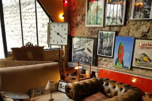
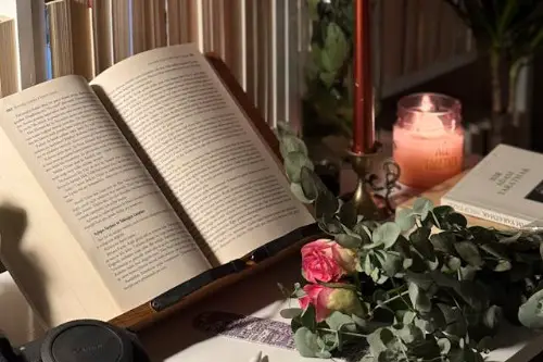
13. Books That Look (and Are) Read

Stacks of real books — not decorative props — add depth, education, and authenticity. They show curiosity, which wealth often affords in both time and exposure. A library, even a small one, suggests cultural capital beyond money. Conversely, empty shelves or fake spines can feel hollow.
Books signal engagement with the world, something timelessly tied to refinement. It’s not about how many you have, but how they’re presented — well-thumbed, organized, and personal. Designers often use books to add warmth and intelligence to a space. In the end, genuine interest always looks rich.
This post 13 Decorative Touches That Subconsciously Signal Wealth — or the Lack of It was first published on Greenhouse Black.