
1. Tuscan-Style Kitchens
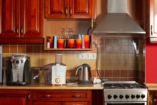
Tuscan kitchens peaked in the late 1990s and early 2000s, when faux-European luxury was everywhere. Think dark cherry cabinets, heavy distressing, tumbled stone backsplashes, and ornate corbels. At the time, it felt warm and upscale, especially compared to the white kitchens of earlier decades. Now it often feels heavy, dim, and overly themed.
The problem is how specific the look is to that era’s idea of wealth. Advances in lighting and open-plan living have made dark, enclosed kitchens feel impractical. The faux-aging techniques also tend to look artificial once trends move on. When you see a full Tuscan kitchen, it’s almost impossible not to date it to a specific housing boom moment.
2. Wall-to-Wall Shag Carpet
Shag carpet is practically a mascot for the 1970s, especially in colors like avocado, harvest gold, and burnt orange. The extra-long pile was originally meant to feel luxurious and cozy underfoot, which made sense in an era obsessed with comfort. Today, it instantly signals its age because it traps dust, odors, and allergens far more than modern flooring. Even when it’s new, the texture alone tends to read as retro rather than intentionally vintage.
The bigger issue is that shag carpet dominates a room visually and physically. It limits furniture choices because legs sink in and surfaces never feel level. Modern interiors favor cleaner lines and materials that let architecture shine instead of swallowing it. When people see shag, they don’t think “timeless,” they think “sunken living room with conversation pit.”
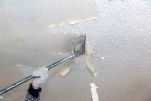
3. Sponge-Painted Walls
Sponge painting was a huge trend in the 1990s, especially in suburban homes. It was marketed as an easy DIY way to add depth and texture without wallpaper. The mottled, cloudy effect felt artsy and custom at the time. Today, it usually reads as uneven and unintentionally blotchy.
The technique is very hard to refresh or integrate into modern design. It clashes with the clean, flat finishes that define contemporary interiors. Once you notice sponge painting, it becomes the only thing you see on the wall. That visual noise is why it immediately signals its decade.
4. Glass Block Walls
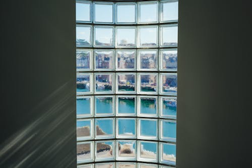
Glass block walls had a big moment in the 1980s and 1990s, especially in bathrooms and entryways. They promised privacy while still letting in light, which felt innovative at the time. Builders used them heavily in tract homes and remodels. Unfortunately, that widespread use made them feel dated very quickly.
The chunky grid pattern is the main giveaway. Modern design tends to prefer uninterrupted glass or clearly framed windows. Glass blocks also limit flexibility because they’re difficult to modify or remove. When people see them now, they often associate them with mall aesthetics or older spa bathrooms.
5. Popcorn Ceilings
Popcorn ceilings became popular in the 1970s and carried into the 1980s because they were cheap and practical. The texture hid imperfections and reduced sound, which appealed to builders. For a while, they were considered standard rather than stylish. Now they’re one of the most complained-about features in older homes.
Visually, popcorn ceilings interrupt clean sightlines and make rooms feel lower. They’re also difficult to repair without drawing attention to patches. Modern ceilings are expected to disappear, not demand attention. When you look up and see popcorn texture, the home’s age is instantly revealed.
6. Mirrored Accent Walls
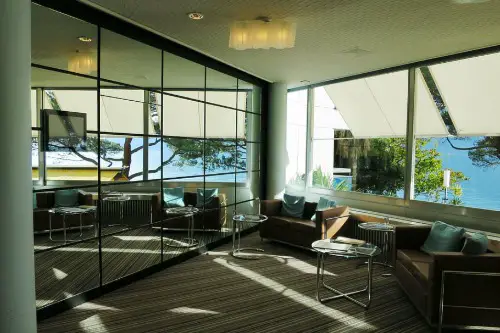
Mirrored walls were especially popular in the late 1970s and 1980s. They were meant to make rooms feel larger and more glamorous. In theory, they reflected light and added drama. In reality, they often doubled clutter and highlighted awkward layouts.
The association with disco-era excess is hard to shake. Full mirrored walls feel performative rather than practical by today’s standards. Modern design uses mirrors strategically, not overwhelmingly. When an entire wall is mirrored, it tends to lock the room into a very specific moment in time.
7. Themed Rooms
Themed rooms, like Tuscan dining rooms or nautical bathrooms, surged in popularity in the 1990s. Homeowners were encouraged to “commit” to a concept using matching colors, accessories, and finishes. This approach made rooms feel cohesive at first. Over time, it became restrictive and visually tiring.
The issue is that themes age faster than individual elements. Once the cultural moment passes, the room feels frozen. Updating becomes expensive because everything is tied to the same idea. That all-or-nothing commitment is why themed rooms are so easy to date.
8. Overdone Chevron Patterns
Chevron patterns exploded in the 2010s, appearing on floors, walls, textiles, and décor. The zigzag felt graphic and energetic, especially compared to the minimalism before it. Designers and homeowners alike leaned in hard. Eventually, the repetition became exhausting.
When chevron is everywhere, it stops feeling like a design choice and starts feeling like a timestamp. The pattern is visually dominant and hard to ignore. Used sparingly, it can still work, but full chevron floors or walls scream a very specific era. That overuse is what dates it, not the pattern itself.
9. Edison Bulbs in Industrial Fixtures
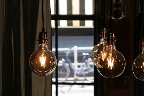
Exposed Edison bulbs became synonymous with the industrial look of the 2010s. They were meant to feel vintage, raw, and authentic. Restaurants, cafés, and homes adopted them almost overnight. Soon, they were everywhere.
The warm glow can be appealing, but the lack of proper light output is a real drawback. Bare bulbs often cause glare and uneven lighting. As lighting design has become more sophisticated, this trend feels lazy rather than intentional. Seeing rows of exposed bulbs instantly places a space in the mid-2010s.
10. Farmhouse Word Art and Signs
Farmhouse-style signage took over in the late 2010s, fueled by social media and home renovation shows. Phrases like “Gather,” “Eat,” and “Live Laugh Love” appeared on walls everywhere. The goal was to add charm and personality. Instead, it often felt generic and mass-produced.
Text-based décor ages quickly because language trends change. Once a phrase becomes ubiquitous, it loses meaning. These signs also tell you how to feel in a space, which can feel forced. When you see them now, they strongly evoke a specific Instagram-driven era.
11. Granite Tile Countertops
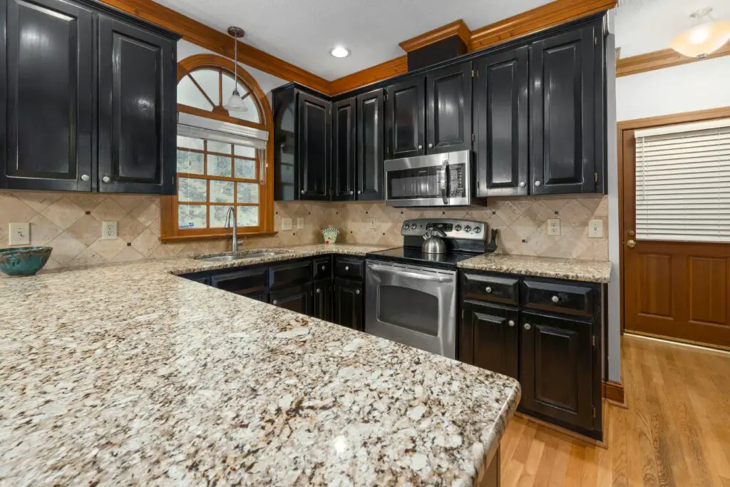
Granite tile countertops were especially popular in the late 1990s and early 2000s. They were seen as a budget-friendly alternative to slab granite. At the time, granite itself symbolized luxury. The tiled version helped more homeowners buy into that look.
The grout lines are the biggest giveaway. They interrupt the surface visually and are difficult to keep clean. Modern kitchens favor continuous materials that feel seamless. When you spot granite tiles, they clearly point to a past phase of kitchen design evolution.
12. Vessel Sinks
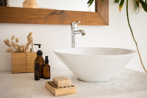
Vessel sinks rose to popularity in the early to mid-2000s. Sitting on top of the counter, they felt sculptural and spa-like. Designers loved the dramatic look and hotel-inspired vibe. Homeowners embraced them as a statement piece.
Over time, practicality became an issue. Vessel sinks splash more easily and can be awkward to use daily. As bathrooms shifted toward integrated, streamlined fixtures, these sinks fell out of favor. Now they’re a strong marker of that early-2000s design mindset.
This post Design Trends That Scream a Specific Decade (in a Bad Way) was first published on Greenhouse Black.