
1. Layered Rugs on Carpet
Stacked rugs on top of wall-to-wall carpet look cozy and stylish in editorial spreads. They add texture and create defined zones, which plays well on camera. But in real homes, layered rugs over soft carpet can become a trip hazard and constantly bunch up. They’re also nearly impossible to keep looking neat if anyone actually walks on them.
Photographers love this trick because it adds dimension and interest under a coffee table or in a bedroom shot. But unless you plan to never touch that area again, it’s not going to hold up. Rug pads can help, but they rarely fix the root issue on soft carpet. You’ll end up constantly adjusting, straightening, or getting frustrated.
2. Furniture with Zero Clearance
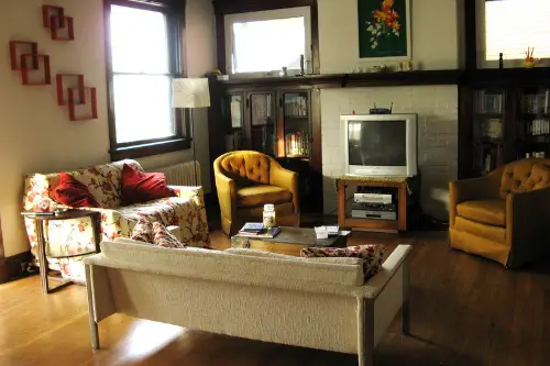
You’ll often see stunning living room shots where the furniture is pushed flush against the walls or tightly packed together for symmetry. It looks clean, sleek, and minimal—but it’s totally impractical for daily life. In real homes, you need clearance for baseboards, cords, airflow, and, you know, actually walking around. Living with furniture that tight leaves no room for flexibility or comfort.
Designers do this in photoshoots to make the room look larger or more “styled,” which works great from the camera’s angle. But in reality, this layout limits how you use the space and makes cleaning a pain. You won’t want to be nudging your sofa away from the wall every time you vacuum. Also, it can lead to scuff marks on both the furniture and your walls—no thanks.
3. Open Shelving Packed with Decor
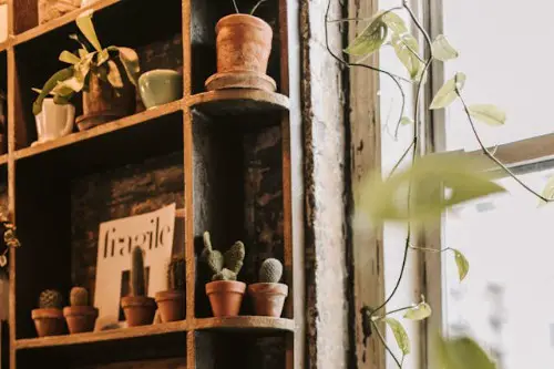
A shelf stacked to the brim with beautiful bowls, vases, and books looks curated and sophisticated in photos. But in real life, all that open storage becomes a magnet for dust—and a visual headache. Unless you’re dusting weekly and constantly editing, it quickly turns into clutter. What reads as “styled” on camera just feels chaotic at home.
This trick works in photos because everything is placed just so and nobody is actually using the shelf. In practice, you need open shelving to function as actual storage, not a display case. Unless you’re living in a museum, you’ll want space to breathe and stash less attractive necessities. Also, say goodbye to spontaneous shelf styling once you’ve got toddlers or pets in the mix.
4. Chairs with No Back Support
Minimalist dining chairs with low or no backs pop up in every stylish shoot—they’re elegant and sculptural. But try sitting in one for more than ten minutes, and your spine will start a protest. These chairs prioritize form over function, which might be fine for a short dinner party, but not for daily use. Comfort takes a backseat (literally) in favor of a lean silhouette.
Stylists use them because they photograph beautifully, especially in open-plan kitchens or modern dining areas. They don’t block sight lines and keep the shot feeling airy. But anyone who’s hosted a long meal knows the importance of proper back support. There’s a reason you rarely see them outside of magazines and cafés.
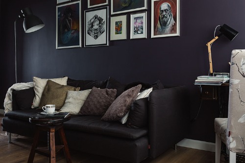
5. Beds with Overstuffed Pillows
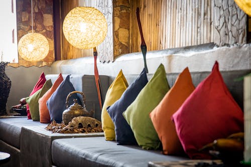
Beds that look like fluffy clouds—overflowing with perfectly chopped throw pillows—are a shoot staple. In photos, this creates depth, dimension, and a sense of luxury. But living with that setup every day? It’s more of a chore than a dream.
Removing ten pillows every night and rearranging them each morning gets old fast. Not to mention, storing them when the bed is in use can be a hassle. Stylists love this look for one-shot wonder moments, but it’s wildly impractical. In a real home, two to four pillows max is the sweet spot for comfort and ease.
6. Accent Lighting That’s Unplugged
Ever notice how lights in photoshoots are glowing softly but there’s no cord in sight? That’s usually because they’ve either hidden or removed the cords entirely. Or worse, the lamp isn’t even plugged in—just lit with Photoshop. While it makes for a clean, magical shot, it’s not how lighting works in actual homes.
You need access to outlets, switches, and cable management in real life. Cordless lamps exist, but they’re pricey and often less reliable. Ignoring cords for the sake of a photo can lead to unrealistic expectations when people try to replicate the look. It’s a great aesthetic cheat that quickly becomes a logistical nightmare off-camera.
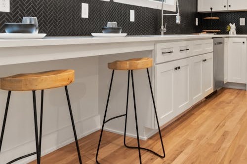
7. Impossibly Clean Kitchens
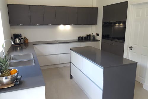
Those sparkling white kitchens with perfectly empty counters and a single bowl of lemons are aspirational—and completely fake. No toaster, no coffee maker, no clutter—it’s a dream that only lasts as long as the photoshoot. In actual homes, those empty counters get covered with daily necessities fast. You need space for prepping, cooking, and storing things you actually use.
Photographers love a minimal kitchen because it reflects light better and feels “aspirational.” But living in one means constantly hiding the basics just to keep the aesthetic. The reality is, a functional kitchen rarely looks untouched. And if it does, someone’s either not cooking—or working way too hard to pretend they aren’t.
8. Plants Placed Where They Can’t Survive
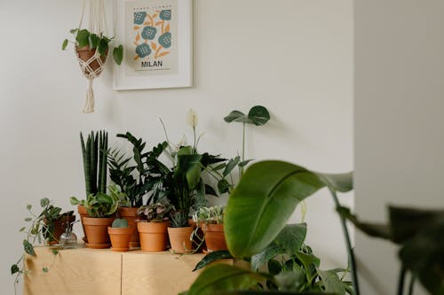
In photos, houseplants often show up in the darkest corners or on high, unreachable shelves. It’s all about balance and composition—but those poor plants are doomed. Without natural light and regular access for watering, most real plants won’t survive more than a few weeks in those spots. Unless you’re swapping them out like a stylist, this trick just doesn’t work long-term.
It’s a clever visual move to soften edges or fill awkward space in a frame. But if you want plants that thrive, you need to place them based on light, not layout. Even low-light plants need some light. The takeaway? Don’t trust a fiddle-leaf fig in a windowless nook—it’s suffering for the aesthetic.
This post 8 Design Tricks That Only Work in Photoshoots—Not Real Homes was first published on Greenhouse Black.