
1. Bedside Tables With No Storage
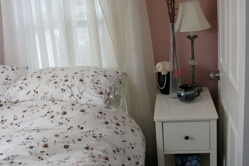
Minimalist nightstands—just a tiny table and a single book or glass of water—look serene in editorial shoots. But try living without drawers or shelves, and suddenly you’ve got your phone charger, hand lotion, and random receipts scattered on the floor. Photographers love the clean lines, but you’ll end up missing the function real fast. Aesthetics take a backseat when your sleep routine involves more than two objects.
It’s also common for shoots to clear away all personal items to keep the frame clean. That’s great for emphasizing the lamp or the wall color, but not helpful when you’re trying to store tissues or a journal. Real nightstands need room for the chaos of real routines. Style is important—but it can’t replace storage.
2. Open Shelving That’s Styled Within an Inch of Its Life
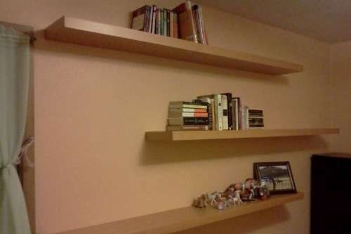
Those dreamy kitchen shots with open shelves filled with curated ceramics and artfully placed cookbooks? Gorgeous in photos—but good luck keeping them that pristine day to day. Real homes deal with dust, grease, and actual meals, not to mention mismatched mugs and snack packaging. The carefully styled shelves are often set up just for the shoot, sometimes even with items temporarily tacked in place.
In everyday life, open shelving becomes a visual clutter trap unless you’re ruthlessly organized or never cook. What looks like minimalism in a photo often means hiding the real storage somewhere else. It’s not sustainable unless you’re Marie Kondo’s most devoted follower. Cabinets exist for a reason—they hide the mess real life brings.
3. Rugs That Are Comically Too Small
In magazine spreads, you’ll sometimes see a beautiful rug floating like a postage stamp in the middle of a room. It may look chic in a photo, but in real life, rugs that are too small make a space feel disconnected and awkward. Designers often cheat this for editorial shots because the frame is cropped tightly—no one sees the edges. But in an actual home, a rug should anchor your furniture, not look like it got lost on the way to the living room.
When you try this in your own space, you’ll likely end up with furniture half on, half off the rug, or no visual cohesion at all. The result is usually more irritating than elegant. The rule of thumb: at least the front legs of sofas and chairs should sit on the rug. That’s one trick that can’t be fudged outside a lens.
4. Oversized Art Leaning Casually on the Floor
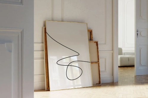
You’ve seen this: massive art pieces leaning against the wall, just so. It makes a space feel effortless and artsy—but it’s not practical if you have kids, pets, or even a Roomba. In real homes, unmounted art becomes a hazard, prone to falling or getting damaged. It’s often staged this way because hanging large art is tricky and time-consuming, especially on set.
In a photo, the lean looks editorial and intentional. But in day-to-day living, you’ll quickly realize it’s not secure and often just in the way. Wall-mounted art isn’t just safer—it’s more spatially efficient. That floor space can actually be put to better use.
5. Chairs That Are Pretty but Painful
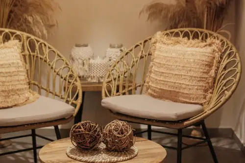
Design shoots love a sculptural chair—something with sleek lines or avant-garde angles. But if you’ve ever tried sitting in one for longer than ten minutes, you know the aesthetic often wins out over comfort. These pieces are usually chosen for their silhouette in a photo, not how they feel during a Netflix binge. A lot of them are even rentals or props brought in for one day.
In a real home, uncomfortable furniture becomes regrettable furniture fast. You’ll end up sitting somewhere else entirely, and the expensive art-chair becomes a dust collector. It’s the classic “form over function” problem. Don’t fall for the trap just because it looked cool in print.
6. Plants Placed in Impossible Corners
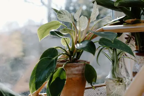
Giant fiddle leaf figs or monsteras placed dramatically in dark corners are photo gold. But without proper sunlight, those plants are on a slow march to death. Stylists often bring in lush greenery for the vibe, shoot the space, and then take them away before they wilt. In some cases, the plants are even fake—just realistic enough for the camera.
At home, plants need what they need: light, water, and airflow. Placing one in a dim corner because it “looked good in the magazine” just sets you up for disappointment. That lush look is hard to maintain unless you’re a dedicated plant parent with a lighting strategy. The takeaway? Style around your plant’s needs—not the other way around.
7. Impractically Styled Coffee Tables
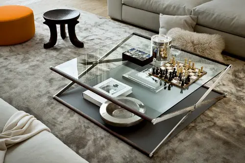
Photoshoot coffee tables are a masterclass in balance: a stack of books, a tray with candles, maybe a tiny vase of flowers. But what they lack is any space to actually put down a drink or your feet. In real life, coffee tables are used—heavily. When styled like a still life, they stop being functional.
What’s more, many of these tables are cleared and styled for just the shot, often with items borrowed or staged. You don’t see the remote controls, coasters, or snacks that would normally clutter the surface. Without that function, the style just doesn’t hold up. You need a surface you can actually use—not one that’s only good for Instagram.
8. All-White Everything
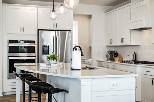
That pristine, all-white look—white walls, white sofa, white rug—is pure editorial candy. It creates a blank canvas that makes any space look bigger and brighter in photos. But in real homes, especially with kids or pets, it’s a stain magnet. Stylists may even bring in a brand-new white sofa just for the shoot, then return it afterward.
Maintaining that level of whiteness is a full-time job. One coffee spill or muddy paw print, and the illusion is gone. White upholstery fades and shows wear fast, and white floors need constant cleaning. It may photograph like a dream—but it lives like a nightmare.
This post 8 Design Tricks That Only Work in Photoshoots—Not Real Homes was first published on Greenhouse Black.