
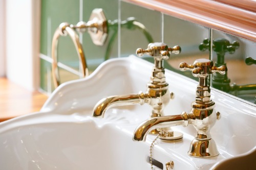
1. Gold Overload
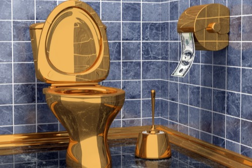
Gold accents can elevate a space, but when everything is gold, it stops feeling sophisticated. Too many matching metallic finishes make a room look overstyled and artificial. A touch of brass or antique gold goes further than an entire room of reflective surfaces. True elegance comes from contrast, not saturation.
The best designers use metallics sparingly—like jewelry for a room. They mix tones such as brushed nickel or aged bronze to add character. When gold is used in balance, it enhances warmth and luxury. When it dominates, it becomes costume instead of class.
2. Overly Shiny Finishes
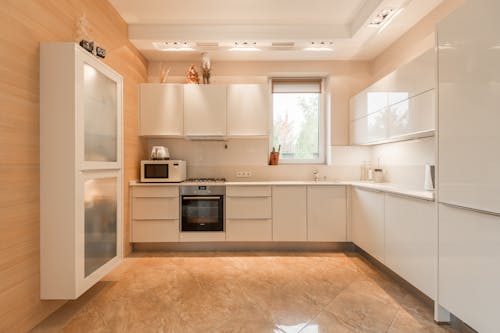
High-gloss furniture and surfaces often look sleek in photos but feel cheap in person. They reflect every fingerprint, smudge, and scratch, which instantly lowers the sense of quality. Designers often prefer satin or matte finishes because they diffuse light more softly and age better. When everything gleams like a mirror, it starts to resemble low-cost laminate rather than craftsmanship.
The psychology of sheen plays a big role in perceived value. People tend to associate subtle luster with durability and depth. Too much shine makes materials feel thinner and more synthetic. That’s why matte finishes dominate in higher-end interiors and premium packaging design alike.
3. Faux Marble Surfaces
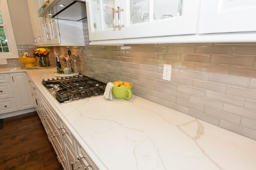
Printed marble patterns on plastic or laminate may save money but rarely fool the eye. The repeating veining patterns give away that it’s fake, even from a distance. Real stone has variation, translucency, and mineral depth that copies can’t replicate. When the illusion breaks, so does the perception of luxury.
Designers often use quartz or composite materials as a better alternative because they mimic natural stone more convincingly. These options have realistic depth and less pattern repetition. The trick is to choose subtle veining and matte textures instead of high-contrast gloss. A restrained, believable finish always looks more expensive than a loud fake one.
4. Visible Machine Seams
When you can see welds, screws, or joint lines on furniture, it suggests cost-cutting. These visible seams draw attention away from design and toward construction flaws. High-end pieces hide those details, creating smooth transitions and clean silhouettes. It’s not just an aesthetic issue—it’s also a signal of quality control.
Good design integrates seams as part of the overall look rather than an afterthought. Even affordable pieces can seem more expensive with careful joinery. Hidden fasteners and flush connections make an item feel solid and intentional. When seams stand out, they break the illusion of craftsmanship.
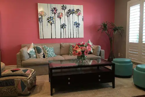
5. Too Much Statement Wallpaper
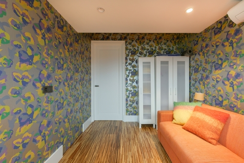
A bold wallpaper can make a room pop, but when every wall demands attention, the effect is exhausting. Large patterns and shiny finishes overwhelm the senses and shrink the perceived space. Luxury interiors usually limit bold prints to one accent wall or small room. It’s about balance, not boldness for its own sake.
When used sparingly, wallpaper feels custom and curated. When overused, it reads like a showroom display. Even expensive prints can look cheap if they dominate the space. Subtle texture or tone-on-tone patterning creates a richer, calmer impression.
6. Imitation Metal Finishes
Spray-painted “gold” or “silver” items rarely age gracefully. The coatings chip, flake, or dull quickly, revealing the base material beneath. Real metal finishes, even if brushed or tarnished, develop patina that signals authenticity. Faux versions tend to look flat and disposable.
Designers often prefer solid brass, iron, or aluminum because of their tactile feel and longevity. Even a small detail like a real metal drawer pull can change the entire perception of a piece. The difference is immediately noticeable when you touch it. Texture, weight, and sheen all contribute to a sense of quality.
7. Overuse of LED Strip Lighting
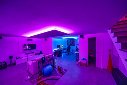
LED strips have their place, but too many make a room feel more like a retail display than a home. Bright, cool-toned lighting flattens textures and kills warmth. Subtle, warm, and indirect lighting feels more intentional and high-end. It draws the eye softly instead of shouting for attention.
Designers use light layering to create depth—combining ambient, task, and accent lighting. When every edge glows, that layering disappears. Harsh LEDs can make even good materials look cheap and cold. A dimmer and a warmer tone can instantly restore balance.
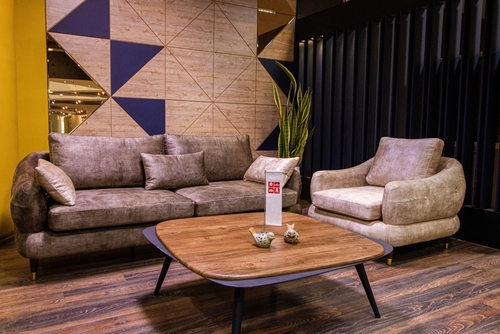
8. Matchy-Matchy Decor
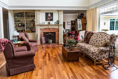
Perfectly matched furniture sets might seem safe, but they lack depth and individuality. When every wood tone, color, and texture is identical, it feels staged rather than lived-in. Designers create tension and interest by mixing finishes and eras. That mix gives a room authenticity and warmth.
Even subtle variation—like pairing light wood with darker accents—adds sophistication. The human eye appreciates balance over uniformity. A room full of identical materials feels one-note and impersonal. Variety, when done with intention, signals designer-level confidence.
9. Cheap Hardware
Hardware is a small detail with big influence on perceived quality. Hollow, lightweight knobs and handles instantly make cabinetry feel mass-produced. Solid metals like brass, bronze, or stainless steel add satisfying heft and durability. It’s one of the simplest upgrades for elevating a space.
Designers often refer to hardware as “the jewelry of the room.” It’s tactile, noticeable, and frequently used, so people subconsciously judge quality through it. Swapping cheap pieces for heavier, well-finished ones changes the entire experience. Even if the furniture is modest, the feel can become premium.
10. Overly Trendy Color Palettes
Trendy colors catch attention online but age faster than most other design choices. Once a shade becomes mainstream, it starts feeling less special. Timeless design relies on balanced neutrals with small pops of color. That restraint keeps spaces feeling current without looking desperate for attention.
People tend to associate longevity with value. When something feels too “of the moment,” it also feels disposable. Designers know to use trendy colors in accents, not core pieces. A little trend goes a long way toward freshness without cheapening the overall look.
11. Excessive Branding
When logos dominate the design—whether on furniture, towels, or accessories—it comes off as insecure rather than stylish. True luxury doesn’t need to announce itself loudly. Subtlety and craftsmanship speak louder than branding ever can. Overexposure turns prestige into pretense.
Designers often choose anonymous, well-made pieces that blend seamlessly into a cohesive space. That approach makes the home feel curated instead of commercial. The more quietly confident the design, the more expensive it feels. Overt branding breaks that illusion by focusing attention on the label instead of the quality.
12. Overdecorating with “Designer” Pieces
Filling every surface with expensive items doesn’t make a room luxurious—it makes it cluttered. Too many focal points compete for attention and reduce the impact of each. Designers rely on negative space to give objects room to breathe. That restraint makes the few standout pieces truly shine.
Quality design is about editing as much as adding. Each object should serve a visual or emotional purpose. When a room feels crowded, even the nicest things lose their meaning. Luxury is as much about space as it is about style.
This post 12 “Designer Touches” That Lower Perceived Quality on the Spot was first published on Greenhouse Black.