
If you’re someone who sees the world in full spectrum and loves making bold, beautiful choices, 2025 is shaping up to be your kind of year. Designers and trend forecasters are already signaling a vibrant shift in everything from home decor and fashion to branding and paint palettes. Gone are the muted tones of recent years—color is back, and it’s making a statement.
Whether you’re refreshing a room, planning a wardrobe update, or just love staying ahead of the curve, these 14 colors are set to dominate in 2025. From punchy pastels to deep, moody hues, each one reflects the optimism, complexity, and individuality that define the cultural mood. Ready to get inspired? Let’s dive into the shades that are stealing the spotlight.
1. Deep Teal
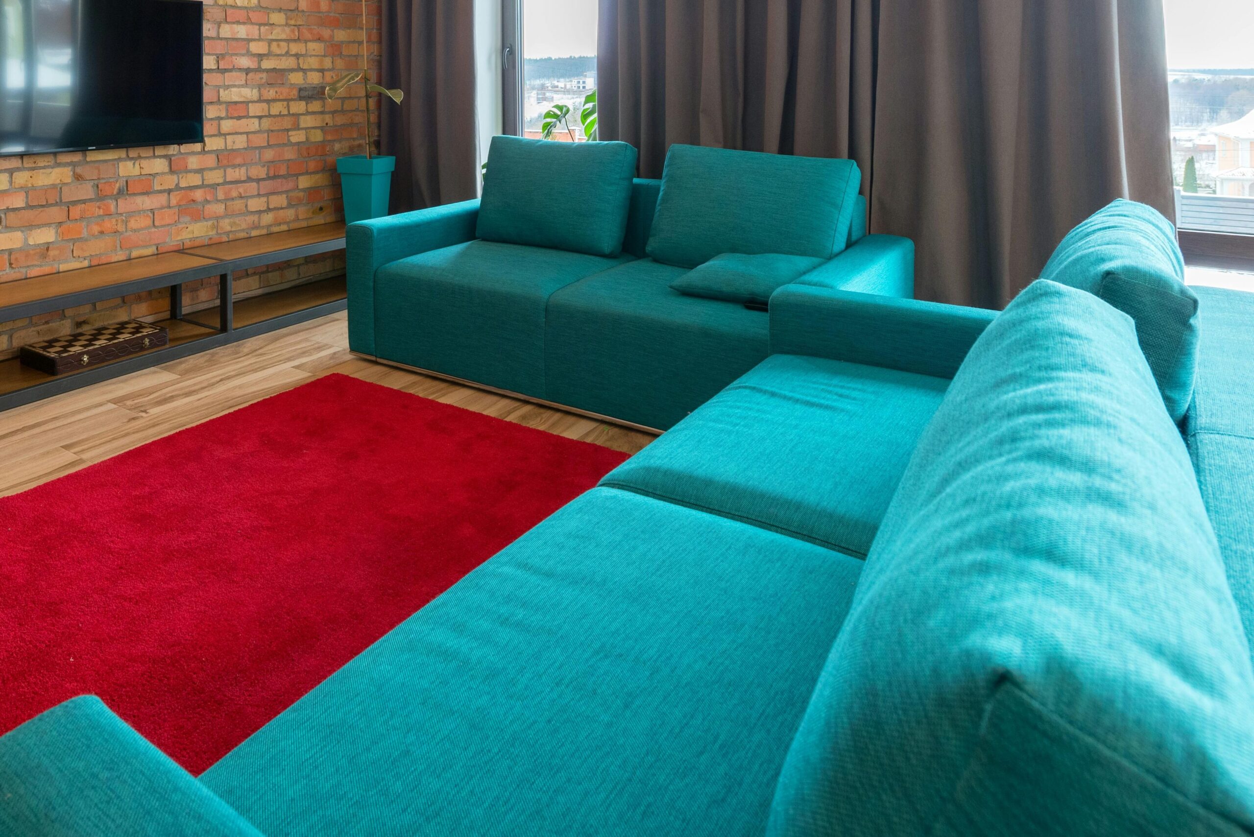
According to Homes & Gardens, deep teal is the perfect blend of green and blue, offering both sophistication and tranquility. It has quickly become a favorite for bedrooms, home offices, and statement furniture, as it exudes a calming yet luxurious feel. The richness of deep teal makes it a versatile shade that can be paired with a variety of color schemes, from warm neutrals to bold jewel tones. This adaptability has made it a top pick for those looking to infuse character into their interiors.
One of the best ways to elevate deep teal is by pairing it with metallic accents like gold, brass, or copper. These finishes enhance the color’s depth and create an upscale, polished look. Additionally, this shade works beautifully in velvet textures, plush upholstery, or even matte-painted walls. Whether used in a contemporary or vintage-inspired setting, deep teal is a color that adds both elegance and a touch of mystery to any space.
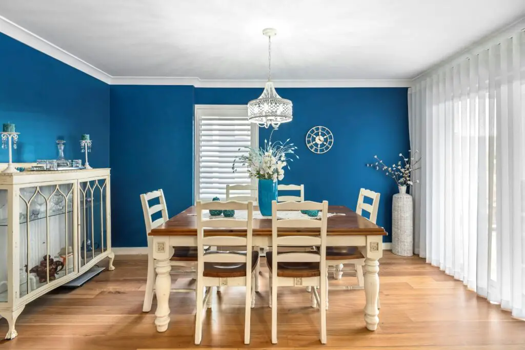
2. Electric Blue
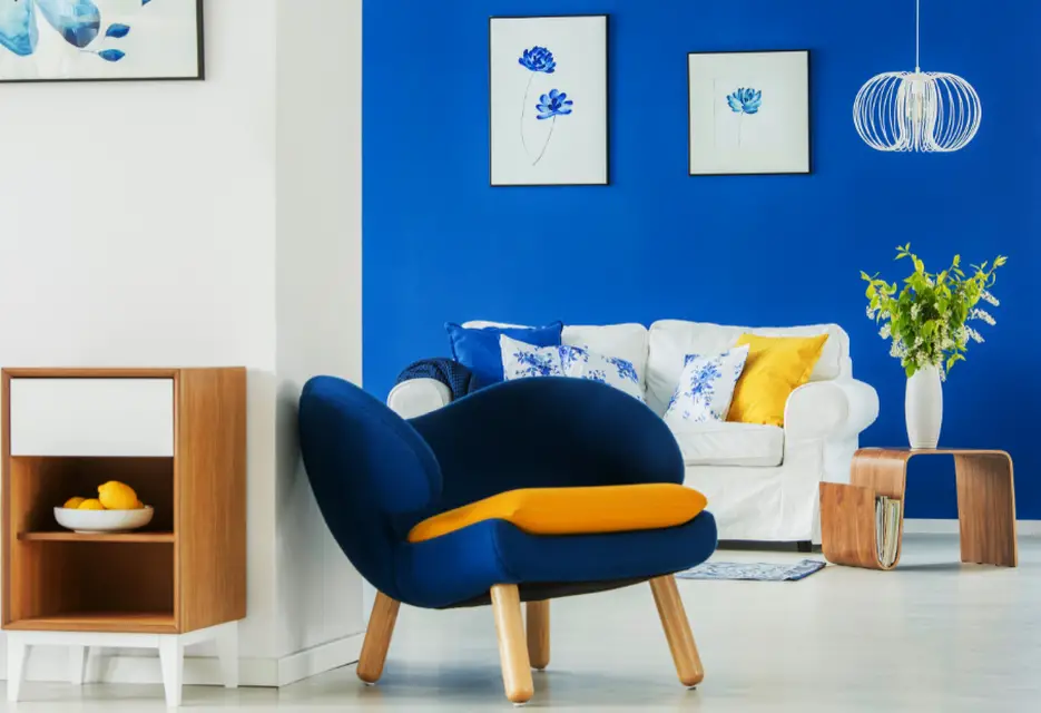
According to Elle Decor, electric blue is one of the most striking shades taking over interiors. This vibrant and eye-catching color is perfect for creating bold statement walls or dramatic kitchen cabinets that pop against neutral tones. It injects energy into any space, making it an ideal choice for contemporary and eclectic designs. To enhance its modern appeal, many designers recommend pairing electric blue with gold or brass hardware for a sleek, polished look.
Beyond aesthetics, electric blue is also associated with creativity and confidence, making it a great option for home offices and artistic spaces. It blends beautifully with contrasting shades like crisp white, deep navy, or even warm wood tones. While it may seem like a daring choice, incorporating this color through furniture, accent walls, or décor elements can instantly elevate a room’s sophistication. For those hesitant to go all in, start with smaller touches like throw pillows or rugs before committing to larger surfaces.
3. Terracotta Red
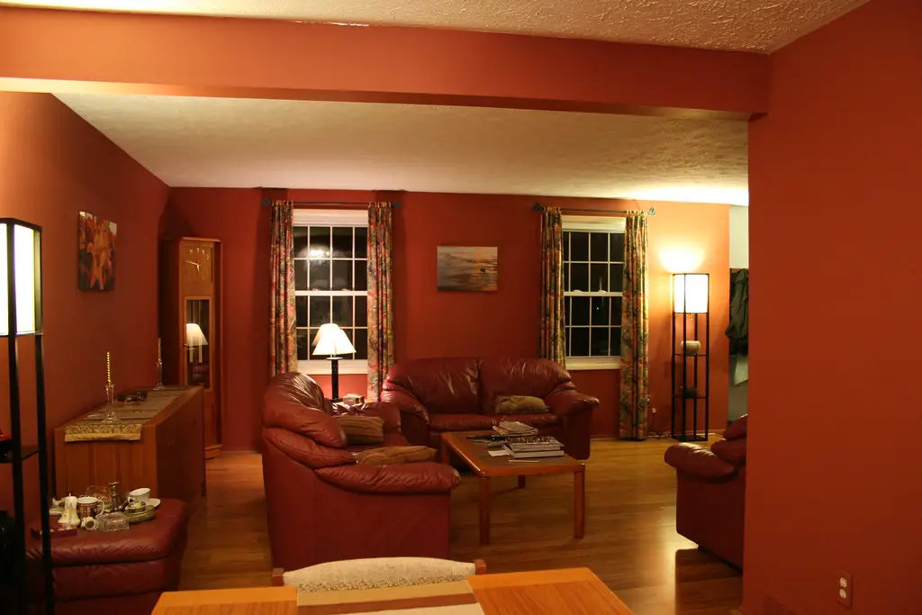
House Beautiful notes that earthy, warm hues like terracotta red are redefining cozy home aesthetics. This rich, inviting shade is perfect for living rooms, dining areas, or entryways, where it creates a welcoming and grounding atmosphere. The warm undertones of terracotta red pair effortlessly with natural materials like wood, linen, and rattan, adding depth and texture to any space. It’s a timeless choice that feels both rustic and modern, depending on how it’s styled.
To balance its boldness, interior designers suggest complementing terracotta red with softer tones like beige, cream, or muted green. When used strategically, it can add a Mediterranean-inspired warmth to homes, making spaces feel sun-kissed and inviting. Accent pieces like terracotta-colored tiles, pottery, or upholstery are great ways to embrace this trend without overwhelming a room. Whether used in a large-scale design or as a subtle accent, this color brings effortless charm and warmth to any space.
4. Mustard Yellow
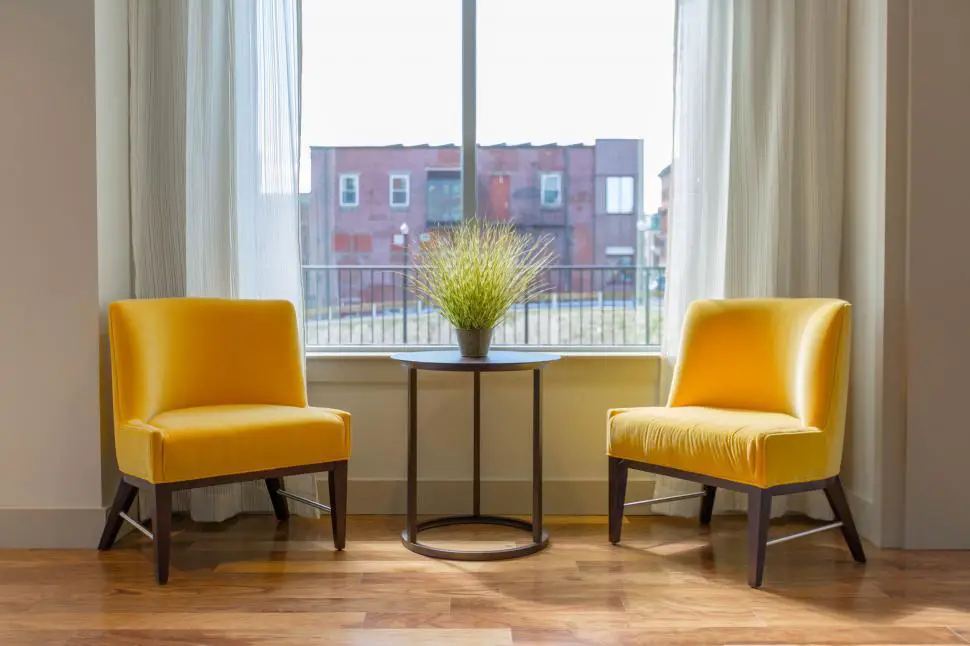
As Real Simple explains, mustard yellow is reclaiming its spot as a bold and nostalgic choice for home interiors. This rich, golden shade brings warmth and vibrancy to kitchens, dining rooms, and entryways, creating a cheerful yet sophisticated ambiance. It works well as a statement wall, cabinetry color, or even in furniture pieces, offering a retro-modern aesthetic that feels both trendy and timeless. Designers love mustard yellow for its ability to brighten up spaces while still maintaining an earthy undertone.
For the best results, mustard yellow pairs beautifully with deep wood tones, navy blue, and crisp white to create contrast. It’s also a fantastic choice for mid-century modern interiors, where it adds a sense of nostalgia and playfulness. If painting an entire room in this hue feels overwhelming, consider incorporating mustard yellow through accessories like curtains, rugs, or accent chairs. This way, the warmth and character of the color can still enhance a space without dominating it.
5. Hot Pink
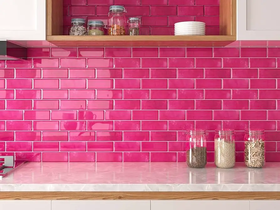
Hot pink is making a bold return in 2025, injecting energy and playfulness into home décor. This vibrant shade is perfect for accent walls, statement furniture, or decorative accessories, instantly brightening up a space. While traditionally associated with youthful or feminine design, hot pink is now being used in modern, high-fashion interiors for a daring and contemporary edge. It’s an exciting way to break away from neutrals and embrace color in a fearless way.
To prevent hot pink from overwhelming a space, designers suggest pairing it with neutral tones like gray, white, or beige. This contrast allows the color to shine without becoming too intense. If an entire wall feels like too much, introducing hot pink through throw pillows, rugs, or artwork can be an easy way to incorporate the trend. Whether used in small doses or as a standout feature, hot pink brings energy and vibrancy into any room.
6. Emerald Green
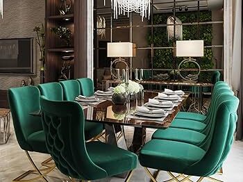
Emerald green is making waves as a luxurious and opulent choice for 2025. This jewel-toned shade is often used in dining rooms, libraries, and sophisticated living areas to create a regal, upscale aesthetic. It exudes richness and pairs exceptionally well with classic décor elements like tufted furniture and dark wood finishes. For those wanting a lush, dramatic interior, emerald green is an excellent way to achieve that timeless look.
To prevent this color from feeling overwhelming, interior designers suggest balancing it with crisp white trim or lighter wood tones. Velvet and metallic accents also enhance its elegance, making it a great choice for those who love a bit of glamour. Whether incorporated through wall paint, furniture, or decorative accents, emerald green brings a sense of depth and grandeur that instantly elevates any room.
7. Dusty Lavender
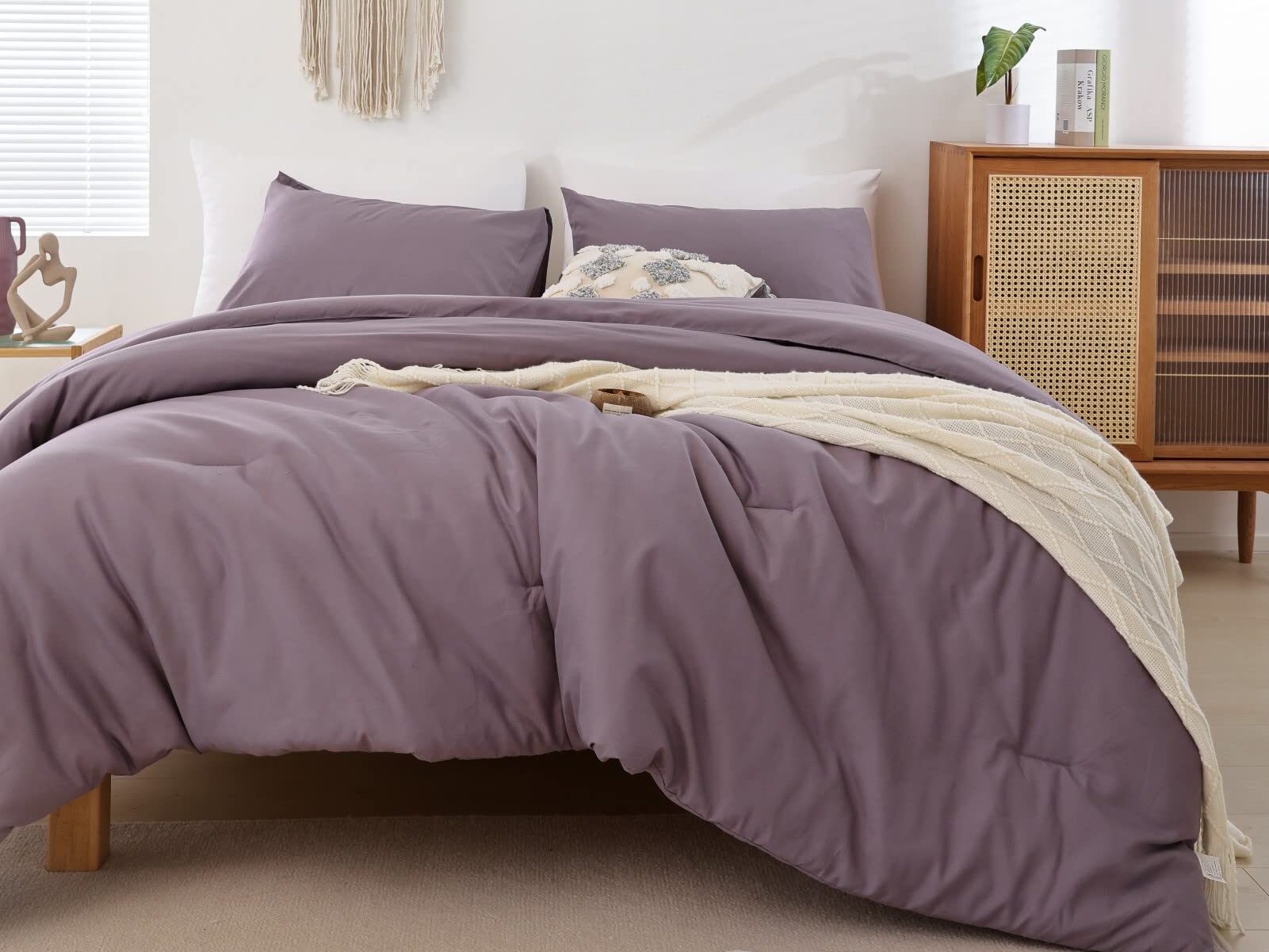
For those looking for a soft yet unexpected color, dusty lavender is a beautiful choice. This muted purple shade is gaining popularity for its ability to bring a calming yet stylish aesthetic to interiors. It’s particularly well-suited for nurseries, bedrooms, and bathrooms, where it creates a serene and inviting atmosphere. Unlike traditional pastels, dusty lavender has a slightly earthy undertone, making it more adaptable to modern design.
Pairing this shade with neutrals like gray, white, or taupe allows it to stand out without overwhelming the space. Soft textures like linen and velvet further enhance its cozy and elegant feel. Whether used as an accent wall, in furniture upholstery, or through subtle décor elements, dusty lavender is a unique way to introduce color into a home.
8. Rust Orange
Rust orange is making a statement in 2025 as a warm, earthy hue that brings vintage charm to modern interiors. This deep, burnt orange shade adds a cozy and inviting feel to living rooms, dining areas, and reading nooks. It pairs beautifully with natural materials like leather, wood, and rattan, creating a balanced and grounded aesthetic. Whether used in textiles, wall paint, or furniture, rust orange is a color that exudes comfort and nostalgia.
To keep the space feeling cohesive, designers recommend pairing rust orange with neutral shades like beige, cream, or muted greens. This combination prevents the color from feeling overpowering while still allowing it to stand out. For those looking to make a bolder statement, rust orange can be layered with deep navy or burgundy for a dramatic, sophisticated look. Whether incorporated in small doses or as a main feature, this shade brings warmth and personality to any home.
9. Peacock Blue
Peacock blue is quickly becoming a favorite in kitchens and bathrooms, thanks to its bold and jewel-like quality. This rich, deep blue has an elegant vibrancy that adds a touch of luxury to any space. Whether used in cabinetry, wall paint, or decorative accents, peacock blue commands attention while maintaining a timeless appeal. Its versatility allows it to complement both modern and vintage interiors effortlessly.
To enhance the sophistication of peacock blue, designers recommend pairing it with gold or copper fixtures. The metallic finishes bring out the depth of the color, adding a refined and polished touch. For a more eclectic look, patterned tiles or bold wallpaper featuring peacock blue can create a dynamic and layered aesthetic. Whether used as a dominant color or an accent, this shade adds richness and charm to any design.
10. Charcoal Black
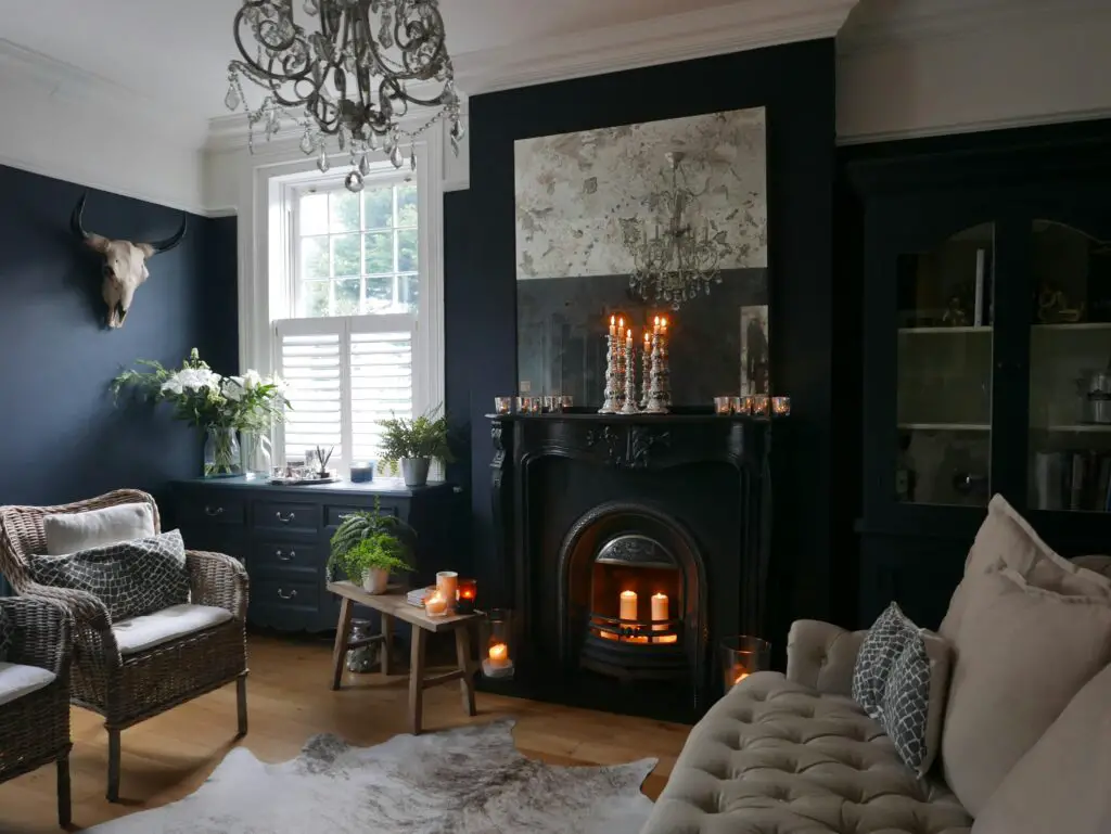
Dark and moody, charcoal black is a trend that’s proving to be both dramatic and sophisticated. Many modern interiors are embracing this bold hue, particularly in bedrooms, bathrooms, and accent walls. While black can feel intimidating, charcoal offers a slightly softer approach, making it more versatile for different spaces. When paired with the right lighting and décor, it creates a striking, high-end atmosphere.
To keep a charcoal-colored space from feeling too heavy, designers recommend incorporating contrasting elements like white or beige furnishings. Metallic finishes and textured materials, such as marble or velvet, can also add dimension and prevent the room from appearing flat. Charcoal black works exceptionally well in minimalist and industrial designs, where it brings an edgy yet refined touch.
11. Olive Green
Olive green is an earthy, grounding color that is gaining popularity for its natural and calming qualities. This versatile shade works beautifully in kitchens, mudrooms, and living spaces, providing a sophisticated alternative to traditional neutrals. It pairs well with organic materials like stone, wood, and linen, creating a cozy and inviting environment. For those who prefer a muted yet rich color palette, olive green is an excellent choice.
Designers recommend combining olive green with black or gold details to enhance its depth and warmth. It also pairs well with soft whites and creams, allowing the color to take center stage without overwhelming the space. Whether used for cabinetry, furniture, or wall paint, olive green brings a sense of balance and harmony to any home. Its understated elegance makes it a timeless addition to both modern and rustic interiors.
12. Warm Peach
Warm peach is making a comeback as a fresh and versatile hue for 2025. This soft yet rich shade adds warmth and light to interiors, making it ideal for bedrooms, living areas, and even kitchens. It provides a cheerful yet sophisticated atmosphere, blending beautifully with a variety of design styles. Whether used in wall paint, upholstery, or décor accents, warm peach is a color that feels both inviting and stylish.
To create a balanced look, designers suggest pairing warm peach with cool grays or crisp whites. This combination prevents the space from feeling too warm while adding a modern touch. For those looking to experiment with color, warm peach also pairs beautifully with sage green or dusty blue for a fresh and airy feel. Whether used in subtle accents or bold statements, this shade is a refreshing addition to 2025’s home color trends.
13. Soft Blue
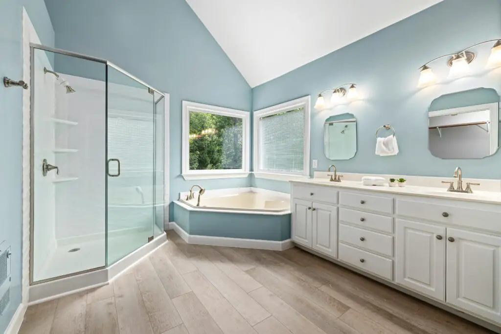
Soft blue is a serene and timeless color that evokes calm and relaxation. This tranquil hue works well in bedrooms, bathrooms, and living areas, creating a peaceful atmosphere that promotes rest and rejuvenation. Blue is a perennial favorite for creating a soothing, serene environment in the home. Whether you choose a pale sky blue or a more muted, dusty blue, the color offers timeless appeal that complements a variety of design styles.
Soft blue pairs beautifully with white, gray, and natural wood tones, creating a fresh and harmonious color palette. It’s a color that never goes out of style, whether it’s used on walls, furniture, or accessories. For a timeless home, soft blue adds a sense of serenity and sophistication that will endure for years to come.
14. Rich Burgundy
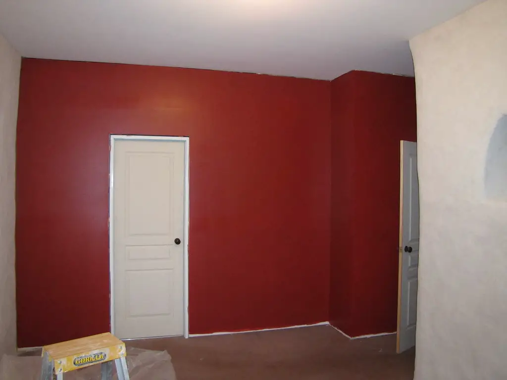
Burgundy is a deep, rich color that adds warmth and sophistication to any room. This bold, classic shade works well in living rooms, dining rooms, and even bedrooms, creating a refined and luxurious atmosphere. Burgundy has been a staple in home design for centuries because of its regal and timeless quality. This color pairs beautifully with gold, gray, and neutral tones to create a rich, sophisticated look.
Burgundy can be used as an accent color or as a primary shade, depending on the mood you want to create. It pairs especially well with wooden furniture and natural fabrics, adding depth and richness to the space. A timeless choice, burgundy remains a favorite for homeowners looking to add a touch of elegance to their interiors.