
1. Shiplap Overload
What started as rustic charm in farmhouse-style homes became a design epidemic. Shiplap walls showed up in every renovation show and every new build. It went from warm and textured to tired and predictable. When every wall has planks, none of them stand out.
Used sparingly, shiplap still adds texture and depth. But personality comes from choosing materials that mean something — maybe reclaimed wood from a local barn or a painted accent that fits your story. Following trends blindly turns style into a uniform. Even Joanna Gaines has moved on.
2. Matching Furniture Sets
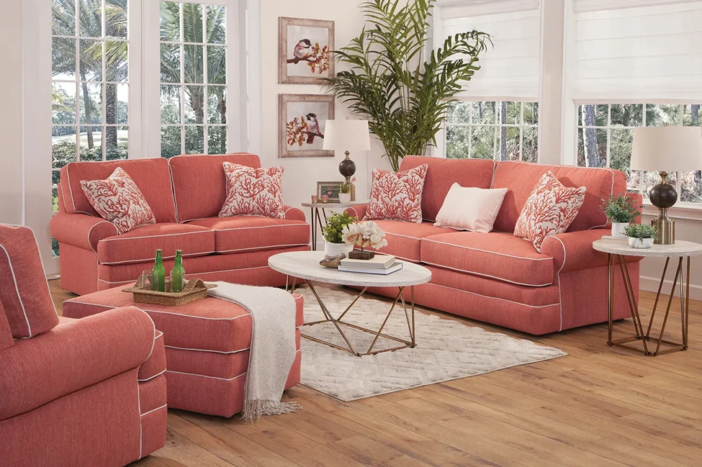
For decades, “good taste” meant buying entire matching furniture sets from a catalog or showroom. It was seen as the safest, most elegant way to make a room look “cohesive.” But those sets often drained homes of personality, turning living spaces into showroom replicas instead of reflections of real lives. Mixing styles, eras, and finishes actually creates depth and warmth — something those cookie-cutter sets rarely achieve.
The idea that everything needs to “match” came from mid-century marketing, when mass production made it easier to sell full-room packages. But homes that lean into contrast — an antique next to a modern chair, or a rustic table with sleek lighting — tell a story. It’s not chaos; it’s character. Good taste, it turns out, isn’t about matching — it’s about meaning.
3. Open Concept Everything
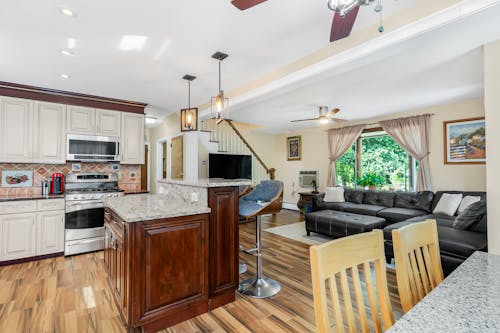
Knocking down walls became synonymous with modern living in the early 2000s. HGTV made it look like every home needed to “flow,” no matter how it actually functioned. But open-concept living often sacrifices privacy, sound control, and cozy corners where real life happens. It’s design theater — beautiful in photos, frustrating in daily life.
Families found that cooking smells, TV noise, and clutter from one zone quickly spilled into another. There’s a growing movement back toward defined rooms, especially for reading, working, or simply retreating. Boundaries can be beautiful, and they help different moods coexist. Sometimes, good taste just needs a door.
4. Grey Everything
For nearly a decade, gray walls were the default choice for “elegant” interiors. They were neutral, modern, and safe — until every house looked the same. What started as understated became downright depressing, sucking warmth out of rooms and individuality out of homes. It was the paint equivalent of choosing personality beige.
Now, designers are rediscovering color as a form of self-expression. Earthy greens, moody blues, and even rich browns feel fresh because they actually say something about the person living there. Gray still has its place, but not as a default. It’s okay for homes to feel alive again.
5. Granite Countertops
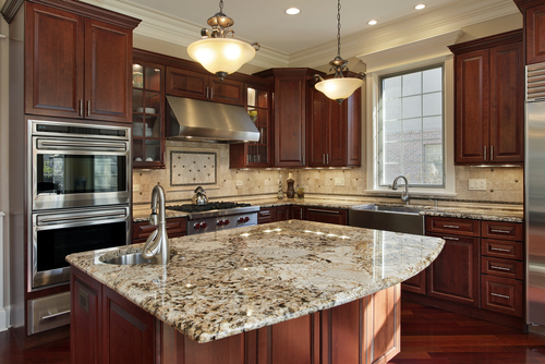
Granite became a status symbol in the 1990s and early 2000s. It screamed “upgraded” and “tasteful,” even when it didn’t match the rest of the home. But the obsession led to a wave of nearly identical kitchens that prioritized trends over personality. Every listing suddenly bragged about the same speckled surface.
Homeowners now realize there are dozens of beautiful, practical alternatives — quartz, butcher block, even recycled glass. The most interesting kitchens often mix materials and tell a story through age and use. A countertop doesn’t define taste; how you use the space does. Granite’s dominance made everything look expensive — but not necessarily expressive.
6. Minimalism as a Moral Choice
Minimalism was once a design philosophy — “less is more.” Somewhere along the way, it became a moral one: clutter was bad, and owning things meant failure. The minimalist aesthetic flattened homes into white boxes devoid of comfort or quirk. Instead of peace, many people found emptiness.
The truth is, humans are sentimental creatures. We collect things that remind us who we are. Good design makes space for that — it doesn’t erase it. “Clean” doesn’t have to mean “blank.”
7. Recessed Lighting Everywhere
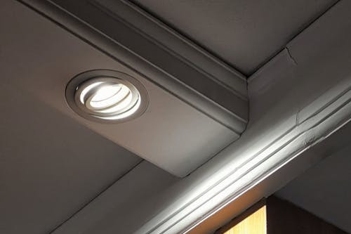
Recessed lights promised sleek, modern illumination, free from the “clutter” of lamps or fixtures. But overuse made homes feel more like offices or hotel lobbies than cozy living spaces. The uniform glow erased shadows, texture, and atmosphere — the very things that give rooms character. It’s hard to feel intimate under an evenly lit ceiling grid.
Layered lighting — combining sconces, lamps, and pendants — adds dimension and personality. Each source casts its own warmth and rhythm across a space. Light should highlight life, not flatten it. Sometimes, one well-placed lamp says more than ten ceiling cans.
8. Subway Tile as a Default
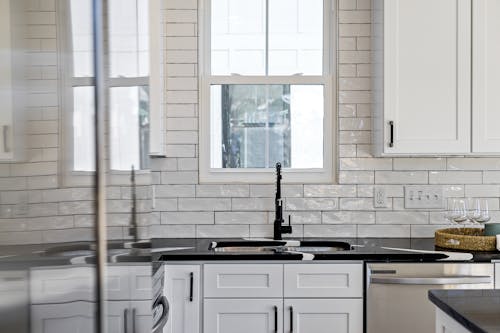
Subway tile started as a timeless, practical choice. Then it became the “only” choice. Suddenly, every kitchen and bathroom looked like a Pinterest clone — glossy white rectangles, black grout if you were daring. What was once classic turned into cliché.
Designers now suggest exploring variation — handmade tiles, color glazes, or creative layouts. These small differences reintroduce texture and individuality. “Timeless” doesn’t have to mean predictable. A little imperfection is often the most memorable detail.
9. The Fear of Pattern
For years, design advice warned against bold wallpaper, patterned rugs, or colorful upholstery. The message was: keep things neutral so they’ll “age well.” But this caution stripped personality out of homes and replaced joy with anxiety about resale value. Rooms lost their rhythm and soul.
Pattern creates energy and tells stories. It reflects culture, humor, and even courage. The best spaces balance calm with surprise. A floral wallpaper or geometric rug isn’t “too much” — it’s you, on display.
10. All-White Everything
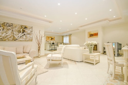
Minimalist white interiors were once the gold standard of sophistication. Magazines pushed them as the peak of cleanliness and restraint, especially in the 1990s and 2000s. But all-white rooms often feel sterile and unwelcoming, more like art galleries than homes. Over time, this “pure” aesthetic quietly erased the visual cues that make spaces feel personal and lived-in.
Designers now know that warmth comes from layers — color, texture, and imperfection. Natural wood, soft textiles, and subtle hues add comfort and personality. An all-white space might photograph beautifully, but it rarely invites you to sit down and relax. “Good taste” shouldn’t mean bleaching out every sign of life.
11. Open Shelving in Kitchens
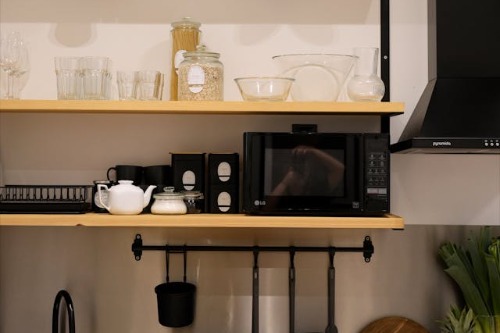
Open shelving photographed beautifully on Instagram. It suggested simplicity, authenticity, and “living curated.” But in real life, it collected dust, demanded constant styling, and exposed clutter most people don’t want to see. For most homes, it was more stress than style.
Closed cabinets exist for a reason — to hide the practical chaos of everyday life. There’s nothing “tasteless” about wanting storage. A balance of open and closed shelving works better and feels more personal. Real kitchens should serve people, not aesthetics.
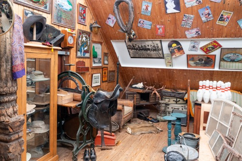
12. The War on “Clutter”
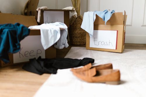
Magazines and influencers made “decluttering” sound like a spiritual practice. But in the process, homes lost warmth and evidence of real living. Souvenirs, kids’ art, and quirky mementos were replaced by blank surfaces and anxiety about “too much stuff.” Personality became collateral damage in the pursuit of calm.
Clutter isn’t always chaos — it’s texture, history, and memory. The trick is editing, not erasing. A curated mess can be beautiful. Homes should reflect lives in progress, not catalog perfection.
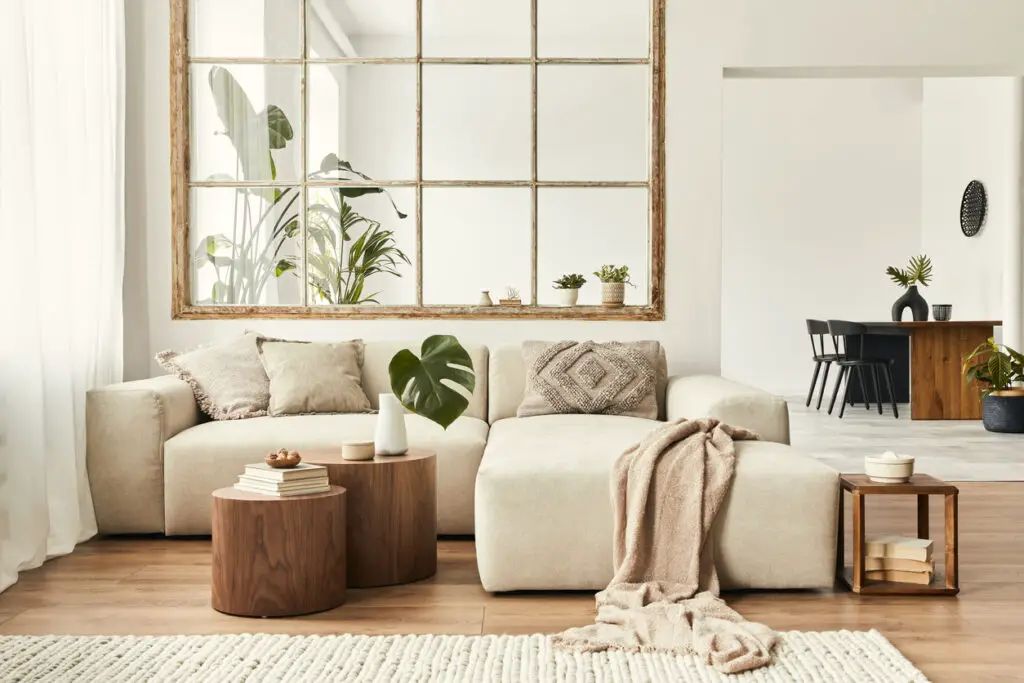
13. The “Neutral” Personality
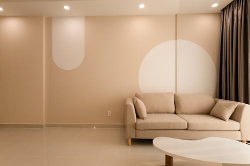
The modern obsession with beige, cream, and taupe came from a desire to appeal to everyone. Real estate staging and lifestyle branding taught people that neutral equals “good taste.” But in trying to please the masses, many lost their personal expression entirely. Beige became the color of fear — the fear of being wrong.
Neutrals can be calming, but they’re most powerful when contrasted with something bold or unexpected. A colorful chair, a textured throw, or an art piece with personality makes all the difference. Taste isn’t about disappearing — it’s about showing who you are, confidently. A truly beautiful home doesn’t blend in; it speaks up.
This post 13 “Good Taste” Rules That Quietly Destroyed Personality in Homes was first published on Greenhouse Black.