
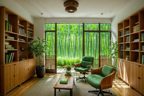
1. The Matchy-Matchy Living Room
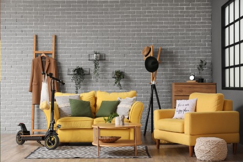
You’ve seen it before: every pillow, curtain, and rug perfectly color-coordinated like someone bought the entire showroom set in one go. While it might feel cohesive, this kind of “too perfect” styling can make a room feel soulless. Designers like Kelly Wearstler and Leanne Ford emphasize contrast and imperfection as key to creating spaces that feel lived-in and layered. Mixing textures, tones, and eras creates depth—and that’s what makes a home feel real, not rehearsed.
When everything matches, your eye stops exploring, and that’s the death of visual interest. A perfectly coordinated space can start to look more like a hotel lobby than a home. Instead, try pairing a modern sofa with an antique coffee table or swapping a few throw pillows for something unexpected. It’s the little imperfections that make your living room look intentionally curated rather than mass-produced.
2. Over-Styled Coffee Tables
That symmetrical coffee table with three art books, one candle, and a designer tray might look good on Instagram—but it’s not fooling anyone in real life. Real homes have remotes, cups, and the occasional stack of unread mail, and that’s okay. When every corner looks like a product flat lay, the space starts to feel like a catalog shoot instead of a lived-in room. Interior stylists often use asymmetry and height variation to add authenticity and flow.
A slightly off-center arrangement or a casual flower stem in a simple vase can make a coffee table look less try-hard. Overly staged surfaces often betray insecurity rather than style confidence. Designers suggest starting with a few meaningful objects—like a travel memento or a handmade bowl—so your décor tells your story, not a brand’s. The fastest way to look cheap? Trying too hard to look perfect.
3. All-White Everything
A crisp, white interior can look luxurious in theory, but in practice, it often falls flat. Without texture or variation, all-white rooms can feel sterile and unfinished, like a rental waiting for personality. Even minimalist icons like John Pawson use texture—think linen, plaster, or pale oak—to create warmth. When everything is the same shade, you lose the visual layering that makes minimalism work.
Instead, try mixing warm and cool whites, or adding tactile materials like boucle, wool, and stone. It’s the subtle interplay between them that makes a white room look expensive. Overdoing it makes it feel like you’re afraid of color, not curating a palette. True minimalism isn’t about perfection—it’s about balance.
4. Mirror Walls
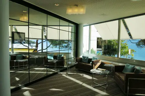
Mirror walls were once the symbol of modern luxury, but now they scream 1980s condo. The problem isn’t mirrors themselves—it’s the overuse. Instead of reflecting light tastefully, full mirrored walls can distort a room’s proportions and make it feel artificial. Designers now favor antique or smoked mirrors for a subtler, more atmospheric touch.
Adding a mirror strategically—above a console or near a window—can create depth without excess. When every wall shines back at you, it starts to feel more like a gym than a home. Reflective surfaces should enhance, not overwhelm. Balance is what keeps a mirror moment from turning into a mirrored nightmare.
5. Over-Accessorized Shelves
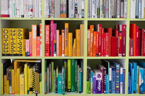
Perfectly arranged bookshelves with color-coded spines and evenly spaced objects may look satisfying online, but they rarely feel authentic. In real life, bookshelves are living things—they evolve with interests and time. Designers like Justina Blakeney advocate for “shelfies” that mix books, plants, and personal items naturally. The goal isn’t symmetry—it’s story.
When every inch is styled like a store display, it’s a dead giveaway that you decorated for likes, not life. A few slightly tilted books or a plant that spills over the edge bring warmth and movement. Texture and imperfection make shelves feel collected, not contrived. Perfection reads flat; imperfection reads human.
6. Faux-Luxury Materials
Shiny marble contact paper, acrylic “ghost” chairs, and chrome finishes can look chic at first glance—but cheap materials show their secrets fast. When corners peel or scratches appear, that illusion of glamour collapses. Interior pros always say: it’s better to have less of the real thing than more of the fake. Quality ages gracefully; imitation doesn’t.
Choosing honest materials—even if they’re humble—creates authenticity. Wood, linen, and ceramic have natural variation that adds richness over time. It’s not about being fancy, it’s about being real. The fastest way to cheapen a space? Pretending it’s more expensive than it is.
7. Identical Furniture Sets
Buying the entire bedroom set—bed, nightstands, dresser, and mirror—might feel efficient, but it kills individuality. These “one-and-done” packages flatten personality and make your space look like a staged model home. Designers recommend mixing eras or finishes to create tension and charm. A vintage dresser next to a modern bed instantly feels layered and unique.
Curation beats coordination every time. When everything matches perfectly, you lose the storytelling element that gives rooms life. Think of your home as a wardrobe: the best outfits mix high, low, and unexpected. If everything matches, it looks like you never took the tags off.
8. Overuse of Trends
From terrazzo everything to the “millennial pink” takeover, chasing trends too hard can date your space overnight. What looks cutting-edge this year often looks tired the next. Interior design evolves quickly, and trend fatigue is real. Instead, experts advise focusing on timeless pieces and adding trends in small, replaceable doses.
That means trendy throw pillows or art prints, not expensive fixtures or flooring. When your entire home screams one aesthetic, it’s hard to evolve without a total overhaul. Spaces that age gracefully mix classic foundations with playful updates. Perfection that’s tied to a trend never lasts—it expires.
9. Overly Symmetrical Rooms
Symmetry can feel elegant, but when taken too far, it becomes robotic. Two identical lamps, two matching chairs, two mirrored artworks—it’s overkill. Designers like Nate Berkus often recommend “near symmetry” instead—balanced but not mirrored. It keeps the eye interested and the room feeling organic.
Perfect symmetry can also make a space feel stiff and predictable. Introducing subtle asymmetry—a single statement piece or uneven artwork—breaks the monotony. It’s those small imperfections that make a room memorable. When everything’s lined up like soldiers, it loses soul.
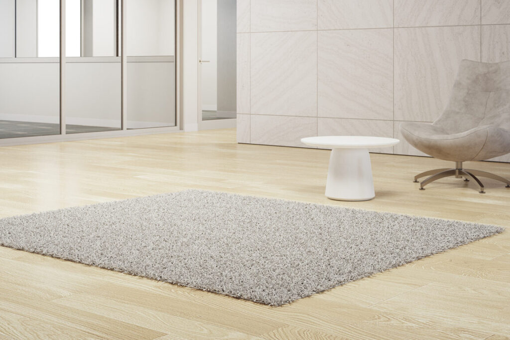
10. Too Much Open Space
Minimalism doesn’t mean emptiness, yet some homes mistake space for sophistication. Vast, echoing rooms with little furniture can feel more like galleries than homes. True minimalists know how to create comfort with proportion, texture, and thoughtful negative space. Too much bare floor just reads as unfinished.
Balancing openness with warmth is key—layer a rug, add a sculptural chair, or include artwork with presence. The goal is calm, not cold. When you strip away too much, it stops feeling intentional and starts feeling cheap. Luxury is about restraint, not absence.
11. Excessive Lighting Fixtures

A chandelier in every room used to be a mark of opulence—but now it’s often a shortcut to looking overdone. Light fixtures should complement the room, not compete for attention. Designers recommend layering light sources—ambient, task, and accent—rather than relying on one dramatic piece. The best interiors glow softly, not glaringly.
When lighting becomes decoration for its own sake, it distracts from the space’s architecture and mood. A small, well-placed sconce can do more for ambiance than a dripping crystal showpiece. Understated light feels expensive because it looks effortless. Overly bright perfection just feels desperate.
12. Over-Edited Color Palettes
A perfectly coordinated palette—where every shade is within one tone—might look sleek, but it often lacks depth. The most compelling interiors mix colors with intention, not rigidity. Designers like Athena Calderone use earthy neutrals with one unexpected hue to keep things alive. It’s contrast that creates warmth, not control.
If your space feels too polished, introduce something that “shouldn’t” work—a clashing accent chair, a bold piece of art, or a vintage rug. These elements break monotony and tell a personal story. When everything’s perfectly edited, it can feel impersonal and flat. Real beauty comes from rhythm, not perfection.
This post 12 Interiors That Prove Perfection Is the Fastest Way to Look Cheap was first published on Greenhouse Black.