
1. Taxidermy or Faux Animal Heads

Mounted animal heads—or the faux versions made of papier-mâché or resin—can add a “rustic lodge” vibe to a room. They’re often seen as artistic or whimsical now, not just trophies. But the symbolism underneath is still rooted in dominance over nature. Even the fake ones echo a legacy of conquest and control.
The resurgence of these items ties into the broader trend of “cabincore” and American heritage aesthetics. They’re frequently used to invoke wilderness, masculinity, or a connection to the past. But in modern homes, they often feel jarringly out of place and oddly theatrical. It’s hard to look at one without wondering what message it’s really sending.
2. Live Laugh Love Signs
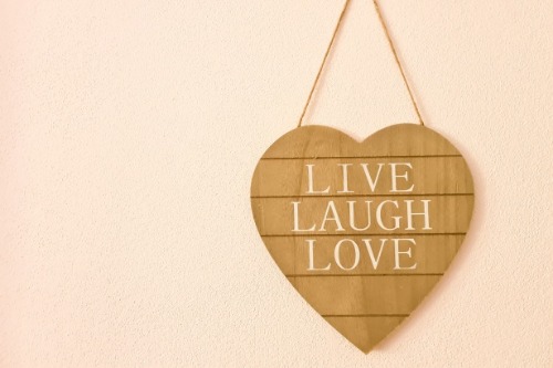
At first glance, this trio of cheerful words seems like an innocent reminder to stay positive. You’ll find it painted on wood blocks, stitched into pillows, or scrawled in a flowy font above the couch. But this phrase has become such a cliché that it’s now shorthand for a certain kind of superficial optimism. It often gets associated with performative wholesomeness that glosses over real-life struggles.
The phrase originated from a 1904 poem by Bessie Anderson Stanley, which was meant to define success through kindness and integrity. But its mass-produced use today can feel more like aesthetic filler than deep wisdom. It’s become so parodied online that it’s now practically code for “I bought this at a discount home goods store without thinking twice.” In short, it doesn’t always signal deep personal philosophy—it might just mean you haven’t updated your décor since 2012.
3. Books Arranged by Color

This design choice turns a bookshelf into a rainbow, and yes, it looks satisfying on Instagram. At first glance, you think, “Wow, they must really love books and aesthetics.” But this trend often signals that the books are more for show than for reading. Organizing by spine color isn’t how readers usually find titles—it’s how designers fill space.
The practice became popular thanks to interior design influencers and stylists looking to simplify visual noise. But it can make it nearly impossible to find a specific book unless you remember the shade of its cover. It suggests the books are being used as props, not for intellectual engagement. So while it may look wholesome and literary, it often prioritizes style over substance.
4. Oversized Wall Clock That Doesn’t Work
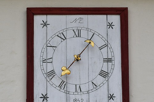
A giant farmhouse-style clock on the wall seems practical and charming, like something Joanna Gaines would recommend. But so often, these clocks don’t even tell time—they’re either broken or never had working batteries to begin with. It’s a classic example of form over function. Something meant to ground you in the present ends up being just background noise.
This décor trend exploded with the rise of farmhouse and industrial styles in the 2010s. Many of these clocks are poorly manufactured, sold at big-box stores, and intended more as conversation pieces than timekeepers. So if you’re at someone’s house and the giant clock says 2:15 for five hours, you know it’s more prop than timepiece. Ironic, considering it’s supposed to be the one thing helping you keep track of reality.
5. Family Rules Sign
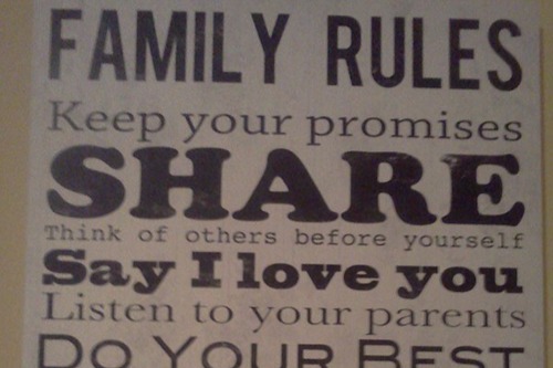
This sign lists commands like “Say Please and Thank You,” “Share,” and “Always Tell the Truth.” It’s sweet and moral on the surface, like a kindergarten classroom distilled into plywood. But it raises the question—do people in the house need these reminders every day? And if so, are they following them, or is the sign doing all the work?
This style of sign became trendy through Pinterest and Etsy in the 2010s, appealing to people who wanted to project a wholesome, values-based home. But sometimes, it’s a way to mask dysfunction or signal order in a chaotic household. It’s more about how the house wants to appear than how it truly operates. So while it reads like a code of ethics, it can also feel like decorative overcompensation.
6. A Bowl of Shells When You Don’t Live Near Water
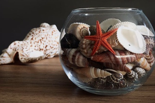
Collected seashells seem personal, nostalgic—maybe even a tribute to a favorite vacation. But if you’re miles from the ocean and the shells are store-bought, it tells a different story. These aren’t memories—they’re set dressing, meant to evoke calm and breezy vibes in places that don’t naturally have them. It’s kind of like playing coastal cosplay in the Midwest.
This trend ties into the broader “coastal grandmother” aesthetic, popularized on social media and in lifestyle magazines. It tries to bring in oceanic serenity through colors, textures, and motifs. But when it’s not grounded in actual experience, it can feel like an attempt to manufacture a personality rather than express one. What feels wholesome might just be aspirational fluff.
7. “Gather” Sign in the Dining Nook
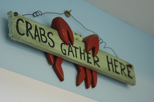
The word “Gather” written in script above a dining area is meant to evoke warmth, family, and shared meals. It suggests connection and quality time, like a Norman Rockwell painting brought to life. But more often than not, it hangs over a table nobody actually eats at anymore. The sign might be sincere, but the behavior it encourages is long gone.
This kind of signage gained traction with the rise of farmhouse décor and influencer culture. It became a placeholder for the actual experience of community. So when guests see it, they may subconsciously wonder what’s missing. It’s a wholesome sentiment, but sometimes, it’s just there to fill a gap.
8. Mason Jars as Candle Holders
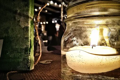
Mason jars remind people of canning, harvests, and old-fashioned simplicity. But as candle holders in a suburban living room, they’re more Pinterest-core than prairie. They evoke a DIY lifestyle that few people actually live. They’re sold as authentic, but they’re often mass-produced and styled to look handmade.
This trend grew out of the rustic-chic wedding boom in the early 2010s. Once it hit the home décor scene, it stuck around far longer than anyone expected. Now, they’re everywhere—from chandeliers to bathroom storage—but they rarely hold jam. They’re cute, sure, but they often stand in for real history or tradition.
9. Bowl of Decorative Balls
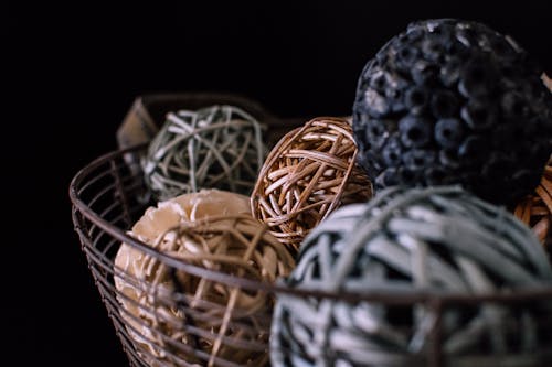
You’ve seen them: rattan spheres, woven twine orbs, and sparkly faux acorns gathered neatly in a bowl. These objects scream neutral, non-threatening, and vaguely rustic—purely ornamental, purely safe. But they’re the ultimate example of owning something that has no function other than visual clutter. What do they do exactly? Nothing.
The concept comes from a design trend called “staging,” where homes are styled to appeal to the broadest audience possible. These balls became popular in the 2000s with the rise of open house culture. In reality, they’re kind of like the grown-up version of plastic fruit: convincing enough to glance at, weird enough to question up close. If you ask someone why they have them, don’t expect a deeper answer than “It looked good at Target.”
10. Cross-Stitched Quotes in a Frame
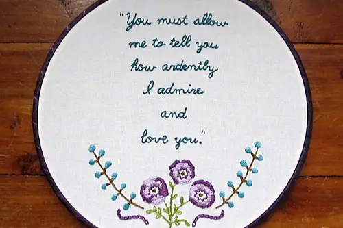
These framed bits of needlework feel sweet and vintage, like something your grandmother would’ve made. Often, they feature inspirational phrases or inside jokes in pastel threads. But today, many of them are made by Etsy sellers or big retailers, not hand-stitched with love. That sentimentality is being outsourced.
Cross-stitching used to reflect patience, craft, and personal investment. Now, it can sometimes be used ironically or sold to people who want the vibe without the effort. It’s a shortcut to wholesomeness that doesn’t always ring true. It may look heartfelt, but it could just be Hobby Lobby kitsch.
11. Board Games on Display but Still in Shrink Wrap
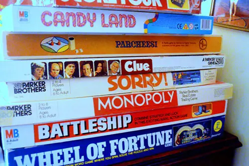
A stack of board games in the living room signals fun, connection, and good old-fashioned screen-free bonding. But if they’re still shrink-wrapped or visibly untouched, they’re just for show. It suggests a kind of aspirational family life that might not exist in practice. They’re props in a fantasy of quality time.
This happens a lot when people decorate with the idea of hobbies rather than the reality. Having the games visible becomes a symbol of intention, not action. So instead of being played, they become décor with a weird undercurrent of guilt. It’s wholesome on the outside, but a little hollow underneath.
12. Scented Pinecones in a Basket
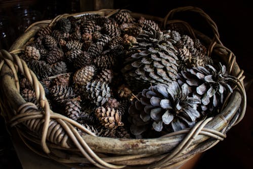
At first whiff, these pinecones conjure cozy autumn memories—cinnamon spice, crisp air, comfort. But they’re often chemically treated to smell that way, and the scent can be overpowering or artificial. They’re not from your backyard; they’re from a factory. That rustic charm is engineered.
These pinecones became a seasonal staple thanks to holiday marketing and home fragrance brands. They’re meant to sell the experience of a nostalgic season rather than offer an actual one. So while they look natural, they’re more commercial than organic. It’s a packaged version of comfort that doesn’t always hold up under scrutiny.
This post 12 Living Room Items That Seem Wholesome Until You Ask What They Really Mean was first published on Greenhouse Black.