
1. Tuscan-Inspired Kitchens
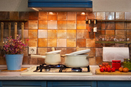
In the early 2000s, Tuscan kitchens were the ultimate sign of sophistication—think dark cherry cabinets, ornate backsplashes, and heavy granite countertops. Today, those same elements make a kitchen feel dated and dim. Homebuyers now favor light, airy spaces with simple lines and neutral tones. The ornate Tuscan look tends to photograph poorly and suggests expensive remodels ahead.
That doesn’t mean warm, rustic charm is gone for good. It just needs to be modernized with lighter woods, matte finishes, and less visual clutter. A pared-down Mediterranean feel still works if done subtly. The key is balance—today’s elegance lies in restraint.
2. Frosted Glass Block Windows
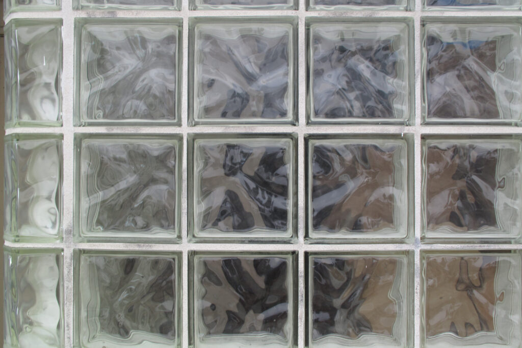
Glass blocks were once a modern statement—offering privacy while letting in light. But in 2025, they mostly read as relics from 1980s bathrooms and basement remodels. They’re bulky, hard to replace, and clash with the clean-lined glazing trends in contemporary architecture. Most buyers see them as a clear “update me” signal.
Replacing them with frosted or textured glass panels can give the same privacy without the bulk. It’s also easier to incorporate energy-efficient options now. Homeowners who cling to glass blocks risk their home feeling older than it is. This one swap can instantly freshen up curb appeal.
3. Heavy Crown Molding Everywhere
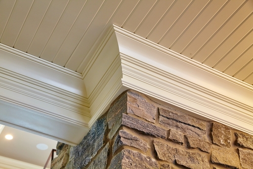
There was a time when lavish crown molding screamed “custom home.” These days, excessive trim reads as fussy and overly formal, especially in smaller spaces. Modern design trends lean toward simpler profiles or even no molding at all. The visual weight of thick molding can make ceilings feel lower and rooms more cramped.
Buyers now associate clean edges with a sense of calm and space. While subtle trim can still look refined, overdoing it feels like costume jewelry on a casual outfit. If you have it, painting it the same color as the walls can help it fade into the background. Less really is more here.
4. Granite Countertops with Busy Patterns
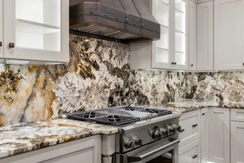
Granite once ruled the kitchen world, but its speckled patterns and heavy shine are falling out of favor. Today’s homeowners want cleaner, more natural looks—quartz, soapstone, or even solid surfaces that mimic marble. Busy granite feels dated and makes kitchens look darker. It also clashes with the minimalist, Scandinavian-inspired trends dominating home design.
While granite is durable, its visual busyness overwhelms many modern aesthetics. Replacing it isn’t always cheap, but even resurfacing or changing hardware can help. Lighter tones and honed finishes can tone down the effect if replacement isn’t an option. The goal is a surface that enhances, not dominates.
5. Brown-Toned Tile Floors
Remember when beige or brown ceramic tile was everywhere—from kitchens to foyers? Those warm, orangey undertones now read as tired and builder-basic. Modern interiors prefer cooler neutrals or natural stone tones. Plus, the grout lines on those old tiles are a maintenance headache.
Luxury vinyl planks or large-format porcelain tiles are today’s go-to alternatives. They give a cleaner look, fewer seams, and better water resistance. If you’re renovating, swapping the old tile can make an instant difference in how “fresh” your home feels. It’s one of those subtle updates that pays off visually and financially.
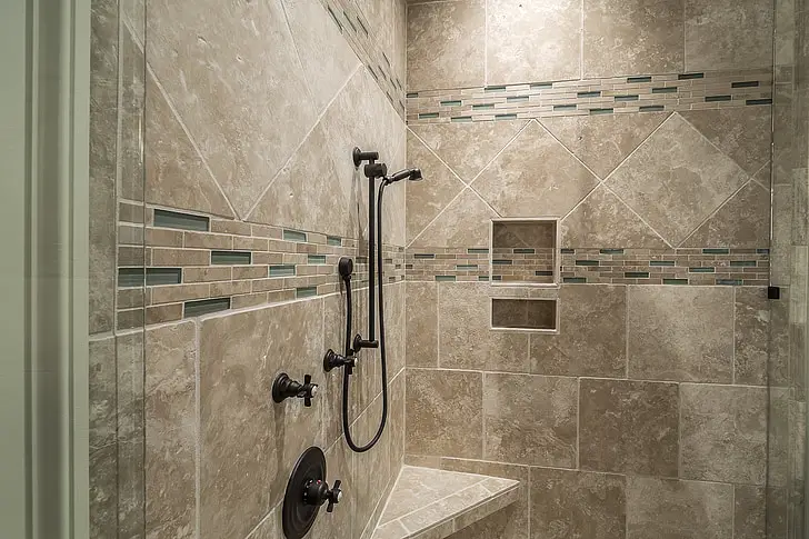
6. Whirlpool Tubs in Primary Bathrooms
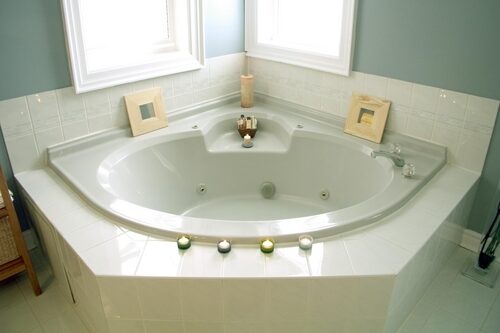
Once the height of luxury, whirlpool tubs are now mostly collecting dust. Homeowners discovered that they’re noisy, hard to clean, and rarely used. The focus has shifted toward oversized showers with rain heads and benches. Buyers now see jetted tubs as wasted space and a possible plumbing hassle.
That doesn’t mean baths are out entirely—just that function and simplicity matter more. A deep soaking tub looks modern and practical by comparison. Removing an old whirlpool can open up valuable floor space. The new luxury is efficiency with comfort.
7. Wall Niches and Ledges for Décor
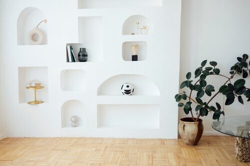
Architectural niches used to feel like built-in art displays. Today, they’re often seen as awkward, dust-catching recesses. Their overly specific shapes make decorating tricky, especially with today’s minimal design trends. Instead of highlighting a home’s features, they can date it instantly.
Most modern designers prefer clean, flush walls that let art or shelves be flexible. If you have a niche, drywalling it over or turning it into storage can modernize the space. The emphasis now is on functionality and adaptability. Those old alcoves just don’t serve today’s lifestyles.
8. Cherry or Mahogany Cabinets
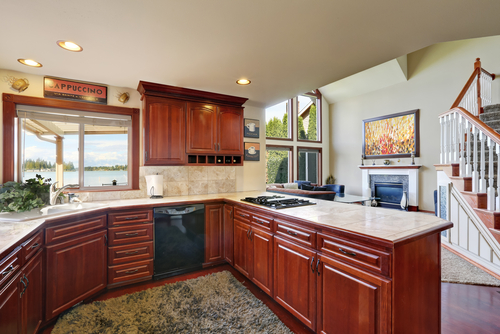
Dark red-toned woods once symbolized high-end craftsmanship. Now, they make kitchens and offices feel closed in and outdated. People gravitate toward lighter, natural woods or painted finishes that brighten a space. The deep, shiny cherry look has been replaced by matte, earthy minimalism.
Painting or refacing cabinets is an easy way to bring them into the present. A soft greige, sage, or even navy tone feels sophisticated without feeling old-fashioned. This single update can transform the heart of a home. The goal is warmth, not weight.
9. Ornate Iron Stair Railings
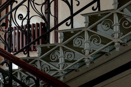
Intricate wrought iron used to scream luxury. Today, those scrolls and curls often look overly dramatic. Simpler vertical or horizontal balusters in matte black or wood are much more appealing to current buyers. Ornate metalwork now clashes with the clean, open-concept interiors people want.
Swapping in sleeker railing designs can instantly update a staircase. It’s a focal point, so the change has outsized impact. Even painting an existing railing a uniform matte finish can tone down the visual noise. Think understated elegance, not castle chic.
10. Formal Living and Dining Rooms
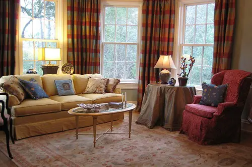
Separate, formal spaces once showed off a home’s size and status. Now they’re seen as wasted square footage that no one uses. Open layouts and flexible living zones fit today’s casual, multifunctional lifestyles better. Buyers often walk into those closed-off rooms and think “demo day.”
Repurposing them into home offices, media rooms, or libraries can make them relevant again. People want flow and functionality more than formality. It’s not that elegance is out—it’s just that it has to serve real life. Walls no longer impress; livable layouts do.
11. Overly Coordinated Bathroom Suites
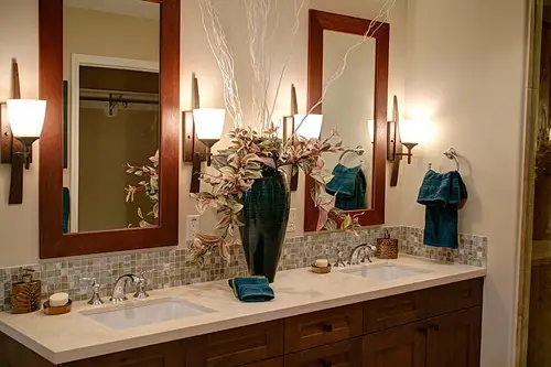
Matching everything—the faucet, the towel bars, even the toilet handle—once felt polished. Now it feels sterile and predictable. Current design favors mixing metals and textures for a more curated, personal vibe. A bathroom that looks like it came from a single showroom is no longer aspirational.
Breaking up those matchy-matchy sets adds depth and personality. Try pairing brass with matte black or nickel with warm wood. It signals taste and confidence, not a default design package. The new rule is: mix smartly, not excessively.
12. Popcorn Ceilings
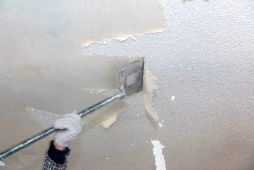
Popcorn ceilings were once a builder’s dream—cheap, sound-absorbing, and fast to apply. Today, they’re a huge aesthetic and maintenance red flag. They trap dust, can contain asbestos in older homes, and make rooms look instantly dated. Nearly every buyer today notices them immediately.
Removing or covering them smooths out a home’s appearance and adds instant value. It’s a messy job but worth the investment. Smooth or lightly textured ceilings look higher and more modern. Think of it as the haircut your home’s been needing for years.
This post 12 Once-Elegant Home Details That Now Look Like Red Flags was first published on Greenhouse Black.