
1. A Fire Pit Surrounded by Adirondack Chairs… and Also Bistro Seating, and Also Benches
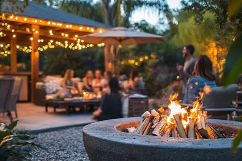
When a garden can’t decide between rustic cabin vibes, Parisian café chic, or community park energy, chances are, it’s a design-by-committee situation. Adirondack chairs say “casual summer nights,” while wrought-iron bistro sets suggest you might break out a cheese board at any moment. Throw in a park-style bench or two, and now it’s like every stakeholder got to pick one seating option with no cohesive plan. The result is more like a yard furniture showroom than a unified gathering space.
The issue here isn’t variety, it’s lack of intention. A well-designed garden typically sticks to a theme or at least a unifying material palette. But in a committee-designed space, compromise often wins over vision. So you get wood, metal, and plastic all shouting over each other.
2. Herb Spirals in Raised Beds Beside Rows of Potted Annuals
Herb spirals are permaculture darlings—compact, water-efficient, and great for maximizing microclimates. But pairing them with decorative pots full of annuals that require constant watering and seasonal swapping is a mixed message. It says, “We care about sustainability! But also flowers that die in October!” It’s like trying to write a farm-to-table cookbook and a wedding planner blog at the same time.
Raised beds also suggest some level of serious gardening, while pots full of marigolds and petunias scream quick curb appeal. Both are valid goals—but together, they often indicate competing priorities rather than a clear plan. The garden ends up feeling like an exhibit on different gardening philosophies. And the transitions are usually as awkward as the planning meetings that produced them.
3. Three Different Types of Pathways That Don’t Quite Connect
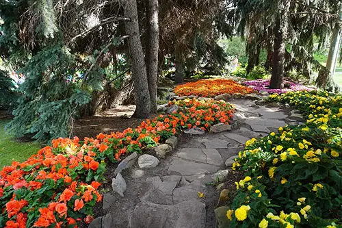
Maybe there’s a flagstone path that suddenly gives way to gravel, which then awkwardly butts up against red brick. And somehow none of them actually reach the back gate without a detour through a patch of lawn. This kind of layout screams compromise—or worse, “We’ll just finish this next spring,” which no one ever did. You can feel the decision fatigue in the paving choices.
Good garden paths do more than guide—they tie the space together. Materials should be complementary, and the flow should feel natural. But when five opinions lead to three materials and no clear route, you get what feels like three half-finished ideas stitched together. And your feet can tell.
4. Five Different Mulch Types in One Line of Sight
One corner of the flowerbed has cedar chips, another spot has river rock, and there’s inexplicably a patch of red rubber mulch under the shrubs. This is what happens when one person loves the look of bark, another insists on low-maintenance gravel, and someone else had leftover playground mulch in the garage. It’s not a design decision—it’s democracy in decay. You can spot this kind of garden chaos from the curb.
Mulch choices usually follow practical needs like soil type, plant preference, or local climate. But when every option gets equal billing, it just looks like a supply chain mishap. Instead of enhancing the plants, the inconsistent textures and colors become the main attraction. And not in a good way.
5. A Zen Rock Garden Next to a Cottagecore Trellis
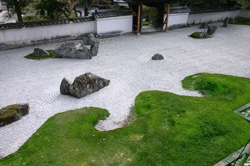
Zen gardens are about restraint, calm, and minimalism—think raked gravel, a few carefully placed stones, maybe a bonsai. So when that’s directly adjacent to a tangled rose-covered trellis and whimsical birdhouses, it’s safe to assume someone caved at the last planning meeting. It’s not that these styles can’t be near each other, but here they’re clearly not speaking the same design language. The overall effect is more jarring than serene.
When one person wants meditative peace and another wants Beatrix Potter vibes, you get a garden that tries to do both and ends up doing neither. Visual harmony gets lost in the shuffle. The contrast isn’t balanced—it’s borderline argumentative. You can almost hear the aesthetic tension.
6. Solar Lights, Gas Lanterns, and String Bulbs All Competing for Attention
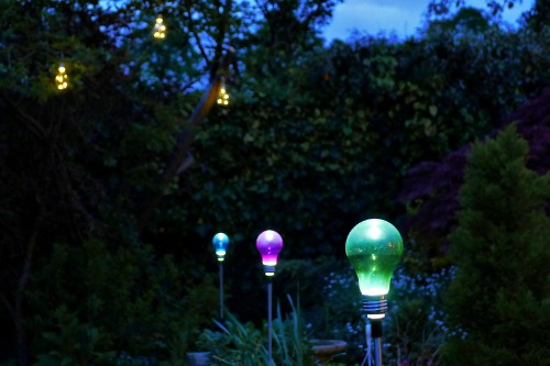
Lighting should be a vibe-setter, not a mood swing. One style—whether it’s soft solar lighting or dramatic overhead bulbs—can give a space clarity and ambiance. But when the flower beds glow like an airport runway and a gas lantern flickers near the grill while string bulbs dangle over the firepit, the result is visual whiplash. It doesn’t look festive—it looks like a lighting aisle exploded.
This is often the result of everyone choosing their favorite light fixture without considering how they’ll work together. Layered lighting is great when done with intention, but clashing color temperatures and styles just create visual clutter. In a well-designed garden, lighting highlights the best features without drawing attention to itself. In a committee garden, the lighting is the show—whether you want it to be or not.
7. A Wildflower Meadow Next to a Perfectly Manicured Lawn
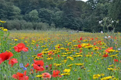
It’s the ultimate aesthetic standoff: native-plant rewilding versus suburban turf worship. A lush lawn suggests control and order, while a meadow of milkweed and bee balm says, “Let nature do its thing.” Together? They say no one wanted to back down during the landscaping meeting.
This contrast is especially glaring when there’s no transitional planting in between. A design-savvy approach would blend the two with intentional edging or a soft shrub border. But in a committee-led garden, you often see hard lines and abrupt shifts. It’s like watching two very different TV shows on split screen.
8. A Pergola, a Gazebo, and a Shade Sail All in One Backyard
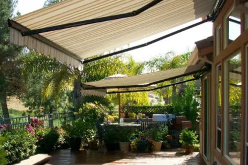
Each of these structures has a clear function—pergolas offer partial shade and visual structure, gazebos are cozy focal points, and shade sails are modern, budget-friendly solutions. But putting all three in one average-sized backyard is less about function and more about compromise overload. It’s clear someone wanted a classic gazebo, someone else wanted sleek lines, and someone else just wanted to block the afternoon sun without blowing the budget. So they all got what they wanted—and now no one wins.
The result often feels crowded and confused. It’s hard to know where to sit or what the “main area” of the yard actually is. A single, well-placed structure would anchor the space far better. But a committee often builds for consensus, not clarity.
9. An Overdesigned Pollinator Garden With Tiny, Barely-Labeled Signs
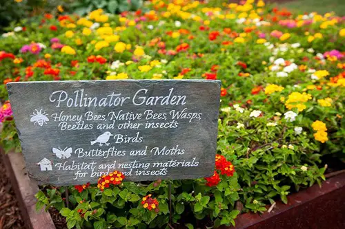
Pollinator gardens are fantastic—when they’re truly about attracting bees, butterflies, and hummingbirds with native, nectar-rich plants. But when they’re clearly someone’s pet project and full of laminated signs that say things like “Native Plant Zone: Do Not Disturb,” it starts to feel more like a museum exhibit than a living ecosystem. Add in QR codes and themed rock borders, and it’s clear this garden was designed for a grant presentation, not for nature. It’s informative, sure—but it’s also a bit exhausting.
Often, these gardens reflect a group’s good intentions but not their shared design sensibility. Every committee member wants to add something educational, and soon you’re standing in front of a five-square-foot patch of coneflowers with more signage than the average art gallery. The plants deserve better. So do the pollinators.
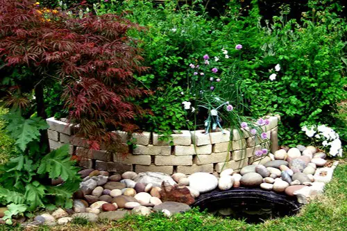
10. A Water Feature That’s Too Small to Be a Pond and Too Big to Be a Birdbath
This is the classic “compromise size” mistake. One person wanted a peaceful koi pond, another thought that was too much maintenance, and someone else insisted on at least a birdbath for the robins. What you get instead is a fiberglass tub with a solar fountain that gurgles just loud enough to be annoying but not calming. It’s not tranquil—it’s tentative.
Water features can be stunning focal points, but scale and context matter. This hybrid attempt usually ends up awkwardly placed and underused. It may even have token aquatic plants struggling to thrive in the shallow basin. No one loves it, but no one wants to remove it either.
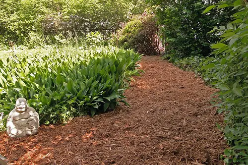
11. Decorative Gravel in an Area That Clearly Needs Grass
Maybe someone thought gravel would mean less maintenance. But the patch in question is under a playset or beside the driveway where people walk barefoot—and now everyone regrets it. You can tell it wasn’t meant to be gravel from the first time it rains and the runoff carries half of it into the lawn. This is the kind of decision that sounds smart in a meeting but doesn’t survive a single season.
Grass isn’t always the answer, but neither is a cheap fix for an ongoing problem. The right groundcover depends on how the space is used, and that takes thoughtful design. But in a committee garden, practicality often gets buried under aesthetics—or budget constraints. And then the gravel gets buried under mud.
12. Clashing Color Palettes in Every Planting Bed
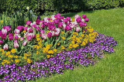
In one corner, you’ve got hot pink petunias next to orange marigolds. Another bed is all cool purples and blues, with an accidental red zinnia thrown in. It’s not just bold—it’s bewildering. Like a gardening catalog exploded and everyone picked their favorites at random.
Color theory matters in garden design just as much as it does in interior decorating. A cohesive palette creates calm and flow. But when six different people bring home flats of whatever looked good at the nursery, you get chaos in bloom. It’s cheerful, sure—but not exactly curated.
This post 12 Outdoor Vibes That Say “This Garden Was Designed By Committee” was first published on Greenhouse Black.