
1. Coffee tables stacked with unread books
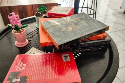
Large art books are a classic Instagram styling tool. They add height, color, and implied sophistication. In real homes, coffee tables usually hold remotes, drinks, or feet. When books dominate the surface, it limits actual use.
These books are often chosen for their covers, not their content. They rarely show signs of being opened or moved. Functional living rooms allow flexibility and mess. A table you’re afraid to touch exists for photos.
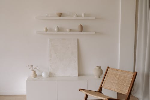
2. Open shelving styled but impractical
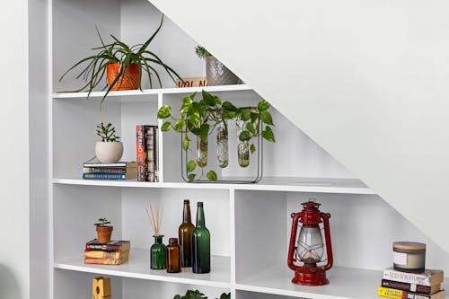
Open kitchen shelving filled with perfectly spaced dishes photographs beautifully. The problem is that everyday kitchens produce grease, dust, and clutter fast. In lived-in homes, frequently used items are usually stored behind cabinet doors. When every shelf looks frozen in time, it suggests no one actually cooks there.
This trend persists because open shelves add visual depth in photos. They also let creators display color-coordinated ceramics and glassware. Functionally, though, they require constant restyling and cleaning. If using a plate means disrupting a vignette, the kitchen was staged for content.
3. Statement lighting that’s harsh or blinding

Oversized pendant lights or exposed-bulb fixtures make a strong visual impact online. In person, they can cast glare, harsh shadows, or uneven light. Good residential lighting balances ambiance with task needs. When lighting looks dramatic but feels uncomfortable, it’s optimized for photos.
Bright, downward-facing lights help cameras capture crisp images. They also highlight textures and finishes that pop on screens. People living in the space, however, need lighting that works at night and in motion. If you’re squinting at dinner, the fixture is performing for the lens.
4. Rugs that are clearly too small
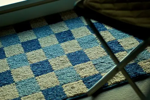
Tiny rugs centered in a room are a common giveaway. They photograph neatly because they show off flooring and furniture legs. Design guidelines generally recommend rugs large enough for front furniture legs to sit on them. When a rug floats alone, the room feels less functional and less comfortable.
Living rooms need rugs to anchor seating and reduce noise. Bedrooms benefit from rugs that extend beyond the bed for warm footing. Undersized rugs prioritize visual symmetry over actual use. It’s a choice that looks tidy in a square photo but fails in daily life.
5. A strictly neutral, low-contrast palette
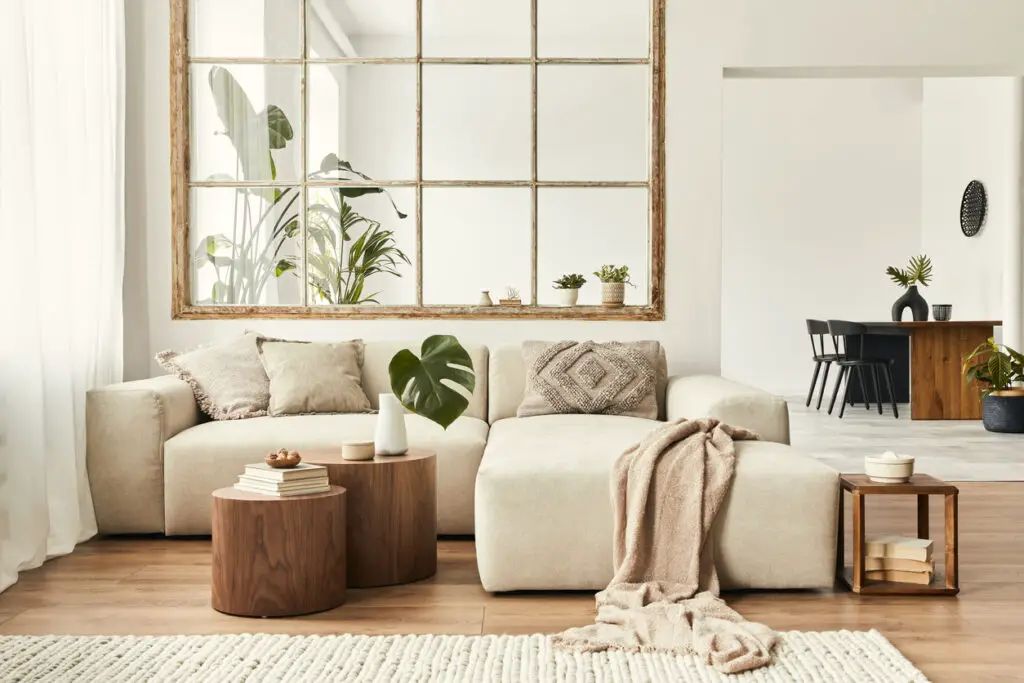
Beige-on-beige rooms photograph softly and appeal to broad audiences. They also hide wear unevenly and can feel flat in person. Homes designed for living often use contrast to define spaces and surfaces. When everything blends together, it’s usually for visual cohesion on screen.
Neutral palettes compress well on social platforms. They don’t distract from architectural lines or decor styling. But daily living benefits from visual cues and variety. If you can’t tell surfaces apart easily, the room was styled for scrolling.
6. The pristine white sofa with no protection
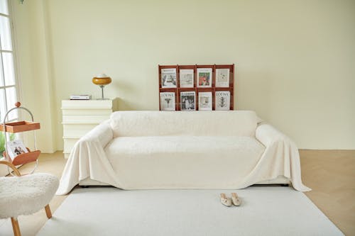
The all-white sofa looks amazing in photos, especially under bright, even lighting. In real life, it’s a magnet for coffee spills, denim transfer, and pet hair. Homes designed for living usually include washable slipcovers or darker, forgiving fabrics. When there’s no visible plan for stains, it’s a sign the couch is there to be admired, not used.
This choice often shows up because white reflects light and reads clean on camera. Influencers favor it because it makes a room feel larger and calmer in a single frame. But people who actually sit, nap, or eat on their sofa need materials that can survive daily wear. If everyone perches awkwardly instead of relaxing, the furniture is doing its job for Instagram, not you.
7. Plants placed where they block light or movement
Oversized plants instantly make photos feel fresh and styled. Sometimes they’re placed directly in front of windows or walkways. Healthy indoor plants generally need adequate natural light. When placement ignores growth or flow, aesthetics came first.
Plants are often positioned to frame a shot. They add organic contrast against clean interiors. But lived-in homes arrange greenery around daily paths. If you sidestep a fiddle-leaf fig, it’s serving the camera.
8. Bare windows with no coverings
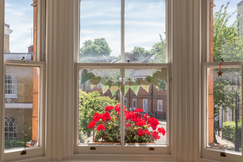
Uncovered windows let in maximum light for photography. They also reduce visual clutter in images. Most homes need privacy, glare control, or insulation. When windows are naked, comfort has been deprioritized.
Curtains and blinds complicate a clean frame. They introduce folds, shadows, and hardware. People living in the space usually need flexibility throughout the day. If you avoid eye contact with neighbors, it’s an Instagram choice.
9. Kitchens with no usable counter space
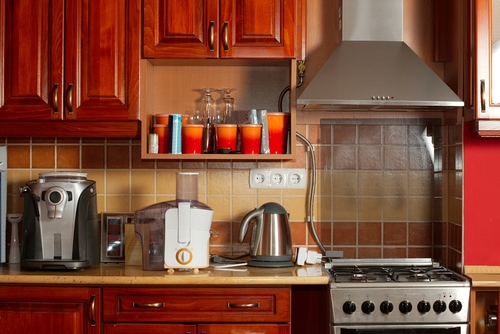
Minimalist kitchens look sleek when counters are empty. Appliances are often hidden or removed for photos. Cooking requires prep space, tools, and mess. A kitchen without room to work isn’t meant for daily meals.
Clear counters photograph as calm and high-end. They emphasize materials like stone and wood. Real kitchens accumulate items because they’re used. If making toast disrupts the look, it’s not a living kitchen.
10. Accent chairs that are uncomfortable
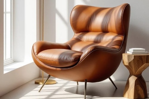
Sculptural chairs add interest to a room’s composition. They often prioritize shape over ergonomics. In functional homes, seating invites people to linger. When chairs are stiff or low, they’re decorative.
These pieces photograph well from specific angles. They help balance a layout visually. But guests notice comfort immediately. If no one chooses that chair, it’s a prop.
11. No visible storage for everyday items
Instagram interiors often hide storage completely. There are no coat hooks, baskets, or drop zones. Daily life generates shoes, bags, and mail. When storage is invisible, mess is simply off-camera.
Clean lines are easier to maintain in photos. They suggest effortlessness and control. Functional homes plan for habits and routines. If clutter has nowhere to land, the house isn’t meant to live in.
This post Signs a House Was Decorated for Instagram, Not for Living was first published on Greenhouse Black.