
1. Too Many Family Photos in Public Spaces
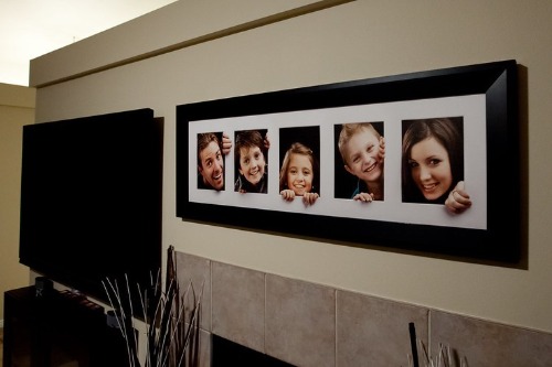
Family photos are important—but when every wall is covered in portraits, it can feel more like a shrine than a home. Designers recommend keeping personal photos to more intimate areas like hallways or bedrooms. In living rooms or dining areas, they can overwhelm the space and limit design flexibility. It’s about balance, not banishment.
Mix in art, mirrors, or objects that reflect your interests and style. Let your home tell your story in layers. Family is part of that—but not the whole picture. Curate, don’t clutter.
2. Generic Inspirational Quote Art
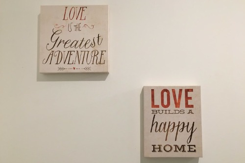
“Live, Laugh, Love” had its moment—but that moment has passed. Mass-produced quote art feels impersonal and overdone, especially when it’s the same phrases seen in every big-box store. Designers crave originality and authenticity, and these signs often do the opposite. They flatten a space instead of adding depth.
If you love words, opt for framed poetry, handwritten notes, or typography that means something to you. Better yet, support a local artist who can create something custom. Your walls should reflect your voice, not a cliché. Meaning beats mass appeal every time.
3. Overly Themed Decor (Especially Nautical)

Unless you live on a boat, anchors, oars, and rope knots probably don’t belong on your walls. Themed decor can quickly veer into kitsch, especially when it’s too literal. Designers want your space to feel curated, not like a souvenir shop. A little nod to a theme is fine—an entire wall of it is not.
Instead, choose pieces that evoke a feeling or memory without spelling it out. A seascape painting or driftwood sculpture can be far more elegant. Subtlety is your friend. Let the theme whisper, not shout.
4. Wall Decals That Try Too Hard

Peel-and-stick decals can be fun for kids’ rooms, but in main living areas, they often feel juvenile or temporary. Script fonts, faux brick patterns, or oversized florals can cheapen a space if not done thoughtfully. Designers prefer texture and depth over flat, sticker-like visuals. And decals rarely hold up over time.
If you want impact, consider wallpaper, stenciling, or even a painted mural. These options feel more intentional and lasting. Your walls deserve more than a quick fix. They deserve commitment.
5. Tiny Art on Huge Walls
A single 8×10 print floating on a large wall doesn’t make a statement—it just looks lost. Scale matters, and undersized art can make a room feel unfinished or awkward. Designers often see this mistake in living rooms and bedrooms where the wall space dwarfs the artwork. It’s not minimal—it’s mismatched.
Go bigger or group smaller pieces into a gallery wall. Art should anchor the space, not disappear into it. When in doubt, size up. Your walls can handle more than you think.
6. Faux Window Frames and Shutters
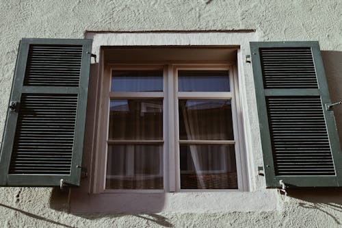
Hanging decorative window frames or shutters indoors might seem charming, but they often confuse the eye and disrupt the flow of a room. They’re meant to frame a view—not pretend to be one. Designers see them as filler pieces that don’t serve a real purpose. And they rarely age well.
If you want architectural interest, try a vintage mirror, a sculptural piece, or even a salvaged door with character. Let your walls tell a story—not play dress-up. Authenticity always wins.
7. Clocks That Don’t Work (or Are Just for Show)
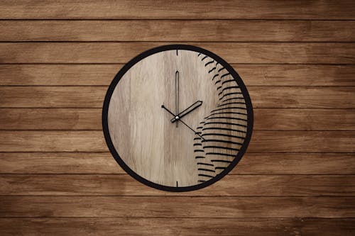
A large wall clock can be a beautiful focal point—but only if it actually works. Designers often see clocks that are either broken or purely decorative, which can feel lazy or confusing. It’s a functional item pretending to be art. And that disconnect is noticeable.
If you love the look, make sure it’s ticking—or choose a sculptural piece that doesn’t pretend to tell time. Form and function should go hand in hand. Otherwise, it’s just dead weight on your wall.
8. Mass-Produced “Abstract” Prints
Those generic brushstroke canvases from big-box stores might fill a wall, but they rarely add soul. Designers can spot them instantly—and so can guests. They’re meant to be neutral, but they often just feel forgettable. Art should spark emotion, not just fill space.
Instead, look for local artists, vintage finds, or even DIY pieces that reflect your taste. You don’t need a gallery budget to find meaningful art. Just a little intention. Your walls deserve something with a heartbeat.
9. Empty Picture Frames
Hanging empty frames as decor was once a quirky trend, but now it just feels unfinished. Without art or photos, they lack purpose and can make a space feel incomplete. Designers see them as missed opportunities—why hang a frame if there’s nothing to frame? It’s more confusing than creative.
If you love the shape or texture, fill it with something meaningful: fabric, pressed flowers, or even a mirror. Give it a reason to be there. Your walls should feel intentional, not experimental.
10. Wall-Mounted Word Sculptures

Metal or wooden words like “Eat,” “Home,” or “Relax” might seem welcoming, but they’ve become design clichés. They tell people what to feel instead of letting the space evoke it naturally. Designers are moving away from literal decor in favor of more nuanced storytelling. Your home should speak for itself.
If you want to add warmth, do it through color, lighting, and texture. Let your space feel lived-in, not labeled. Words belong in books and conversations—not bolted to the wall.
11. Fake Greenery and Plastic Wreaths
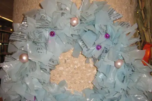
Artificial plants have their place, but wall-mounted faux greenery often misses the mark. Plastic ivy garlands or synthetic wreaths tend to look dusty, dated, and unconvincing up close. Designers prefer real or thoughtfully preserved botanicals, which add life without pretending. When greenery is fake and overused, it becomes visual noise instead of a natural touch.
If maintenance is a concern, consider low-maintenance real plants in wall planters or dried arrangements with texture. These options bring nature indoors without the artificial feel. Your walls should breathe—not look like they’re covered in plastic vines from a craft aisle. Design is about authenticity, even in the small details.
12. Tapestries Meant for Dorm Rooms
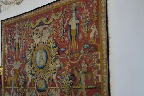
Tapestries with mandalas, celestial prints, or psychedelic patterns might bring back college memories—but they rarely work in adult spaces. These oversized sheets often wrinkle, sag, and dominate the wall without offering much depth. Designers find them more suitable for temporary setups, not long-term interiors. They tend to flatten a room rather than enhance it.
If you like textile art, try a framed textile piece or a woven wall hanging with real dimension. Quality materials and craftsmanship make all the difference. The goal is to add warmth and artistry, not recreate your freshman year. Grown-up walls deserve grown-up style.
13. Corkboards Covered in Clutter
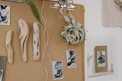
Corkboards filled with pinned-up papers, receipts, and mementos might work in a dorm or home office, but not in living areas. When they’re overloaded, they look chaotic and unfinished, and they don’t contribute to the overall design. Designers see them as a clutter trap that quickly becomes a catch-all for things you didn’t want to deal with. It’s better to keep your reminders and notes elsewhere.
If you like having a rotating display, consider a gallery-style board with curated prints or rotating art cards. It keeps the wall intentional and visually appealing. Your walls shouldn’t feel like a bulletin board at the post office. Control the chaos—don’t hang it up.
14. Outdated Canvas Sets
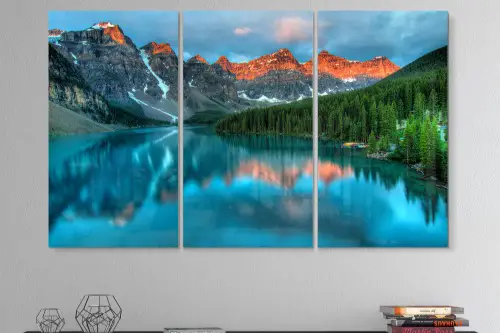
Those three-panel sunset or cityscape canvases from decades past often look mass-produced and dated. They were once trendy, but now they read as generic and uninspired. Designers find that these cookie-cutter sets strip personality from a room. Even worse, their symmetry often stifles creativity rather than enhancing the layout.
Instead, try mixing different sizes and mediums—combine photography, paintings, and mixed media for a richer look. Or replace them with a bold, single statement piece. Art should evolve with your taste, not get stuck in a 2008 catalog. Retire the triptychs and make room for something fresh.
15. Hobby-Themed Wall Gear
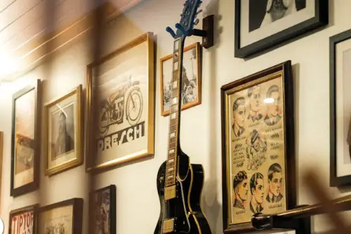
Whether it’s tennis rackets, guitars, or vintage skis, hobby gear on the wall can easily turn into kitsch. Designers caution that unless the item is truly unique or beautifully presented, it can feel more like storage than art. These pieces work better in personal spaces where they add meaning without dominating the decor. In main areas, they often feel too on-the-nose.
If your passions are central to your style, try displaying a single, standout piece with thoughtful framing or placement. Context and balance matter. Your walls should nod to your interests—not shout them. Display less, but do it better.
16. Framed Stock Photography

That black-and-white photo of a random pier or a bowl of fruit might look “neutral,” but it rarely adds character. Designers see stock imagery as filler—safe, but soulless. These pictures don’t tell your story or reflect your personality, which makes your home feel generic. A home should look lived-in, not like a waiting room.
Instead, try using your own photography, or explore vintage markets for more meaningful imagery. Even amateur shots have charm when printed and framed with care. Let your walls reflect your experiences, not someone else’s placeholder. Real memories beat random landscapes every time.
17. Cheap Wall Stick-On Mirrors
Peel-and-stick mirror decals might promise to add light and depth, but in reality, they usually do neither. These flimsy, distorted pieces often warp over time and look like an afterthought rather than design. Designers say they can cheapen a room instantly, especially when applied in odd geometric patterns. They don’t function well as mirrors—and they don’t fool anyone.
Instead, invest in a real mirror with substance, weight, and frame presence. Mirrors should feel intentional, not gimmicky. When placed well, they can expand a space and reflect beauty. When stuck on like decals, they just reflect poor decisions.
18. Faux Vintage Signs
Signs that say things like “Farm Fresh Eggs” or “Laundry 5¢” might work in a farmhouse kitchen—but they rarely read as authentic. Most of these signs are printed to look aged, but end up feeling forced and inauthentic. Designers agree that faux nostalgia can strip a space of its real character. When everything is pretending to be old, nothing feels genuine.
If you love vintage, look for actual antique signage or thrifted finds with a history. It’s not about being trendy—it’s about being true to your taste. Let your decor have a story that’s real, not manufactured. Your walls should reflect who you are, not who a marketing team thinks you should be.
This post 18 Things Designers Wish You’d Stop Hanging on Your Walls was first published on Greenhouse Black.