
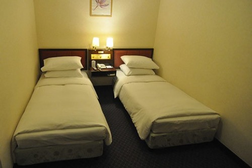
1. Narrow Walking Paths
When sofas pinch walkways against walls or dining chairs barely leave room to slide back, movement becomes constrained. Guests may feel trapped in their seating or awkwardly shuffle between zones. Even a well-designed layout loses grace when flow is blocked. No one likes squeezing past furniture just to get a drink.
Maintain paths that are at least 36 inches wide where possible. Prioritize layout that accommodates circulation, not just placement. Movement reflects freedom—and freedom fuels comfort. Your furniture’s position shapes your hospitality.
2. Too Many Decorative Pillows
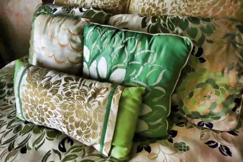
A bed or sofa piled high with throw pillows might seem cozy, but guests often hesitate to sit or settle in. The layering creates visual clutter and physical barriers to comfort. They may feel unsure about where to place or move the pillows, increasing social tension. A soft touch can become a sharp statement if it’s overdone.
Edit down to just a few purposeful accents. Texture matters more than count. Let decor invite interaction, not choreograph it. Minimal cushions often lead to maximum comfort.
3. Low-Hanging Light Fixtures
Statement chandeliers and bold pendants can add elegance—but when they’re hung too low, they threaten headspace. Guests find themselves ducking or sidestepping, which interrupts natural movement and creates subconscious discomfort. A fixture that looms is rarely welcoming. Suspended style needs altitude.
Raise fixtures to allow sightlines and motion underneath. Aim for at least 7 feet from floor to base in living areas. Lighting should illuminate—not intimidate. Space is felt vertically as much as it is side to side.
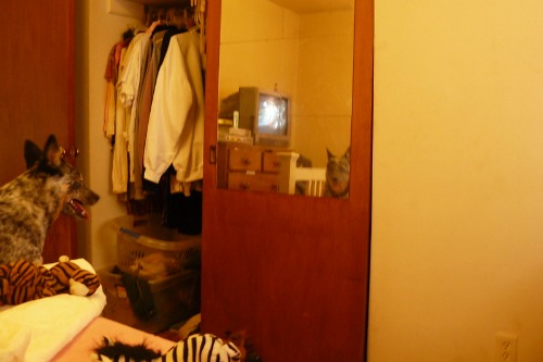
4. Closed-Off Corners
Fully enclosed reading nooks or tight alcoves may seem charming, but guests often avoid them for fear of feeling cut off. Without visual connection to the main room, these spaces can induce a sense of isolation or containment. They whisper “retreat” when the moment calls for “engage.” Intimacy needs invitation—not seclusion.
Soften corners with open shelving, windows, or partial dividers. Design connection points that anchor, not isolate. Even quiet zones benefit from visual warmth. Claustrophobia often starts in the shadows.
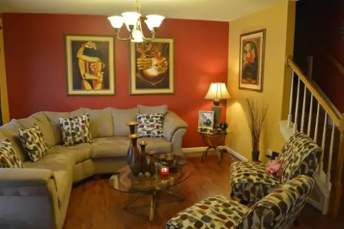
5. Oversized Furniture in Small Rooms
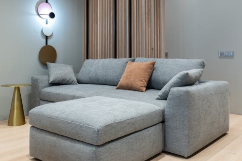
Even the most stylish couch can overwhelm a room if it’s too bulky for the footprint. Large sectionals, deep armchairs, and king-sized coffee tables often leave little space to move around freely. Guests may feel boxed in or cautious not to bump into anything, especially in high-traffic areas. Style isn’t the issue—scale is.
Proportional furniture allows breathing room and flow, making spaces feel expansive rather than oppressive. Consider slim silhouettes, leggy frames, or modular pieces that adapt to gatherings. Roominess isn’t just physical—it’s psychological. Guests relax when space respects movement.
6. Mirrors That Multiply Clutter
Mirrors are usually considered space-expanders—but when they reflect busy shelves, dense gallery walls, or piles of objects, they double the visual overwhelm. Guests may feel visually boxed in by layers they weren’t meant to see twice. Design that intends lightness can accidentally cause chaos. Reflection should reveal—not repeat mess.
Use mirrors to bounce light or emphasize calm areas like windows or greenery. Limit mirror size and placement in cluttered rooms. A good reflection supports ease, not anxiety. Let your mirror echo serenity.
7. Heavy Drapes and Dark Walls
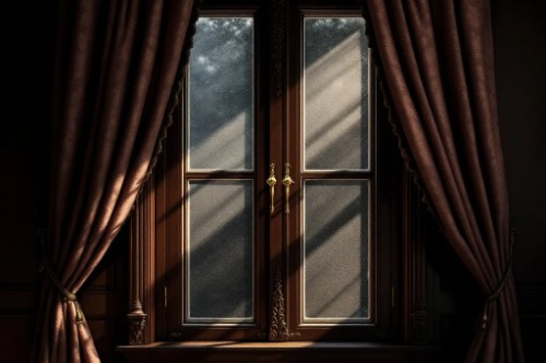
Dark tones and thick textiles can create elegance—but in excess, they also create compression. Guests may sense emotional heaviness or reduced visibility, which amplifies claustrophobic vibes. Rich colors need balance, and dense drapery needs air. A moody palette doesn’t have to be stifling.
Pair deep hues with lighter trim, mirrors, or intentional lighting. Choose curtains with movement or semi-sheer options for flexibility. Let darkness feel inviting—not overwhelming. Weight should express warmth—not walls.
8. Overstuffed Shelves and Cabinets
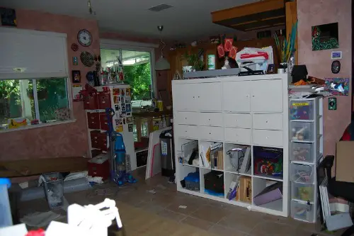
A wall full of books, vases, and collectibles might reflect personality—but it can also crowd the senses. Guests feel visually bombarded when every surface competes for attention. It’s not the items—it’s the absence of pause between them. Eye space matters just as much as floor space.
Curate with breathing room—leave empty sections, vary object heights, and avoid symmetry overload. Style thrives with negative space. Every shelf needs silence between the words. Display less to say more.
9. Lack of Natural Light
A room with few windows or heavy coverings can create an enclosed feeling, even with stunning furniture and finishes. Natural light offers psychological expansion and emotional ease—its absence shrinks more than shadows. Guests instinctively look for light to orient and relax. Dimming it dampens the mood.
Install mirrors opposite windows, opt for lighter paint colors, and trim window treatments to invite daylight in. Even an indirect glow beats artificial fill. Brightness isn’t vanity—it’s vitality. Airiness comes in rays.
10. Monolithic Color Schemes
Rooms painted entirely in one hue—from floor to ceiling—can lack dimension and overwhelm the eye. Without contrast, guests feel disoriented, as depth disappears and navigation becomes less intuitive. A monochrome space may seem chic—but it’s also emotionally flat. Saturation needs balance to avoid suffocation.
Break up the palette with texture, tone variation, or pops of complementary color. Add visual rhythm through artwork, textiles, or plant life. Depth is created through contrast. Color should engage—not engulf.
11. Ceiling Too Low with No Vertical Accents
Low ceilings don’t automatically make a space claustrophobic—but failing to visually lift them does. Without tall decor, vertical lines, or strategic lighting, the ceiling can feel like it’s pressing down. Guests sense constraint, not containment. The room needs a visual exhale.
Use vertical mirrors, floor-to-ceiling shelves, or tall plants to draw the eye upward. Paint ceilings in light, cool tones to expand overhead space. Lift through design where structure won’t. The sky doesn’t end at eight feet.
12. Overuse of Closed Storage
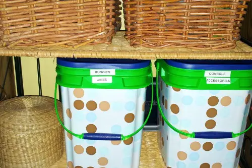
Closed cabinetry, bins, and drawers keep clutter at bay—but when every item is tucked away, the space can feel sterile or over-managed. Guests may feel uncertain about interacting or locating necessities. A little visibility signals welcome and accessibility. Hidden doesn’t always mean helpful.
Include open shelves, baskets, or display zones for balance. Show what’s in use—not just what’s stored. Access creates ease, and ease breeds comfort. The best rooms reveal just enough to belong.
This post 12 Things That Make Guests Feel Claustrophobic—Even in a Well-Designed Home was first published on Greenhouse Black.