
1. Impossibly Curated Shelves
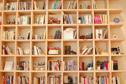
When every shelf holds matching vases, color-coded books, and decorative objects arranged with surgical precision, it feels more like a visual display than a lived-in space. These setups often lack personal touches—no dog-eared novels, souvenirs, or anything slightly imperfect. Guests may admire the aesthetics but wonder, “Does anyone actually touch these things?” It’s styled to impress, not to connect.
Narrative design favors emotion over perfection, inviting curiosity through stories told in objects. A shelf can still look beautiful while holding mismatched frames or lived-in items. Real homes have layers, not just themes. Let your shelves whisper instead of shout.
2. Identical Color Palette Across Rooms
A strict adherence to beige, taupe, or greige everywhere can make a home feel like a showroom. While cohesion is good, over-uniformity flattens emotional depth and strips personality. Guests may struggle to distinguish one room from the next—it’s continuity without contrast. When everything matches, nothing moves you.
Instead, consider color as a mood-setting tool—warm tones in gathering areas, cooler hues in bedrooms. Let variation reflect energy shifts throughout the day. Homes speak through tone and texture, not just palette. A little contrast goes a long way in feeling human.
3. Branded Signage or Catchphrases

Typography art with phrases like “Gather,” “But First, Coffee,” or “Stay Awhile” turns spaces into retail décor. These signs rarely reflect the owner’s voice and often feel copied from trend guides. They’re a placeholder for personality rather than an expression of it. Guests notice when meaning feels mass-produced.
Swap slogans for imagery or words that feel personal—handwritten notes, vintage signage, or framed memories. Your walls should spark connection, not mimic marketing language. Cliché decor has a shelf life. Sentiment lasts longer than font selection.
4. Coordinated Product Lines
When all pillows, throws, rugs, and furniture are from one brand or product line, rooms risk feeling transactional. It’s convenience over character—a design shortcut that skips soul. Guests can sense when nothing has been collected, gifted, inherited, or discovered. The space begins to echo retail rhythm rather than personal cadence.
Layer in pieces from different eras or sources to add dimension. Thrifted finds and travel mementos can ground a room and disrupt the showroom effect. A true home mixes stories, not just SKUs. Beauty comes in variation, not duplication.
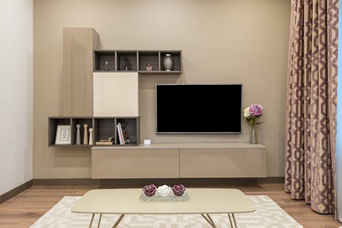
5. Immaculately Staged Coffee Tables
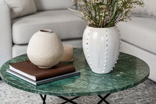
A tray with perfectly stacked books, a pristine candle, and an untouched orchid might look stunning—but it often feels untouchable. When every element is styled for composition rather than use, guests hesitate to set down a drink or move anything. It’s more installation than invitation. Design becomes performance.
Instead, let surfaces show life—a coaster in reach, an open magazine, a bowl for keys. Comfort begins with access, not aesthetics alone. The best coffee tables are lived on, not just looked at. Let the styling breathe and the function lead.
6. Accent Walls Built Around Trend
Chevron wood paneling, bold geometric shapes, or murals chosen to mirror social media trends can date a space quickly. These choices often prioritize visual impact over emotional resonance. Guests may admire the feature but struggle to feel at ease—it’s statement without context. A wall should speak for you, not for your algorithm.
Choose materials or patterns that mean something—stone from a hometown quarry or wallpaper with cultural motifs. Personal touches build longevity. When trends fade, meaning remains. Expression works best when it’s rooted.
7. Furniture That’s Beautiful but Unusable
Sharp-edged side tables, low-profile sofas, and sculptural chairs often sacrifice comfort for silhouette. Guests may find themselves sitting stiffly, unsure how to lounge—or avoiding the furniture altogether. Style that intimidates use turns homes into galleries. Beauty isn’t enough if it repels engagement.
Consider fabrics, forms, and dimensions that support real life. A cozy armchair or a table that welcomes clutter shows people they belong. Comfort can be stunning too. Invite touch, not tiptoes.
8. Overuse of Transparent Decor
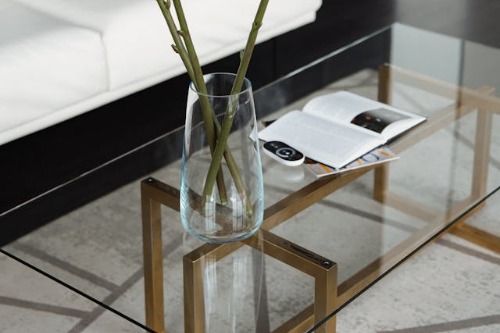
Glass tables, acrylic chairs, and ghost furniture can visually expand a room—but too much transparency starts to feel like a showroom. These pieces lack texture and warmth, creating a space that looks sleek but feels hollow. Guests might struggle to read the room emotionally—it’s there, but it isn’t grounded. Visibility doesn’t equal intimacy.
Break up the gloss with woven fibers, tactile fabrics, or wood tones. A home needs weight as much as lightness. Transparency is a design tool—not a lifestyle. Mix the see-through with the heartfelt.
9. Layered Branding in the Kitchen
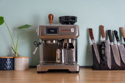
Countertops lined with trending products—from pour-over coffee kits to curated spice jars and cookbooks propped open—can turn cooking zones into influencer staging. If nothing looks used or accessible, the space risks feeling more performative than practical. Guests may admire the display but wonder if anyone actually cooks there. The kitchen becomes content.
Opt for utility-driven beauty: stained cutting boards, family recipes, and tools that show wear. Kitchens are sensory spaces meant to feed more than mouths. A little mess tells a better story than curated perfection. Design should serve function before it serves style.
10. Overexposure to Neutral Texture
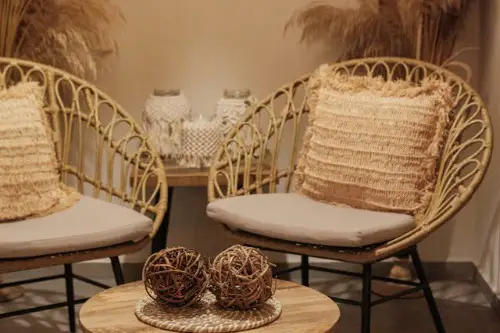
While texture is key to warmth, relying too heavily on beige boucle, rattan, and light oak can wash out a room’s identity. Guests may feel like they’re in a catalog that forgot the heart. When every surface blends into softness without emotional punctuations, the home fades into background. Comfort needs contrast to stand out.
Introduce unexpected materials—a velvet throw, metal lamp, or leather-bound book—to awaken visual depth. Texture should spark not just soothe. Personality can be plush, yes—but also vivid. Balance soft with strong, calm with character.
11. Stylized Entryways with No Utility
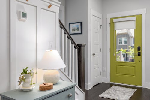
Entryways decked out with oversized mirrors, fresh-cut flowers, and curated trays often lack hooks, benches, or catchalls that actually serve guests. These spaces make a powerful visual impression but no functional gesture. Visitors are left unsure where to drop bags, remove shoes, or settle in. It’s elegance without empathy.
Even high-design entries need baskets for keys or places to pause. A welcoming foyer says “I thought of you,” not “Look at this.” Decor should anticipate behavior—not direct it. Welcome begins with practicality.
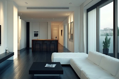
12. Rooms That Photograph Better Than They Function

Spaces built around good lighting angles, statement pieces, and visual flow sometimes fall flat in person. If the room feels curated for content rather than comfort, guests can sense the difference immediately. It’s design for display—not experience. The aesthetic overshadows emotion.
Homes built to live in invite imperfections, storylines, and space to breathe. Design should reflect presence, not posture. A home that functions beautifully will naturally photograph well. Life leaves marks—and those make the best composition.
This post 12 Things That Make Guests Feel Like They’re Visiting a Concept Store, Not a Home was first published on Greenhouse Black.