
1. Lighting That’s Cinematic but Inconvenient
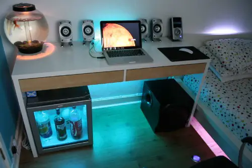
Sculptural fixtures, LED cove lighting, and oversized pendants dominate online design—but they can be poorly positioned or hard to maintain. If turning on a lamp involves navigating smart settings or a hidden switch, guests notice the disconnect. Atmosphere shouldn’t come at the cost of usability. Even beauty needs a plug.
Choose lighting layers that enhance ambiance and function: task lights, dimmers, and warm bulbs. Complexity should serve comfort—not flex tech literacy. If the mood dies with the menu, the light missed the mark. Glowing is better when it’s graceful.
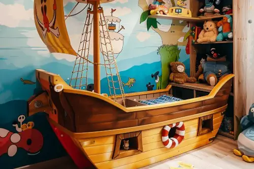
2. Furniture That’s More Statement Than Usable
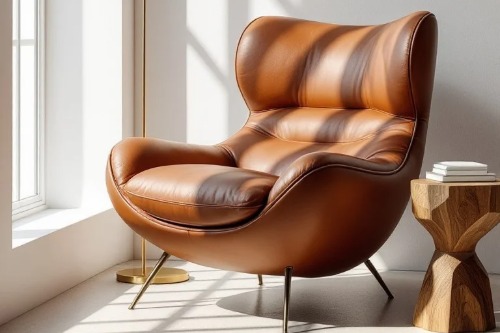
Sculptural chairs, sharp-edged tables, and ultra-low sofas may look editorial—but they can be uncomfortable, inaccessible, or impractical for real-life use. Guests who hesitate to sit or struggle to relax may interpret the space as more performative than welcoming. Design that prioritizes silhouette over experience suggests it was built for eyes—not for people. There’s a difference between admiration and invitation.
Choosing pieces that balance style with usability sends a warmer message. When form supports function, hosting becomes effortless. A stylish chair no one wants to sit in isn’t just decor—it’s a missed opportunity for connection. Ease should never be sacrificed for applause.
3. Overuse of Popular “Influencer” Products
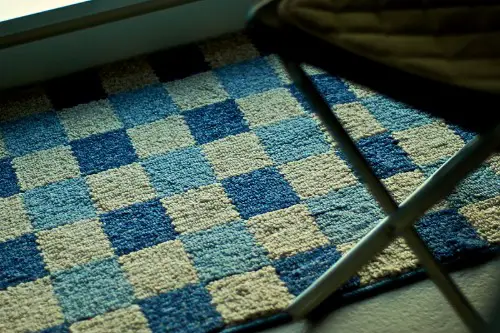
From boucle ottomans to checkerboard rugs and squiggle mirrors, homes overloaded with trending items can read as algorithm-designed. These pieces scream relevance—but may also whisper insecurity. Design led by likes often misses the mark on longevity or individuality. It’s more costume than character.
Trends can be fun—but anchoring them with personal selections makes them meaningful. A room should speak with nuance, not mimic the mood of a feed. Depth is harder to achieve when every detail is sponsored. Thoughtfulness shows through the mix—not the mimicry.
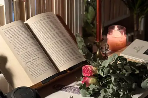
4. Art That’s Chosen for Color Over Connection
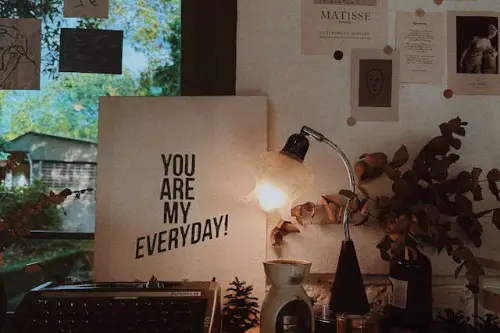
When wall art is selected solely to match the sofa or “complete a look,” it loses emotional weight. Guests often sense when a piece was picked for palette instead of passion. It’s decorative, not expressive—and it subtly signals the space was styled to impress, not inhabit. A painting should say something—beyond “I go here.”
Personal or locally sourced art, framed memories, or pieces that provoke curiosity feel more layered. Even abstract work benefits from context and intention. Design for applause flatlines when sentiment is sidelined. Your walls are your voice—don’t whisper generic.
5. Rooms Designed Around Photo Angles
Spaces that prioritize symmetry, lighting, and clean sightlines over function often reveal an Instagram-first approach. Every corner looks poised—but lacks the emotional comfort or versatility of lived-in design. It becomes clear the room was built for views, not views with friends. Aesthetic is only half the story.
Design that adapts to human moments—even messy ones—leaves a stronger impression. Lighting can flatter without overproducing. Guests connect with homes that feel sincere, not staged. Let angles serve life, not optics.
6. Surfaces Too Styled to Use
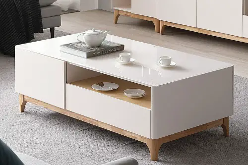
If a coffee table looks more like a showroom vignette than a place to set down a mug, it’s decor with a script. Tray arrangements, stacked books, and fragile centerpieces may look elegant—but if they repel use, they send a message: observe, don’t engage. It turns function into set dressing. The room starts playing a role—not holding one.
Leave breathing room for actual movement—coasters, open books, or even a stray pen. Styling that invites use over admiration changes how a home feels. Let objects live—not just perform. Interaction is the new impression.
7. Matching Decor From a Single Retailer

When every room features identical textiles, furniture lines, or wall art from the same store, the space starts to feel more branded than personal. While it’s convenient and polished, it can unintentionally signal a performance mindset—where cohesion trumps character. Guests might admire the look but sense that it’s curated for optics, not emotion. Design that feels rehearsed is rarely remembered.
Mixing eras, makers, or even materials adds depth and signals confidence in personal taste. A curated home builds resonance through contrast, not repetition. When everything shouts “new arrival,” the personality goes quiet. A story beats a showroom every time.
8. Immaculate Kitchens With No Signs of Cooking
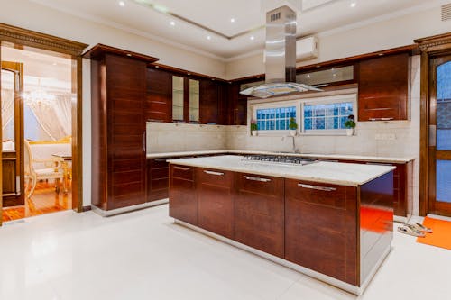
A kitchen so pristine it looks untouched can signal performance over practicality. Hidden appliances, empty counters, and showroom-level styling suggest it’s more for hosting than meal prep. Guests may admire it—but wonder who really uses it. Clean doesn’t always mean cared-for.
Functionality shines through motion—utensils in reach, ingredients visible, or a pot simmering mid-gathering. Let the space speak of flavor, not just finish. A room built for applause forgets how to nourish. Cooking is choreography too—but it needs heat.
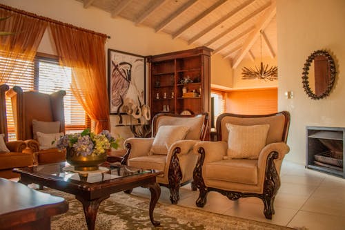
9. Formal Guest Spaces With No Flexibility
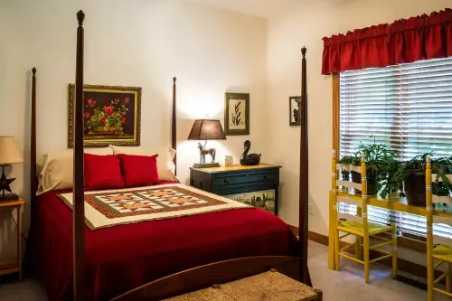
Rooms where every chair is part of a matched set and every cushion is staged into place can feel more like a hotel lounge than a home. The lack of casual clutter or adjustable pieces limits spontaneity and comfort. If people hesitate to move furniture or stretch out, the room becomes rigid. Presentation has replaced participation.
Add flexible seating, throw blankets, or layered lighting to soften structure. Design that adapts shows warmth—and welcomes flaws. Comfort needs freedom, not just framing. If every guest feels on display, hosting starts to miss the point.
10. Overly Themed Decor
Homes styled entirely around one theme—coastal, industrial, mid-century—can start to resemble stage sets. These choices often drown nuance, leaving little room for personal quirks or unexpected contrasts. Guests feel like they’re visiting a concept, not a character. Design becomes descriptive, not expressive.
Blend influences, break formulas, and honor evolution. A home should reflect seasons of taste—not rigid categories. Applause fades when surprise disappears. Let style flex—because stories aren’t one-note.
11. Every Corner “Used” Without Purpose
Filling every inch of floor or wall space with decor, seating, or styled objects can create visual overwhelm. Spaces need negative space to breathe—to signal calm, focus, and intention. When every corner feels occupied, guests sense overcompensation. It’s design that tries too hard not to leave gaps.
Strategic emptiness builds emotional pacing. A blank wall or unfilled nook can feel generous, not neglected. Silence is part of speech—and in design, part of story. Don’t be afraid to let space speak.
12. Mood Boards That Never Shift
Homes that stick rigidly to a design concept—without evolving or responding to life’s changes—can feel emotionally stiff. When the vibe never adapts, it starts to feel more like branding than belonging. Real homes collect—not just coordinate. Living edits design.
Introduce seasonal shifts, spontaneous finds, or moments of whimsy. Your space should surprise even you sometimes. Applause is loud—but intimacy is quieter, deeper. Let growth decorate your rooms.
13. Resistance to Imperfection
When a scuffed floor, creased cushion, or uneven bookshelf triggers panic, the space reveals its fragility. Perfectionism in decor can drain emotional availability and host readiness. Guests may tread lightly—not to preserve beauty, but to avoid disrupting it. When a home flinches at flaws, connection stiffens.
Embrace wear and character as part of your home’s narrative. Let patina and quirks earn their place. Perfection fades—but feeling lasts. Design thrives where people thrive—marks and all.
This post 13 Things That Quietly Reveal a Homeowner Is Designing for Applause was first published on Greenhouse Black.