
1. Subway Tile Backsplashes
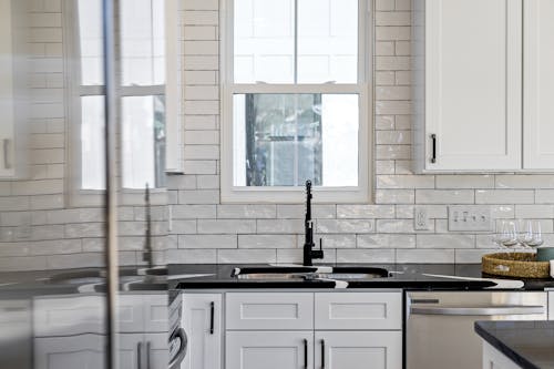
Subway tile was once considered a safe, classic choice—clean, simple, and always in style. But its ubiquity has dulled its impact, and more people now associate it with overdone renovations and budget-friendly flips. What was once timeless now feels template-like, lacking personality or innovation. It’s the design equivalent of playing it too safe.
Designers are exploring alternatives like zellige, hand-painted tile, or stone slab backsplashes that offer texture and variation. These choices bring warmth and uniqueness without sacrificing visual clarity. Subway tile hasn’t vanished, but it’s stepping aside for finishes that feel more personal. Predictability is quietly losing its edge.
2. Gray-on-Gray Color Schemes
The all-gray palette had its heyday—soothing, neutral, and universally appealing. But now it’s being called out for making rooms feel cold, lifeless, or emotionally flat. While it was once the safe choice for homeowners and stagers, it’s falling out of favor in light of warmer neutrals and earth tones. “Timeless” doesn’t mean emotionless.
Soft taupes, dusty greens, and muted terracottas are returning with intent, creating depth and psychological warmth. Gray still has utility, but it’s being demoted from default to accent. Homes are embracing color again—not bold, but honest. The gray era is graying out.
3. Shaker Cabinets
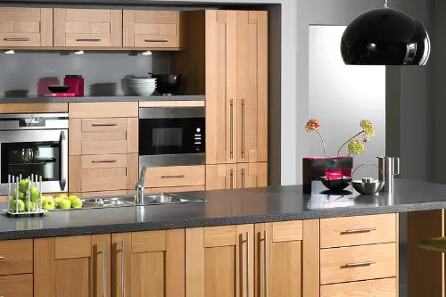
Shaker cabinets—simple, framed fronts with clean lines—have long been synonymous with timeless kitchen design. But their dominance has begun to feel formulaic, especially in builder-grade homes and white-on-white kitchens. The predictability dilutes their impact, turning “classic” into “expected.” What used to signal refined simplicity now often reads as design inertia.
More homeowners are choosing slab fronts, fluted textures, or even inset panels with artistic flair. Cabinet design is being used as a storytelling tool, not just a safety net. Shaker hasn’t disappeared—but it’s no longer the default. Tradition is being reimagined, not repeated.
4. All-White Interiors
White rooms once suggested purity, spaciousness, and versatility—design that wouldn’t date. But now they risk feeling sterile, unfinished, or impersonal, especially without layering or texture. The “blank canvas” look has started to feel emotionally empty in an age craving comfort and character. Timelessness shouldn’t come at the expense of soul.
Today’s interpretation of lightness includes warmer whites, mixed textures, and soft contrasts that invite rather than isolate. Even minimalists are embracing nuance over starkness. White isn’t gone—it’s evolving into something more tactile and lived-in. The goal is serenity, not sanitization.
5. Open Floor Plans Without Separation
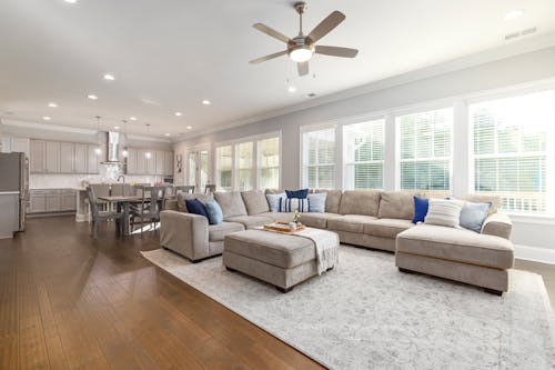
The open floor plan was once the pinnacle of modern living—removing walls to encourage flow, light, and connection. But pandemic-era living exposed the downsides: noise bleed, lack of privacy, and emotional fatigue from too much openness. “Timeless” became “tiring” when homes lacked any visual or functional boundaries. Open didn’t always mean inviting.
Designers are reintroducing soft separations—partial walls, arches, sliding screens, and zones defined by furniture or lighting. The new version of openness honors versatility without demanding exposure. It’s about balance, not banishment. Homes are carving out corners to rediscover comfort.
6. Industrial Fixtures in Residential Spaces
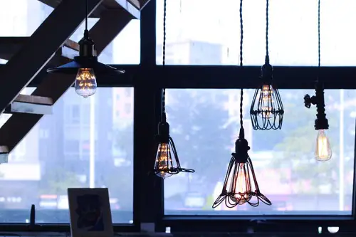
Exposed piping, Edison bulbs, and black metal finishes once made homes feel edgy and chic. But what started as a nod to loft living became a mass-market motif—and it’s losing relevance in more personal, comforting interiors. The industrial look now often feels harsh, gimmicky, or overly branded. “Timeless” turned into overused shorthand.
Soft brass, muted chrome, and hand-finished ceramics are being embraced as warmer alternatives. Fixtures are returning to their decorative origins, adding character instead of echoing commercial design. The pendulum is swinging from raw to refined. Industrial isn’t out—it’s just no longer a blanket approach.
7. Wall-to-Wall Carpeting
For decades, wall-to-wall carpeting was synonymous with coziness and practical design. But it’s become less desirable due to maintenance issues, poor longevity, and design limitations. While it once felt “complete,” it now feels visually heavy and hard to personalize. Timelessness doesn’t mean immobile.
Area rugs layered over hard flooring offer flexibility, style, and easy updates. Carpeting isn’t extinct—but it’s being used more selectively and strategically. Design is favoring freedom of movement and variation. Comfort now includes options, not just padding.
8. Stainless Steel Everything
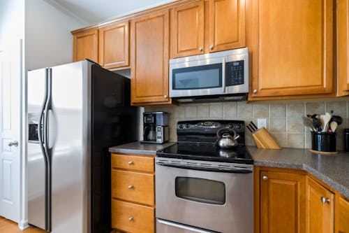
Stainless steel appliances and fixtures were once the gold standard for sleek, functional design. But their ubiquity has made them feel more corporate than custom. Fingerprints, glare, and a cold aesthetic have prompted a shift toward alternative finishes like matte black, brushed gold, and integrated paneling. “Timeless” has started to look tired.
Appliances are being softened to complement interiors rather than dominate them. Mixed-metal kitchens and colored ranges offer personality and warmth. Stainless still works—it just no longer defines. Design is asking for nuance, not uniformity.
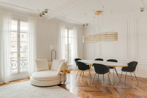
9. Formal Dining Rooms
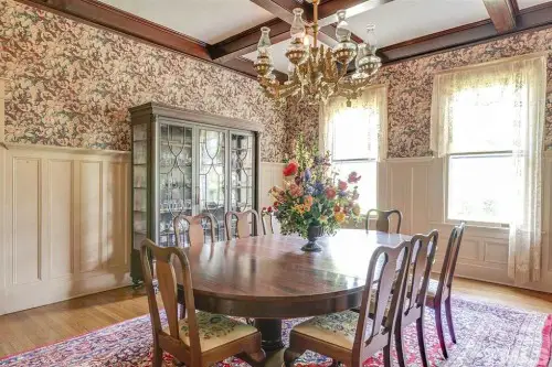
A dedicated, rarely-used dining room was long considered a staple of home design—symbolizing occasion and tradition. But as lifestyles shift toward informal hosting and multifunctional spaces, the formal dining room has lost its footing. It’s now often repurposed as an office, reading room, or flex zone. Usefulness has overtaken symbolism.
Rooms are being defined by activity, not architectural precedent. Dining still matters—but not in isolation. The “timeless” model of rigid space designation is being replaced by fluid living. Function makes the final impression.
This post 9 “Timeless” Touches That Are Aging Out of Relevance was first published on Greenhouse Black.