
1. Peel-and-Stick Fake Brick Panels
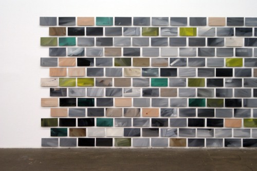
Peel-and-stick brick panels can look convincing online, but in person, they often read as plastic and flimsy. The texture doesn’t mimic real brick well, and the seams between panels are usually obvious. When the light hits them at the wrong angle, the shiny surface gives away the illusion. Instead of adding charm, they can cheapen a space quickly.
These panels also tend to warp or peel at the edges, especially in humid environments like kitchens or bathrooms. The adhesive is rarely strong enough to hold up long-term, which leads to curling corners. Once that happens, it’s impossible not to notice. A real brick veneer or limewash finish may be pricier, but it has the longevity and authenticity the peel-and-stick panels lack.
2. Wallpaper Borders
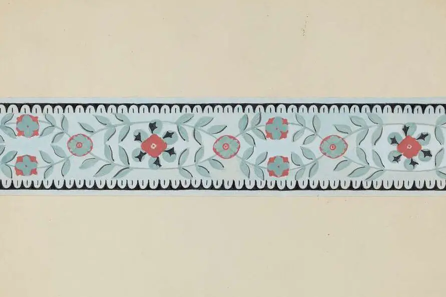
Wallpaper borders were a big trend in the ’80s and ’90s, but now they instantly date a room. The strip running around the top of the wall tends to make ceilings look lower. Even when the design is simple, it interrupts the flow of the wall in a way that feels cluttered. In person, it rarely adds sophistication—it usually takes it away.
Borders are also tricky to apply evenly, and imperfections in alignment stand out more than you’d expect. Over time, edges can peel or discolor, especially in sunny rooms. Removing them is a hassle, and even when gone, they sometimes leave residue behind. Today’s cleaner wall designs or full-wall murals feel more modern and cohesive.
3. Sponge Painting

Sponge painting was once thought to add texture and interest, but today it mostly looks messy. The uneven blotches tend to resemble accidental stains more than intentional artistry. It rarely enhances the architecture of a room and often feels amateur. In person, the inconsistency in pattern is distracting rather than stylish.
Another issue is that sponge painting doesn’t age well. Dust and dirt can cling to the textured surface, making the wall look dingy. Painting over it later is a nightmare because the blotchy tones bleed through without multiple coats. A smooth, even finish almost always looks fresher and more high-end.
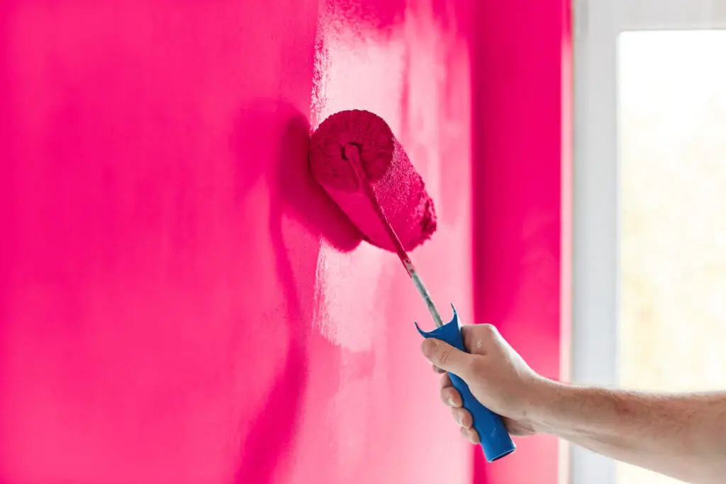
4. Overly Glossy Paint
High-gloss paint can work in specific situations, but when used on large walls, it tends to look cheap. The shininess exaggerates imperfections in drywall, highlighting every bump and seam. Instead of a polished finish, the result can feel like a poorly done DIY. Matte or eggshell finishes are far more forgiving and modern-looking.
Glossy walls also create glare under natural or artificial light. That shine makes rooms feel harsher and less comfortable. It can even distort color, making hues appear brighter or more artificial than intended. While glossy trim has its place, glossy walls almost always look out of step.
5. Plastic Paneling
Plastic wall paneling is marketed as durable and easy to clean, but in person it reads as flimsy. The seams and grooves are usually exaggerated, making walls look like a temporary installation. The artificial sheen gives away the material immediately. Instead of elevating a room, it tends to cheapen it.
Over time, plastic paneling is prone to discoloration, especially when exposed to sunlight. Scratches and dents show easily, and there’s no real way to repair them without replacing panels. In damp spaces, warping is also common. Natural wood or even painted drywall almost always looks more timeless.
6. Faux Finishes with Rollers or Stencils
DIY faux finishes using rollers or stencils often promise an upscale effect, but they rarely deliver. In person, the patterns tend to look repetitive and overly deliberate. It’s clear they’re mass-produced rather than organically textured. Instead of sophistication, they give the impression of cutting corners.
These finishes also highlight application mistakes. Smudges, uneven coverage, and visible roller marks stand out more than you’d expect. The designs often clash with furniture and décor over time, aging poorly. A solid coat of high-quality paint typically looks cleaner and more expensive.
7. Acoustic Popcorn Ceilings
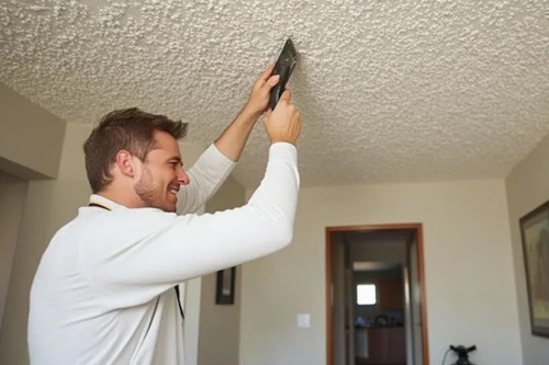
Popcorn ceilings were once popular for hiding imperfections, but now they scream outdated. The texture immediately signals a cost-cutting approach from decades past. In person, it doesn’t feel cozy or stylish—it just looks like something that needs to be removed. For many buyers, it’s a red flag.
Popcorn also traps dust and cobwebs, making it look dingy quickly. Painting over it is difficult, and cleaning it without damaging the texture is nearly impossible. It can also lower the perceived ceiling height by creating a shadowy, uneven surface. Smooth ceilings nearly always feel brighter and more open.
8. Cheap Vinyl Decals
Vinyl wall decals seem fun and easy, but in person they often look juvenile. The flat, plastic-like finish doesn’t blend into the wall the way paint or mural wallpaper does. You can usually spot the edge of each decal, which takes away from the illusion. They tend to make a space feel temporary rather than thoughtfully designed.
These decals also don’t hold up well over time. Edges curl, adhesive weakens, and they can leave residue behind when removed. Larger designs often wrinkle during application, making them look sloppy. Painted murals or framed artwork provide a more intentional, polished effect.
9. Fake Wood Paneling
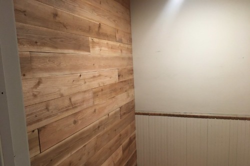
Thin wood-look paneling, especially the kind popular in mid-century basements, immediately dates a room. It lacks the depth and richness of real wood, often looking flat and laminated. The uniformity of the panels makes them read as fake, especially under direct light. In person, they rarely feel warm or inviting.
These panels also tend to warp and peel, particularly in humid environments. Once damaged, they’re hard to repair without replacing whole sections. Even when intact, the seams between panels make a wall look busy and low-budget. Real wood planks or painted walls create a more timeless backdrop.
10. Glitter Paint or Additives
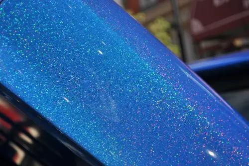
Glitter paint promises sparkle, but in reality, it usually looks patchy and cheap. The glitter rarely distributes evenly, creating random clumps that resemble craft projects. In person, the sparkle catches light in distracting, inconsistent ways. Rather than elegance, it feels more like a school art project gone wrong.
Cleaning glitter-coated walls is also a nightmare, as the texture traps dust and is hard to repaint. Over time, the shimmer effect tends to fade unevenly. The surface can look dull in some areas and overly sparkly in others. If shine is the goal, metallic finishes or polished wallpapers achieve it more tastefully.
11. Low-Quality Wainscoting Kits
Wainscoting can look timeless, but cheap kits often have the opposite effect. Thin, lightweight panels look hollow compared to solid wood. Seams don’t align well, and gaps between boards are noticeable up close. Instead of elevating the room, they emphasize shortcuts.
Over time, the adhesive or fasteners can loosen, creating visible separation from the wall. Paint doesn’t always adhere smoothly to the surface, highlighting the material’s low quality. The result feels more like stage scenery than architectural detail. Professionally installed wainscoting or trim work always carries more weight.
12. Excessive Faux Stone Veneer
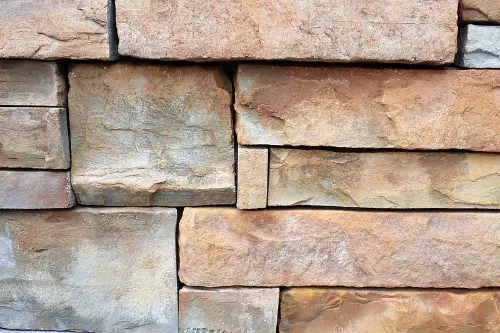
Faux stone veneer can look convincing in moderation, but too much of it overwhelms a space. The colors often read as overly uniform, which gives away their artificial nature. The texture may feel plastic-like instead of natural. In person, it can feel more like a theme restaurant than a home.
Installation mistakes are also very visible. Uneven spacing, messy grout lines, or awkward corners all reveal the shortcut. Over time, cheaper veneers may chip or fade, further reducing the effect. Natural stone or restrained use of veneer goes much further in creating a high-end look.
This post 12 Wall Treatments That Immediately Look Cheap in Person was first published on Greenhouse Black.