
1. Overly Themed Rooms
Designing a room entirely around a single theme—like coastal, farmhouse, or industrial—used to be a way to show off your style savvy. But when taken too literally, it can feel more like a set than a home. It also limits flexibility as your tastes evolve. A room shouldn’t feel like it came with a costume.
Now, people are blending influences to create more nuanced, personal spaces. A touch of coastal here, a bit of vintage there—it’s about creating a vibe, not following a formula. The new flex is subtlety and storytelling. Your home should reflect your life, not just a trend.
2. Statement Bathtubs in the Middle of the Room
Freestanding tubs placed dramatically in the center of a bathroom used to scream luxury. But unless you’re living in a spa, they often end up being more about looks than function. They take up a ton of space, require complicated plumbing, and are rarely used as often as people think. It’s a classic case of form over function.
Now, people are prioritizing showers with thoughtful features—like built-in benches, rainfall heads, and steam options. If there is a tub, it’s often tucked into a cozy nook or paired with practical storage. The new flex is comfort and usability, not just visual drama. A bathroom should feel like a retreat, not a showroom.
3. Open Shelving in Kitchens
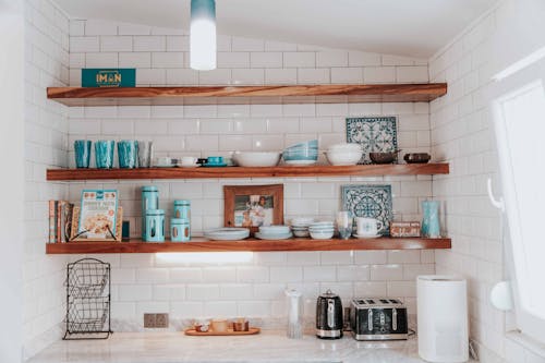
Open shelving was once the darling of Pinterest and design blogs, showing off perfectly styled stacks of dishes and curated ceramics. But in real life, it’s a dust magnet and a visual clutter trap. Unless you’re extremely tidy, it can make your kitchen feel chaotic instead of chic. And let’s be honest—most of us don’t have matching dishware worthy of display.
Closed storage is making a comeback for its practicality and cleaner look. Glass-front cabinets offer a nice middle ground if you still want to show off a few pretty pieces. The new flex is a kitchen that works hard and looks good doing it. Function is finally getting the spotlight it deserves.
4. Wall-to-Wall Marble
Marble everything—counters, floors, backsplashes, even furniture—was once the ultimate symbol of high-end taste. But when used excessively, it can feel cold, overdone, and frankly a bit try-hard. It also stains and scratches easily, making it less practical than it looks. What was once a luxury is now starting to feel like a cliché.
Designers are now mixing materials—pairing marble with wood, metal, or textured tile to create more balanced, layered spaces. Even using marble in smaller doses, like an accent backsplash or a coffee table, feels fresher. The new luxury is restraint and thoughtful contrast. It’s about knowing when to stop.
5. Giant Kitchen Islands with No Purpose
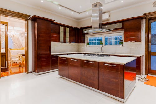
Oversized kitchen islands used to be the ultimate brag—look how much space I have! But if they’re too big to use comfortably or lack storage and seating, they just become wasted real estate. They can also interrupt the flow of the kitchen and make it harder to move around. Bigger isn’t always better.
Now, people are opting for islands that are scaled to the space and packed with function—think drawers, outlets, and built-in appliances. Some are even swapping islands for large tables to encourage more casual, communal dining. The new flex is a kitchen that invites connection, not just admiration. It’s about how the space feels, not just how it photographs.
6. Matching Furniture Sets
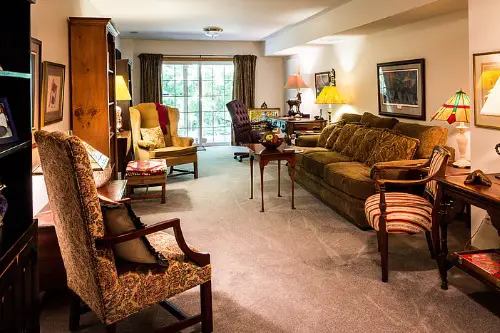
Buying the entire showroom set—sofa, loveseat, coffee table, and side tables all in the same style—used to be a shortcut to a “put-together” look. But now, it just feels flat and uninspired. It lacks the layered, collected feel that makes a space truly personal. It’s more catalog than character.
Mixing styles, eras, and materials creates a more dynamic and lived-in vibe. A vintage chair next to a modern sofa or a rustic table paired with sleek lighting adds depth. The new flex is knowing how to curate, not just coordinate. It’s about taste, not templates.
7. Ultra-Minimalist Living Rooms
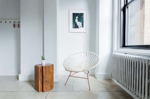
Minimalism had its moment—white walls, low-profile furniture, and barely-there decor. But now, those sparse spaces are starting to feel more empty than elegant. They can lack warmth, personality, and the kind of comfort that makes you want to stay awhile. It’s a look that often prioritizes aesthetics over actual living.
Soft maximalism is taking over with layered textiles, cozy seating, and meaningful objects. It’s not about clutter—it’s about character. The new flex is a space that feels like you, not just a mood board. Comfort is finally cool again.
8. All-White Kitchens
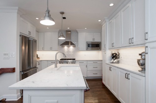
For years, the all-white kitchen was the ultimate design flex—clean, bright, and “timeless.” But lately, it’s starting to feel more sterile than stylish. Without contrast or warmth, these kitchens can come off as cold and overly clinical. They also show every smudge, crumb, and fingerprint, which makes them high-maintenance in real life.
Designers are now leaning into warmer tones, natural wood, and colorful cabinetry to bring personality back into the kitchen. Even subtle shifts—like creamy off-whites, brass hardware, or a statement backsplash—can make a big difference. The goal is still elegance, but with a little more soul. White isn’t out entirely, but it’s no longer the only option.
This post 8 Most Common Design “Flexes” That Are Quietly Out of Style was first published on Greenhouse Black.