
1. Avocado Green Everything
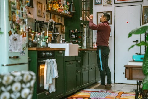
This color defined kitchens in the 1960s and ’70s—but its recent revival hasn’t quite hit the mark. It’s bold in theory but muddy in practice, often clashing with contemporary finishes. What was once earthy now feels erratic. Green dreams age fast.
Designers hoped for retro warmth but got wall-to-wall nostalgia overload. The color dominates instead of complements. Avocado still bruises the room. Some hues should stay in the fruit bowl.
2. Wall-to-Wall Shag Carpet
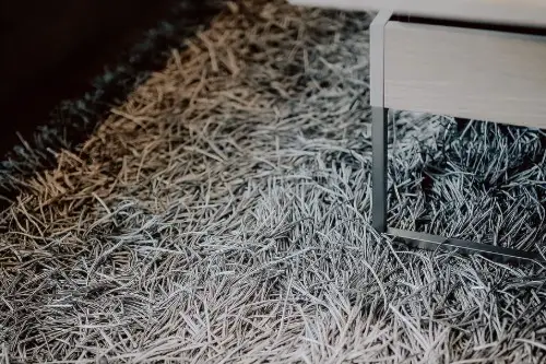
Its comeback promised coziness—but designers quickly realized it traps dust, dulls natural light, and rarely looks fresh for long. What feels plush underfoot quickly becomes a cleaning nightmare. Texture turns into turmoil. The floor starts to fight back.
Modern homes need ease and adaptability, not a full-time vacuum schedule. Even nostalgia has hygiene limits. Shag shows up strong—but overstays the welcome. Feet love it, but eyes don’t.
3. Retro Tile Patterns (Think Checkerboard and Mosaic)
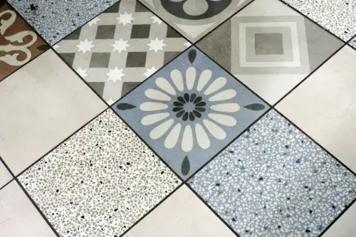
These designs can charm in small doses—but when applied wall-to-wall, they overwhelm. Designers reintroduced them hoping for whimsy, but got visual overload instead. The patterns compete for attention in all the wrong ways. Bold turns into busy.
What worked in diners or vintage bathrooms doesn’t always translate to open-concept homes. Guests feel dizzy, not delighted. Checkerboard checks out quickly. Whimsy walks a fine line.
4. Mirrored Walls
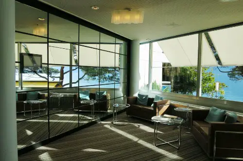
Originally meant to expand space and bounce light, mirrored walls now read more nightclub than home. Designers hoped for glamor; they got glare. Maintenance is a pain and fingerprints become permanent décor. Reflection steals focus.
They disrupt intimacy and age rooms overnight. What once dazzled now distracts. Mirrors belong in moderation. Whole-wall shine dulls the mood.
5. Ruffled Window Treatments
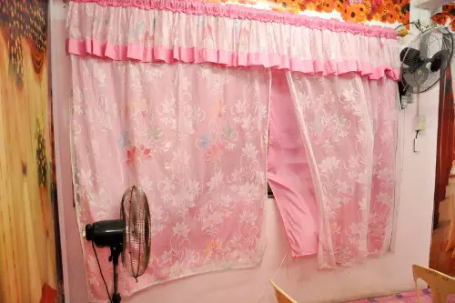
Ruffled valances and layered sheers returned briefly—but quickly brought back dust, visual clutter, and oddly formal vibes. They frame the window like a wedding cake—pretty but perplexing. Fuss fights function. Air and light deserve freedom.
Designers wanted charm but got fluff. These curtains curate confusion. Windows shouldn’t wear corsets. Views look better undressed.
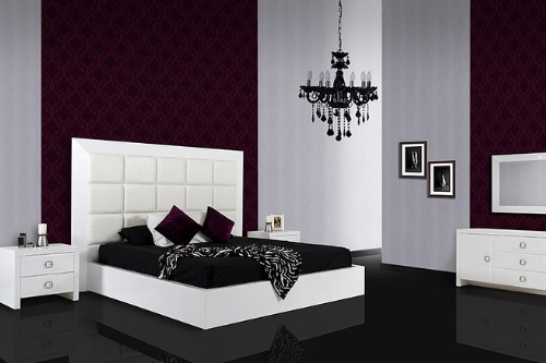
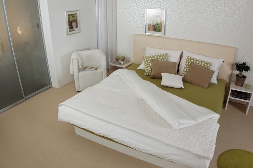
6. Oversized Arched Headboards
The dramatic shape reappeared to nod at Art Deco—but the scale often overpowers bedrooms. Instead of cozy, it feels theatrical. Rooms shrink beneath the curve. Design becomes drama.
Many regret the distraction—especially when coordinating bedside pieces becomes impossible. Arch stops the flow. Bigger isn’t always better. Sleep suffers under statement pieces.
7. Plastic Chrome Accents
Inspired by mid-century diners and atomic-era furniture, designers flirted with chrome revival—but the shine quickly felt cheap. Scratches show fast, and the aesthetic often clashes with warm materials. Glam fades to gimmick. Style shouldn’t squeak.
It’s too reflective to be grounding, and too cold to feel welcoming. Metal needs maturity. Chrome corners age poorly. The future shouldn’t echo a soda fountain.
8. Sunken Living Rooms
Retro for sure—but impractical almost always. Designers reintroduced them as cozy conversation pits, but found they disrupted flow, complicated furniture layout, and posed accessibility issues. You enter, then stumble. Nostalgia isn’t always safe.
Guests trip, furniture tips, and flow suffers. This trend belongs to architecture—not lifestyle. Depth should come from decor—not floor height. The pit quickly becomes a pothole.
9. High-Gloss Lacquer Everything
A few glossy cabinets can feel modern, but full lacquered rooms echo 1980s showroom excess. Fingerprints, glare, and cleaning woes mount quickly. Shine outshines comfort. The room becomes a mirror maze.
Designers sought sleek and got slippery. What reflects light often rejects warmth. High gloss hides home. Matte matters more now.
10. Faux Brick Interior Walls
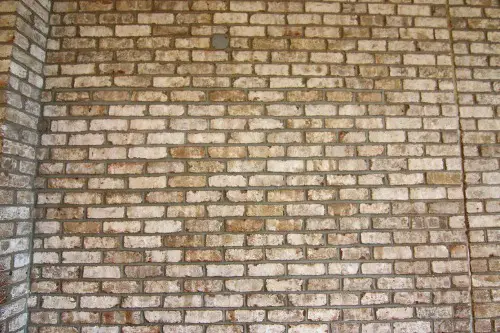
Faux brick aimed to bring charm—but often delivered kitsch. It peels, crumbles, and rarely matches the home’s bones. Texture tries, but truth triumphs. Brick belongs where brick was born.
Designers hoped for cozy industrial—but got suburban cosplay. When fake meets fatigue, style surrenders. Real materials win every time. The wall knows what it wants.
11. Clashing Floral Wallpapers
Busy florals made a comeback—but applying them to entire rooms triggers visual fatigue and limits furniture flexibility. Instead of quaint, they read chaotic. What was romantic now feels restrictive. The garden invades the walls.
Designers regret not scaling back sooner. Accent walls? Yes. Every wall? No. Pattern should whisper, not shout.
12. Glass Block Walls
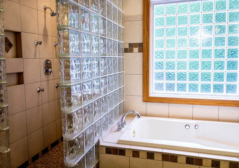
These translucent blocks once screamed ’80s luxury—and they’re making a baffling comeback. Designers hoped for natural light diffusion with a retro edge but ended up with spaces that feel institutional. The bulky form disrupts clean lines and makes walls look like shower stalls. What once said modern now mutters “dated divider.”
They’re difficult to integrate with today’s minimalist or organic aesthetics. Instead of openness, they add awkward opacity. Designers now realize that privacy doesn’t have to come at the expense of beauty. Some trends should stay sealed behind glass.
13. Beaded Curtains
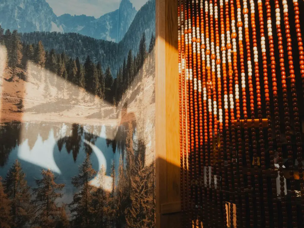
Originally a symbol of bohemian cool, beaded curtains returned to add “texture” and whimsy—until the tangles and noise returned too. Designers underestimated how quickly novelty becomes nuisance. Every breeze becomes a symphony of clicking plastic. And let’s be honest—no one wants to wrestle with their doorway.
They split spaces without truly separating them, making rooms feel less defined and more chaotic. What was meant to loosen structure ends up adding visual clutter. In practice, they’re more nostalgic prop than practical solution. The vibe is fun, but the function fails.
14. Popcorn Ceilings
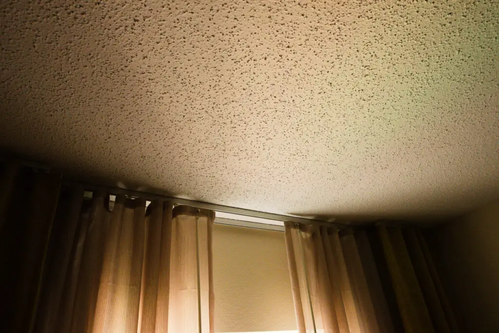
Yes, unbelievably, these textured ceilings are creeping back into trend discussions—especially in DIY circles. Promoted as a fix for acoustic problems or ceiling imperfections, designers are re-learning why we scraped them off in the first place. They trap dust, cast strange shadows, and are nearly impossible to clean. Texture doesn’t always mean interest.
What was once considered cozy now feels oppressive and outdated. A ceiling shouldn’t demand attention—it should lift the space. Most designers now steer clients toward subtle plaster or smooth finishes instead. Popcorn belongs in a bowl, not above your head.
15. Carpeted Bathrooms
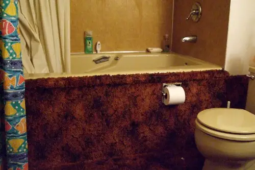
This head-scratcher of a ’70s luxury trend briefly resurfaced under the guise of comfort and spa vibes. Designers quickly remembered why it disappeared—moisture, mildew, and maintenance nightmares. No one wants to step out of a shower onto what might be a petri dish. The idea of softness underfoot turns into stress under scrutiny.
What feels plush on paper turns into a hygienic hazard in practice. Even with modern materials, the risk outweighs the reward. Tiles or stone win every time for function and longevity. Some luxuries aren’t worth the gamble.
16. Macramé Room Dividers
Revived from the 1970s craft scene, these knotted textile panels were supposed to offer softness and artistic flair. Instead, they introduce visual noise and rarely age well in modern settings. They’re magnets for dust and clash with contemporary furniture. What looks great on Pinterest often flops in real life.
Designers regret using them as permanent fixtures rather than occasional accents. They block the eye without truly dividing space. Soft partitioning sounds nice—until you’re constantly adjusting saggy strings. Let macramé live as wall art, not architecture.
17. Faux Wood Paneling
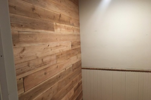
The mid-century basement favorite made a comeback—only to remind everyone why it vanished in the first place. Faux wood rarely mimics real grain convincingly and tends to yellow, peel, or warp over time. Instead of warmth, it adds weight to a room. It feels more rental unit than retro-chic.
Designers hoped to lean into vintage charm but ended up with walls that whisper “rec room.” True warmth comes from genuine materials and thoughtful finishes. Plastic panels just don’t cut it in a natural, grounded design. What’s fake doesn’t always feel fun.
18. Overly Ornate Furniture
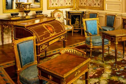
Victorian-inspired pieces resurfaced in recent years, bringing back intricate carvings, claw feet, and brocade fabrics. But in modern homes, these pieces overwhelm rather than elevate. They demand attention without offering comfort or flexibility. Drama doesn’t always mean depth.
Designers now find themselves editing out these showstoppers more often than showcasing them. Homes crave livability—not theatrical stage sets. A chair can be elegant without being exhausting. Baroque belongs in museums, not mudrooms.
19. Tiled Countertops
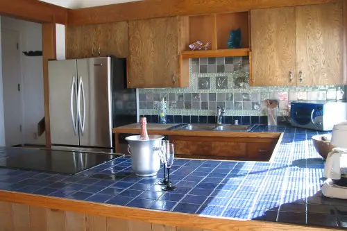
Reintroduced as a charming nod to farmhouse kitchens and Spanish Revival styles, tiled counters seem cute—until you cook on them. Designers quickly remember the downsides: grout lines that stain, surfaces that chip, and impossible cleanup. They break the flow of prep space and can never quite look sleek. Aesthetics suffer for the sake of nostalgia.
In reality, homeowners want smooth, seamless surfaces that stand up to heat, knives, and spills. Tiled counters offer neither convenience nor consistency. The charm fades fast when the grout absorbs every spill. Some trends work in theory—but not on a cutting board.
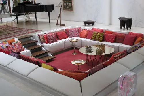
20. Conversation Pits
Once the crown jewel of mid-century social design, conversation pits were revived for their retro cool factor—but quickly proved problematic. Designers envisioned cozy gathering spaces, yet what they got were awkward drops in the floor plan. These sunken zones interrupt furniture flow and create odd spatial challenges. You can’t just slide in a sofa—everything must be custom-fit or contorted.
Safety concerns, especially for kids and older adults, turned this nostalgic feature into a liability. They’re hard to clean, hard to furnish, and harder to justify in modern open-plan homes. What looked chic in a magazine spreads chaos in real life. The conversation ends when the layout stumbles.
21. Waterbeds
Yes, waterbeds—the squishy symbols of 1970s rebellion—made a brief, baffling comeback. Promoted as therapeutic and “retro-luxurious,” they promised comfort but delivered instability and high maintenance. Sloshing sounds, temperature controls, and frequent leaks reminded designers why these beds dried up decades ago. You don’t sleep on them—you survive in them.
Their bulk makes them a nightmare to move, and they rarely match today’s minimal or cozy bedroom styles. Most modern bedrooms aim for calm and supportive rest—not novelty furniture that sloshes with every turn. The charm wears off faster than a fitted sheet on a water chamber. Designers now keep this trend at arm’s length—preferably with a towel.
22. Venetian Plaster Overload
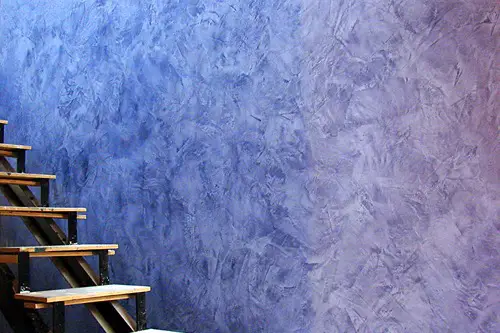
Venetian plaster had a moment of high-end allure—but its overuse has dulled its elegance. Designers reintroduced it for its texture and warmth, but full-room applications quickly overwhelmed modern interiors. What once felt artisan now reads artificial in mass-market applications. Luxury doesn’t scale well when every wall looks dipped in wax.
The technique is labor-intensive and difficult to maintain, especially in high-traffic areas. When not perfectly executed, it can look uneven or even greasy. Designers now reserve it for focal points or subtle accents. Used everywhere, it smothers a space in pretension instead of polish.
This post 22 “Vintage” Home Trends That Designers Quietly Regret Reintroducing was first published on Greenhouse Black.