
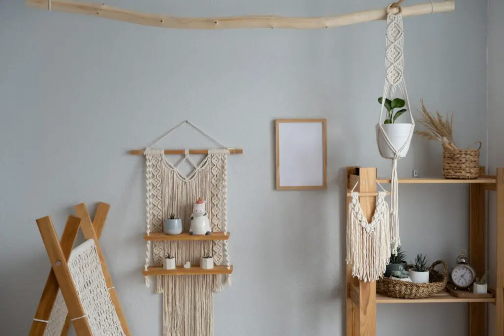
1. Open Shelving… Packed to the Brim
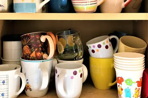
Open shelving is often associated with minimalism and a clean, curated aesthetic. But when every square inch is crammed with mismatched mugs, novelty shot glasses, and expired spices, the effect is more visual chaos than streamlined elegance. It’s like trying to blend a Marie Kondo mindset with a garage sale hoarder instinct. The intent may be modern, but the execution screams indecision.
Owners might have been inspired by Pinterest-perfect kitchens, but forgot that open shelving requires ruthless editing. If you’re not prepared to maintain order, it becomes a magnet for clutter. The tension between aspiration and practicality shows a tug-of-war happening behind the scenes. And unfortunately, it plays out right in front of dinner guests.
2. Farmhouse Sinks in Ultra-Modern Homes
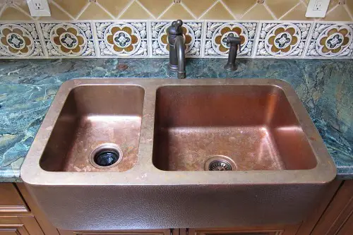
Farmhouse sinks are charming—in a farmhouse. But drop one into a home full of glossy white cabinets, concrete countertops, and brushed steel accents, and it starts to look like the kitchen is having an identity crisis. The contrast isn’t edgy; it’s confusing. It’s like putting cowboy boots on a cyborg.
There’s an obvious appeal to both modern and rustic styles, but smashing them together without cohesion leads to visual whiplash. This kind of hybrid might work in a transitional design, but here it just exposes conflicting aesthetic impulses. You can almost hear the arguments in the design showroom. “Rustic is cozy!” “But sleek is sophisticated!”
3. Neon Lighting Next to Antique Furniture
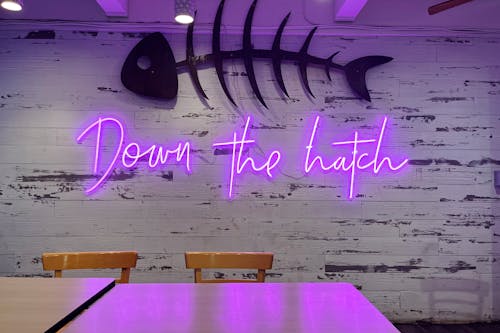
Nothing says “I can’t decide who I am” like a hot pink LED “Good Vibes Only” sign hovering over a Victorian sideboard. It’s a mix of high drama and high dorm room that cancels both energies out. Antique furniture demands a certain gravitas, and neon demands, well, TikTok. Putting them together is like asking Jane Austen to collaborate with Daft Punk.
This setup often stems from trying to balance a reverence for the past with a fear of looking boring. But instead of elevating either style, they end up clashing in a way that’s hard to reconcile. It’s design whiplash, not contrast. And it can make even quality antiques feel like thrift store finds.
4. Wall-to-Wall Carpeting… in a Bathroom
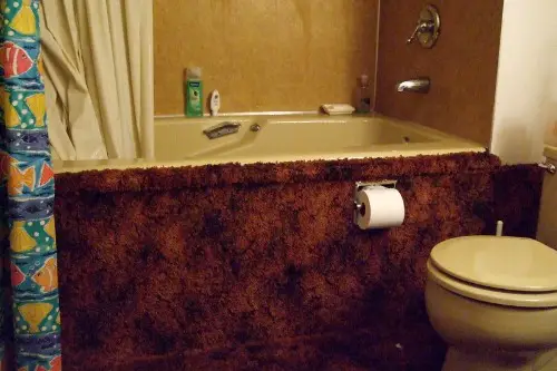
Carpet in the bathroom is one of those decisions that sounds cozy in theory but veers into “Why did anyone think this was okay?” territory. Moisture and fabric are longtime enemies, and no amount of Febreze can mask the eventual mildew saga. Yet people still install it, maybe as a nod to ‘70s luxury—or just nostalgia. Either way, it clashes with modern hygiene standards.
The choice reveals a comfort-first mindset fighting with an awareness that “this might be gross.” It’s a space meant to be clean and sleek, so the carpet contradicts that goal on every level. It’s softness versus sanitation, and neither wins. It’s conflicted taste… and also a potential health hazard.
5. Granite Countertops with Gold Accents

Granite had its heyday in the early 2000s, while gold hardware is part of the newer wave of warm-toned minimalism. Together, they create a weird time-warp that feels a bit like mixing frosted lip gloss with clean girl makeup. The speckled, heavy appearance of granite doesn’t play nicely with sleek brushed gold finishes. They belong to totally different visual languages.
People might be trying to update their kitchen without gutting it, but these half-measures show indecision rather than evolution. It’s like saying, “I want to be trendy, but I also don’t want to let go.” There’s nothing wrong with granite or gold—just not in the same breath. This combo screams aesthetic limbo.
6. Boho Macramé Meets Crystal Chandeliers
Bohemian interiors celebrate imperfection, texture, and natural materials. Chandeliers—especially the dripping, ornate kind—do not. When both appear in the same room, it’s a clash of spiritual wanderer versus Versailles impersonator. Instead of harmony, the result is often jarring and a bit performative.
This mix often comes from a desire to be both grounded and glamorous. But combining raw jute and fringe with cut glass and brass feels like wearing Birkenstocks with a ball gown. There’s no clear vision, just a mishmash of vibes. It’s more confusing than chic.
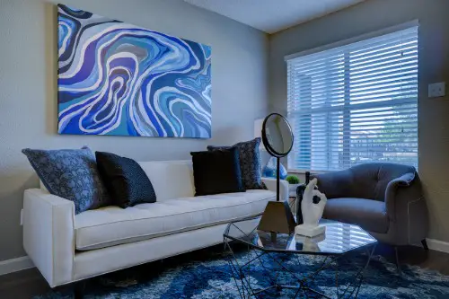
7. Statement Walls That Compete with Statement Furniture
One bold choice can anchor a room, but two or more start to compete for attention like reality TV contestants. A zebra-print wallpaper behind a velvet emerald couch may seem daring, but it usually ends up looking like design-by-impulse. When everything is shouting, nothing is heard. The space lacks rhythm and restraint.
This is a classic case of maximalism done without a strong editorial eye. There’s a difference between curated chaos and aesthetic overload. People often say they “love color and pattern,” but don’t realize those elements still need balance. These rooms feel more like a Pinterest board exploded.
8. Coastal Décor in a Landlocked Cabin

There’s nothing inherently wrong with seashell motifs or rope-wrapped mirrors. But when they show up 600 miles from the nearest beach, especially in a log cabin or mountain town, it raises eyebrows. Nautical themes don’t translate well in rustic, pine-heavy spaces. It’s like insisting on wearing flip-flops in the snow.
This usually happens when someone is emotionally tied to a beach vacation or former coastal lifestyle. But transplanting that vibe into a totally incompatible setting feels like aesthetic denial. It’s charmingly stubborn, but deeply inconsistent. The space never quite settles into itself.
9. Minimalist Furniture with Maximalist Art
A sparse, low-profile sectional in beige next to a chaotic gallery wall of clashing colors and frames creates cognitive dissonance. The minimalist furniture says, “I live simply,” but the artwork screams, “I collect emotions.” This isn’t contrast—it’s confusion. The styles cancel out each other’s impact.
People often believe the furniture is the background and the art is the star, which can work if done intentionally. But in these cases, it feels like two different people decorated the same room on different days. There’s no thematic throughline. Just unresolved aesthetic tension.
10. High-Tech Smart Features in Vintage-Look Rooms
Voice-activated blinds, color-changing bulbs, and AI-powered mirrors all have a place—but maybe not next to Edison bulbs and faux-distressed wood. Tech-heavy features in intentionally old-world interiors make the space feel like it’s glitched. It’s Back to the Future, but without the plot. The vibe is disrupted before it can even settle.
This usually reflects a desire to stay current without giving up cozy or nostalgic elements. But instead of integrating the tech into the design, it’s often slapped on like an afterthought. The result? A room that feels like it’s arguing with itself.
11. Midcentury Modern Everything—Plus a Shabby Chic Hutch
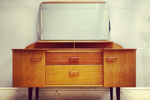
Midcentury modern has clean lines, tapered legs, and smooth finishes. Shabby chic, on the other hand, embraces distressing, florals, and layers. So when someone tries to merge these styles, like placing a painted, sanded-down hutch next to an Eames lounge chair, the result is tonal whiplash. It’s design schizophrenia, not eclecticism.
People might inherit one piece and try to “make it work,” or just love two very different aesthetics. But love alone doesn’t equal cohesion. A good designer would find a unifying color palette or texture—here, it’s just clashing nostalgia. And no one wins.
12. Luxurious Fixtures Paired with Budget DIYs
Crystal faucets, marble backsplashes, and then… peel-and-stick wallpaper or a plywood shoe rack. The contrast is stark and not in a deliberate way. It suggests an all-or-nothing budget was blown on one area, with duct-tape solutions filling the rest. There’s ambition here, but also a lack of editing.
This kind of space often reveals the excitement of trends without the patience to fully commit. The DIYs might be clever, but next to luxury pieces, they read as corner-cutting. It’s not just about money—it’s about consistency. And consistency is often the first casualty in conflicted taste.
This post 12 Home Features That Reveal the Owner Has Deeply Conflicted Taste was first published on Greenhouse Black.