
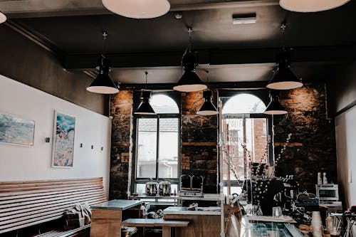
1. Neon signs in coffee shops
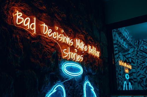
You’ve seen them: cursive neon declaring “But First, Coffee” glowing in the corner. Neon is nostalgic, photogenic, and instantly recognizable on Instagram. But beyond that snapshot appeal, the signs don’t add much to the lighting or the café experience. In fact, they often clash with the warm, cozy vibe coffee drinkers actually enjoy in person.
The reason they’re there is simple—social media visibility. A neon sign can serve as a brand marker in hundreds of photos shared online. The phrase becomes shorthand for the café’s identity, even if it’s just a trendy cliché. It’s a marketing tool disguised as decoration.
2. Swing chairs indoors
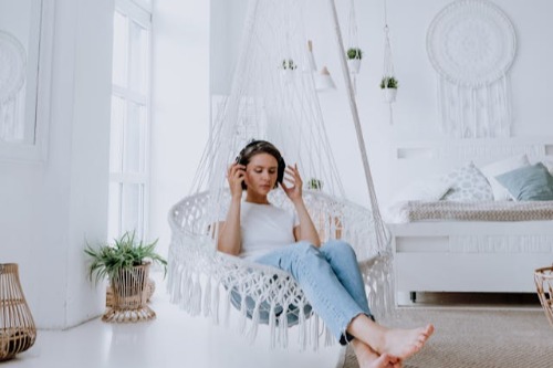
Hanging chairs or swings in restaurants and lobbies look whimsical and inviting in photos. They promise playfulness and relaxation, as if you’ll be sipping coffee while gently swaying. But in reality, they’re not the most practical seating—getting in and out can be awkward, and they’re often uncomfortable for long stays. Still, they persist in Instagram-friendly spaces.
That’s because they make people stop, pose, and share. Movement catches the eye, and a swing instantly makes a space seem unique. Even if customers barely sit in them, the image of a friend laughing mid-swing is priceless for marketing. It’s form over function, but intentionally so.
3. Oversized novelty props
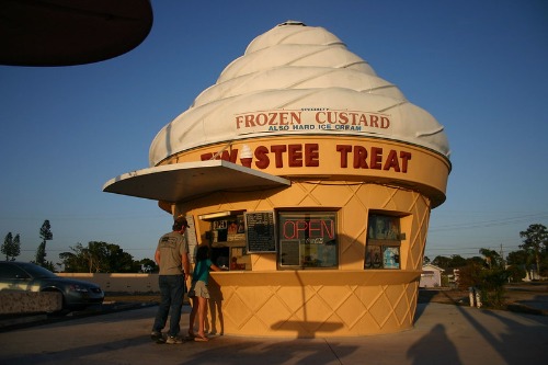
Giant sunglasses, enormous forks, or comically big ice cream cones—these props are basically magnets for selfies. They’re not functional, but they make a brand feel playful and approachable. You wouldn’t actually use a 6-foot fork, but you’d definitely pose with it. That’s the whole point.
These pieces exist to make a space feel “share-worthy.” They turn an otherwise ordinary corner into a mini photo booth. The exaggerated scale makes people smile and remember the location. It’s marketing disguised as whimsy.
4. Mirror walls with catchy text

A mirror that says “You Look Good” or “Hello, Gorgeous” isn’t there for self-esteem alone. It’s perfectly placed to catch natural light and produce flattering selfies. Visitors end up photographing themselves along with the branding in the background. It’s a subtle way to get customers to spread the venue’s message.
From a design perspective, mirrors make small spaces feel larger. But here, the text gives it a clear promotional purpose. Every shared photo becomes an organic ad. The mirror is less about reflection and more about distribution.
5. Rainbow-colored staircases
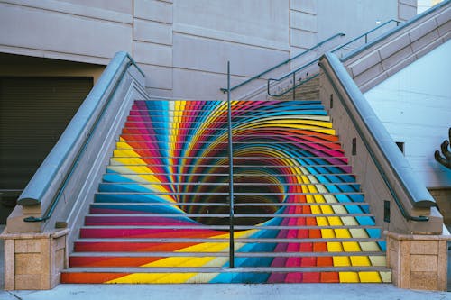
A staircase painted in bright gradients is visually striking, especially from certain angles. In person, it’s still pretty—but it’s the bird’s-eye or angled shot that makes it pop. People often stop midway just to take the perfect snap. The paint doesn’t make the stairs safer or more durable—it’s purely visual.
These designs are chosen for their ability to break up a feed of muted tones. They’re distinctive, so they help places stand out in search results or tagged photos. It’s essentially wayfinding through Instagram. Once photographed, it lives online far longer than the walk it takes to climb it.
6. Living plant walls
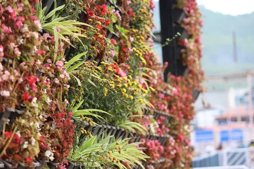
Vertical gardens are undeniably beautiful. They can improve air quality, but in many cases, they’re mostly artificial or maintained just enough to look lush. They create an ideal backdrop for lifestyle shots without taking up floor space. That “greenery vibe” reads as upscale, fresh, and eco-conscious in photos.
They also allow brands to align themselves with wellness and sustainability—even if the plants are fake. A living wall makes a lobby or café seem like an urban oasis. It’s carefully staged nature, optimized for the grid. In person, it’s a wall; online, it’s an identity.
7. Infinity pools
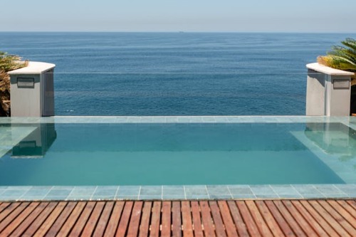
The illusion of water meeting the horizon is a visual trick meant for the camera. When you’re in the pool, you can’t actually see the effect—it’s only noticeable from a distance or certain angles. It’s less about swimming and more about the spectacle. Resorts know this and market accordingly.
An infinity edge instantly communicates luxury. It’s shorthand for “exclusive” in travel photography. Guests often choose hotels based solely on the pool’s Instagram appeal. It’s architecture that’s been built for a lens as much as for leisure.
8. Unusable decorative books

Stacks of vintage hardcovers bound in one color look elegant on shelves. But flip them open, and you might find blank pages or glued spines. They’re there for texture, not reading. The books exist to create the illusion of sophistication in a space.
On camera, they add instant depth and warmth to a shot. In reality, they don’t invite lingering over a story—they’re props. Designers use them because they’re inexpensive and versatile, perfect for filling space. They photograph far better than they function.
9. Plate-sized latte art
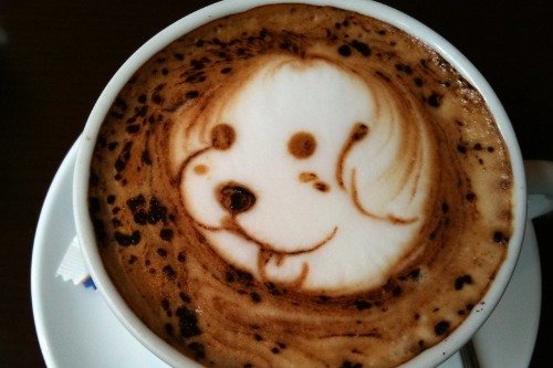
A cappuccino topped with a swan or 3D foam bear looks magical on a feed. In person, though, the design can fade before you take the first sip. Some cafés even use stencils and edible dyes to ensure the art shows clearly in photos. It’s coffee theater more than coffee service.
The reason? A striking coffee photo signals craftsmanship and care. It makes a café feel artisanal, even if the beans aren’t exceptional. The art lasts only minutes in reality, but online it becomes a permanent piece of branding.
10. Backlit marble counters
White marble glows beautifully when lit from beneath. It creates a luxe, high-end feel that pops in low-light photos. But the backlighting serves no practical purpose for customers—it’s there for mood and marketing. It even exaggerates the veining for maximum drama.
Restaurants and bars install them because they make drinks and dishes look more appealing in photos. The glowing surface makes glassware sparkle, catching attention in crowded feeds. It’s a stage for your cocktail as much as it is a countertop. The lighting is the real product.
11. The “Instagram table”
Some restaurants intentionally place one table with the best natural light and most decorative backdrop. This spot is always styled to perfection—fresh flowers, patterned plates, maybe a neon sign in the background. In person, you might not even realize it’s been optimized. But the photos taken there always look better than the rest.
It’s a clever hospitality tactic. That one table creates a disproportionate amount of shareable content. It’s the “free sample” of the restaurant’s atmosphere for people browsing online. The table isn’t just for diners—it’s for marketing.
12. Transparent floor panels
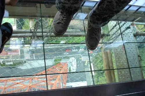
A glass section of floor with something dramatic underneath—fish swimming, a dizzying drop, or historical ruins—feels daring. It’s not the most comfortable thing to stand on, but it’s thrilling in photos. People kneel, lie down, or stretch over it for the best angle. The actual view may be small, but the experience feels big.
The drama comes from how rare it is to look straight down beneath your feet. It’s an instant conversation starter in captions. These features aren’t about daily use—they’re about creating a one-off, unforgettable moment. They exist so the memory (and the photo) lasts longer than the walk across it.
This post 12 Design Features That Only Exist to Photograph Well was first published on Greenhouse Black.