
1. Gold-plated bathroom fixtures
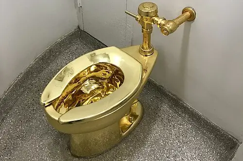
Gold bathroom taps and showerheads have long been a favorite among those who want to scream “money” the moment a guest walks in. While gold finishes can be done tastefully, many mass-market versions end up looking brassy and overly reflective. It’s a shortcut signal of luxury, but one that often comes across as trying too hard. In interior design circles, restraint is usually the bigger flex.
The reason it gets such a reputation is that gold plating was historically expensive, but now cheaper coatings mean it’s accessible in bulk. This makes it easier to buy, but harder to make look timeless. When it’s paired with equally shiny marble or ornate patterns, the overall effect can feel gaudy. That’s why designers often prefer matte or brushed finishes to avoid the “casino lobby” look.
2. Oversized chandeliers in small rooms

Putting an enormous chandelier in a modest dining room is the design equivalent of wearing a ball gown to a coffee shop. The intent is to add drama, but it often overpowers the space and throws off proportions. This visual imbalance is one of the first things a trained eye notices. Lighting should frame a space, not bully it.
Historically, oversized chandeliers belonged in ballrooms or grand foyers. When they’re placed in smaller homes, they often require dimming just to be usable. The mismatch makes the chandelier feel like a trophy instead of a light source. A subtler, well-scaled fixture tends to communicate confidence instead of insecurity.
3. Faux Tuscan kitchens
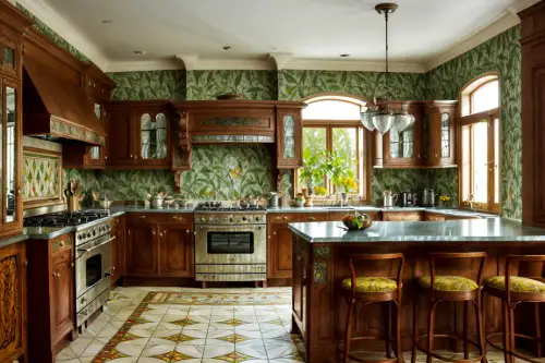
The “Old World” Tuscan look — think heavy dark wood cabinets, granite counters, and wrought-iron accents — was a sign of wealth in the early 2000s. Now, it’s largely seen as dated and overly thematic. It often looks like someone bought the entire kitchen from a catalog rather than curating it over time. The overuse of faux finishes like distressed paint and textured walls makes it feel contrived.
The style took off when luxury homebuilders marketed it as European elegance. In practice, most homeowners ended up with a cartoonish version of an Italian villa. The real Tuscan kitchens are lighter, more restrained, and far less ornate. The American version often misses the understated warmth that makes the originals so charming.
4. Marble everywhere
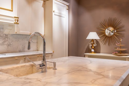
Marble is genuinely expensive, which is why some use it in massive quantities to telegraph wealth. Floors, walls, countertops, and even furniture clad in marble can look impressive in the right setting. But when it’s overdone, the result can feel cold, sterile, and uninviting. It shifts from elegance to excess surprisingly quickly.
True luxury design uses marble sparingly, allowing it to stand out as a focal point. Covering every surface with it can make a space feel like a mausoleum. It’s also impractical — marble stains and etches easily, which makes high-traffic areas look worn faster. Ironically, the more you use, the harder it is to keep that “rich” look intact.
5. Statement aquariums

An enormous built-in aquarium can feel like a Bond villain’s lair — and not always in a good way. They’re costly to install and maintain, which is why they’ve become a showpiece for those with disposable income. But unless you’re genuinely passionate about marine life, they can feel like pure spectacle. Guests often view them as a conversation piece rather than part of the home’s aesthetic harmony.
Many luxury homes in the early 2010s incorporated wall-to-wall tanks as a flex. The upkeep, from filtration systems to specialized lighting, is immense. Without meticulous care, algae buildup and stressed fish undermine the intended “wow” factor. Designers now tend to integrate them more subtly or skip them entirely for less maintenance-heavy features.
6. Designer logo furniture
Some furniture brands prominently display their logos, and for certain buyers, that’s the point. Think chairs upholstered in monogrammed fabric or coffee tables stamped with a recognizable emblem. While these signal a hefty price tag, they can also feel like billboards for wealth. True high-end interiors rarely rely on branding for impact.
Logos became status markers during the rise of “logomania” in fashion, spilling into home décor. However, design experts often see this as insecure styling — leaning on brand recognition instead of cohesive aesthetics. Pieces without logos can still be valuable, often more so if they’re antiques or custom-made. The lack of obvious branding can make the home feel curated instead of merchandised.
7. Overdone crown molding
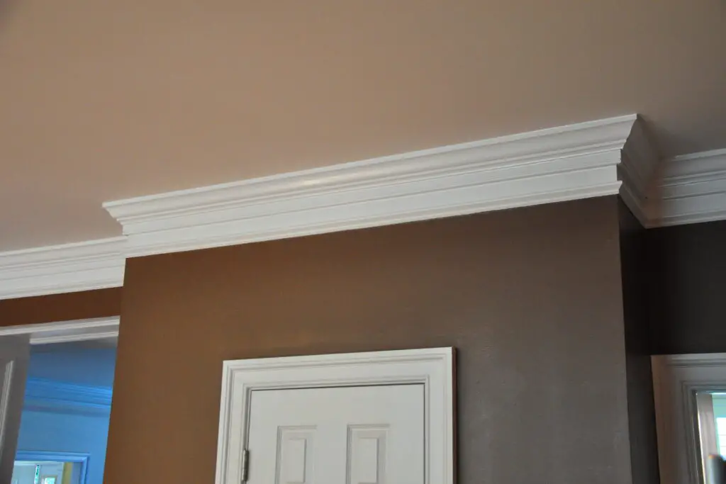
Crown molding can elevate a room, but when it’s overly ornate or layered in multiple tiers, it risks looking like a theme park version of a palace. Intricate patterns in small spaces can make ceilings feel heavy rather than refined. Historically, molding was scaled to match the architecture, not overwhelm it. Too much detail reads as “money spent” rather than “design considered.”
In certain luxury developments, builders add massive molding as a quick signal of craftsmanship. The problem is that proportion and restraint are what actually communicate quality. A well-designed minimalist crown molding can blend seamlessly while still feeling expensive. Overcomplicated versions just look busy.
8. Matching furniture sets
Walking into a living room where every table, chair, and sofa clearly came from the same showroom can feel sterile. Matching sets are easy to buy, but they lack the layered personality that comes from mixing styles and eras. While this approach once signaled a big furniture budget, it now often reads as unimaginative. It’s like wearing a head-to-toe outfit straight from a store mannequin.
Designers tend to avoid sets because they make spaces feel flat. A mix of textures, colors, and shapes creates visual depth and suggests that pieces were collected over time. True luxury homes often feature heirlooms, art, and custom pieces rather than a single brand’s catalog. Matching sets are a shortcut — and it shows.
9. Massive home theaters with outdated tech
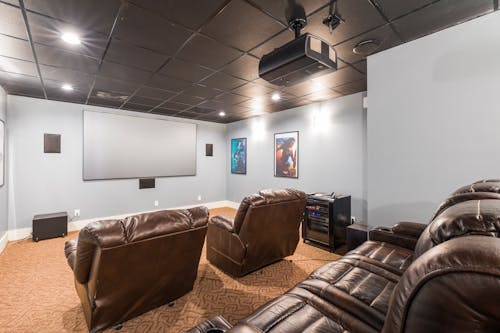
Building a dedicated home theater was once the ultimate status symbol. Rows of leather recliners, a popcorn machine, and heavy drapes signaled serious money. But with streaming services and discreet in-wall speakers, those over-the-top theaters can feel clunky and dated. Many now sit unused except for the occasional family movie night.
Technology changes quickly, so what was cutting-edge five years ago often looks old today. Huge projectors and bulky sound systems are now outshined by sleek 4K TVs and compact surround setups. True luxury is in adapting to current tech without locking yourself into a fixed, dated setup. That’s why multipurpose media rooms are more popular than single-use theater spaces.
10. All-white glossy kitchens
White kitchens can look fresh, but when everything is high-gloss — from cabinets to countertops — it can veer into sterile territory. They were marketed heavily in the 2010s as “clean” and “modern.” In reality, they show fingerprints, smudges, and wear quickly. It’s a look that feels more showroom than home.
The aesthetic was inspired by minimalism but often lost the warmth that makes minimalism work. Without contrast or texture, the space can feel unwelcoming. High-end designers now mix white elements with natural wood, stone, or matte finishes to add depth. The gloss-heavy, all-white approach is slowly fading from luxury design playbooks.
11. Overly themed “wine cellars”
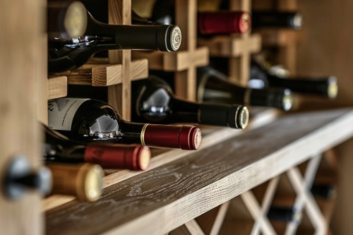
A wine cellar can be impressive, but turning it into a faux-European grotto with stone walls, faux arches, and mood lighting can border on kitsch. The intent is Old World sophistication, but it often lands closer to a theme park attraction. Theatrical design choices distract from the actual wine collection. In high-end design, the wine should be the star.
Modern luxury cellars tend to be sleek and climate-controlled without unnecessary embellishments. They focus on storage, preservation, and display in equal measure. Overly themed versions can look dated in just a few years. They also risk feeling more like a set piece than a functional space.
12. Indoor fountains

An indoor fountain might seem like the height of indulgence — running water, sculptural appeal, a sense of tranquility. But many quickly tip into ostentation, especially if they’re oversized or overly ornate. In smaller spaces, they can overwhelm both visually and acoustically. Instead of calming, they end up feeling like lobby décor.
They gained popularity in the 1980s and 1990s as symbols of success, partly influenced by feng shui interpretations of water as wealth. Today, they’re often seen as impractical and high-maintenance. True luxury design prefers subtle water features integrated into outdoor landscapes. Indoors, it’s usually better to keep the trickling to a tabletop fountain — if at all.
This post 12 Design Trends That Signal Wealth — But Not Taste was first published on Greenhouse Black.