
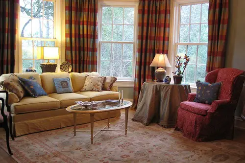
1. Oversized Chandeliers in Every Room
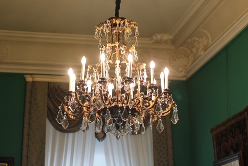
There’s a difference between a statement light fixture and an overcompensating chandelier. When every room—including the guest bathroom—has a massive crystal chandelier, it screams more about showing off than lighting the space. Luxury design typically focuses on proportion, but new-money homes often confuse “large” with “luxurious.” The result is décor that looks more like a hotel lobby than a home.
Chandeliers can be stunning, of course, but they should serve a purpose and suit the room’s scale. Designers often recommend saving dramatic lighting for dining rooms or entryways where it can anchor the space. In contrast, sprinkling chandeliers everywhere feels performative. It’s an easy tell that the homeowner is newly wealthy and eager to display it.
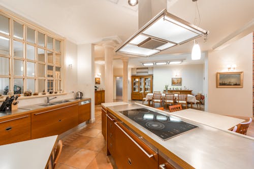
2. Too Many Branded Appliances
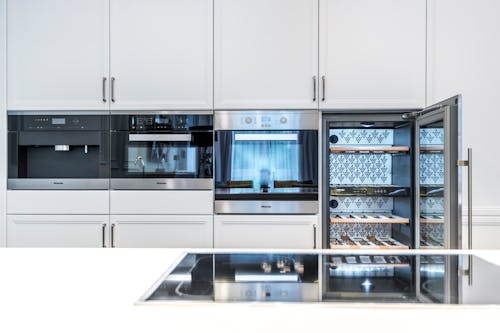
Top-tier kitchens often include names like Sub-Zero, Wolf, or Miele, but when every appliance brand screams luxury, it’s a bit much. A seasoned homeowner knows quality doesn’t always need to announce itself. New-money kitchens sometimes feature every latest gadget simply because it’s the “best,” not because it fits their cooking habits. It’s more about collecting logos than creating function.
Design experts often note that true luxury lies in intention. A minimalist European oven might perform just as well as a high-end statement piece, but it doesn’t draw the same attention. Those trying to telegraph success tend to fill their counters with flashy machines instead of investing in thoughtful design. It’s a subtle but telling difference.
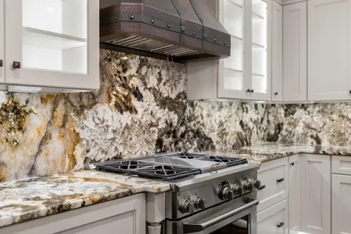
3. Excessive Marble Everywhere
Marble is timeless—but when it’s floor-to-ceiling, wall-to-wall, and covering every counter, it starts to feel more like a showroom than a home. Many wealthy homeowners use marble sparingly to highlight certain areas. New-money spaces often overuse it as an instant status marker. It’s as if the stone itself is the décor, not the design behind it.
Too much marble also requires high maintenance, and seasoned homeowners usually balance it with more durable materials. Designers often mix natural stone with wood or metal to add warmth and depth. When every surface gleams, it can look cold and impractical. That’s when luxury tips into excess.
4. Gold Hardware Overload
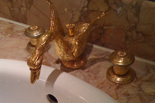
Gold finishes are back in style—but restraint is key. In new-money homes, you’ll often see gold handles, gold faucets, gold light fixtures, and even gold toilets. The problem isn’t the metal itself; it’s the lack of balance. When everything gleams, nothing stands out.
Design pros use metallics as accents to add warmth or contrast. Mixing finishes—like brushed brass with matte black—creates a layered, sophisticated feel. But when gold dominates every touchpoint, it looks more like a display of wealth than taste. It’s the decorating equivalent of shouting instead of speaking softly with confidence.
5. Open Floor Plans with No Purpose
Open layouts can feel airy and inviting, but without thoughtful zoning, they can become chaotic. New-money homes sometimes remove walls just to make things “look bigger.” The result is a cavernous space where furniture floats awkwardly, and acoustics suffer. True luxury is about cohesion, not just size.
Designers often create defined areas using rugs, lighting, and furniture placement. That subtle division keeps the home feeling organized and intentional. When the goal is just openness for its own sake, it often feels impersonal. It’s a hallmark of trying to impress rather than live comfortably.
6. Massive Televisions as Centerpieces
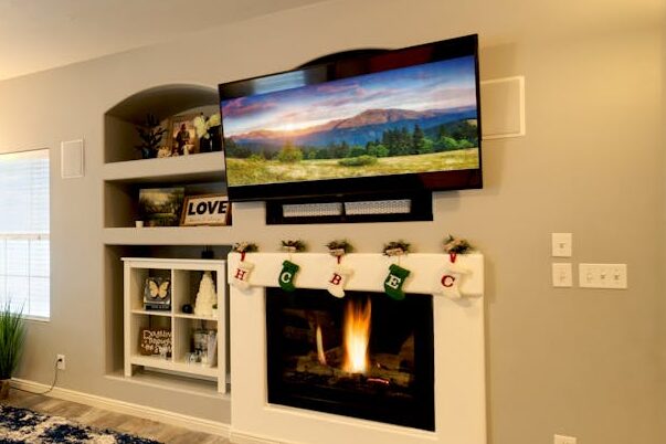
A 100-inch TV dominating the living room wall is often a giveaway. It’s not that high-end homes don’t have tech—they just tend to hide it. Designers frequently use motorized panels or blend screens into art walls. In contrast, new-money homes often make the television the main event.
This signals that entertainment trumps ambiance. A well-designed home balances comfort and aesthetic equally. When the screen dwarfs the furniture and art, it tips toward ostentation. It’s less “modern luxury” and more “electronics store showroom.”
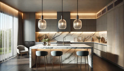
7. Show Kitchens That No One Uses
Some luxury homes feature two kitchens: a show kitchen for aesthetics and a “working” one behind the scenes. In new-money homes, however, the main kitchen often looks staged—but it’s the only one. Every appliance shines because it’s barely touched. There’s no sense of life or personality in the space.
Designers say that true luxury kitchens are designed for how people actually cook and gather. A slightly worn cutting board or an open cookbook gives character. But a pristine, unused kitchen feels sterile. It suggests the space was built to impress, not to live in.
8. Too Many Mirrors
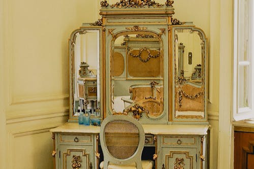
Strategically placed mirrors can open up a room and reflect light beautifully. But when they’re on every wall, door, and hallway, it quickly becomes overwhelming. New-money design often mistakes reflection for richness. The result is more nightclub than home.
Seasoned designers use mirrors sparingly to create depth or highlight architecture. Oversaturation feels insecure—like a need for constant visual validation. A single statement mirror adds glamour, but mirror overload reflects excess. It’s the difference between confidence and showing off.
9. Statement Walls in Every Room
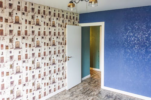
An accent wall can add texture and drama, but doing it in every room feels overproduced. New-money homes often feature glitter paint in the bedroom, faux brick in the kitchen, and wallpaper murals in the hallway. Each one fights for attention instead of complementing the space. True luxury embraces restraint.
Designers often limit statement walls to one or two focal areas to maintain balance. Too many feature walls can make a home feel like a Pinterest board come to life. The goal of high-end design is flow, not competition. That’s what separates curated style from trend-chasing.
10. Overdecorated Entryways
Entryways make the first impression—but going overboard makes it obvious someone’s trying too hard. Think oversized mirrors, two chandeliers, and a table loaded with crystal and flowers. It’s a scene straight out of a mansion reality show. Less is almost always more here.
Professionals often recommend a single art piece or sculptural light fixture instead. It feels intentional rather than performative. When guests feel like they’ve stepped into a movie set, it’s usually a sign of new wealth trying to signal success. Elegance doesn’t need to shout from the doorway.
11. Overly Themed Rooms

A “wine cellar” that looks like a Tuscan villa or a “home theater” styled after an old cinema might seem luxurious—but often feels contrived. New-money homes tend to chase themed aesthetics because they photograph well. True wealth favors timelessness over novelty. Themed rooms can date quickly and lose charm.
Designers suggest focusing on atmosphere instead of mimicry. For example, a warm lighting scheme and textured walls can evoke the feeling of a wine cave without turning it into a set piece. Authentic luxury evolves; it doesn’t imitate. When a space feels like a theme park, that’s a tell.
12. Every Trend at Once
Mixing trends can be stylish—if done with intention. But when every “it” design element shows up in one home, it’s a recipe for chaos. Think boucle chairs, terrazzo counters, LED-lit mirrors, and geometric tile—all competing for attention. It’s a case of wanting everything now, rather than curating over time.
Old-money interiors often evolve through generations, blending pieces from different eras naturally. New-money design tends to be all purchased at once, following what’s currently fashionable. That can make the home feel more like a showroom than a personal space. The absence of patience shows immediately.
13. Custom Logos and Monograms
Personalization can be tasteful, but new-money homes sometimes take it too far. Monogrammed towels, pillows, and even doormats might seem elegant, but overuse can feel self-congratulatory. True sophistication is usually understated. Subtlety, not branding, signals confidence.
Designers often say that luxury should speak through craftsmanship, not initials. A custom embroidery here or there is fine, but a house full of branded decor feels performative. It’s more about proving ownership than expressing personality. That’s when it crosses from personal touch to public display.
14. Overly Staged Furniture Arrangements
When every cushion is perfectly fluffed and every throw blanket folded at a 45-degree angle, it feels more like a model home than a lived-in one. New-money spaces often mimic catalog photos, forgetting that comfort matters, too. Authentic luxury homes usually balance style with ease. Nothing looks too precious to touch.
Design experts recommend leaving space for imperfection—a reading chair that looks used, or a sofa with slightly rumpled linen. That kind of lived-in charm shows confidence and comfort. Over-staging, on the other hand, signals insecurity and inexperience. It’s the aesthetic of someone trying to prove they belong.
15. Art That Matches the Couch
Art chosen purely for its color palette is a dead giveaway. Inexperienced decorators often pick pieces to coordinate with the furniture, not because they love the art. New-money homes can look overly coordinated—almost sterile. True luxury art collections have a story, not just a matching hue.
Collectors and designers alike agree that art should reflect taste and emotion, not décor trends. A striking contrast or an unexpected medium often gives a room soul. When every canvas blends into the wall, it feels safe and superficial. That’s when style becomes status signaling, not self-expression.
This post 15 Subtle Home Details That Instantly Signal “New Money” was first published on Greenhouse Black.