1. Mustard Yellow
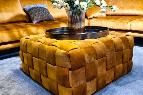
Mustard yellow is warm, yes, but it can age a home quickly because it evokes retro interiors from the 1960s and 1970s. The slightly brown undertones make it tricky to pair with contemporary furniture. On older plaster or textured walls, it can highlight imperfections. While bright and cheerful in theory, in practice it can read as outdated rather than inviting.
Kitchens and living rooms are the main areas where mustard can feel off. Cabinets, trim, and furniture colors must be carefully coordinated, or the overall aesthetic will feel heavy. The wrong lighting can turn the yellow into a murky tone. Even in sunny rooms, mustard often dates the space more than it energizes it.
2. Olive Green
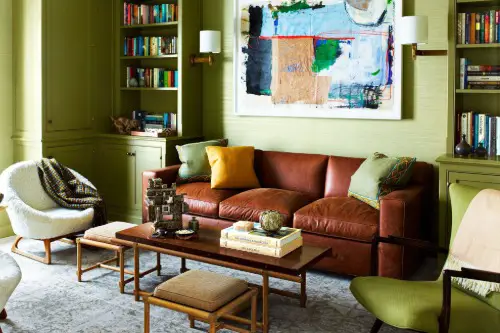
Olive green has been a trendy pick in home decor blogs, but in older homes, it can make spaces feel stuck in the 1970s. The yellow undertones often come across as dull or muddy in natural light. While it pairs well with certain woods, it can exaggerate outdated flooring or cabinetry. Over time, the color can drain energy from a room, leaving it looking tired.
This shade also tends to clash with modern metallic accents, making any updates feel disjointed. It can overwhelm smaller rooms, causing them to feel cluttered or outdated. Even neutral furnishings sometimes struggle to balance olive walls. If the home has vintage light fixtures, olive green walls can make them feel more “stale” than stylish.
3. Dark Charcoal Gray
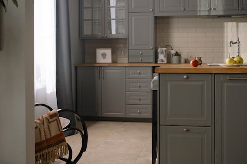
Dark charcoal gray might seem sophisticated at first glance, but it can make rooms feel heavy and smaller, especially if the lighting isn’t perfect. Over time, these deep shades can create a cave-like feeling that’s more oppressive than elegant. It tends to highlight dust, fingerprints, and any wall imperfections, which only ages the space faster. For homes with older finishes or limited natural light, this color can unintentionally emphasize flaws.
When this gray dominates a room, it often clashes with classic architectural details rather than complementing them. Instead of feeling modern, it can make interiors look dated—like a throwback to early 2000s “industrial chic.” It’s particularly tricky in kitchens and bathrooms, where it can make spaces feel cold and uninviting. Even with the right furniture, the overall vibe may skew heavier than cozy.
4. Beige with Strong Brown Undertones
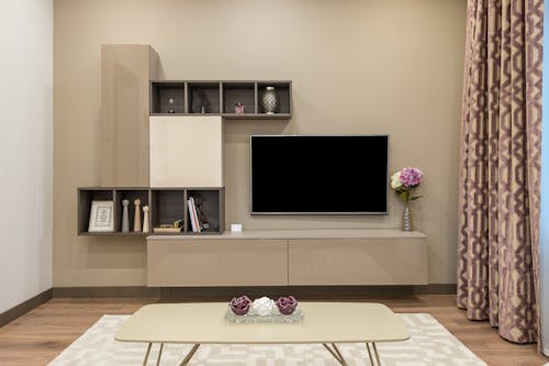
Beige has been a go-to neutral, but beige leaning too brown can make interiors feel old-fashioned. It often reminds people of 1990s and early 2000s rentals, which lacked character and warmth. In homes with older furniture or trim, it can clash rather than complement. The result is often a bland, lifeless feeling instead of a welcoming neutral.
This color can also make rooms feel dim, particularly when paired with soft lighting. Brownish beige can make white trim look yellowed, even if it’s freshly painted. Over time, the walls may appear dingy and dated. It’s a choice that rarely surprises in a positive way.
5. Neon or Ultra-Bright Colors
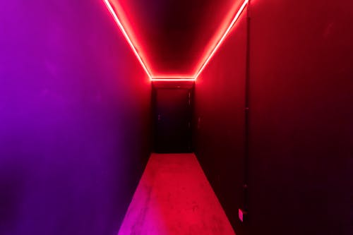
While neon walls scream fun, they rarely age well in a home. Eye-popping colors can overwhelm traditional layouts and make any imperfections obvious. They also tend to date quickly as trends shift. Within a few years, what felt modern and energetic can feel garish and exhausting.
These colors are difficult to match with standard furniture, cabinetry, or flooring. Neon tones can reflect harsh light, creating a strained atmosphere. Paint chips or fading become more noticeable, drawing attention to the home’s age. Even professional staging struggles to make ultra-bright walls feel timeless.
6. Deep Burgundy
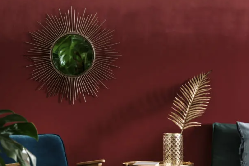
Deep burgundy might feel luxurious, but it often reads as heavy and outdated. Dark reds were extremely popular decades ago, so in older homes, they can conjure a “grandparent’s house” vibe. The color absorbs light, making rooms feel smaller and less airy. It can also clash with warm woods that were popular in older homes.
Additionally, burgundy walls can make furnishings appear faded or mismatched. The dramatic tone doesn’t always complement modern accents. Over time, walls painted this color can look tired or oppressive. While cozy in small doses, large expanses of burgundy age a space more than enhance it.
7. Brownish Taupe
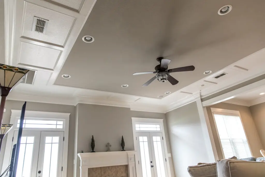
Taupe is often promoted as a versatile neutral, but when it leans too brown, it can quickly date a home. It sits somewhere between gray and beige, which can make it feel muddy rather than clean. This shade tends to highlight flaws on textured walls and trim. Even if the furniture is modern, the walls can drag the look back a decade or two.
Brown taupe also struggles under certain lighting, especially fluorescent or dim bulbs. Shadows can make it appear dull and lifeless. It doesn’t provide enough contrast with older woodwork, making rooms feel flat. Over time, the color can make even a well-maintained home appear weary.
8. Orange-Toned Walls
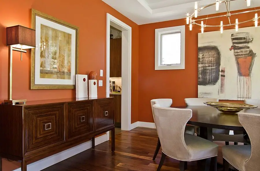
Orange is bold, but strong orange tones tend to feel retro rather than contemporary. In older homes, it can amplify the dated feel of cabinetry or flooring. It also has a way of clashing with neutral furniture, leaving spaces feeling visually chaotic. Warm orange undertones can make rooms appear smaller and more intense.
This color can be hard to live with for long periods. It can drain the sophistication from traditionally styled spaces. Even art and décor must be carefully chosen to avoid visual conflict. Overall, orange walls often scream “trendy of the past” more than “modern and fresh.”
9. Olive-Toned Gray
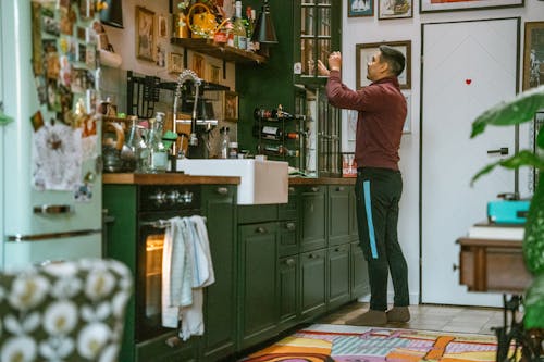
Gray with an olive or green undertone is subtly complex, but often it complicates a space unnecessarily. Natural light can bring out unwanted yellow or green hues, giving a room a slightly dingy look. Over time, it can make interiors appear tired rather than chic. This color also shows scuffs and smudges more easily than neutral grays.
The tricky undertone often clashes with warm wood trims or cabinetry. What was intended as modern sophistication can end up feeling muddled. The gray can make older homes appear less maintained. Matching furniture, rugs, and accents becomes a constant challenge.
10. Muddy Blue
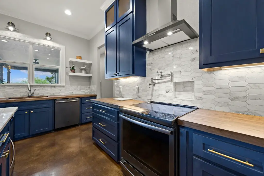
Blue is usually calming, but when it leans too muddy, it ages a room quickly. Muddy blue shades often appear flat and lifeless in rooms without abundant sunlight. They highlight wall imperfections while making whites or creams look dull. Over time, this color can feel oppressive rather than serene.
Muddy blues also tend to date older finishes in kitchens and bathrooms. The undertone can clash with existing cabinetry or flooring. Even decorative accents struggle to brighten the space. What might feel “cozy” at first often ends up feeling dreary after a few years.
11. Rust Red
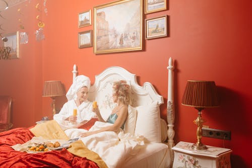
Rusty red tones evoke vintage charm, but they can make a home feel outdated almost overnight. The deep orange-brown undertones pair poorly with modern metals and finishes. They tend to dominate spaces, making them feel smaller and less inviting. Over time, rust red can feel heavy rather than warm or stylish.
This color also highlights dust, scratches, and imperfections. It’s difficult to redecorate around, limiting flexibility in furniture or décor choices. Even professional staging may struggle to modernize a rust-toned room. Often, what initially seems bold and sophisticated quickly appears old-fashioned.
12. Neon Peach or Pink
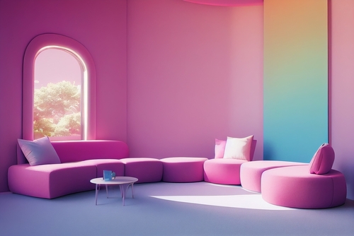
Peach and pink tones in neon or overly saturated forms can date a home rapidly. While softer pastels can work, neon variants reflect light harshly, creating a jarring, almost artificial atmosphere. They tend to clash with natural wood or classic trim. The result is often a room that feels less like home and more like a commercial experiment.
These bright pinks are extremely trend-sensitive, so they rarely maintain a timeless feel. They make aging walls, chips, or cracks more obvious. Over time, the color can make a space feel garish or unbalanced. Even with neutral furniture, the overall aesthetic risks feeling chaotic and outdated.
This post 12 Trendy Paint Colors That Age a Home Overnight was first published on Greenhouse Black.
