
1. Peel-and-Stick Wallpaper
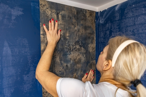
Peel-and-stick wallpaper has come a long way in design, but it still gives off “I might not stay here long” vibes. It’s popular among renters because it’s easy to remove without damaging walls. Homeowners who plan to stay for years usually commit to traditional wallpaper or painted finishes for longevity. Even the best peel-and-stick varieties tend to show seams or corners peeling over time, which can cheapen the overall look.
The reason it signals “temporary” is its very purpose—impermanence. Designers often note that while it’s a fun way to test color or pattern, it lacks the permanence and polish of more traditional treatments. High-end homes usually favor durable wall finishes that age gracefully. Peel-and-stick can look great in photos, but in person, the difference in texture and finish is noticeable.
2. Plug-In Wall Sconces
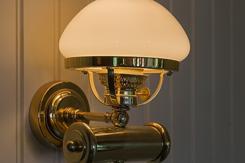
Plug-in sconces are lifesavers for avoiding rewiring, but that cord dangling down the wall gives away the shortcut. In luxury interiors, lighting is typically hardwired and integrated into the overall design plan. Plug-in fixtures say, “I didn’t want to call an electrician,” which is fine—but it’s a telltale sign of a semi-permanent setup. Even with cord covers, the look rarely feels seamless.
People choose them for flexibility and affordability, but that’s also why they suggest a lack of commitment. Designers use them in rentals or transitional spaces, not usually in finished, custom homes. Hardwired sconces blend in and elevate a space, while plug-ins tend to feel like an afterthought. They’re functional, but they quietly say, “I might move this later.”
3. IKEA Furniture That’s Still Unmodified
IKEA pieces are versatile and stylish, but when left untouched, they’re instantly recognizable. The distinct finishes, like high-gloss white or light birch veneer, are associated with budget-friendly setups. Many homeowners personalize them with custom hardware, legs, or paint to give a more bespoke look. Without that effort, they read as starter furniture rather than a design statement.
The reason it feels temporary is because IKEA is designed for easy assembly and portability, not permanence. Designers often suggest mixing one or two IKEA finds with higher-end or vintage pieces to add depth. Entire rooms furnished straight from the flat-pack catalog tend to feel transient. It’s not about cost—it’s about customization and character.
4. Unhemmed Curtains That Pool Awkwardly
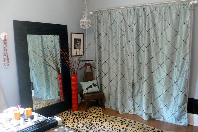
Curtains that are too short—or bunched awkwardly on the floor—instantly signal a space that hasn’t been fully considered. Perfectly fitted window treatments are a hallmark of permanence and intention. When curtains are clipped, uneven, or still have raw hems, it looks like someone just moved in. Even in an expensive home, sloppy window treatments can undermine everything else.
This happens often when people buy “standard size” curtains instead of tailoring them. Custom drapes are one of those subtle upgrades that completely change the feel of a space. They hang better, filter light more gracefully, and instantly make a room feel grounded. When done wrong, they create the visual equivalent of rolled-up extension cords—temporary and unfinished.
5. Temporary Command Hooks Everywhere

Command hooks are brilliant for renters—they don’t damage walls and can hold surprising weight. But in a permanent home, they signal hesitation about making real design choices. Seeing one behind every door or propping up artwork can make even a luxurious space feel like a college dorm. The adhesive strips are practical, not polished.
The issue isn’t functionality—it’s visual clutter. Permanent hardware feels more deliberate and cohesive with the rest of the room. Designers often say a well-placed screw or anchor adds more visual weight and confidence to a space. When everything’s hung “just for now,” it subtly communicates that the home is still in flux.
6. Removable Vinyl Floor Tiles
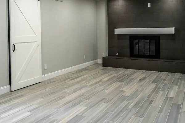
Peel-and-stick floor tiles are popular DIY fixes for outdated flooring, but they rarely pass for the real thing. The seams, slight lifting at edges, and repetitive patterns give them away. Even premium brands can’t fully replicate the depth and texture of ceramic, wood, or stone. They’re great short-term solutions but not built for the long haul.
Design pros use them for renters, laundry rooms, or temporary makeovers—not as long-term flooring in main living areas. They can freshen up a space quickly but start to show wear sooner than expected. Once the adhesive loosens or edges shift, the illusion fades fast. Permanent flooring signals investment, while vinyl tile says “we’ll deal with it later.”
7. Generic Staging Art
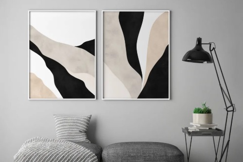
Large abstract prints in neutral tones are everywhere because home stagers love them—they’re safe and inoffensive. But that’s also why they scream “temporary.” They don’t reflect personal taste or history, just a placeholder aesthetic. Even expensive homes can feel impersonal with walls full of mass-produced art.
The difference between “temporary” and “timeless” art is emotional connection. Personal artwork, photography, or local finds give a sense of permanence and individuality. Designers often encourage homeowners to swap out generic staging pieces for something meaningful. When art looks like it came from a hotel lobby, it dulls the personality of the space.
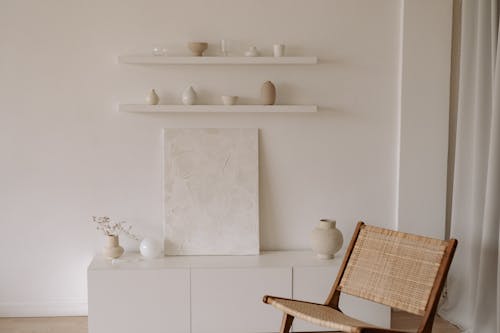
8. Floating Shelves That Are Barely Styled
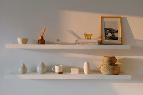
Floating shelves can look sleek, but when they’re sparsely filled—or overstuffed with random items—they look like a stopgap. A well-curated shelf takes time and intention, not just a few quick decorations. When homeowners leave them half-empty, it feels like the job isn’t finished. Even in a high-end kitchen or living room, it reads as temporary.
Shelves signal permanence when they’re integrated and thoughtfully arranged. Designers often recommend layering objects of varying heights and materials to create balance. When shelves feel underdeveloped, they don’t look lived-in, just “installed.” That lack of personality makes the space feel transitory.
9. Minimal Baseboards or Missing Trim
Bare walls without proper trim or baseboards are subtle but powerful clues of incompletion. In upscale homes, molding and trim work define transitions and add architectural weight. When they’re missing or skimped on, rooms feel hollow—like a builder-grade space that hasn’t been fully dressed. It’s one of those details you only notice when it’s gone.
Homeowners sometimes skip trim to save money or simplify cleaning, but it changes the entire perception of quality. Even simple baseboards create a visual “frame” that makes a wall feel grounded. Without them, the space looks more like a temporary rental than a finished residence. It’s a small touch with outsized impact.
10. Unanchored Rugs That Curl at the Corners
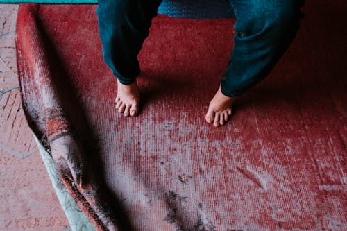
Rugs that don’t quite fit the space—or curl up at the corners—make a room look unsettled. The right rug anchors furniture and defines zones; the wrong one feels like an afterthought. When the edges curl or slide, it suggests the space hasn’t been properly measured or finished. Even a luxurious rug can’t hide poor placement.
Interior designers stress that scale and fit matter as much as material. A rug that floats under a coffee table instead of connecting the whole seating area looks transitional. Adding a rug pad or replacing it with one sized to the room instantly changes the impression. It’s the difference between “decorating” and “designing.”
11. Folding Furniture in Main Living Areas
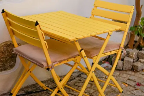
Folding tables, chairs, or desks are practical but inherently signal impermanence. They’re designed for flexibility, not permanence, which makes sense in small or multipurpose spaces. But in main living areas, they give off a “still settling in” energy. Even when made from quality materials, their function-first design reads as temporary.
They’re great for guest overflow or hobbies, but not as primary pieces. Permanent homes rely on furniture that feels rooted—something that visually and physically stays put. Designers note that stability is key to perceived luxury. Foldable furniture says, “We might move this next week.”
12. Exposed Power Strips and Extension Cords
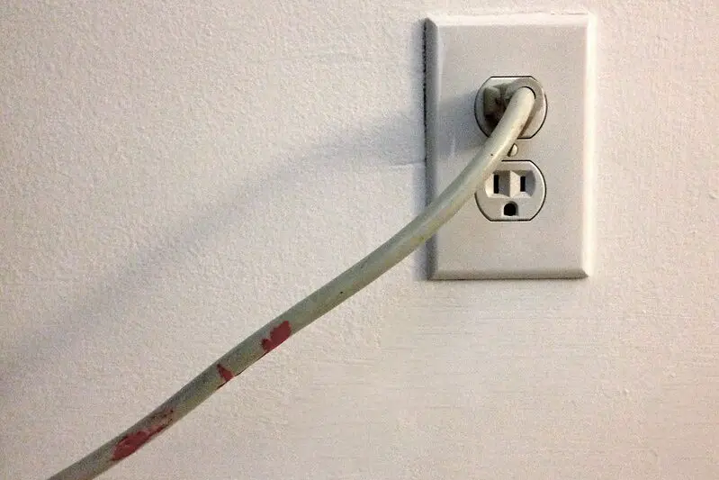
Visible extension cords instantly disrupt a polished interior. They’re practical, sure, but they draw the eye and hint that furniture placement or electrical planning was improvised. In well-designed homes, outlets and lighting are positioned to minimize these workarounds. Seeing one snake across the floor suggests a setup that hasn’t fully landed.
Homeowners often rely on them temporarily after moving in or rearranging furniture. Hiding cords behind furniture, using cord covers, or adding new outlets helps reclaim visual calm. Designers treat visible wiring as unfinished business. Even in luxury homes, exposed cords whisper “we haven’t figured this out yet.”
13. Empty Corners and Bare Walls
A blank wall or empty corner might seem minimalist, but too much of it feels unfinished. In homes meant to be lived in, every space tends to have a purpose or at least a sense of completion. Bare areas suggest that decorating paused halfway or that the homeowner hasn’t fully committed. It’s a subtle cue that the space is still in progress.
Designers balance negative space with intention—using art, plants, or lighting to create rhythm. When those details are missing, even a beautifully furnished room feels temporary. It’s not about clutter, but about cohesion. A “done” room feels resolved, while a “temporary” one feels paused mid-thought.
This post 13 Decor Choices That Quietly Signal “Temporary” Even in Expensive Homes was first published on Greenhouse Black.