
1. Oversized “Luxury” Logos Everywhere
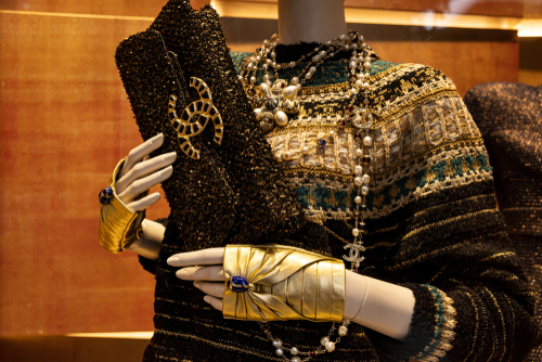
A home covered in brand names doesn’t scream luxury — it screams insecurity. Decorating with Chanel pillows or a Louis Vuitton-patterned wall decal might seem high-end, but it often comes off as tacky. These logos were meant for fashion, not furniture. True luxury shows through craftsmanship and design, not through shouting a brand name from every surface.
The best interiors with real style are the ones that feel personal and curated. Mixing textures, eras, and art shows confidence, while plastering designer logos looks like you’re trying too hard. It’s a subtle difference, but design is all about restraint. A tasteful space whispers quality — it never yells it.
2. All-White Everything
White-on-white interiors may look stunning in magazine photos, but in real life, they often feel cold and impractical. Maintaining an all-white couch, rug, and wall combo is nearly impossible unless you live in a museum. What’s more, it can strip a home of warmth and personality. Even the most expensive white marble or linen can end up feeling sterile.
A good designer balances neutrals with depth and texture — think cream, taupe, and soft gray mixed with natural materials. White needs contrast to feel alive. Without it, you risk living in a space that feels more like a sterile showroom than a welcoming home. Money can buy the materials, but not the lived-in charm.
3. Mirrored Furniture Overload
A mirrored dresser or coffee table can add glam, but too much of it turns a room into a funhouse. These pieces scratch easily, collect fingerprints, and reflect every smudge or clutter pile in sight. What’s meant to add sparkle ends up adding stress. It’s one of those trends that looks expensive but ages quickly.
Tasteful glam relies on balance — one mirrored accent, not an entire collection. Designers often use mirrored furniture sparingly, pairing it with matte or textured finishes to soften the shine. When everything reflects, nothing stands out. The result? A dizzying, overly bright space that looks more flashy than refined.
4. Faux Tuscan Mansions
Remember the early 2000s craze for “Old World” luxury — faux stone walls, wrought-iron scrolls, and heavy drapery? Many of those homes cost a fortune but ended up looking more like movie sets than Italian villas. The style rarely fits modern architecture or climate, making it feel artificial. Real Tuscan homes are rustic and breezy, not overloaded with dark faux finishes.
Good design understands context. Bringing warmth and texture from the Mediterranean makes sense, but copying it wholesale doesn’t. Today’s trend toward lighter, airier spaces shows how overdone that look became. Money can buy the materials, but not the authenticity of a centuries-old farmhouse.
5. Overly Themed Rooms
Turning your living room into a “Parisian café” or “nautical beach retreat” might sound charming, but it usually feels contrived. Themed decor tends to rely on clichés — Eiffel Tower lamps, anchor prints, or seashell art. It’s the design equivalent of wearing a costume. What starts as fun quickly slides into kitsch.
The most stylish interiors borrow inspiration without copying. Subtle nods, like vintage maps or linen textures, convey a theme without spelling it out. Designers know restraint creates sophistication. A hint of personality beats a heavy-handed motif every time.
6. Overuse of LED Strip Lighting
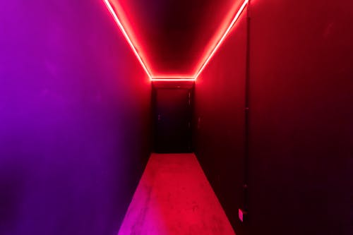
LED lighting can be great for ambiance, but when every surface glows neon, it feels more nightclub than home. Blue and purple under-cabinet or ceiling lights often make a space look cheap, even if the fixtures cost thousands. The harsh hue flattens textures and ruins the warmth of a room. It’s more tech showroom than tasteful living room.
Lighting should highlight design, not compete with it. Warm-toned LEDs or concealed lighting create atmosphere without distraction. Designers use light to enhance architecture — not to turn it into a spectacle. When every edge glows, it’s clear someone mistook “futuristic” for “fashionable.”
7. Overdecorated Chandeliers
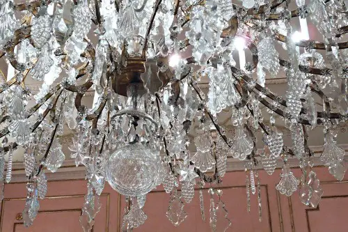
A massive crystal chandelier might signal wealth, but size doesn’t equal taste. When a light fixture overwhelms the room, it dominates instead of enhancing. Many homeowners splurge on ornate chandeliers that feel more Vegas than Versailles. True elegance lies in proportion and placement.
Designers often say that lighting should complement the space, not upstage it. A smaller, well-scaled fixture creates balance and visual harmony. Flashy chandeliers often look dated within a few years. It’s a reminder that drama without design discipline rarely ends well.
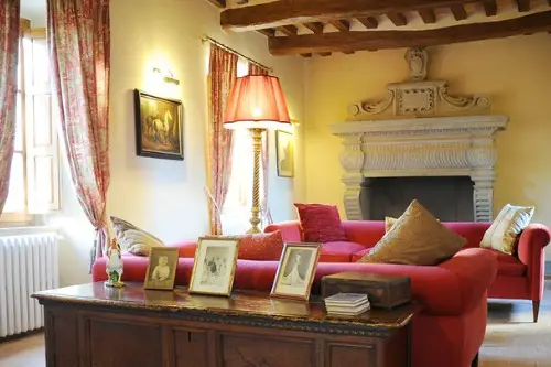
8. Velvet Everything
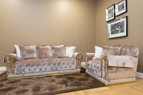
Velvet can be gorgeous — in moderation. But when an entire room is draped in it, from curtains to couches to pillows, it feels like a lounge from the 1970s. The texture loses its luxury when there’s no contrast. Too much velvet absorbs light and makes a space feel heavy and dated.
Designers love using velvet as an accent — a single chair, a headboard, or a few cushions. Paired with lighter fabrics, it looks intentional and rich. Overdoing it, though, makes the room feel suffocating. Even the most expensive fabric can’t save poor composition.
9. Marble Overload
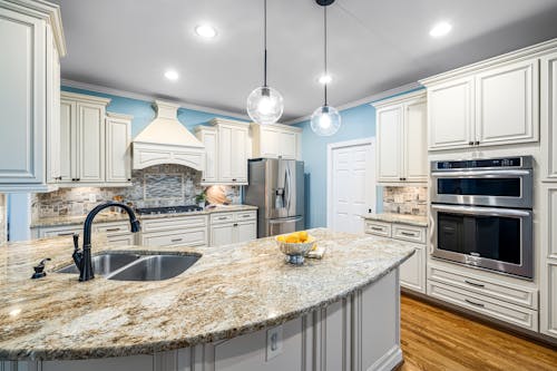
Marble floors, marble counters, marble walls — it’s easy to assume more equals better. But a home covered in stone can feel more like a hotel lobby than a living space. The natural beauty of marble shines when it’s contrasted with wood or metal. Without that balance, it feels cold and sterile.
The cost of marble doesn’t guarantee taste. In fact, designers often use it sparingly to highlight a focal point. When every surface gleams, your eye has nowhere to rest. It’s proof that restraint, not price, makes a space timeless.
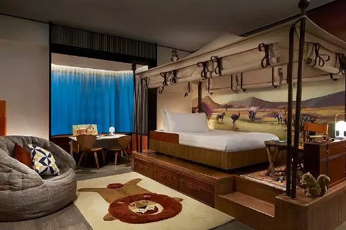
10. Matching Furniture Sets
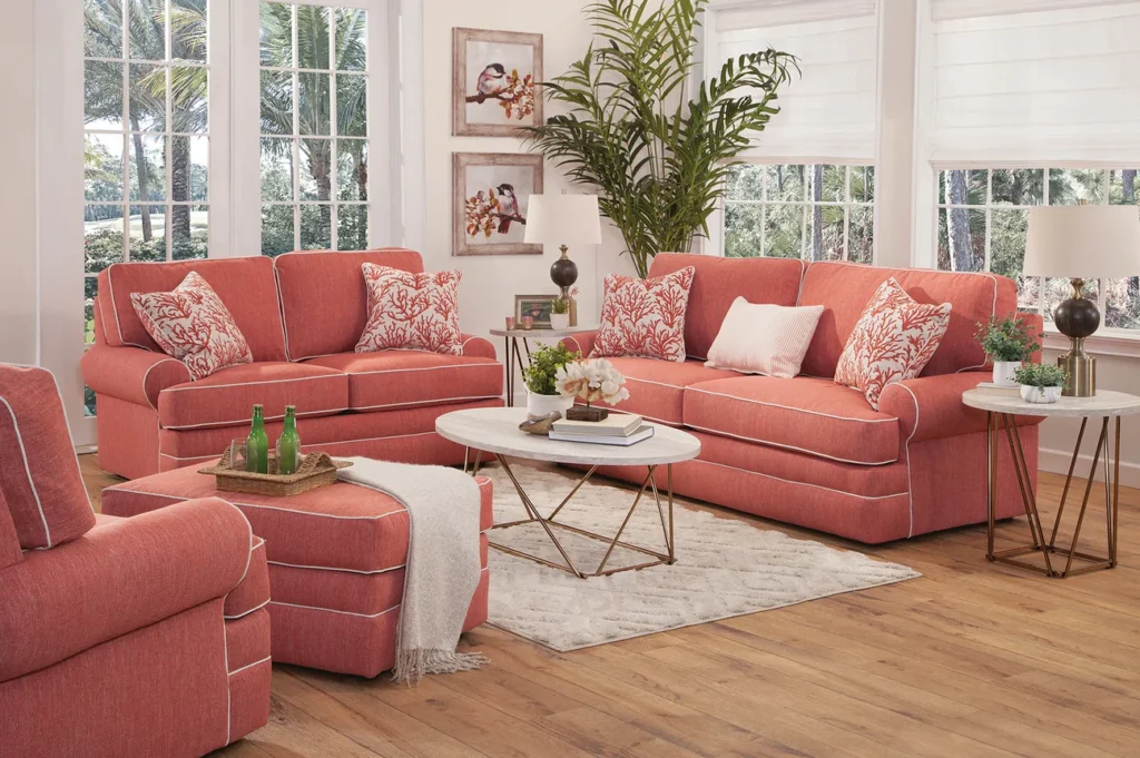
Buying a full matching set from a showroom seems like the easy route to a “finished” room, but it almost always lacks soul. Everything matching — from sofa to side table — flattens the space and removes personality. It’s a cookie-cutter look that feels impersonal no matter how much it costs. True style comes from mixing, not matching.
Designers curate spaces over time, blending different styles, eras, and textures. A room with varied pieces tells a story and feels authentic. Perfectly coordinated furniture just tells you where someone shopped. Money buys convenience, not character.
11. Fake Plants in Designer Pots
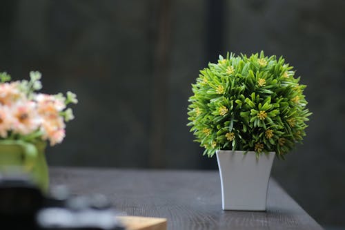
A $500 ceramic planter won’t fool anyone if the greenery inside is plastic. Fake plants have improved over the years, but up close, they still lack life and texture. They collect dust, fade under sunlight, and feel oddly lifeless in an otherwise beautiful space. The disconnect between the cost of the container and the quality of the contents is jarring.
Even minimal real plants bring movement and authenticity. A fiddle leaf fig or a low-maintenance snake plant adds vibrancy no fake can match. Designers use greenery to soften architecture and connect indoor and outdoor life. When that connection is fake, the whole space loses warmth.
12. Gold Everything
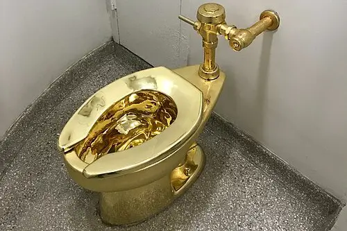
Gold accents can look elegant, but when every fixture and frame gleams, it crosses into gaudy territory. Gold works best as a highlight — not the main event. Excessive metallic finishes reflect light harshly and make spaces feel cluttered. It’s the decorating equivalent of wearing every piece of jewelry at once.
Modern luxury favors balance — mixing gold with matte finishes, natural woods, or stone. The contrast keeps it sophisticated. Without that restraint, gold quickly turns from glamorous to garish. Money might buy shine, but not sophistication.
13. Open-Concept Gone Wrong
Open-concept homes can feel spacious and social, but poor execution often leads to chaos. Without thoughtful zoning, furniture placement, and acoustics, it’s just one giant echo chamber. When everything is visible, clutter becomes impossible to hide. Expensive finishes can’t make up for a lack of design flow.
The best open layouts use area rugs, lighting, and furniture to define zones. Even subtle separations create coziness and function. Without them, it feels like a warehouse with nice countertops. A well-designed home is about balance, not just openness.
14. Art That’s Just for Show

Buying art to impress guests rather than because it moves you always backfires. A giant abstract piece chosen for its price tag or brand name can feel soulless. Design pros can spot a “decorator purchase” instantly — it looks perfect but says nothing. Real art brings personality and perspective, not just prestige.
Homes that feel genuine include pieces collected over time. Prints, local art, or even family photos can add far more warmth than a gallery-priced canvas. Art should tell a story about the person who lives there. Money can fill walls, but it can’t create meaning.
This post 14 Decor Choices That Prove Money Can’t Buy Taste was first published on Greenhouse Black.