
1. Barn Doors Indoors
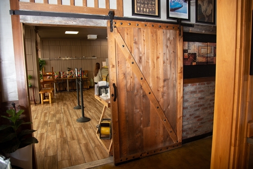
Sliding barn doors exploded as a rustic-meets-modern statement piece. They looked handcrafted and “farmhouse chic,” but their function rarely matched their charm. Most don’t seal properly, which means no soundproofing or privacy—bad news for bathrooms or bedrooms. The hardware also tends to loosen over time, making them noisy and wobbly.
They were meant to give character, but in most suburban homes, they feel more like cosplay than craft. The door trend spread because it photographed well on Instagram, not because it worked better than a hinged one. They also take up wall space that could’ve held shelves or art. It’s a clear example of visual novelty winning over practical quality.
2. Open-Concept Everything
For years, tearing down walls felt like the ultimate way to modernize a home. Open-concept living promised light, air, and connection—but it often delivered noise, clutter, and nowhere to hide. Without walls, smells travel from the kitchen, and the TV competes with every conversation. It photographs beautifully but can feel chaotic in everyday life.
The idea was rooted in creating flow, but it overlooked how people actually live. Privacy, acoustics, and comfort all took a hit in the name of openness. Families discovered that sometimes a little separation makes a house calmer and more functional. The best spaces have balance, not just open space for its own sake.
3. All-White Kitchens
White-on-white kitchens became synonymous with luxury minimalism. They feel clean and bright—at least until you actually live in them. Every fingerprint, smudge, and coffee drip shows up instantly, turning “crisp” into “constant upkeep.” The sterile look also strips away warmth, making spaces feel more like showrooms than homes.
The popularity came from the perception of purity and resale value. But what many homeowners found was that all-white requires constant maintenance and doesn’t age gracefully. Natural materials and mixed tones often create a more welcoming and forgiving kitchen. True progress means designing for life, not just for photos.
4. Shiplap Walls
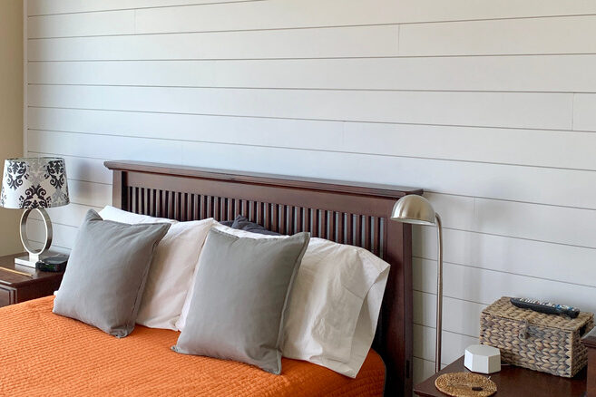
Shiplap walls, once a humble farmhouse material, turned into a HGTV obsession. The problem? It quickly lost authenticity when installed in every suburban hallway and powder room. Over time, those horizontal lines started feeling more dated than timeless. Worse, they trap dust and moisture, making upkeep harder than expected.
The trend exploded because it felt cozy and “simple.” But true craftsmanship got replaced by mass-produced panels nailed up for looks. What started as a nod to rustic durability became pure decoration. Real quality lies in thoughtful texture, not copy-paste nostalgia.
5. Floating Shelves Everywhere
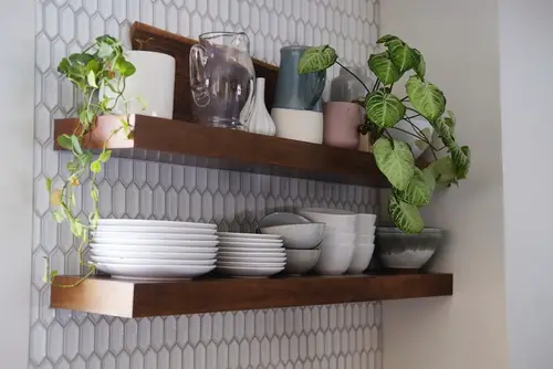
Minimalist floating shelves looked elegant and modern at first glance. They turned kitchens and living rooms into airy, open spaces—until real life crept in. With nowhere to hide clutter, they demanded constant styling and dusting. Functionally, they offer less storage and strength than enclosed cabinetry.
They gave a sense of visual space but removed actual utility. The “Instagram kitchen” aesthetic worked for photos but not for families. Even worse, cheap installations sag or pull away from walls over time. Progress in design should make life easier, not more performative.
6. Edison Bulbs and Exposed Fixtures
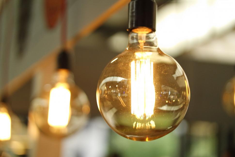
The industrial-chic look with Edison bulbs and visible wiring once screamed urban cool. But those dim amber lights quickly wore out their welcome when people realized they barely illuminated a room. What felt “moody” in a café became impractical at home, especially in kitchens or offices. And the exposed fixtures collected dust and aged fast.
It’s a perfect example of design prioritizing aesthetic over atmosphere. Good lighting design enhances how you live, not just how your space looks on Pinterest. Brightness and warmth can coexist without sacrificing style. The illusion of progress here was simply swapping function for vibe.
7. Grey Everything
For nearly a decade, grey was the “neutral of the future.” It looked sophisticated, consistent, and easy to pair with anything. But eventually, it drained homes of personality and warmth. Too much grey made spaces feel cold, sterile, and emotionally flat.
This trend lasted because it photographed well and appealed to cautious buyers. Yet people soon realized how lifeless it could feel day-to-day. Now designers are steering back toward earthy tones that feel more human and grounded. True progress isn’t about safety—it’s about soul.
8. Glass Railings
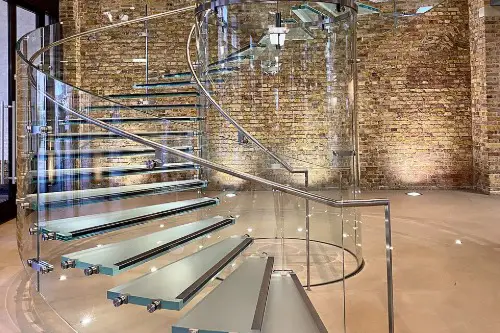
Glass stair railings looked sleek and high-end, especially in modern homes. They opened up sightlines and made small spaces appear larger. But fingerprints, streaks, and constant cleaning turned them into maintenance nightmares. Even minor scratches dulled the luxury effect over time.
The illusion was transparency equaling sophistication. In reality, they demand far more effort and cost than traditional wood or metal railings. Safety can also be a concern if panels loosen or chip. A well-designed home balances beauty with durability—not just glass for glass’s sake.
9. Vessel Sinks
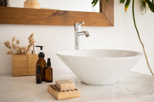
Vessel sinks looked sculptural and high-design when they first appeared in bathrooms. But the daily experience told another story: they splash easily, sit at awkward heights, and are tricky to clean around. What seemed spa-like quickly proved inconvenient for everyday use. Maintenance and ergonomics were afterthoughts.
They sold the illusion of luxury because they looked “different.” Yet a good sink isn’t meant to make you adjust how you wash your hands. It should integrate seamlessly into your habits. Sometimes design restraint is the real sophistication.
10. Accent Walls
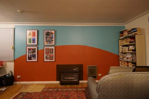
Accent walls were once a go-to way to add “drama” without commitment. A single bold color or pattern could feel like a design statement—but it often just interrupted visual harmony. Instead of cohesion, you got a jarring divide that aged quickly. Many homeowners ended up repainting when the novelty faded.
This trend thrived because it felt like an easy DIY upgrade. But designers now favor subtler ways to add depth, like layered textures or lighting. True quality lies in balance, not one loud wall. The illusion was creativity, when it was really just surface-level change.
11. Faux Materials
Faux wood beams, faux marble countertops, faux brick wallpaper—fake everything had a moment. They were marketed as affordable luxury but often looked cheap up close. Over time, the imitation materials warped, peeled, or aged poorly. What seemed clever at first ended up feeling disposable.
The rise of these substitutes reflected a rush for aesthetic shortcuts. But the charm of real materials comes from texture, longevity, and authenticity. Homeowners learned that genuine craftsmanship wears better, both physically and emotionally. Progress isn’t pretending—it’s investing in what lasts.
12. Smart Everything
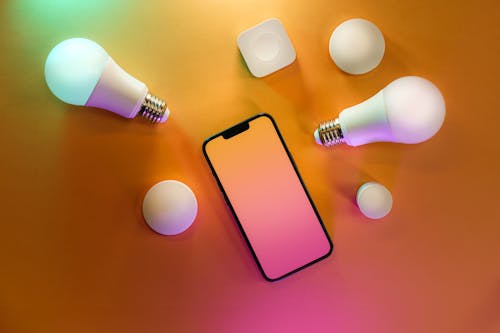
From Wi-Fi light bulbs to app-controlled blinds, smart home tech promised seamless living. But too often, it just added complexity and points of failure. Devices stopped working after updates, and privacy concerns grew with every microphone added to the home. The “smart” label started to feel more like a gimmick than an upgrade.
Technology should serve design, not overwhelm it. A truly well-designed home blends tech quietly into everyday life. When you’re constantly troubleshooting your thermostat, that’s not innovation—it’s irritation. Sometimes, the smartest home is the one that simply works.
This post 12 Design Trends That Created the Illusion of Progress—But Not Quality was first published on Greenhouse Black.