
1. Oversized Statement Chandeliers
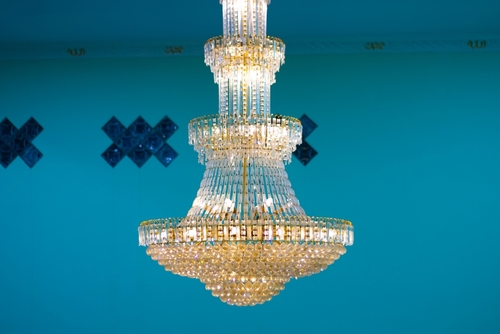
A chandelier that’s way too large for the room tends to announce itself before anything else does. When guests walk in and see a lighting fixture that could double as a prop from a historical drama, they notice its scale instantly. Designers generally recommend choosing a chandelier that’s proportional to the room’s dimensions, so an oversized one stands out for the wrong reasons. It can make the space feel more like a showroom than a home.
People often choose these pieces to signal sophistication or luxury, but the intention doesn’t always land. Instead of appearing elegant, it can look like you’re trying a bit too hard to elevate the room’s status. Guests may wonder whether the piece was chosen for personal taste or purely for effect. That ambiguity is what gives off the “overcompensating” vibe.
2. A Wall of Branded Luxury Shopping Bags
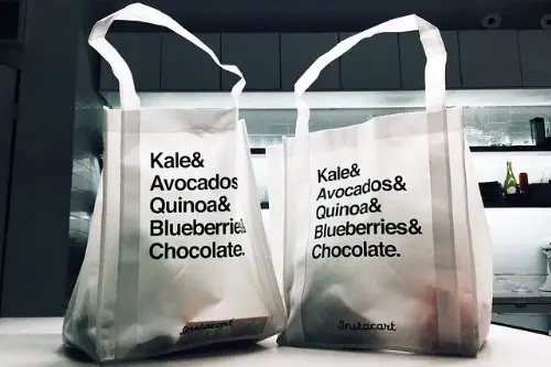
Turning branded bags into décor can feel like a billboard for your purchases. While it might seem like a creative way to reuse packaging, the brands become the focal point rather than your personality. Guests see logos long before they see any real design elements. It communicates more about spending habits than style.
Many people do this to express pride in high-end purchases, but the display can read as performative. Instead of enhancing the room, it can come off as an attempt to appear more fashionable or affluent. The bags themselves were never intended as long-term décor, so they often clash with other elements. The overall effect can feel curated for attention rather than comfort.
3. Overly Themed Rooms
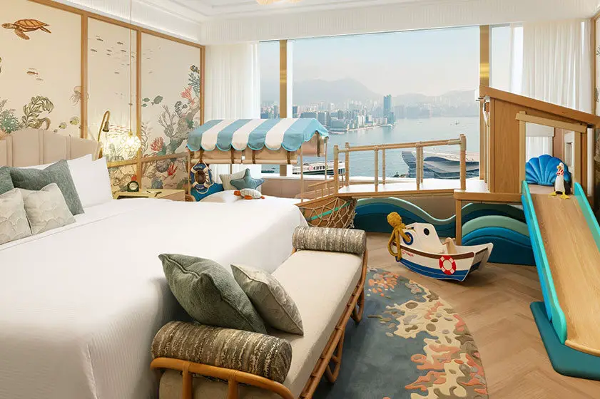
A room themed down to the coasters communicates a level of commitment that can feel overwhelming. Even popular themes like “coastal” or “rustic cabin” can become excessive when every item reinforces the concept. When décor lacks variation, guests may feel like they’re stepping into a set rather than someone’s home. A little thematic inspiration goes a long way.
People often create these rooms to showcase a strong sense of identity, but the intensity can feel forced. Without balance, the theme becomes more of a costume than a style. Guests may interpret it as trying too hard to broadcast personality. A lighter touch keeps the design from drifting into overcompensation.
4. Matching Furniture Sets
Perfectly matching furniture sets can make a room feel too coordinated, almost like a catalog page. While consistency isn’t inherently bad, every piece sharing the same finish and shape can feel overly controlled. Designers often recommend mixing textures and styles to create visual depth. A full set removes that opportunity and risks looking generic.
People choose full sets believing it creates a polished look, but the result can feel more like an attempt at guaranteed style than confident taste. Variety shows personal decision-making, whereas strict matching can seem cautious or image-driven. Guests may interpret the uniformity as a bid for sophistication. Adding even one contrasting piece can soften the impression.
5. Display-Only Towels
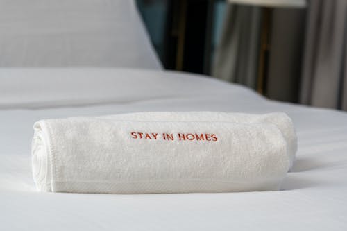
When towels look too perfectly folded or pristine to ever be used, guests notice. It suggests the bathroom is staged rather than lived in. Decorative towels can be lovely, but when they’re clearly off-limits, it creates an uninviting tone. The message becomes about presentation, not comfort.
Many homeowners intend to add a hotel-like feel, but the result can feel more rigid than luxurious. Guests may worry about touching anything for fear of disrupting the setup. Instead of offering hospitality, the space feels like it’s performing. Practical, attractive towels strike a more welcoming balance.
6. Faux Books for Aesthetic Only
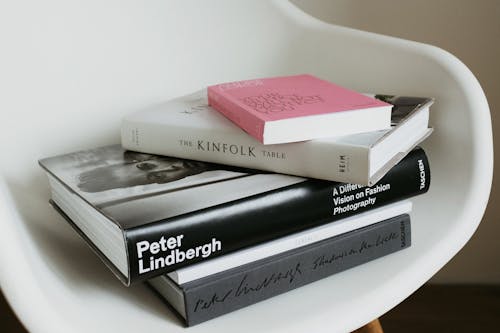
Decorative book bundles or empty book spines send a clear signal that the shelf is more about appearance than substance. Books are often seen as extensions of personal interests, so fake ones feel impersonal. They eliminate the opportunity for guests to learn anything real about you. This creates an oddly hollow visual effect.
People often use them to fill space quickly or achieve a certain color scheme. While the result can be tidy, it strips away authenticity. Real books, even in small numbers, offer more character and credibility. Guests tend to appreciate shelves that reflect genuine reading habits.
7. Excessive Mirror Wall
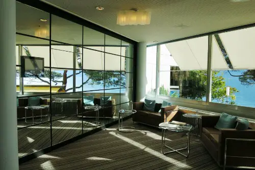
Mirrors can make a room feel larger, but too many of them can feel disorienting. When every angle reflects another reflection, the space starts to resemble a funhouse. Designers usually recommend mirrors as accents, not entire wall treatments. The aesthetic quickly shifts from stylish to self-conscious.
People often add multiple mirrors to create drama or show an eye for design. However, guests may interpret the setup as overly fixated on appearance. It can also distract from the rest of the décor, minimizing any warmth the room might have. A single well-placed mirror communicates confidence more effectively.
8. Furniture Wrapped in Plastic
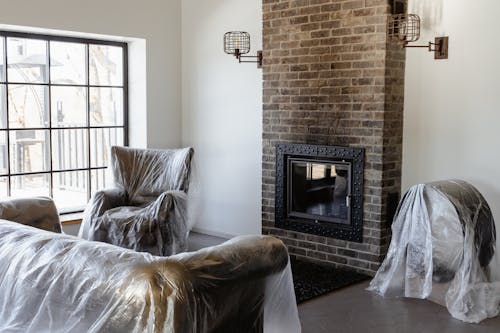
Plastic coverings give a home an unmistakably cautious vibe. They’re practical for protection, but they instantly diminish comfort. The crinkling sound and stiff texture make furniture feel unwelcoming. Guests quickly sense that preservation is more important than relaxation.
Many choose plastic covers to safeguard expensive pieces, but it signals anxiety rather than style. It suggests you care more about maintaining appearances than enjoying the space. The furniture becomes a display rather than a functional item. Removing the plastic shows trust in both your guests and your home.
9. Giant Inspirational Word Art
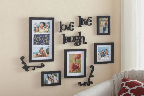
Oversized signs with words like “Live,” “Love,” or “Gather” tend to feel redundant in a lived-in space. Guests already understand the intended vibe without needing to read it off the wall. While the sentiment is positive, the scale can make it feel less sincere. The décor starts to resemble a retail display.
People often choose these pieces to create warmth, but the literal messaging can feel heavy-handed. Instead of inspiring, it can seem like a scripted attempt at wholesomeness. Personal art or subtle accents convey the same feeling with more authenticity. Guests appreciate meaning delivered through style, not instructions.
10. Velvet Rope Around “No-Sit” Areas
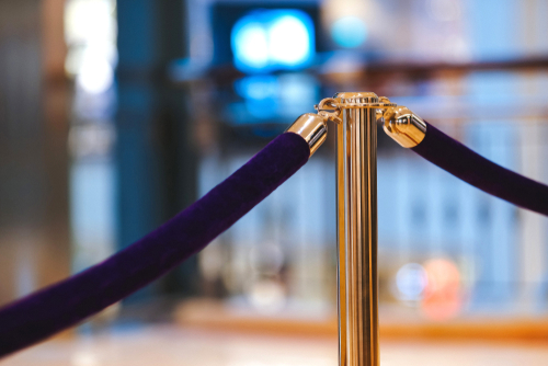
Creating a blocked-off section in a living space feels theatrical and out of place. Homes aren’t museums, and separating an area with a rope sends a strict message. It tells guests the room has boundaries they must navigate visually. This can create unnecessary stiffness.
Many homeowners do this to preserve pristine furniture or delicate displays. However, the gesture communicates that form matters more than function. Guests may feel nervous about accidentally crossing an invisible line. A more practical layout achieves protection without creating tension.
11. Massive Home Logo or Monogram Décor
A giant monogram instantly draws attention to your initials rather than your design choices. Personal touches are great, but oversized ones can dominate the room. They risk shifting from identity to ego display. Guests may quietly wonder about the intention behind such prominence.
People often choose these pieces to create a sense of ownership or signature style. But subtlety tends to achieve that more effectively. Smaller monograms or integrated designs feel confident without shouting. When décor feels modest, guests feel more at ease.
12. Immaculate, Unused Kitchen Displays
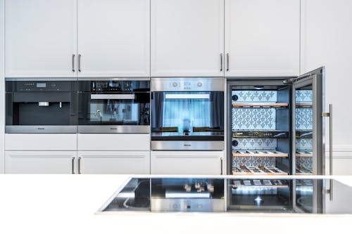
A kitchen with untouched appliances and bowls of decorative fruit can feel staged. When nothing looks like it’s ever been cooked with, guests notice. Kitchens usually carry signs of life, so a spotless one can feel performative. The space becomes more about image than hospitality.
People often maintain display-only kitchens to project elegance or control. However, guests may interpret it as signaling that real activity is discouraged. The room loses warmth and relatability. A lived-in look, even subtle, signals comfort instead of overcompensation.
This post 12 Decor Choices That Tell Guests You’re Overcompensating was first published on Greenhouse Black.