
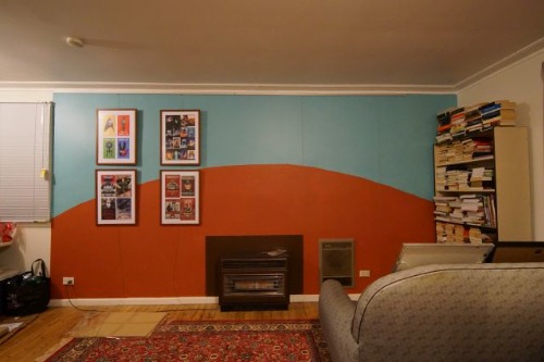
1. The Oversized TV Over the Fireplace
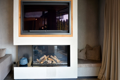
An extra-large TV mounted over a fireplace instantly becomes the focal point of the room. That sounds good until it’s the only thing people can see. Fireplaces were designed to be at eye level when you’re standing, not sitting. The result is a screen that dominates the space and pulls attention away from furniture, art, and architecture.
People also tend to notice the neck strain before they notice the picture quality. The higher the TV, the more obvious the placement feels, especially during longer viewing sessions. Even well-styled mantels can’t compete with a giant black rectangle. Instead of blending in, the TV announces itself every time someone walks in.
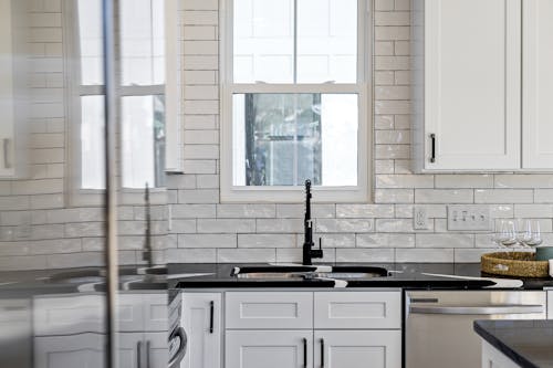
2. Mismatched Cabinet Hardware Finishes
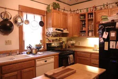
Switching out cabinet hardware feels like a quick win, but mixing finishes without a plan can backfire. When knobs and pulls don’t match nearby faucets or lighting, the inconsistency stands out. People may not know why the kitchen feels “off,” but their eyes keep hopping around. The hardware ends up being more noticeable than the cabinets themselves.
This happens because kitchens have a lot of repeated elements in a small space. Even slight finish differences are easy to spot when they’re multiplied across drawers and doors. Instead of reading as layered or intentional, it can look like a half-finished update. The fix draws attention to the lack of cohesion rather than the upgrade.
3. High-Gloss Paint on Imperfect Walls
Glossy paint reflects light, which means it reflects everything else too. That includes dents, patches, and uneven drywall seams. In older homes especially, walls are rarely as smooth as they look under flat paint. Once gloss goes on, those flaws suddenly take center stage.
People notice texture before they notice color in this situation. The shine creates shadows that make minor imperfections feel major. What was meant to look sleek and modern can end up looking unfinished. Instead of admiring the bold choice, guests see the wall’s history.
4. A Trendy Light Fixture That Overpowers the Room
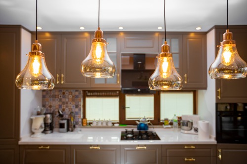
Statement lighting is popular, but scale and style matter more than trends. A fixture that’s too large or ultra-stylized can hijack the entire room. Instead of complementing the space, it competes with everything else. The eye goes straight up and stays there.
This is especially noticeable in dining rooms and entryways. When the light doesn’t match the home’s overall style, it feels like it belongs somewhere else. People remember the fixture, not the room. The “fix” becomes the only thing anyone talks about.
5. An Accent Wall in the Wrong Color
Accent walls are meant to add interest, not visual confusion. When the color is much darker or brighter than the rest of the room, it can shrink the space. The wall becomes a visual stop sign rather than a feature. Instead of enhancing the layout, it interrupts it.
People tend to focus on contrast more than intention. If the accent wall doesn’t tie into textiles or furniture, it feels random. The eye keeps returning to it, trying to make sense of the choice. The result is attention on the decision, not the design.
6. Open Shelving Without a Storage Plan
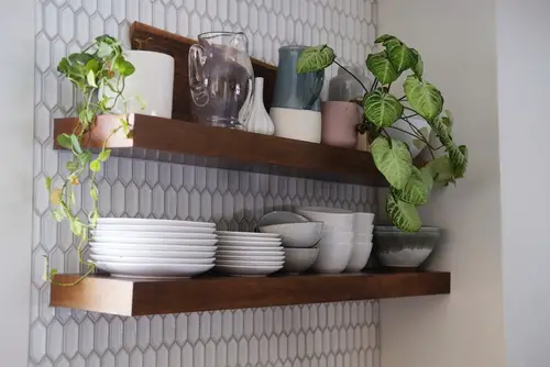
Open shelves promise an airy, modern look, but they demand discipline. Everyday items like mismatched mugs and cereal boxes quickly take over. What was supposed to feel curated starts to feel cluttered. The shelves become the first thing people notice when they walk in.
Because everything is visible, even small messes are amplified. Guests’ eyes are drawn to uneven stacks and empty gaps. Instead of noticing the kitchen’s layout or finishes, they see your storage habits. The fix highlights daily life in a way that closed cabinets never would.
7. Barn Doors in Spaces That Need Privacy
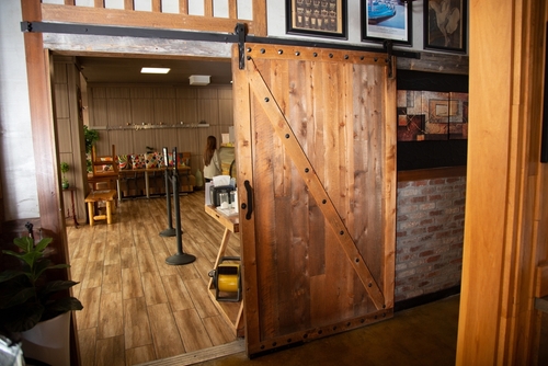
Barn doors are visually striking, but they’re not great at sealing off a room. They don’t block sound well and often leave gaps around the edges. In bathrooms, bedrooms, or offices, that limitation becomes obvious fast. The door draws attention to what it can’t do.
People notice when a door feels performative instead of practical. The sliding hardware and exposed track become focal points. Instead of appreciating the style, guests clock the noise and privacy issues. The door becomes a conversation piece for the wrong reasons.
8. Faux Hardwood Flooring With a Repeating Pattern
Budget-friendly flooring has come a long way, but repetition is still a giveaway. When the same plank pattern shows up every few feet, the illusion breaks. People may not articulate it, but they sense something artificial. Their eyes catch the repetition and linger there.
This is especially true in open-plan spaces with lots of natural light. Sunlight makes identical knots and grain patterns easier to spot. Instead of noticing the room’s size or flow, attention goes to the floor. The fix highlights its own limitations.
9. High-Contrast Grout in an Uneven Backsplash
Bold grout colors are popular, but they demand precision. If tiles aren’t perfectly aligned, dark grout makes every inconsistency visible. Small spacing issues suddenly feel much bigger. The backsplash becomes a map of tiny mistakes.
People naturally follow lines, and grout creates a lot of them. When those lines wobble, the eye keeps tracking them. Instead of admiring the tile choice, guests notice the execution. The upgrade draws attention to craftsmanship rather than style.
10. Exposed Cords and DIY Cable Management
Mounting a TV or adding smart devices often introduces a cord problem. Temporary fixes like raceways or fabric sleeves can look fine up close. From across the room, they still read as an afterthought. The eye follows cords straight to the outlet.
People are used to technology, but they’re also used to it being hidden. When cables are visible, they feel unfinished. Instead of seeing a clean setup, guests see the workaround. The fix highlights what wasn’t fully solved.
11. DIY Crown Molding With the Wrong Proportions
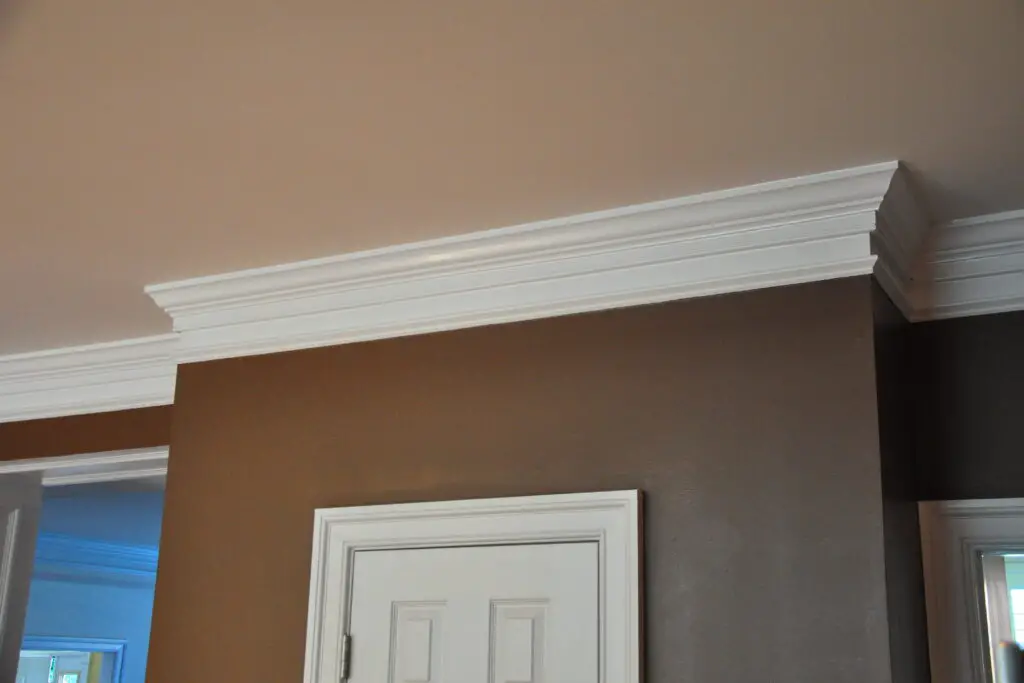
Crown molding can elevate a room, but size and installation are critical. Too small, and it looks like an afterthought. Too large, and it overwhelms the ceiling line. Gaps and uneven corners are especially noticeable at eye level.
People instinctively look up when something frames a room. If the lines aren’t crisp, the flaws stand out immediately. Instead of adding polish, the molding draws attention to itself. The fix ends up spotlighting the learning curve.
This post These Home Fixes Draw Attention to the Wrong Things was first published on Greenhouse Black.